The pipeline viewer in X-Pack provides a simple way for you to visualize and monitor the behavior of complex Logstash pipeline configurations. Within the pipeline viewer, you can explore a directed acyclic graph (DAG) representation of the overall pipeline topology, data flow, and branching logic. The diagram is overlayed with important metrics, like events per second and time spent in milliseconds, for each plugin in the view.
The diagram includes visual indicators to draw your attention to potential bottlenecks in the pipeline, making it easy for you to diagnose and fix problems.
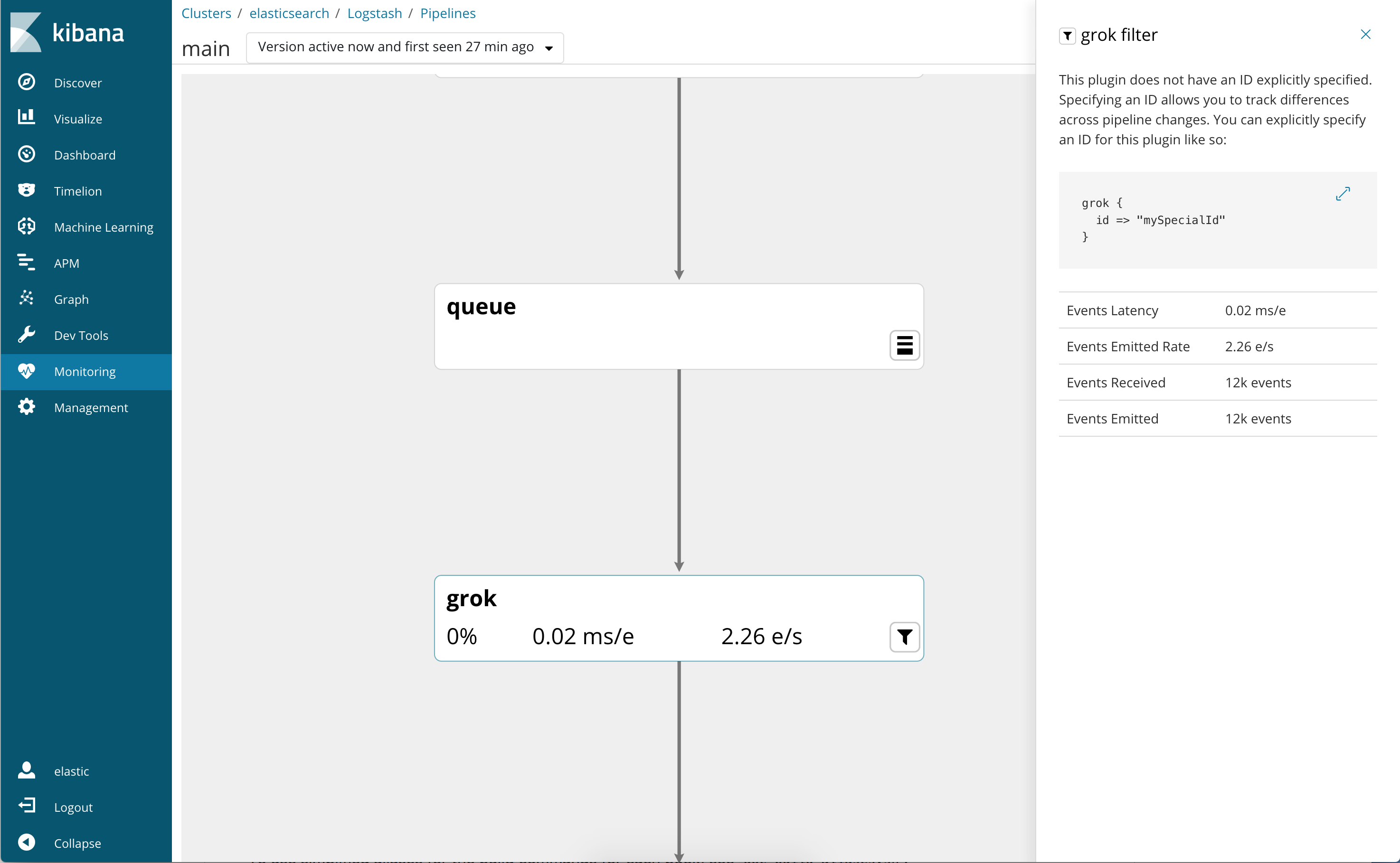
When you configure the stages in your Logstash pipeline, make sure you specify semantic IDs. If you don’t specify IDs, Logstash generates them for you.
Using semantic IDs makes it easier to identify the configurations that are
causing bottlenecks. For example, you may have several grok filters running
in your pipeline. If you haven’t specified semantic IDs, you won’t be able
to tell at a glance which filters are slow. If you specify semantic IDs,
such as apacheParsingGrok and cloudwatchGrok, you’ll know exactly which
grok filters are causing bottlenecks.
Before using the pipeline viewer, you need to set up X-Pack and configure Logstash monitoring.
The pipeline viewer highlights CPU% and event latency in cases where the values are anomalous. The purpose of these highlights is to enable users to quickly identify processing that is disproportionately slow. This may not necessarily mean that anything is wrong with a given plugin, since some plugins are slower than others due to the nature of the work they do. For instance, you may find that a grok filter that uses a complicated regexp runs a lot slower than a mutate filter that simply adds a field. The grok filter might be highlighted in this case, though it may not be possible to further optimize its work.
The exact formula used is a heuristic, and thus is subject to change.
To view the pipeline diagram:
-
In Logstash, start the Logstash pipeline that you want to monitor.
Assuming that you’ve set up Logstash monitoring, Logstash will begin shipping metrics to the monitoring cluster.
-
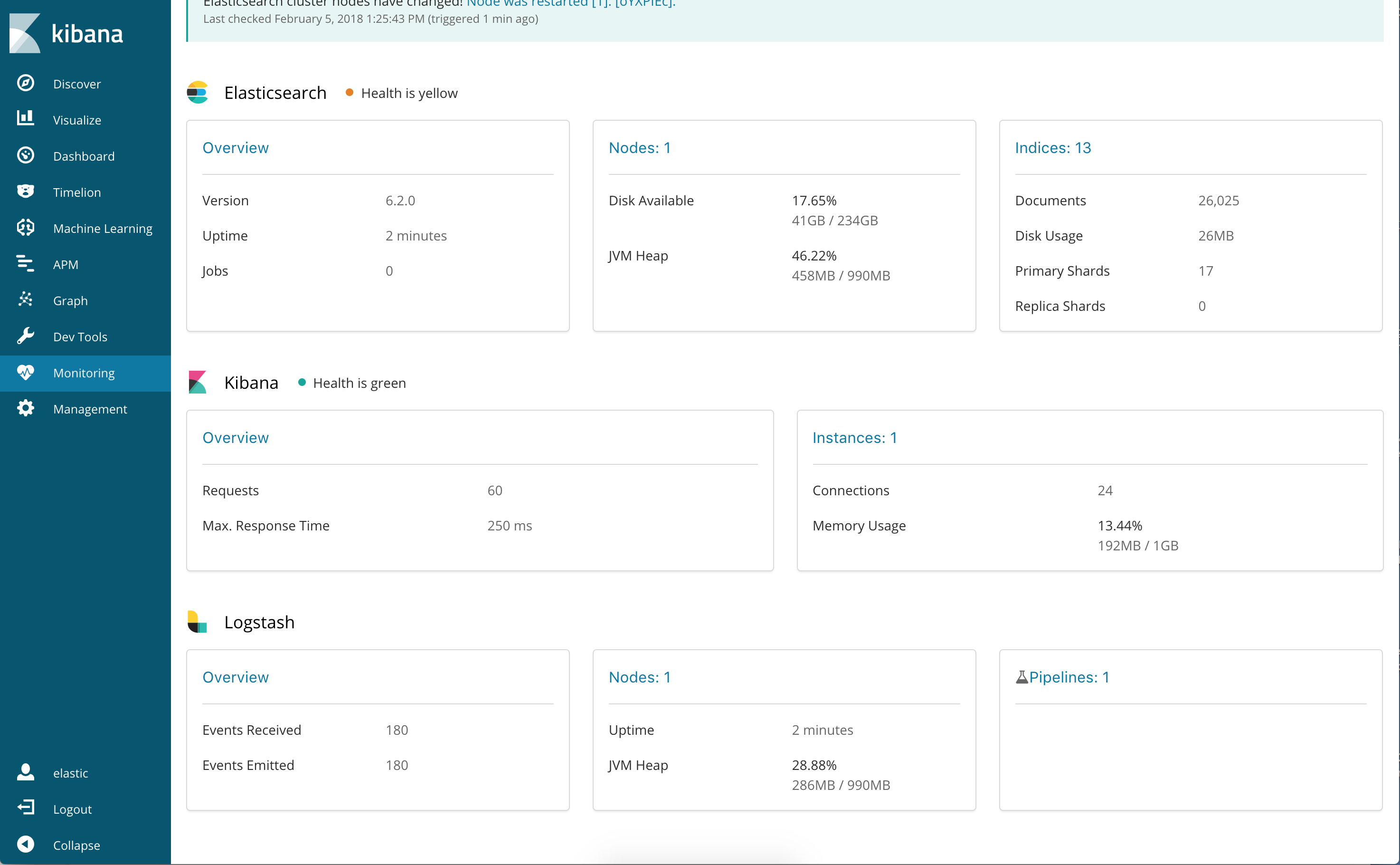
Navigate to the Monitoring tab in Kibana.
You should see a Logstash section.
-
Click the Pipelines link under Logstash to see all the pipelines that are being monitored.
Each pipeline is identified by a pipeline ID (
mainby default). For each pipeline, you’ll see charts showing the pipeline’s throughput and the number of nodes on which the pipeline is running during the selected time range.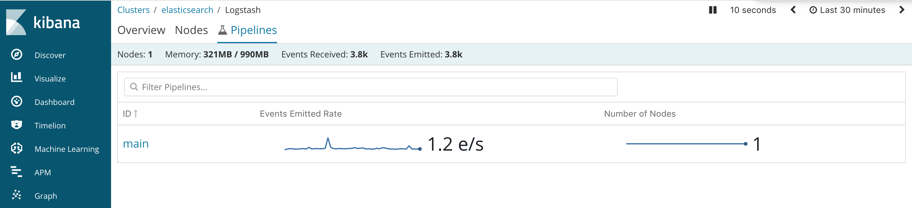
-
Click a pipeline in the list to drill down and explore the pipeline diagram. The diagram shows the latest version of the pipeline. To view an older version of the pipeline, select a version from the drop-down list next to the pipeline ID at the top of the page.
Each time you modify a pipeline, Logstash generates a new version. Viewing different versions of the pipeline stats allows you see how changes to the pipeline over time affect throughput and other metrics. Note that Logstash stores multiple versions of the pipeline stats; it does not store multiple versions of the pipeline configurations themselves.
The diagram shows all the stages feeding data through the pipeline. It also shows conditional logic.
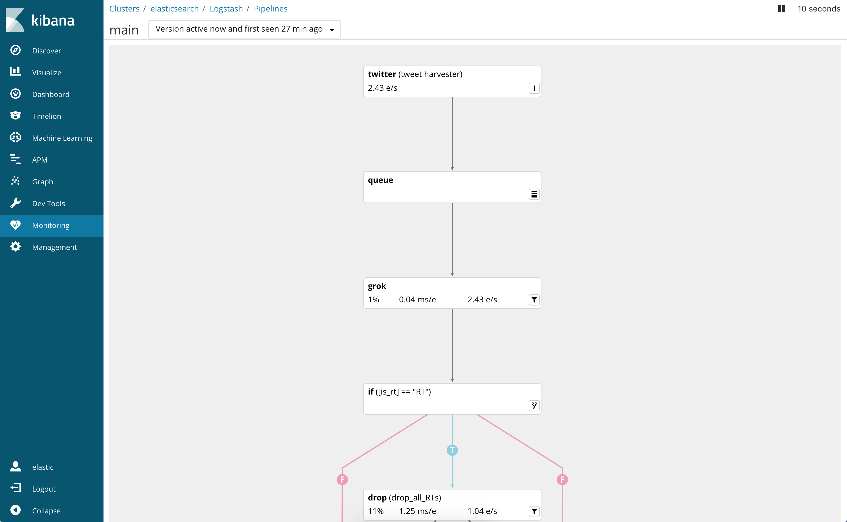
The information displayed on each vertex varies depending on the plugin type.
Here’s an example of an input vertex:
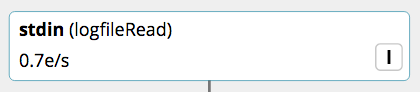
The I badge indicates that this is an input stage. The vertex shows:
- input type - stdin
- user-supplied ID - logfileRead
- throughput expressed in events per second - 0.7 e/s
Here’s an example of a filter vertex.
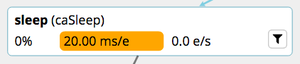
The filter icon indicates that this is a filter stage. The vertex shows:
- filter type - sleep
- user-supplied ID - caSleep
- worker usage expressed as the percentage of total execution time - 0%
- performance - the number of milliseconds spent processing each event - 20.00 ms/e
- throughput - the number of events sent per second - 0.0 e/s
Stats that are anomalously slow appear highlighted in the pipeline viewer. This doesn’t necessarily indicate a problem, but it highlights potential bottle necks so that you can find them quickly.
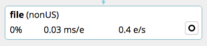
An output vertex shows the same information as a vertex node, but it has an O badge to indicate that it is an output stage:
- Hover over a vertex in the diagram, and you’ll see only the related nodes that are ancestors or descendants of the current vertex.
- Explore the diagram and look for performance anomalies.
-
Click on a vertex to see details about it.