Analyze time series data
editAnalyze time series data
editIn this tutorial, you’ll use the ecommerce sample data to analyze sales trends, but you can use any type of data to complete the tutorial.
When you’re done, you’ll have a complete overview of the sample web logs data.
Before you begin, you should be familiar with the Kibana concepts.
Add the data and create the dashboard
editAdd the sample ecommerce data, and create and set up the dashboard.
- Go to the Home page, then click Try sample data.
- On the Sample eCommerce orders card, click Add data.
Create the dashboard where you’ll display the visualization panels.
- Open the main menu, then click Dashboard.
- On the Dashboards page, click Create dashboard.
Open and set up the visualization editor
editOpen the visualization editor, then make sure the correct fields appear.
- On the dashboard, click Create visualization.
- Make sure the kibana_sample_data_ecommerce data view appears, then set the time filter to Last 30 days.
Create visualizations with custom time intervals
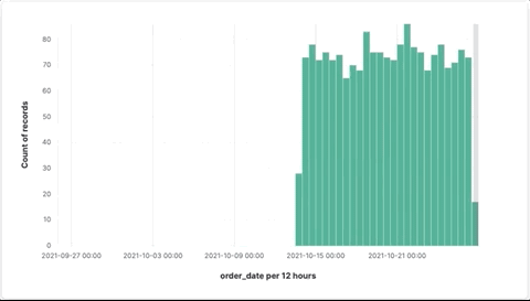
editWhen you create visualizations with time series data, you can use the default time interval, or increase and decrease the interval. For performance reasons, the visualization editor allows you to choose the minimum time interval, but not the exact time interval. The interval limit is controlled by the histogram:maxBars setting and time range.
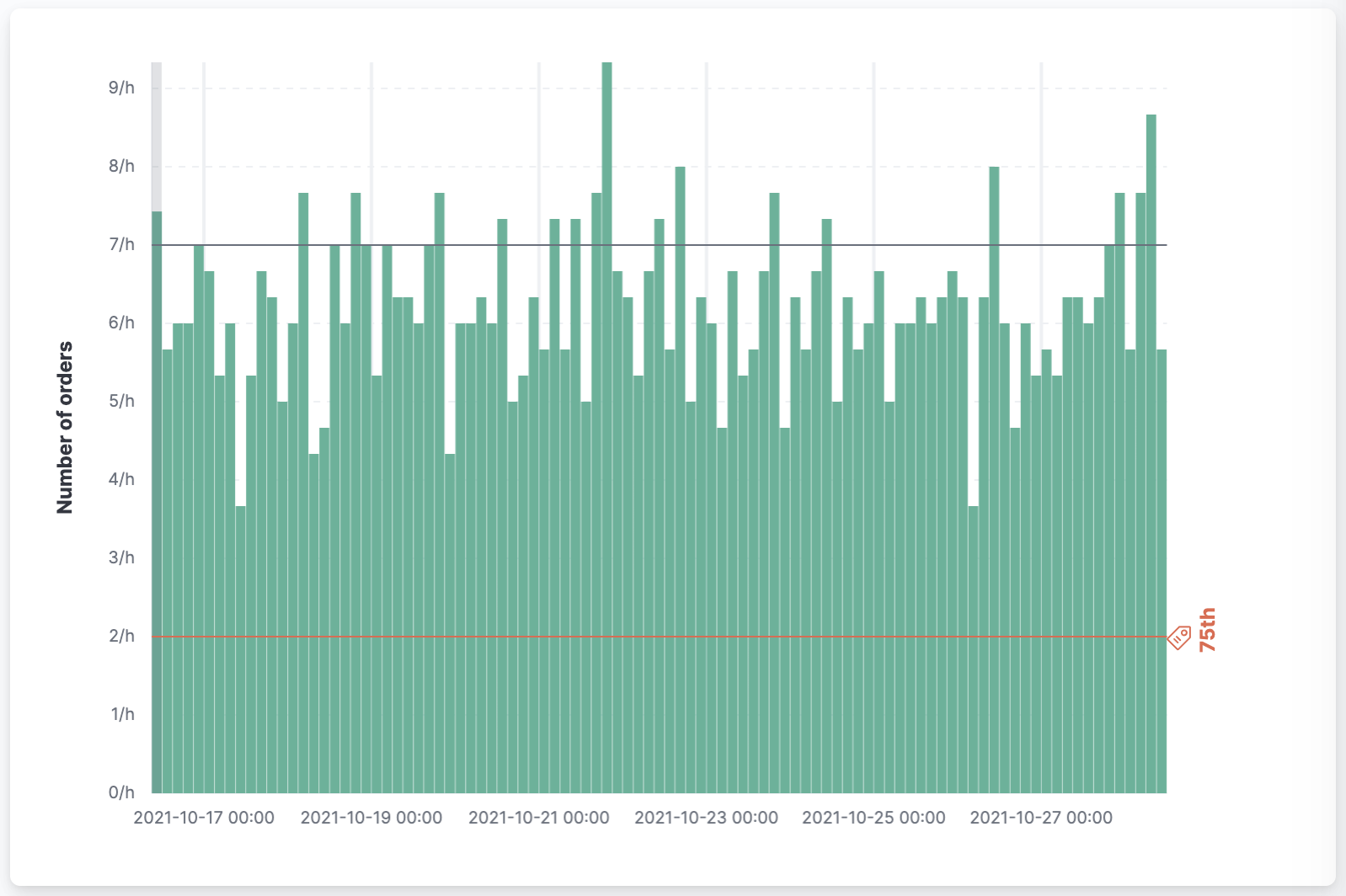
To analyze the data with a custom time interval, create a bar chart that shows you how many orders were made at your store every hour:
-
From the Available fields list, drag Records to the workspace.
The visualization editor creates a bar chart.
-
To zoom in on the data, click and drag your cursor across the bars.
-
In the layer pane, click Count of Records.
-
In the Display name field, enter
Number of orders. - Click Add advanced options > Normalize by unit.
-
From the Normalize by unit dropdown, select per hour, then click Close.
Normalize unit converts Average sales per 12 hours into Average sales per 12 hours (per hour) by dividing the number of hours.
-
In the Display name field, enter
- To hide the Horizontal axis label, open the Bottom Axis menu, then deselect Show.
To identify the 75th percentile of orders, add a reference line:
- In the layer pane, click Add layer > Reference lines.
- Click Static value.
-
Click the Percentile function, then enter
75in the Percentile field. -
Configure the display options.
-
In the Display name field, enter
75th. - Select Show display name.
- From the Icon dropdown, select Tag.
-
In the Color field, enter
#E7664C.
-
In the Display name field, enter
-
Click Close.
- Click Save and return.
Analyze multiple data series
editYou can create visualizations with multiple data series within the same time interval, even when the series have similar configurations with minor differences.
To analyze multiple series, create a line chart that displays the price distribution of products sold over time:
- On the dashboard, click Create visualization.
- Open the Visualization type dropdown, then select Line.
- From the Available fields list, drag products.price to the workspace.
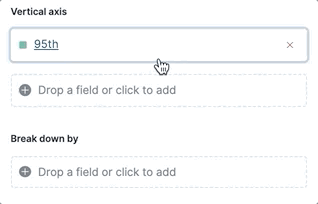
Create the 95th price distribution percentile:
- In the layer pane, click Median of products.price.
- Click the Percentile function.
-
In the Display name field, enter
95th, then click Close.
To copy a function, you drag it to the Drop a field or click to add field within the same group. To create the 90th percentile, duplicate the 95th percentile:
-
Drag the 95th field to Add or drag-and-drop a field for Vertical axis.
-
Click 95th [1], then enter
90in the Percentile field. -
In the Display name field enter
90th, then click Close. -
To create the
50thand10thpercentiles, repeat the duplication steps. -
Open the Left Axis menu, then enter
Percentiles for product pricesin the Axis name field.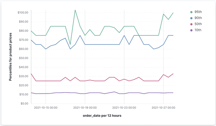
- Click Save and return.
Analyze multiple visualization types
editWith layers, you can analyze your data with multiple visualization types. When you create layered visualizations, match the data on the horizontal axis so that it uses the same scale.
To analyze multiple visualization types, create an area chart that displays the average order prices, then add a line chart layer that displays the number of customers.
- On the dashboard, click Create visualization.
- From the Available fields list, drag products.price to the workspace.
-
In the layer pane, click Median of products.price.
- Click the Average function.
-
In the Display name field, enter
Average price, then click Close.
- Open the Visualization type dropdown, then select Area.
Add a layer to display the customer traffic:
- In the layer pane, click Add layer > Visualization.
- From the Available fields list, drag customer_id to the Vertical Axis field in the second layer.
-
In the layer pane, click Unique count of customer_id.
-
In the Display name field, enter
Number of customers. - In the Series color field, enter #D36086.
- Click Right for the Axis side, then click Close.
-
In the Display name field, enter
- From the Available fields list, drag order_date to the Horizontal Axis field in the second layer.
-
In the second layer, open the Layer visualization type menu, then click Line.
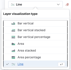
-
To change the position of the legend, open the Legend menu, then select the Alignment arrow that points up.
- Click Save and return.
Compare the change in percentage over time
editBy default, the visualization editor displays time series data with stacked charts, which show how the different document sets change over time.
To view change over time as a percentage, create an Area percentage chart that displays three order categories over time:
- On the dashboard, click Create visualization.
- From the Available fields list, drag Records to the workspace.
- Open the Visualization type dropdown, then select Area percentage.
For each order category, create a filter:
- In the layer pane, click Add or drag-and-drop a field for Break down by.
- Click the Filters function.
-
Click All records, enter the following in the query bar, then press Return:
-
KQL —
category.keyword : *Clothing -
Label —
Clothing
-
KQL —
-
Click Add a filter, enter the following in the query bar, then press Return:
-
KQL —
category.keyword : *Shoes -
Label —
Shoes
-
KQL —
-
Click Add a filter, enter the following in the query bar, then press Return:
-
KQL —
category.keyword : *Accessories -
Label —
Accessories
-
KQL —
- Click Close.
-
Open the Legend menu, then select the Alignment arrow that points up.
- Click Save and return.
View the cumulative number of products sold on weekends
editTo determine the number of orders made only on Saturday and Sunday, create an area chart, then add it to the dashboard.
- On the dashboard, click Create visualization.
- Open the Visualization type dropdown, then select Area.
Configure the cumulative sum of store orders:
- From the Available fields list, drag Records to the workspace.
- In the layer pane, click Count of Records.
- Click the Cumulative sum function.
-
In the Display name field, enter
Cumulative weekend orders, then click Close.
Filter the results to display the data for only Saturday and Sunday:
- In the layer pane, click Add or drag-and-drop a field for Break down by.
- Click the Filters function.
-
Click All records, enter the following in the query bar, then press Return:
-
KQL —
day_of_week : "Saturday" or day_of_week : "Sunday" -
Label —
Saturday and SundayThe KQL filter displays all documents where
day_of_weekmatchesSaturdayorSunday.
-
KQL —
-
Open the Legend menu, then click Hide.
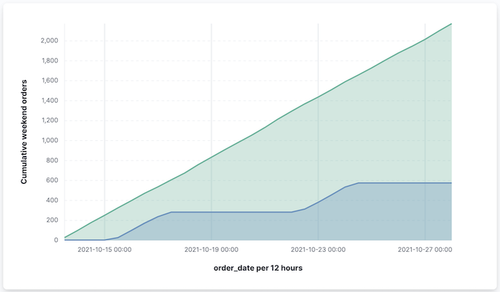
- Click Save and return.
Compare time ranges
editWith Time shift, you can compare the data from different time ranges. To make sure the data correctly displays, choose a multiple of the date histogram interval when you use multiple time shifts. For example, you are unable to use a 36h time shift for one series, and a 1d time shift for the second series if the interval is days.
To compare two time ranges, create a line chart that compares the sales in the current week with sales from the previous week:
- On the dashboard, click Create visualization.
- Open the Visualization type dropdown, then select Line.
- From the Available fields list, drag Records to the workspace.
- To duplicate Count of Records, drag Count of Records to Add or drag-and-drop a field for Vertical axis in the layer pane.
To create a week-over-week comparison, shift Count of Records [1] by one week:
- In the layer pane, click Count of Records [1].
-
Click Add advanced options > Time shift, select 1 week ago, then click Close.
To use custom time shifts, enter the time value and increment, then press Enter. For example, enter 1w to use the 1 week ago time shift.
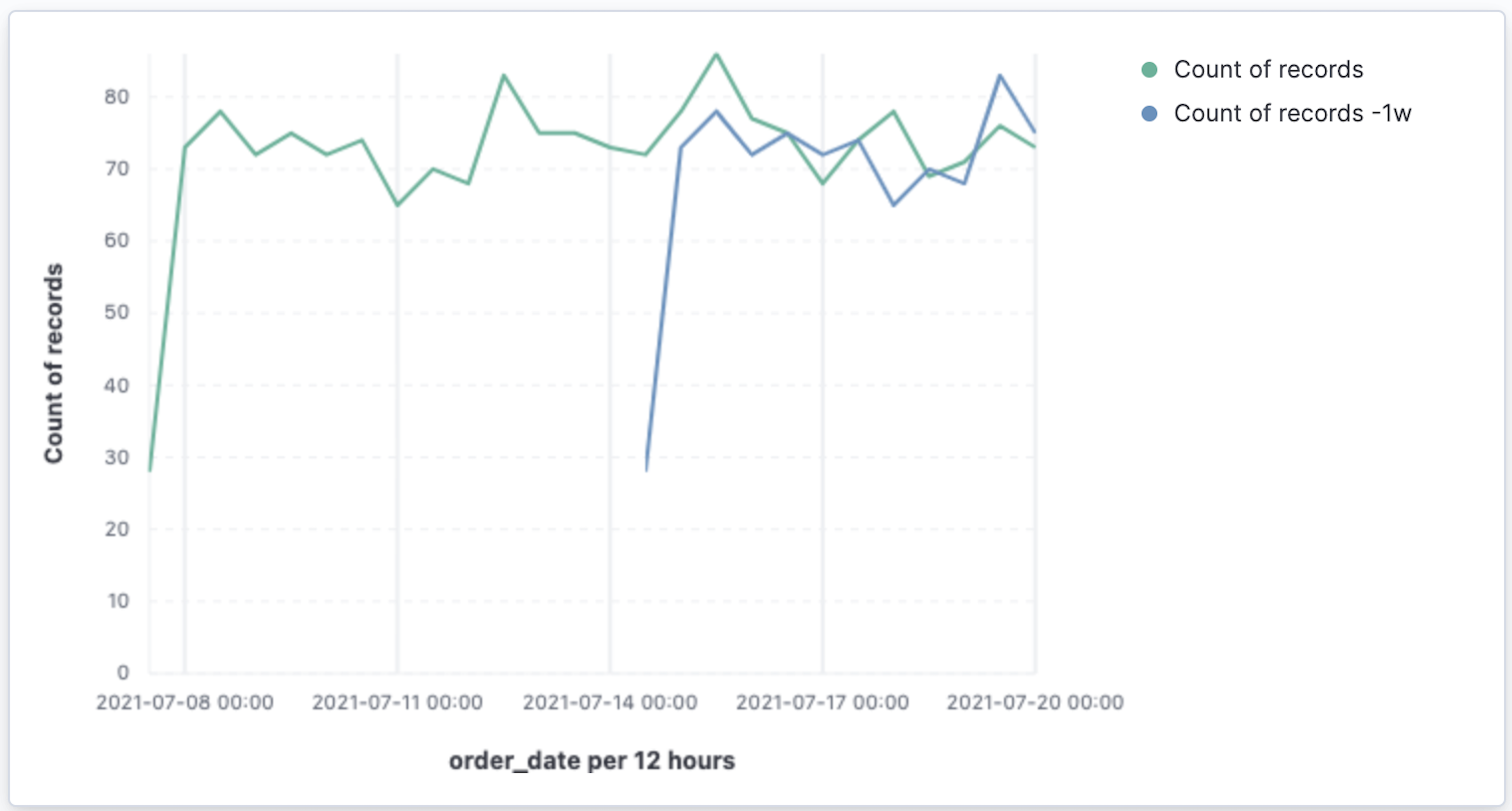
- Click Save and return.
Time shifts can be used on any metric. The special shift previous will show the time window preceding the currently selected one in the time picker in the top right, spanning the same duration. For example, if Last 7 days is selected in the time picker, previous will show data from 14 days ago to 7 days ago. This mode can’t be used together with date histograms.
Analyze the percent change between time ranges
editWith Formula, you can analyze the percent change in your data from different time ranges.
To compare time range changes as a percent, create a bar chart that compares the sales in the current week with sales from the previous week:
- On the dashboard, click Create visualization.
- From the Available fields list, drag Records to the workspace.
- In the layer pane, click Count of Records.
-
Click Formula, then enter
count() / count(shift='1w') - 1. -
Open the Value format dropdown, select Percent, then enter
0in the Decimals field. -
In the Display name field, enter
Percent of change, then click Close.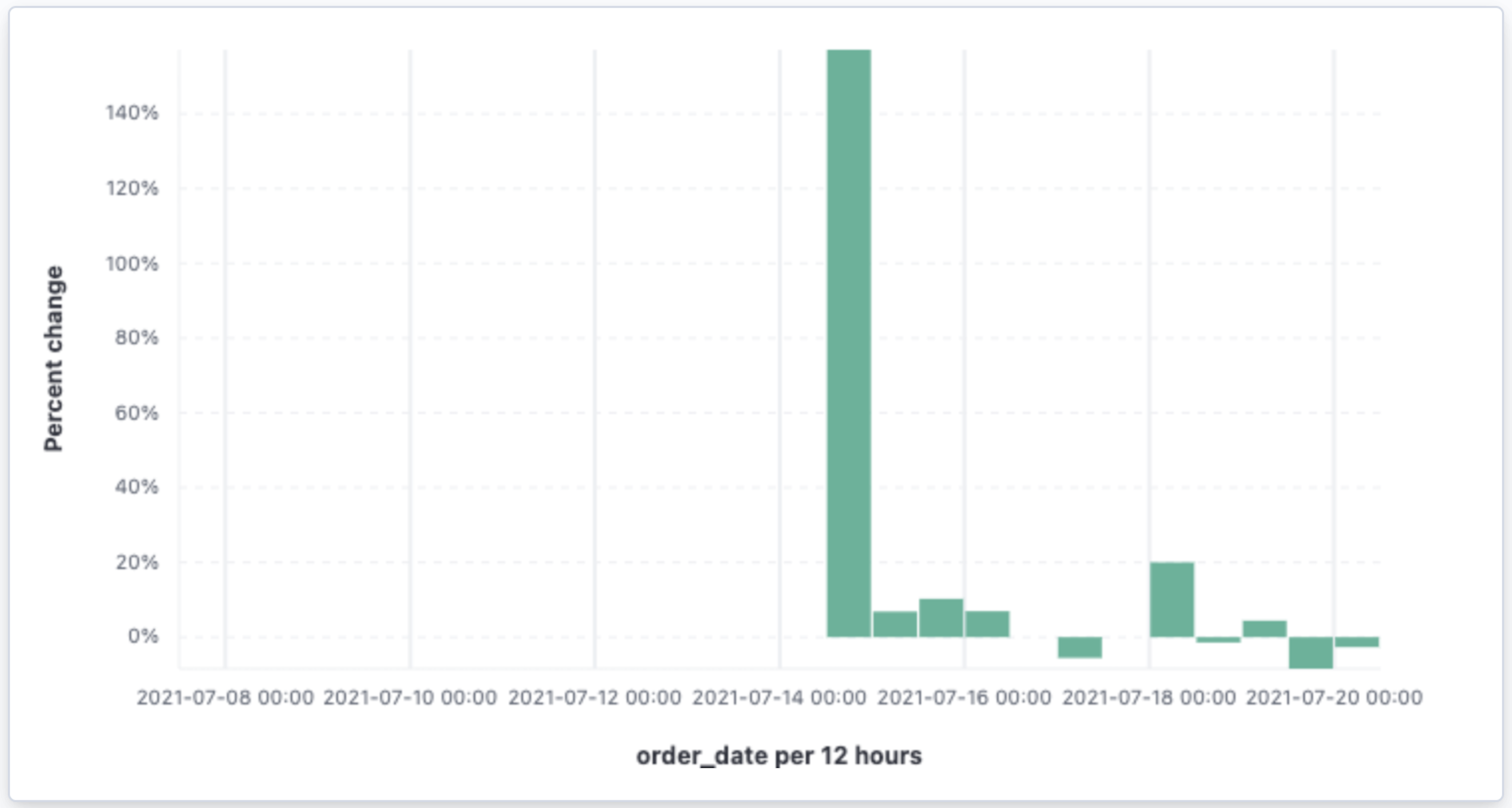
- Click Save and return.
Analyze the data in a table
editWith tables, you can view and compare the field values, which is useful for displaying the locations of customer orders.
Create a date histogram table and group the customer count metric by category, such as the continent registered in user accounts:
- On the dashboard, click Create visualization.
- Open the Visualization type dropdown, then select Table.
-
From the Available fields list, drag customer_id to the Metrics field in the layer pane.
- In the layer pane, click Unique count of customer_id.
-
In the Display name field, enter
Customers, then click Close.
-
From the Available fields list, drag order_date to the Rows field in the layer pane.
- In the layer pane, click the order_date.
- Select Customize time interval.
- Change the Minimum interval to 1 days.
-
In the Display name field, enter
Sales, then click Close.
To split the metric, add columns for each continent using the Columns field:
-
From the Available fields list, drag geoip.continent_name to the Columns field in the layer pane.
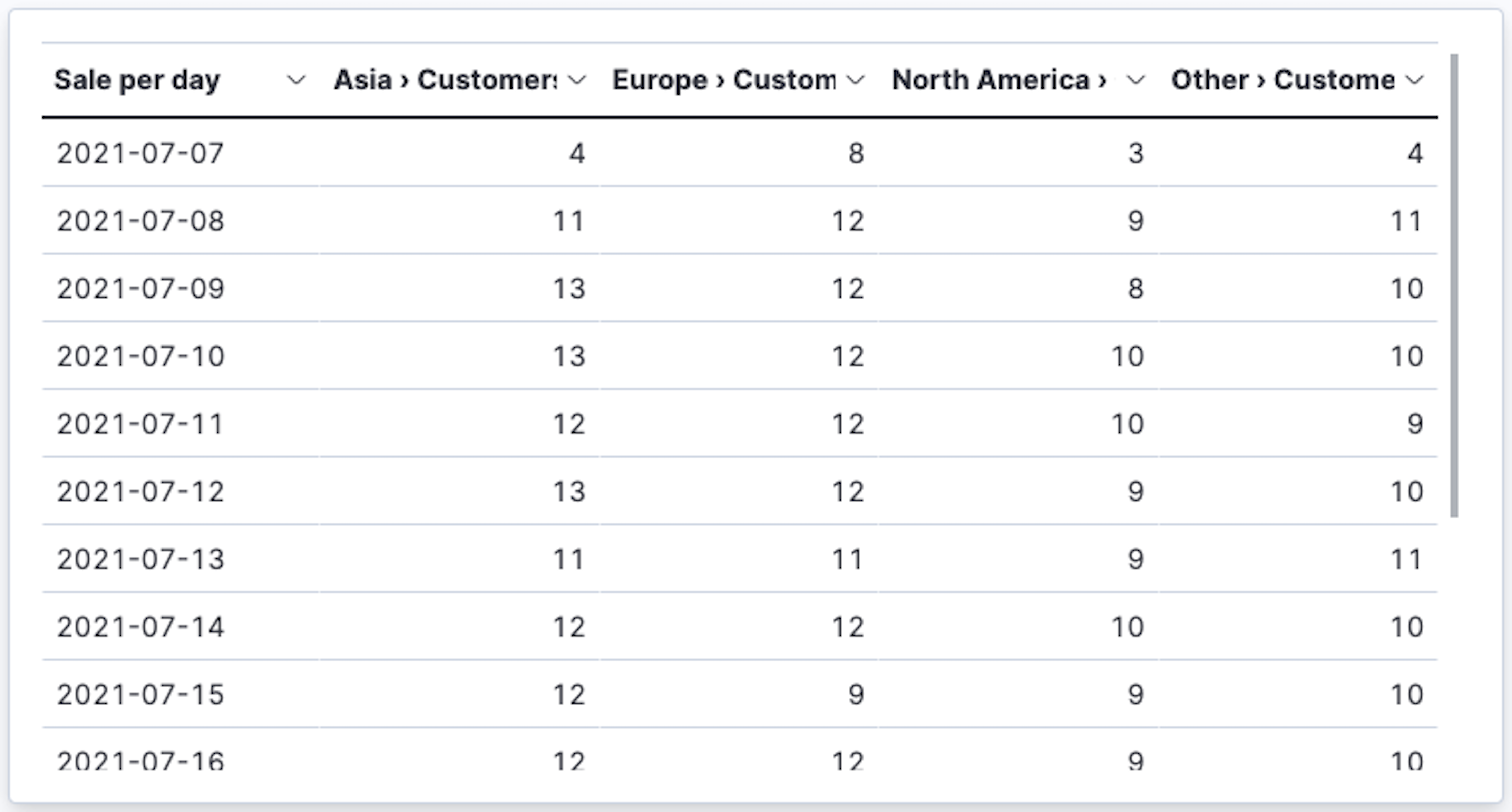
- Click Save and return.
Save the dashboard
editNow that you have a complete overview of your ecommerce sales data, save the dashboard.
- In the toolbar, click Save.
-
On the Save dashboard window, enter
Ecommerce sales, then click Save. - Select Store time with dashboard.
- Click Save.