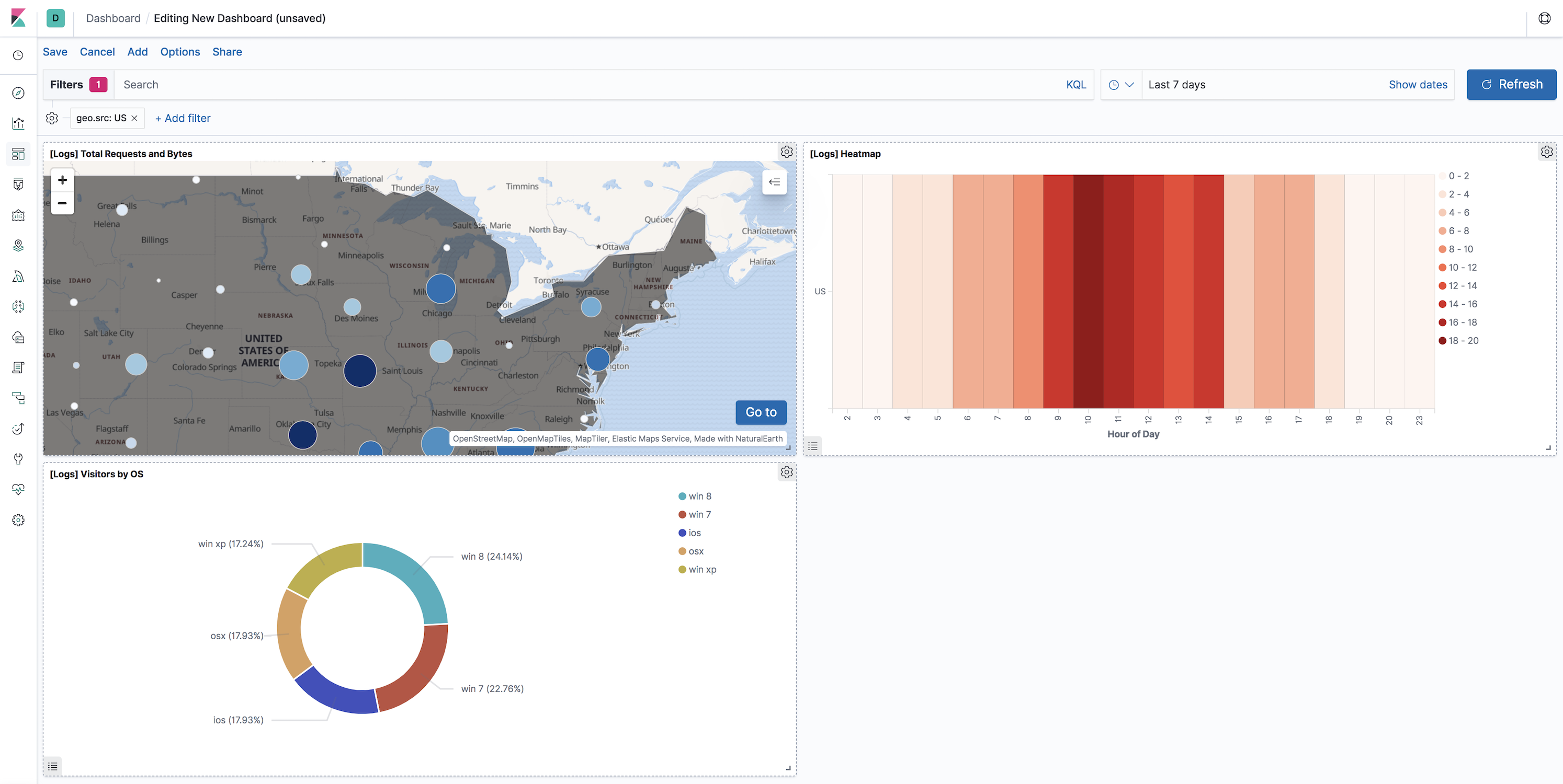
Add the map to a dashboard
editAdd the map to a dashboard
editYou can add your saved map to a dashboard and view your geospatial data alongside bar charts, pie charts, and other visualizations.
- Open the menu, then go to Dashboard.
- Click Create dashboard.
- Set the time range to Last 7 days.
-
Click Add.
A panel opens with a list of objects that you can add to the dashboard. You’ll add a map and two visualizations.
- Set the Types select to Map.
- Click the name of your saved map or the [Logs] Total Requests and Bytes map included with the sample data set to add a map to the dashboard.
- Set the Types select to Visualization.
- Click [Logs] Heatmap to add a heatmap to the dashboard.
- Click [Logs] Visitors by OS to add a pie chart to the dashboard.
-
Close the panel.
Your dashboard should look like this:
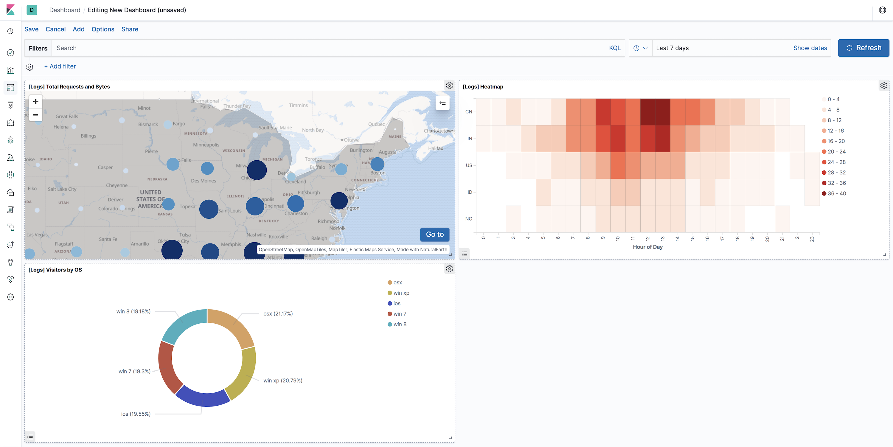
Explore your data using filters
editYou can apply filters to your dashboard to hone in on the data that you are most interested in. The dashboard is interactive—you can quickly create filters by clicking on the desired data in the map and visualizations. The panels are linked, so that when you apply a filter in one panel, the filter is applied to all panels on the dashboard.
-
In the [Logs] Visitors by OS visualization, click on the osx pie slice.
Both the visualizations and map are filtered to only show documents where machine.os.keyword is osx. The machine.os.keyword: osx filter appears in the dashboard query bar.
- Click the x to remove the machine.os.keyword: osx filter.
- In the map, click in the United States vector.
-
Click plus
 next to the iso2 row in the tooltip.
Both the visualizations and the map are filtered to only show documents where geo.src is US. The geo.src: US filter appears in the dashboard query bar.
Your dashboard should look like this: