Lens
editLens
editThis functionality is in beta and is subject to change. The design and code is less mature than official GA features and is being provided as-is with no warranties. Beta features are not subject to the support SLA of official GA features.
Lens is a simple and fast way to create visualizations of your Elasticsearch data. To create visualizations, you drag and drop your data fields onto the visualization builder pane, and Lens automatically generates a visualization that best displays your data.
With Lens, you can:
- Use the automatically generated visualization suggestions to change the visualization type.
- Create visualizations with multiple layers and indices.
- Add your visualizations to dashboards and Canvas workpads.
To get started with Lens, select a field in the data panel, then drag and drop the field on a highlighted area.
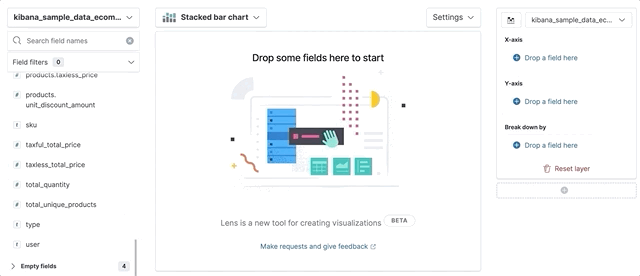
You can incorporate many fields into your visualization, and Lens uses heuristics to decide how to apply each one to the visualization.
Drag-and-drop capabilities are available only when Lens knows how to use the data. If Lens is unable to automatically generate a visualization, you can still configure the customization options for your visualization.
Change the data panel fields
editThe fields in the data panel are based on the selected index pattern and time filter.
To change the index pattern, click it, then select a new one. The fields in the data panel automatically update.
To filter the fields in the data panel:
- Enter the name in Search field names.
- Click Filter by type, then select the filter. To show all of the fields in the index pattern, deselect Only show fields with data.
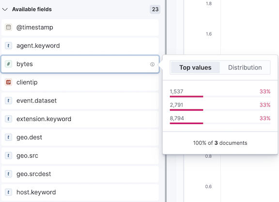
Data summaries
editTo help you decide exactly the data you want to display, get a quick summary of each field. The summary shows the distribution of values within the selected time range.
To view the field summary information, navigate to the field, then click i.
Change the visualization type
editLens enables you to switch between any supported visualization type at any time.
Suggestions are shortcuts to alternate visualizations that Lens generates for you.
If you’d like to use a visualization type that is not suggested, click the visualization type, then select a new one.
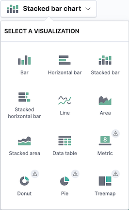
When there is an exclamation point (!) next to a visualization type, Lens is unable to transfer your data, but still allows you to make the change.
Change the aggregation and labels
editFor each visualization, Lens allows some customizations of the data.
- Click Drop a field here or the field name in the column.
-
Change the options that appear. Options vary depending on the type of field.
Add layers and indices
editArea, line, and bar charts allow you to visualize multiple data layers and indices so that you can compare and analyze data from multiple sources.
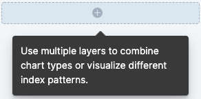
To add a layer, click +, then drag and drop the fields for the new layer.
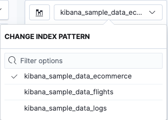
To view a different index, click it, then select a new one.
Lens tutorial
editReady to create your own visualization with Lens? Use the following tutorial to create a visualization that lets you compare sales over time.
Before you begin
editTo start, you’ll need to add the sample ecommerce data.
Build the visualization
editDrag and drop your data onto the visualization builder pane.
- Select the kibana_sample_data_ecommerce index pattern.
-
Click
 , then click Last 7 days.
The fields in the data panel update.
-
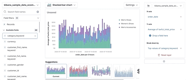
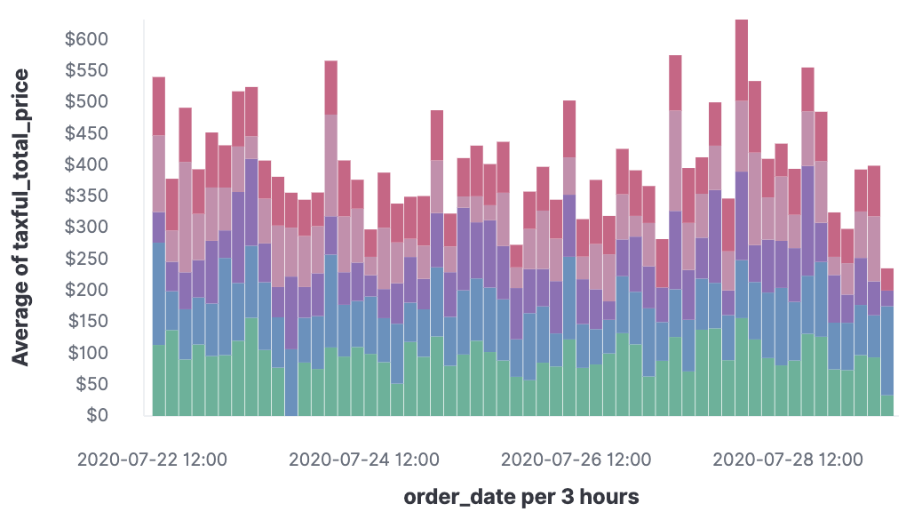
Drag and drop the taxful_total_price data field to the visualization builder pane.
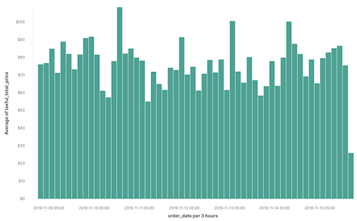
To display the average order prices over time, Lens automatically added in order_date field.
To break down your data, drag the category.keyword field to the visualization builder pane. Lens knows that you want to show the top categories and compare them across the dates, and creates a chart that compares the sales for each of the top three categories:
Customize your visualization
editMake your visualization look exactly how you want with the customization options.
-
Click Average of taxful_total_price, then change the Label to
Sales.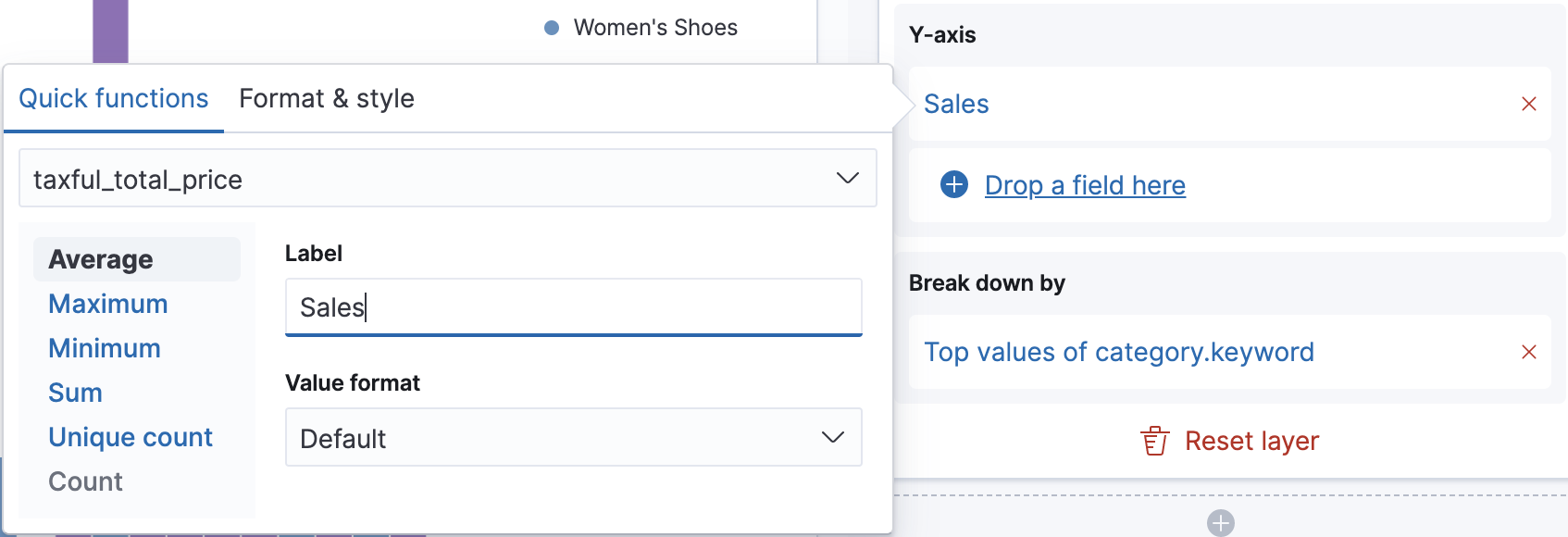
-
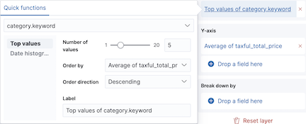
Click Top values of category.keyword, then change Number of values to
10.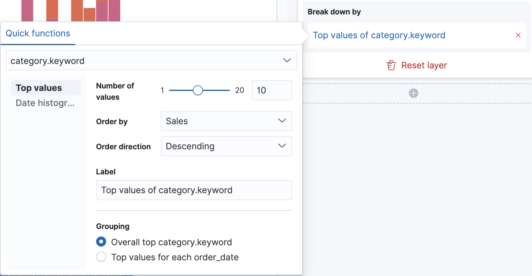
The visualization updates to show there are only six available categories.
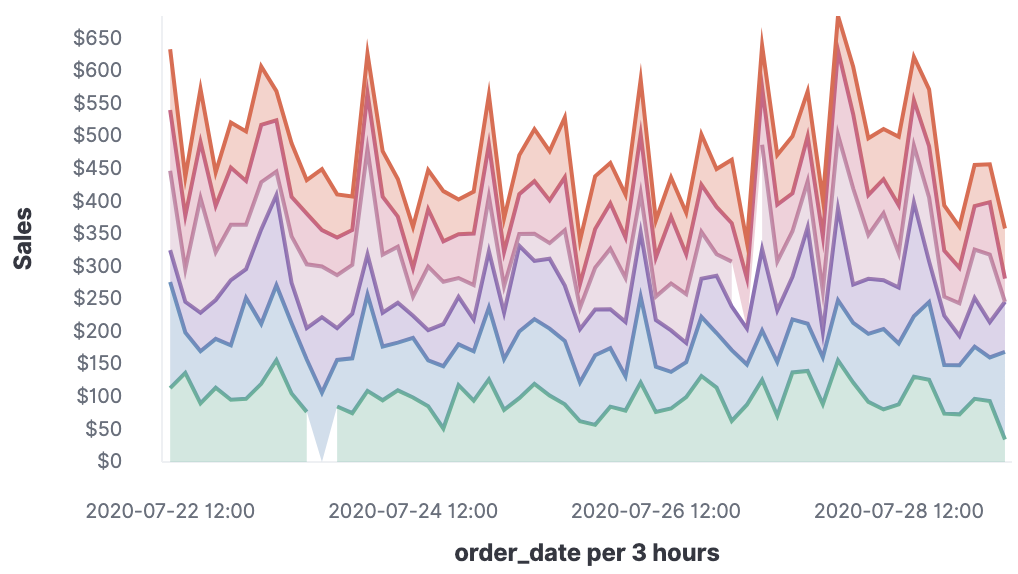
Look at the Suggestions. An area chart is not an option, but for the sales data, a stacked area chart might be the best option.
-
To switch the chart type, click Stacked bar chart in the column, then click Stacked area from the Select a visualizations window.
Next steps
editNow that you’ve created your visualization, you can add it to a dashboard or Canvas workpad.