Detecting and inspecting log anomalies
editDetecting and inspecting log anomalies
editThis functionality is in beta and is subject to change. The design and code is less mature than official GA features and is being provided as-is with no warranties. Beta features are not subject to the support SLA of official GA features.
When the machine learning anomaly detection features are enabled, you can use the Log rate page in the Logs app. Log rate helps you to detect and inspect log anomalies and the log partitions where the log anomalies occur. This means you can easily spot anomalous behavior without significant human intervention — no more manually sampling log data, calculating rates, and determining if rates are normal.
Log rate automatically highlights periods of time where the log rate is outside expected bounds, and therefore may be anomalous. You can use this information as a basis for further investigations. For example:
- A significant drop in the log rate might suggest that a piece of infrastructure stopped responding, and thus we’re serving less requests.
- A spike in the log rate could denote a DDoS attack. This may lead to an investigation of IP addresses from incoming requests.
You can also view log anomalies directly in the Machine Learning app.
Enable log rate analysis and anomaly detection
editCreate a machine learning job to enable log rate analysis and anomaly detection.
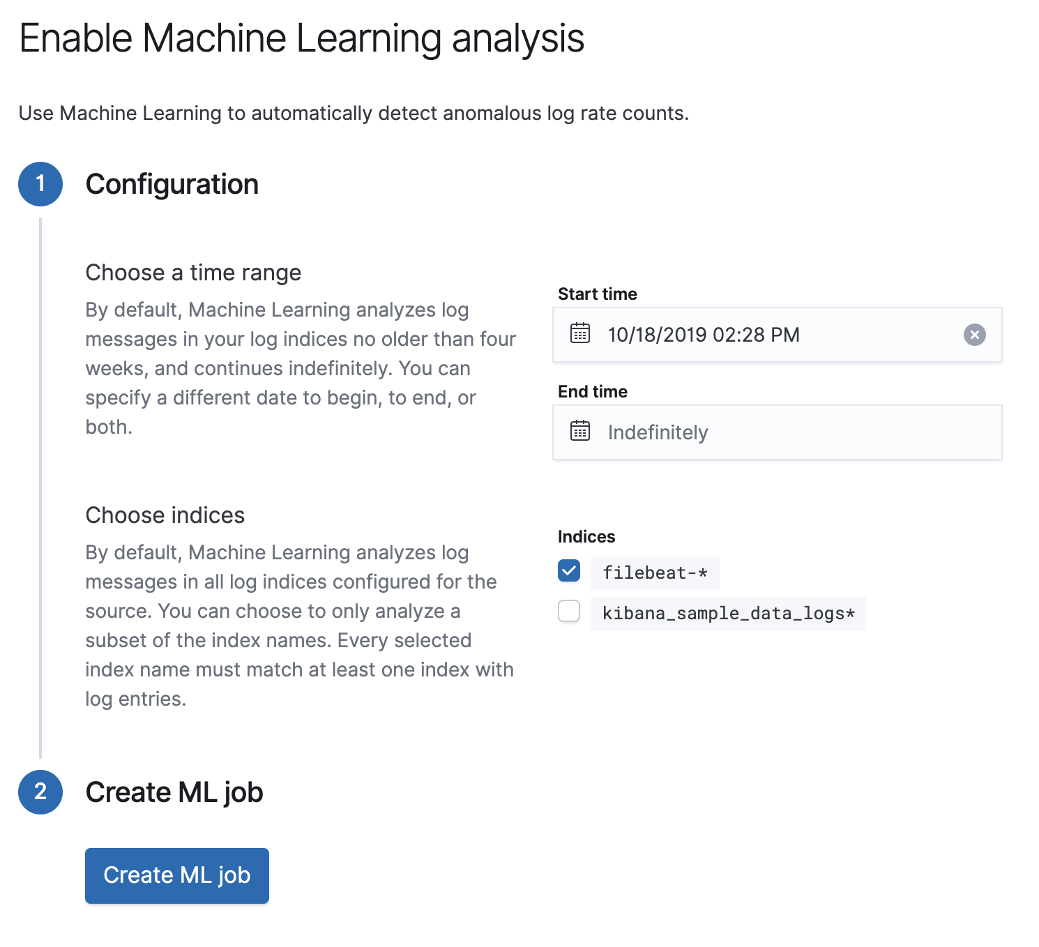
- To enable log rate analysis and anomaly detection, you must first create your own space.
- Within a space, navigate to the Logs app and select Log rate. Here, you’ll be prompted to create a machine learning job which will carry out the log rate analysis.
- Choose a time range for the machine learning analysis.
- Add the Indices that contain the logs you want to analyze.
- Click Create ML job.
- You’re now ready to analyze your log partitions.
Even though the machine learning job’s time range is fixed, you can still use the time filter to adjust the results that are shown in your analysis.

Log entries chart
editThe log entries chart shows an overall, color-coded visualization of the log entry rate,
partitioned according to the value of the Elastic Common Schema (ECS)
event.dataset field.
This chart helps you quickly spot increases or decreases in each partition’s log rate.
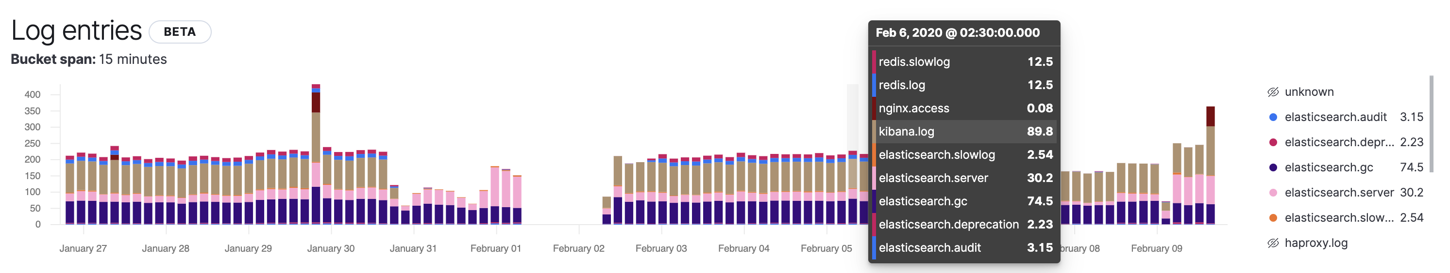
If you have a lot of log partitions, use the following to filter your data:
- Hover over a time range to see the log rate for each partition.
- Click or hover on a partition name to show, hide, or highlight the partition values.
Anomalies charts
editThe Anomalies chart shows the time range where anomalies were detected. The typical rate values are shown in grey, while the anomalous regions are color-coded and superimposed on top.
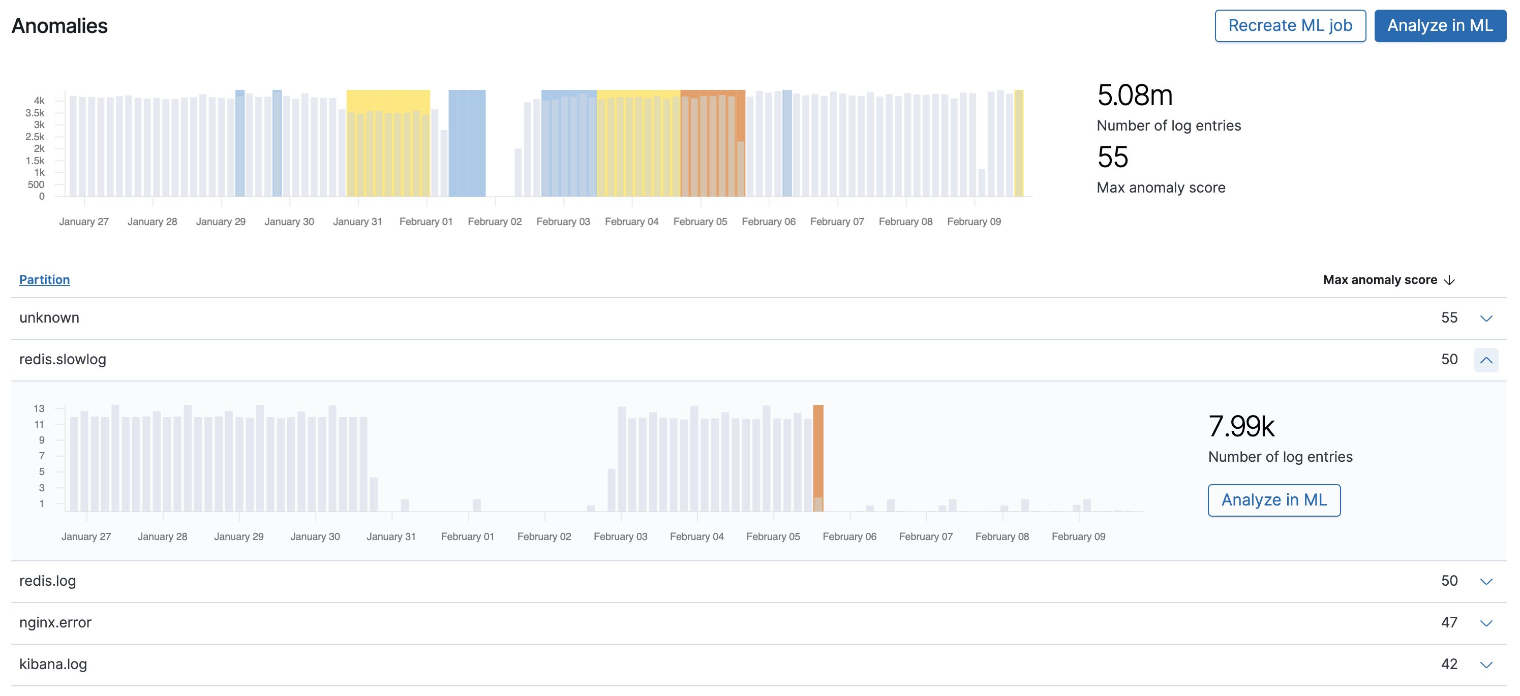
When a time range is flagged as anomalous, the machine learning algorithms have detected unusual log rate activity. This might be because:
- The log rate is significantly higher than usual.
- The log rate is significantly lower than usual.
- Other anomalous behavior has been detected. For example, the log rate is within bounds, but not fluctuating when it is expected to.
The level of anomaly detected in a time period is color-coded, from red, orange, yellow, to blue. Red indicates a critical anomaly level, while blue is a warning level.
To help you further drill down into a potential anomaly, you can view an anomaly chart for each individual partition:
Anomaly scores range from 0 (no anomalies) to 100 (critical).
To analyze the anomalies in more detail, click Analyze in ML, which opens the Anomaly Explorer in Machine Learning.