Lens
editLens
editThis functionality is in beta and is subject to change. The design and code is less mature than official GA features and is being provided as-is with no warranties. Beta features are not subject to the support SLA of official GA features.
Lens provides you with a simple and fast way to create visualizations from your Elasticsearch data. With Lens, you can:
- Quickly build visualizations by dragging and dropping data fields.
- Understand your data with a summary view on each field.
- Easily change the visualization type by selecting the automatically generated visualization suggestions.
- Save your visualization for use in a dashboard.
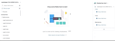
Drag and drop
editThe panel shows the data fields for the selected time period. When you drag a field from the data panel, Lens highlights where you can drop that field. The first time you drag a data field, you’ll see two places highlighted in green:
- The visualization builder pane
- The X-axis or Y-axis fields
You can incorporate many fields into your visualization, and Lens uses heuristics to decide how to apply each one to the visualization.
Drag-and-drop capabilities are available only when Lens knows how to use the data. You can still customize your visualization if Lens is unable to make a suggestion.
Find the right data
editLens shows you fields based on the index patterns you have defined in Kibana, and the current time range. When you change the index pattern or time filter, the list of fields are updated.
To narrow the list of fields, you can:
- Enter the field name in Search field names.
- Click Filter by type, then select the filter. You can also select Only show fields with data to show the full list of fields from the index pattern.
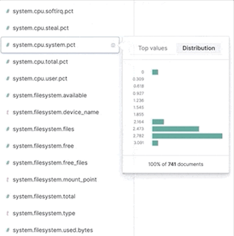
Data summaries
editTo help you decide exactly the data you want to display, get a quick summary of each data field. The summary shows the distribution of values in the time range.
To view the data information, navigate to a data field, then click i.
Change the visualization type
editWith Lens, you are no longer required to build each visualization from scratch. Lens allows you to switch between any supported chart type at any time. Lens also provides suggestions, which are shortcuts to alternate visualizations based on the data you have.
You can switch between suggestions without losing your previous state:
If you want to switch to a chart type that is not suggested, click the chart type, then select a chart type. When there is an exclamation point (!) next to a chart type, Lens is unable to transfer your current data, but still allows you to make the change.
Customize the data for your visualization
editLens allows some customizations of the data for each visualization.
-
Click the index pattern name, then select the new index pattern.
If there is a match, Lens displays the new data. All fields that do not match the index pattern are removed.
-
Change the data field options, such as the aggregation or label.
- Click Drop a field here or the field name in the column.
- Change the options that appear depending on the type of field.
Layers in bar, line, and area charts
editThe bar, line, and area charts allow you to layer two different series. To add a layer, click +.
To remove a layer, click the chart icon next to the index name:
Lens tutorial
editReady to create your own visualization with Lens? Use the following tutorial to create a visualization that lets you compare sales over time.
Before you begin
editTo start, you’ll need to add the sample ecommerce data.
Build the visualization
editDrag and drop your data onto the visualization builder pane.
- Open Visualize, then click Create visualization.
- On the New Visualization window, click Lens.
- Select the kibana_sample_data_ecommerce index.
-
Click
 , then click Last 7 days. The list of data fields are updated.
-
Drag and drop the taxful_total_price data field to the visualization builder pane.
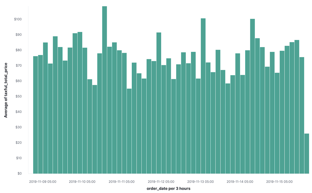
Lens has taken your intent to see taxful_total_price and added in the order_date field to show average order prices over time.
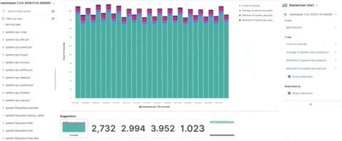
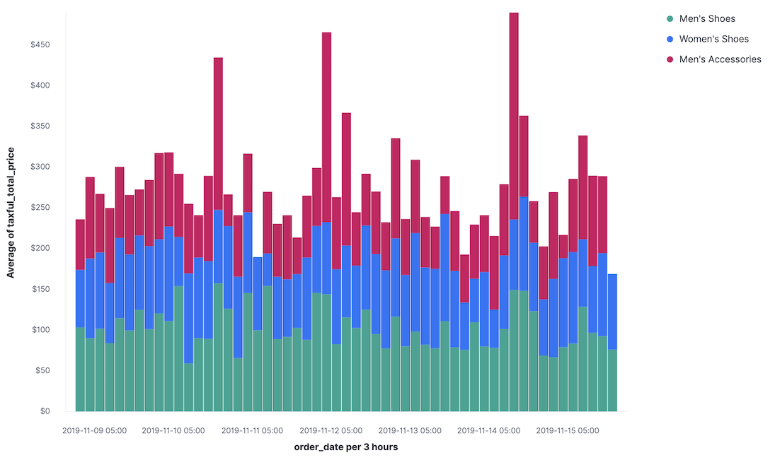
To break down your data, drag the category.keyword field to the visualization builder pane. Lens understands that you want to show the top categories and compare them across the dates, and creates a chart that compares the sales for each of the top 3 categories:
Further customization
editCustomize your visualization to look exactly how you want.
-
Click Average of taxful_total_price.
-
Change the Label to
Sales, or a name that you prefer for the data.
-
Change the Label to
-
Click Top values of category.keyword.
-
Increase Number of values to
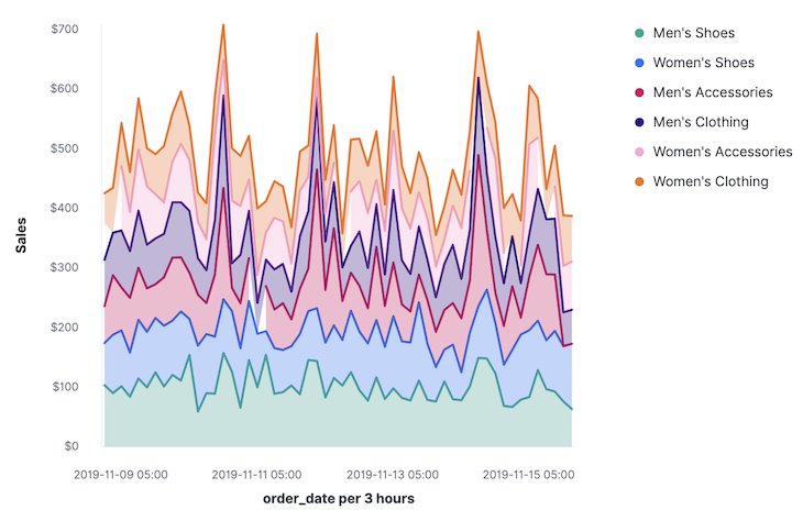
10. The visualization updates in the background to show there are only six available categories.
-
Increase Number of values to
-
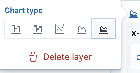
Look at the suggestions. None of them show an area chart, but for sales data, a stacked area chart might make sense. To switch the chart type:
- Click Stacked bar chart in the column.
-
Click Stacked area.
Next steps
editNow that you’ve created your visualization in Lens, you can add it to a Dashboard.
For more information, see Dashboard.