What’s new in 7.15
editWhat’s new in 7.15
editHere are the highlights of what’s new and improved in 7.15. For detailed information about this release, check out the release notes.
Other versions: 7.14 | 7.13 | 7.12 | 7.11 | 7.10 | 7.9 | 7.8 | 7.7 | 7.6 | 7.5 | 7.4 | 7.3 | 7.2 | 7.1 | 7.0
Simplified home page
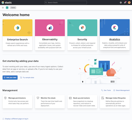
editCheck out our simplified home page, which has a new design that helps you get to the solutions and your data faster.
In the solutions section, the previously titled Kibana group has been renamed Analytics, and we’ve given equal prominence to each solution card, in addition to reducing and simplifying the descriptions.
In the Add data section, we’ve reduced and simplified the available actions to the primary Add your data action, and secondary Try sample data action.
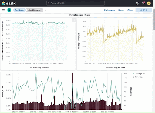
Dashboard and visualizations—Heatmap color options, flexible legend options, and more
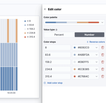
editHeatmap color options
editIn the drag-and-drop visualization editor, you can now apply color pallettes and custom colors to heatmaps, and fine tune the opacity of individual colors.
Flexible legend options
editWe’ve added more options to customize the legends in the drag-and-drop visualization editor, TSVB, and the Aggregation Based area, line, bar, and pie charts.
You can choose to view, or not to view, the full name of your data series by enabling legend text truncation. When enabled, you can control the exact number of lines before truncation to make sure your legend isn’t cutting off the important part of your data labels.
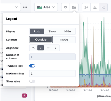
In the drag-and-drop visualization editor, you can save panel space by choosing to embed the legend in the visualization.
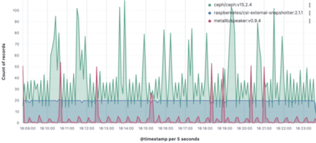
Synchronized cursor hover
editWhen your dashboard contains time series panels, hovering on one panel also hovers on the same time period as the other panels, regardless of the index pattern.
When your dashboard contains non-time series panels, hovering on one value now highlights the same value on the other panels, as long as the data is from the same index pattern.
Synchronized cursor hover is supported in the following visualization editors:
- Drag-and-drop Lens editor
- TSVB
- Aggregation based area, line, and bar charts
- Timelion
Inspect multiple requests for multiple layers
editThe drag-and-drop Lens visualization editor now supports Inspect, which allows you to view the data in visualizations that contain multiple index patterns.
More axis configuration options
editIn the drag-and-drop visualization editor, you can now orient your axis. While it’s better to rotate your visualization to improve readability, axis orientation can help when you need the extra space on the horizontal axis.
Percentile aggregation series and colors
editIn TSVB, you can now visualize multiple percentiles as their own sereies, and apply a color to each series to easily distinguish between them.
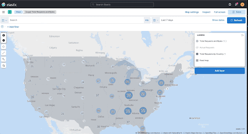
Maps—highlight single layers, tooltip feedback, and more
editMaps now has the ability to highlight a single layer with the Show this layer only action.
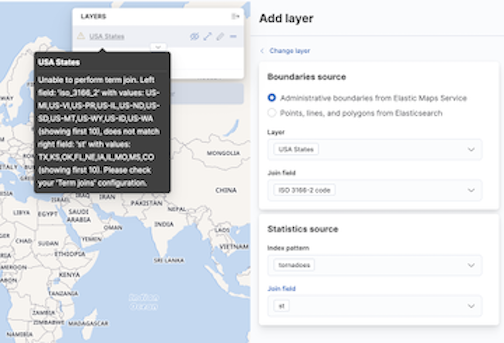
Choropleth layer tooltip feedback
editChoropleth layers now provide you with tooltip feedback for errors when you join data to a layer. The tooltip feedback is helpful for underlying configuration issues in the term-join, or when there are inconsistencies in the underlying data.
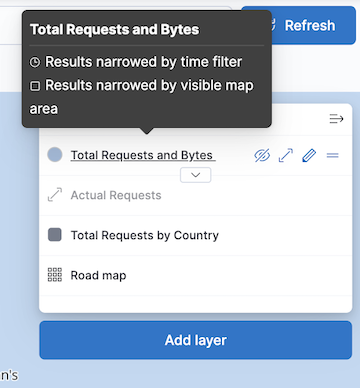
Indicator for dynamically retrieved data
editTo help you determine if the data incrementally refreshes as you pan and zoom, the layer-entry in the table of contents now indicates when the layer data is dynamically retrieved based on the current extent of the map.
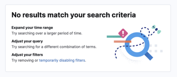
Improved relevant results screen in Discover
editDiscover now includes an improved No results match your search criteria screen with clear next steps and guidance on how you can get relevant results faster.
Machine Learning
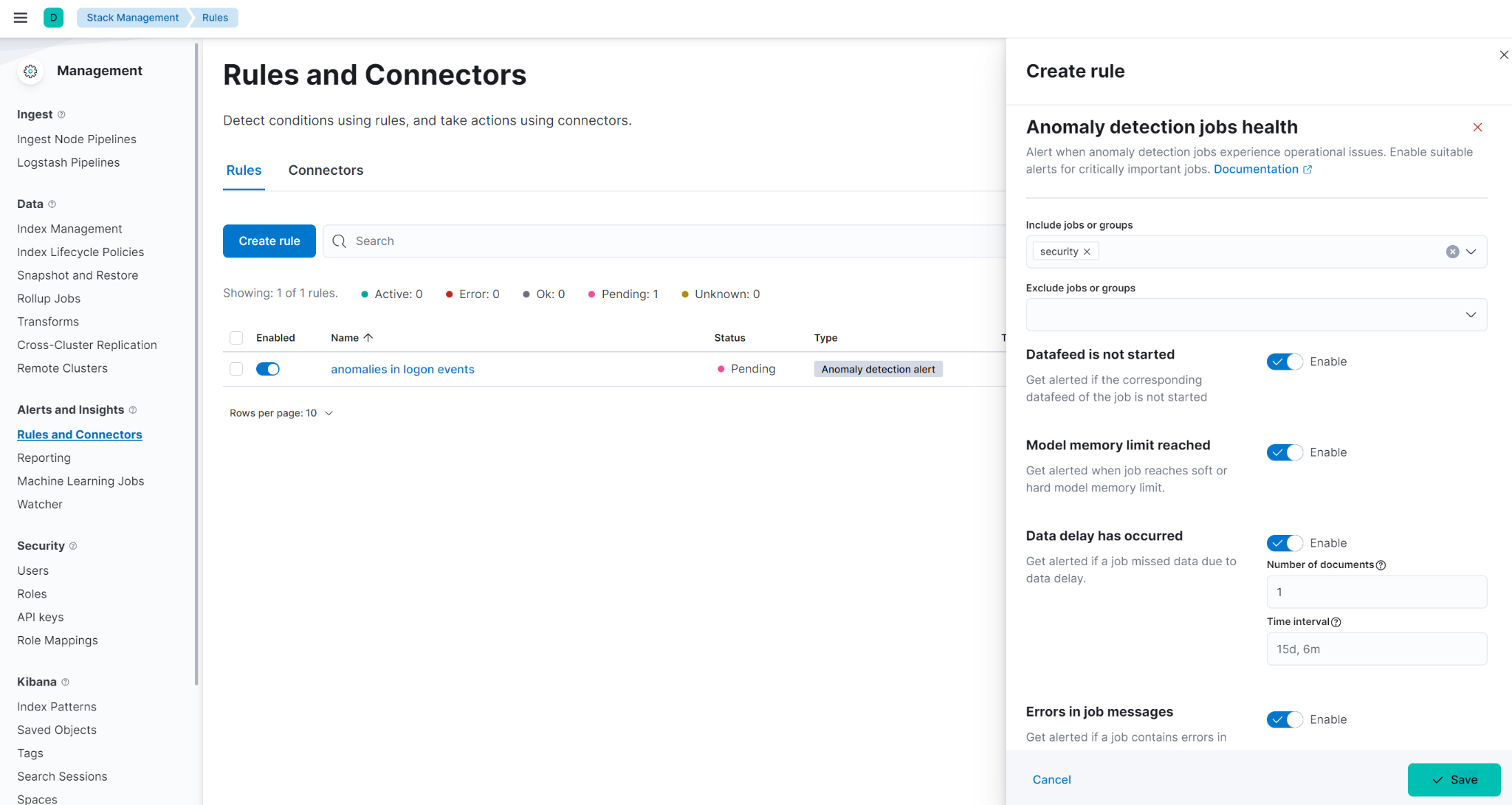
editOperational alerts for anomaly detection jobs
editThe new anomaly detection job alert monitors the job health and notifies when an operational issue is detected. Four types of checks can be enabled: datafeed is not started, model memory limit has been hit, the job is experiencing delayed data, and errors in job messages.
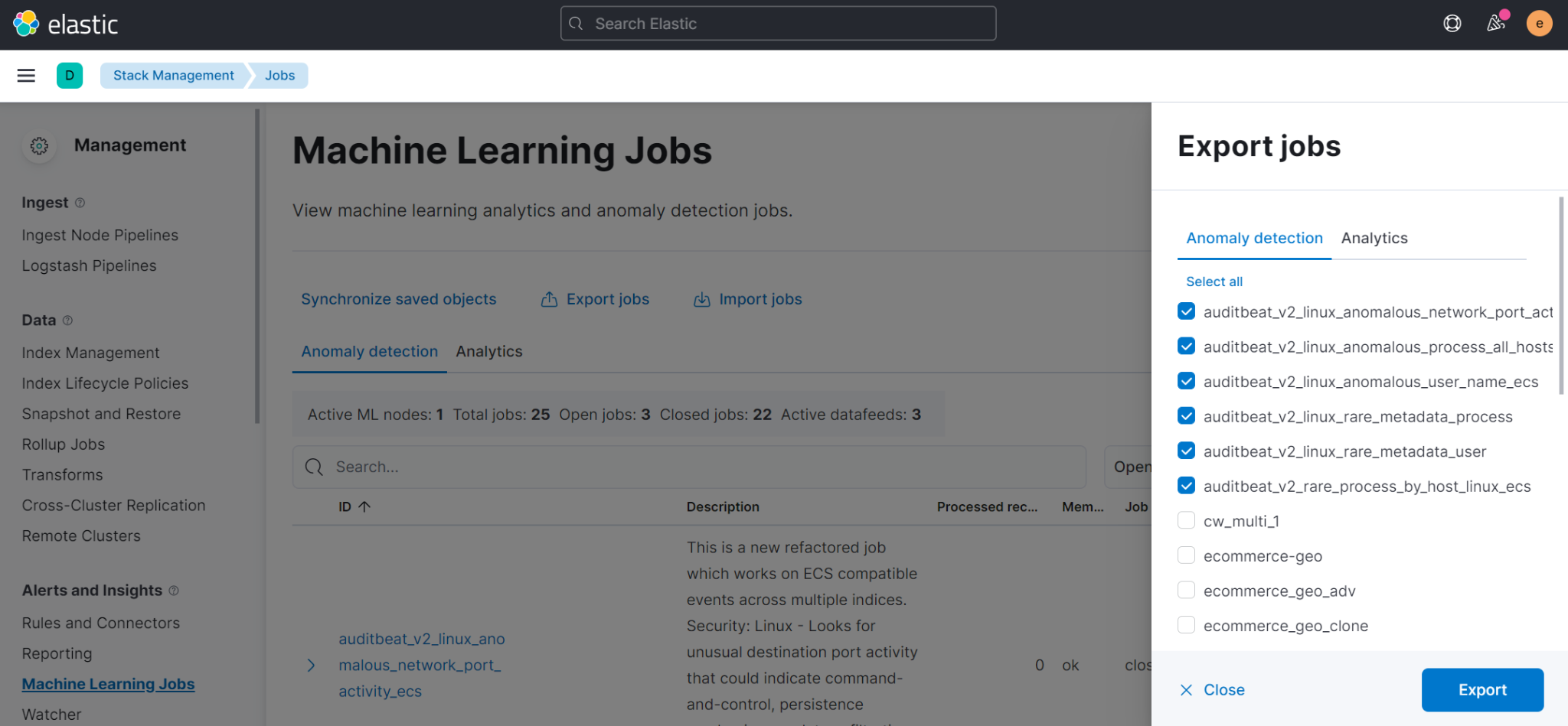
Importing and exporting machine learning jobs
editTo copy jobs more easily across clusters, you can now import and export jobs in Stack Management > Machine Learning Jobs. The exported file contains configuration details for data frame analytics jobs or anomaly detection jobs and datafeeds. For more information, refer to Export and import machine learning jobs.
Stack management
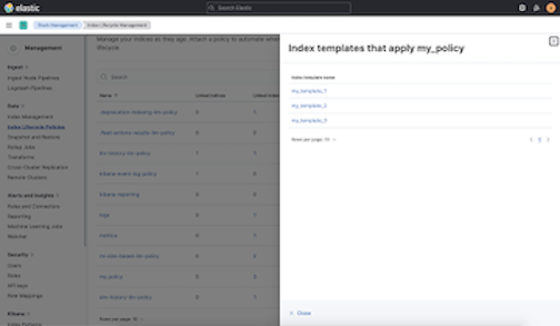
editView affected index templates
editMultiple index templates can refer to the same index lifecycle policy. This makes editing an index lifecycle policy an uncertain process — how do you know which index templates will be affected by a change? Now you can answer this question by reviewing a list of the affected index templates directly in the Index Lifecycle Policies app. Whenever you edit a policy, you’ll know exactly which index templates will be affected.
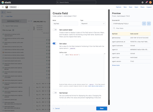
Preview runtime field scripts
editGetting your Painless script just right doesn’t always happen on the first try. The new Preview pane in the Create field editor provides a real-time preview, and improved error handling to make it easier to troubleshoot as scripts get more complex. Now you can evaluate your script against multiple documents, and browse the available fields without leaving the editor.
[beta] This functionality is in beta and is subject to change. The design and code is less mature than official GA features and is being provided as-is with no warranties. Beta features are not subject to the support SLA of official GA features. Osquery Manager—Access controls, standardized scheduled query results, and more
editAccess controls
edit7.15.0 gives security teams more control over who can access Osquery and view results. Previously, only superusers could use Osquery, but now you can grant any users access to sensitive Osquery data, and specify run, save, and scheduled query privileges.
Standardized scheduled query results with ECS
editWhen defining scheduled queries, you can now map query results to ECS fields to standardize your Osquery data for use across detections, machine learning, and any other areas that rely on ECS-compliant data. With standardized scheduled query results, you greatly increase the value of the queries you run by making the results more readily usable across the Elastic Stack.
Scheduled query status at a glance
editScheduled query groups now show the status of individual queries within a group, enabling you to understand at a glance if there are results to review or issues to address. Surfacing this information can also help you tune the queries you’re running. For example, you can identify queries that run too frequently or errors you need to resolve.