Plot big data without plotting too much data
editPlot big data without plotting too much data
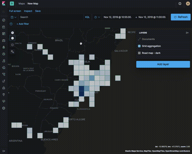
editUse aggregations to plot large data sets without overwhelming your network or your browser. When using aggregations, the documents stay in Elasticsearch and only the calculated values for each group are returned to your computer.
Aggregations group your documents into buckets and calculate metrics for each bucket. Use metric aggregations for data driven styling. For example, use the count aggregation to shade world countries by web log traffic.
You can add the following metric aggregations:
- Average. The mean of the values.
- Count. The number of documents.
- Max. The highest value.
- Min. The lowest value.
- Percentile. The value at which a certain percentage of observed values occur. For example, the 95th percentile is the value which is greater than 95% of the observed values.
- Sum. The total value.
- Top term. The most common value.
- Unique count. The number of distinct values.
Use aggregated layers with document layers to show aggregated views when the map shows larger amounts of the globe and individual documents when the map shows smaller regions.
In the following example, the Grid aggregation layer is only visible when the map is at zoom levels 0 through 5. The Documents layer is only visible when the map is at zoom levels 4 through 24. See the Getting started tutorial for more details on configuring the layers.