Tutorial: Create a dashboard of panels with web server data
editTutorial: Create a dashboard of panels with web server data
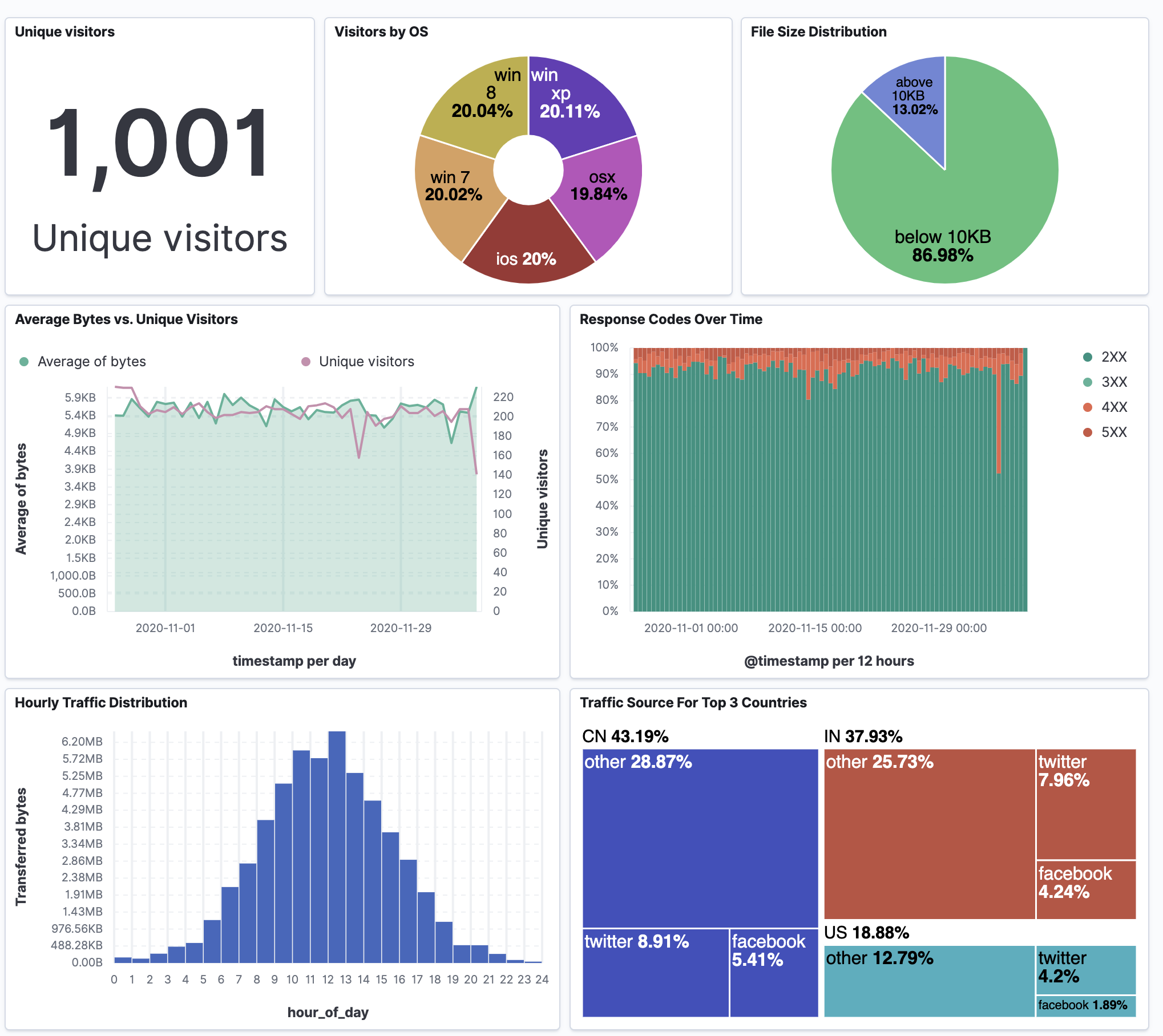
editYou collected data from your web server, and you want to visualize and analyze the data on a dashboard. To create dashboard panels of the data, open the Lens visualization builder, then create the visualization panels that best display the data.
When you’ve completed the tutorial, you’ll have a dashboard that provides you with a complete overview of your web server data.
Add the data and create the dashboard
editTo create visualizations of the data from the web server, add the data set, then create the dashboard.
- From the Kibana Home page, click Try our sample data.
- From Sample web logs, click Add data.
- Open the main menu, click Dashboard.
- Click Create dashboard.
Open and set up Lens
editWith Lens, you identify the data fields you want to visualize, drag and drop the fields, then watch as Lens uses heuristics to apply the fields and create a visualization for you.
- From the dashboard, click Create panel.
-
On the New visualization window, click Lens.
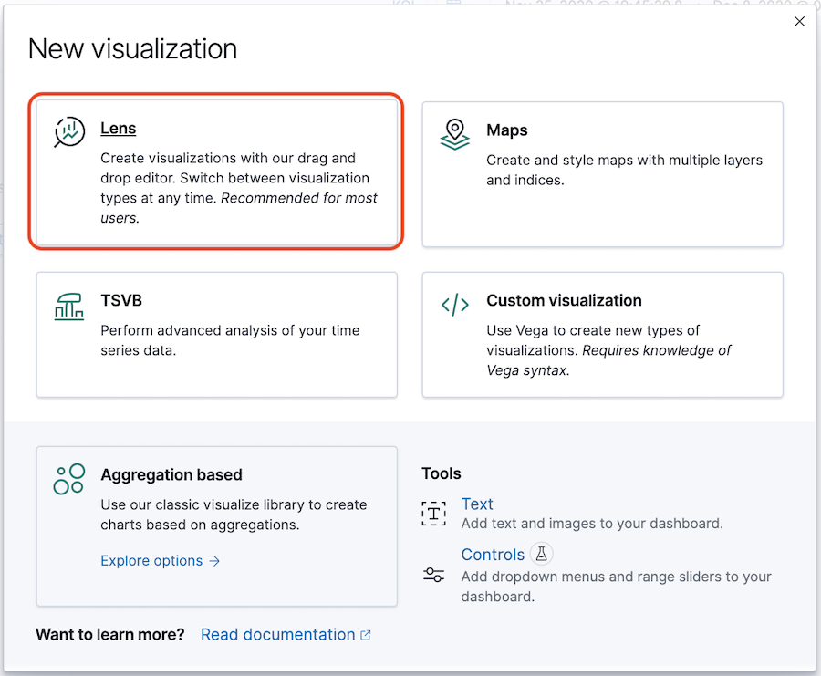
- Make sure the kibana_sample_data_logs index appears.
View the number of website visitors
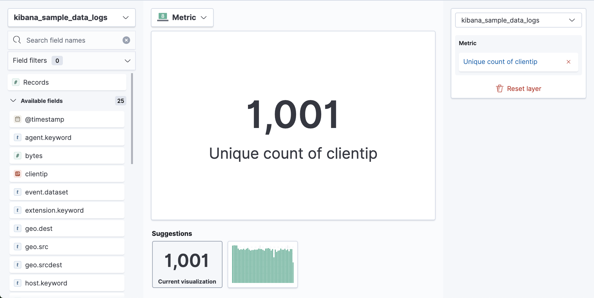
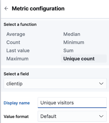
editTo determine how many users have visited your website within the last 90 days, create a metric visualization, then add it to the dashboard.
- Set the time filter to Last 90 days.
-
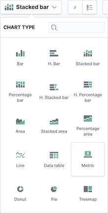
From the Chart Type dropdown, select Metric.
-
From the Available fields list, drag and drop clientip to the visualization builder.
-
In the editor, click Unique count of clientip.
-
In the Display name field, enter
Unique visitors. -
Click Close.
-
In the Display name field, enter
- Click Save and return.
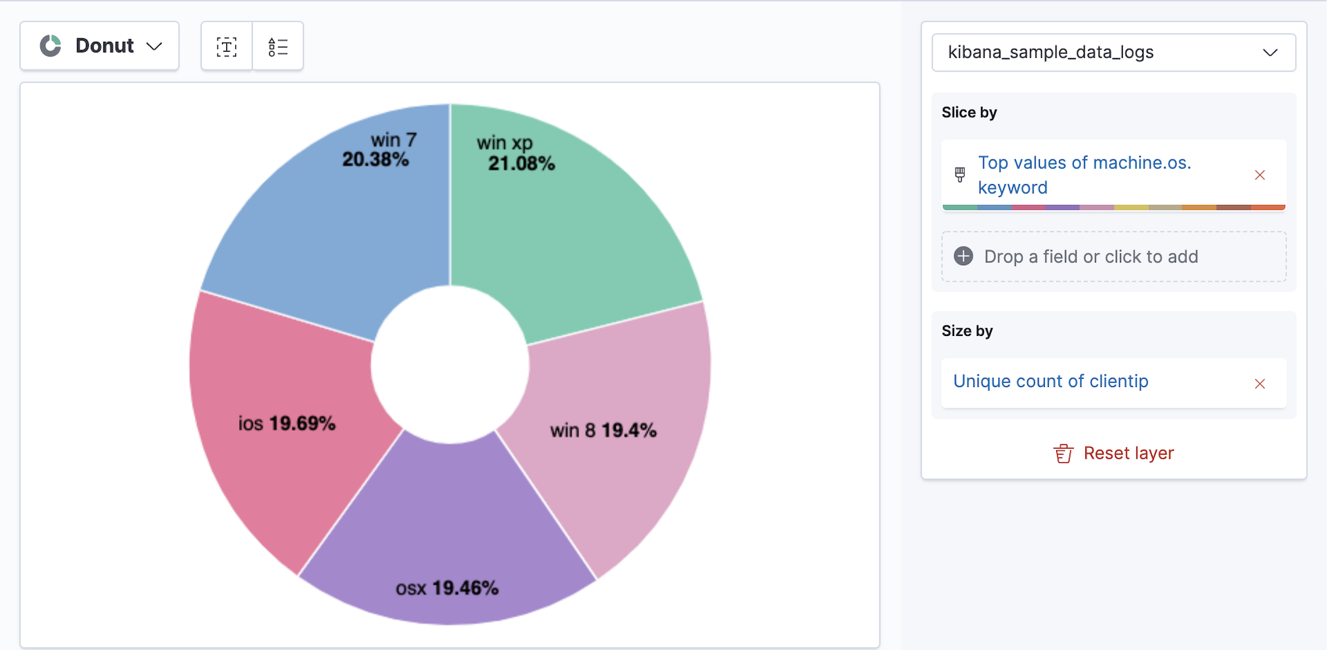
View the distribution of visitors by operating system
editTo determine the operating systems you should continue to support, and the importance of mobile traffic from iOS devices, create a donut chart that displays the top operating systems that your visitors used to access your website within the last 90 days.
- Open Lens, then set the time filter to Last 90 days.
- From the Chart Type dropdown, select Donut.
-
From the Available fields list, drag and drop the data fields to the Drop a field or click to add fields in the editor.
- Drag and drop clientip to the Size by field.
-
Drag and drop machine.os.keyword to the Slice by field.
-
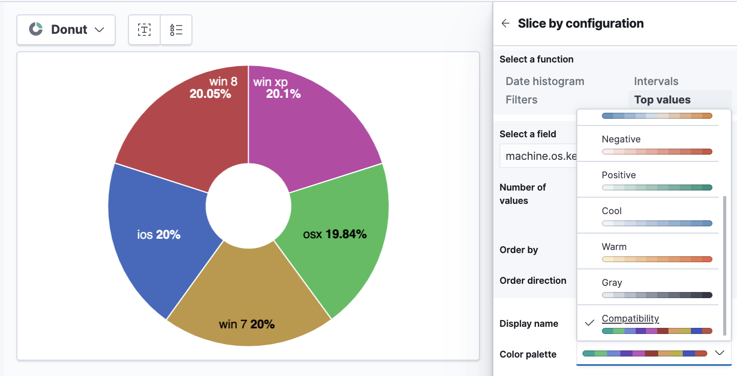
Change the color palette.
- In the editor, click Top values of machine.os.keyword.
- From the Color palette dropdown, select Compatibility.
-
Click Close.
- Click Save and return.
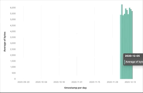
View the average of bytes transfer per day
editTo prevent potential server failures, and optimize the cost of website maintenance, create an area chart that displays the average of bytes transfer. To compare the data to the number of visitors to your website, add a line chart layer.
- Open Lens.
- From the Available fields list, drag and drop bytes to the visualization builder.
-
To zoom in on the data you want to view, click and drag your cursor across the bars.
-
Change the timestamp interval.
- In the editor, click timestamp.
- Select Customize time interval.
-
Change the Minimum interval to
1 days, then click Close.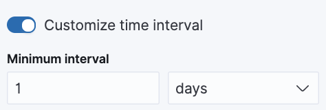
- From the Chart Type dropdown, select Area.
Add the line chart layer
editTo compare the average of bytes transfer to the number of users that visit your website, add a line chart layer.
-
In the editor, click +.
-
From the new layer editor, click the Chart type dropdown, then click the line chart.
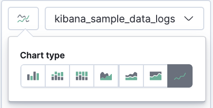
The chart type for the visualization changes to Mixed XY.
-
From the Available fields list, drag and drop the data fields to the Drop a field or click to add fields in the editor.
- Drag and drop timestamp to the Horizontal axis field.
- Drag and drop clientip to the Vertical axis field.
-
Change the timestamp interval.
- In the editor, click timestamp in the line chart layer.
- Select Customize time interval.
-
Change the Minimum interval to
1 days, then click Close.
-
Change the Unique count of clientip label and color.
- In the editor, click Unique count of clientip.
-
In the Display name field, enter
Unique visitorsin the line chart layer. - In the Series color field, enter #CA8EAE, then click Close.
Configure the y-axes
editThere is a significant difference between the timestamp per day and Unique visitors data, which makes the Unique visitors data difficult to read. To improve the readability, display the Unique visitors data along a second y-axis, then change the formatting. When functions contain multiple formats, separate axes are created by default.
- In the editor, click Unique visitors in the line chart layer.
- For Axis side, click Right, then click Close.
Change the visualization type
edit- In the editor, click Average of bytes in the area chart layer.
-
From the Value format dropdown, select Bytes (1024), then click Close.
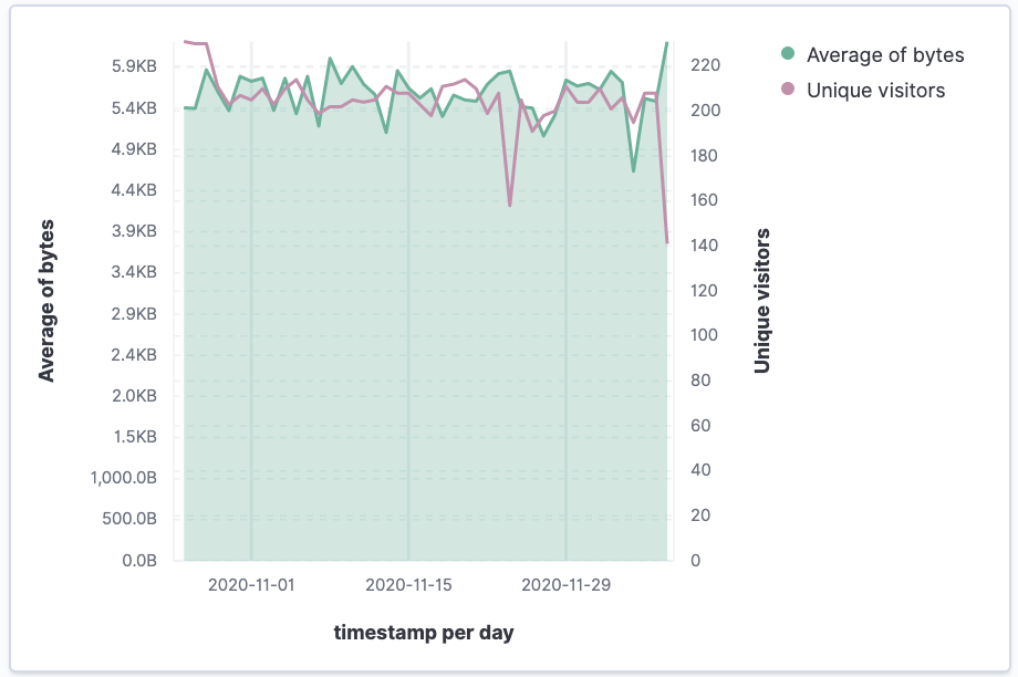
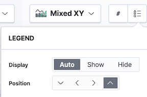
Change the legend position
editThe visualization is done, but the legend uses a lot of space. Change the legend position to the top of the chart.
-
From the Legend dropdown, select the top position.
- Click Save and return.
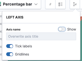
View the health of your website
editTo detect unusual traffic, bad website links, and server errors, create a percentage stacked area chart that displays the associated response codes.
- Open Lens.
-
From the Available fields list, drag and drop the data fields to the Drop a field or click to add fields in the editor.
- Drag and drop Records to the Vertical axis field.
- Drag and drop @timestamp to the Horizontal axis field.
- From the Chart Type dropdown, select Percentage bar.
-
To remove the vertical axis label, click Left axis, then deselect Show.
Add the response code filters
editFor each response code that you want to display, create a filter.
- In the editor, click the Drop a field or click to add field for Break down by.
- From Select a function, click Filters.
-
Add the filter for the successful response codes.
- Click All records.
-
In the KQL field, enter
response.keyword>=200 AND response.keyword<300. -
In the Label field, enter
2XX, then press Return.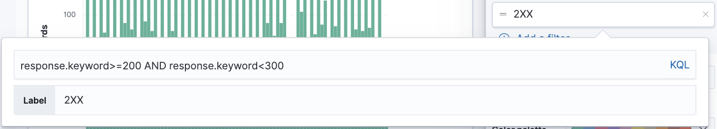
-
Add the filter for the redirect codes.
- Click Add a filter.
-
In the KQL field, enter
response.keyword>=300 AND response.keyword<400. -
In the Label field, enter
3XX, then press Return.
-
Add the filter for the client error codes.
- Click Add a filter.
-
In the KQL field, enter
response.keyword>=400 AND response.keyword<500. -
In the Label field, enter
4XX, then press Return.
-
Add the filter for the server error codes.
- Click Add a filter.
-
In the KQL field, enter
response.keyword>=500 AND response.keyword<600. -
In the Label field, enter
5XX, then press Return.
- To change the color palette, select Status from the Color palette dropdown, then click Close.
- Click Save and return.
View the traffic for your website by the hour
editTo find the best time to shut down your website for maintenance, create a histogram that displays the traffic for your website by the hour.
- Open Lens.
-
From the Available fields list, drag and drop bytes to Vertical axis in the editor, then configure the options.
- Click Average of bytes.
- From Select a function, click Sum.
-
In the Display name field, enter
Transferred bytes. -
From the Value format dropdown, select
Bytes (1024), then click Close.
-
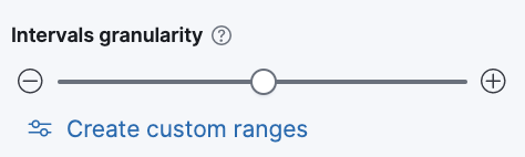
From the Available fields list, drag and drop hour_of_day to Horizontal axis in the editor, then configure the options.
- Click hour_of_day.
-
Click and slide the Intervals granularity slider until the horizontal axis displays hourly intervals.
- Click Save and return.
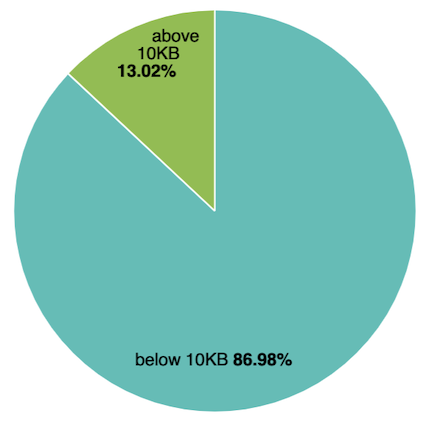
View the percent of small versus large transferred files
editTo determine if your users transfer more small files versus large files, create a pie chart that displays the percentage of each size.
- Open Lens.
-
From the Available fields list, drag and drop bytes to Vertical axis in the editor, then configure the options.
- Click Average of bytes.
- From Select a function, click Sum, then click Close.
-
From the Available fields list, drag and drop bytes to Break down by in the editor, then specify the file size ranges.
- Click bytes.
-
Click Create custom ranges, enter the following, then press Return:
-
Ranges —
0→10240 -
Label —
Below 10KB
-
Ranges —
-
Click Add range, enter the following, then press Return:
-
Ranges —
10240→+∞ -
Label —
Above 10KB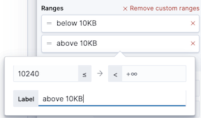
-
Ranges —
- From the Value format dropdown, select Bytes (1024), then click Close.
-
From the Chart Type dropdown, select Pie.
- Click Save and return.
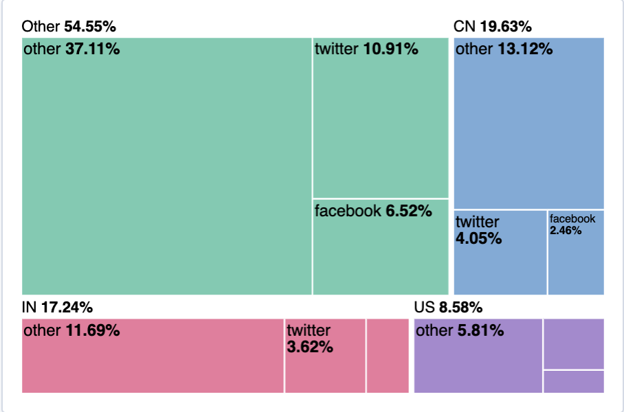
View the top sources of website traffic
editTo determine how users find out about your website and where your users are located, create a treemap that displays the percentage of users that enter your website from specific social media websites, and the top countries where users are located.
- Open Lens.
- From the Chart Type dropdown, select Treemap.
- From the Available fields list, drag and drop Records to the Size by field in the editor.
-
In the editor, click the Drop a field or click to add field for Group by, then create a filter for each website traffic source.
- From Select a function, click Filters.
-
Click All records, enter the following, then press Return:
-
KQL —
referer : *facebook.com* -
Label —
Facebook
-
KQL —
-
Click Add a filter, enter the following, then press Return:
-
KQL —
referer : *twitter.com* -
Label —
Twitter
-
KQL —
-
Click Add a filter, enter the following, then press Return:
-
KQL —
NOT referer : *twitter* OR NOT referer: *facebook.com* -
Label —
Other
-
KQL —
- Click Close.
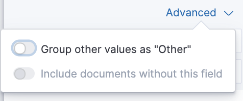
Add the geographic data
editTo determine the top countries where users are located, add the geographic data.
Compare the top sources of website traffic data to the top three countries.
- From the Available fields list, drag and drop geo.src to the visualization builder.
-
To change the Group by order, click and drag Top values of geo.src so that it appears first in the editor.
-
To view only the Facebook and Twitter data, remove the Other category.
- In the editor, click Top values of geo.src.
-
From the Advanced dropdown, deselect Group other values as "Other", then click Close.
- Click Save and return.
Save the dashboard
editNow that you have a complete overview of your web server data, save the dashboard.
- In the toolbar, click Save.
-
On the Save dashboard window, enter
Web server data, then click Save.