Tutorial: Create a dashboard of panels with ecommerce sales data
editTutorial: Create a dashboard of panels with ecommerce sales data
editYou collected sales data from your store, and you want to visualize and analyze the data on a dashboard. To create dashboard panels of the data, open the Lens visualization builder, then create the visualization panels that best display the data.
When you’ve completed the tutorial, you’ll have a dashboard that provides you with a complete overview of your ecommerce sales data.
Add the data and create the dashboard
editTo create visualizations of the data from your store, add the data set, then create the dashboard.
- From the Kibana Home page, click Try our sample data.
- From Sample eCommerce orders, click Add data.
- Open the main menu, then click Dashboard.
- On the Dashboards page, click Create dashboard.
Open and set up Lens
editOpen the Lens editor, then make sure the correct fields appear.
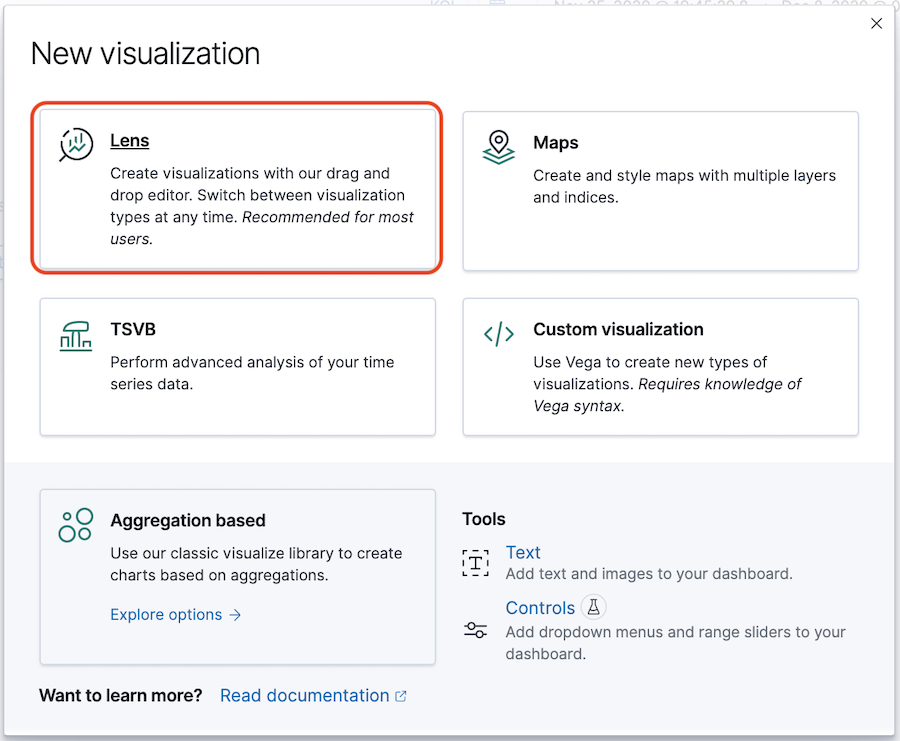
- From the dashboard, click Create panel.
-
On the New visualization window, click Lens.
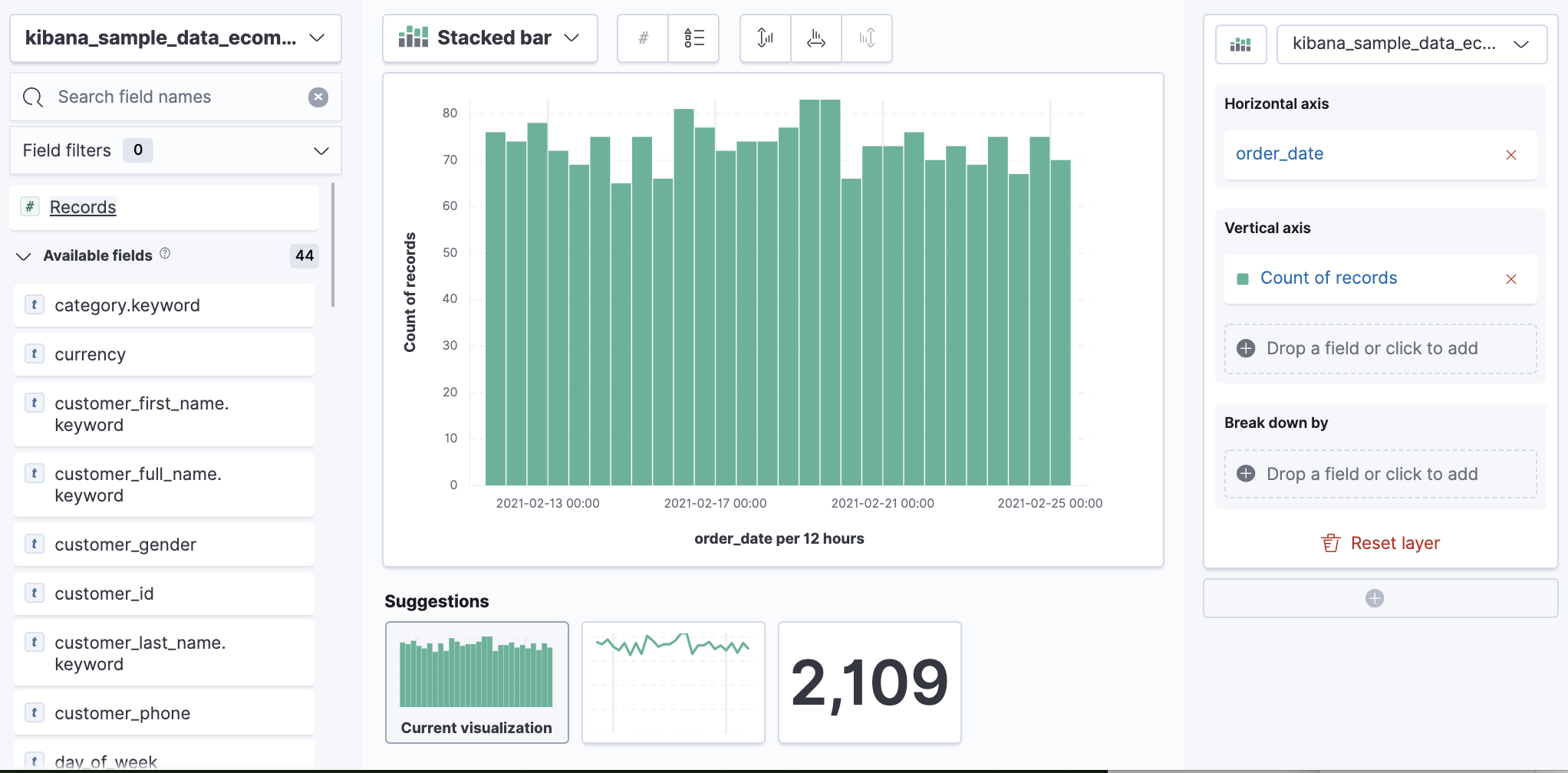
- Make sure the kibana_sample_data_ecommerce_ index appears.
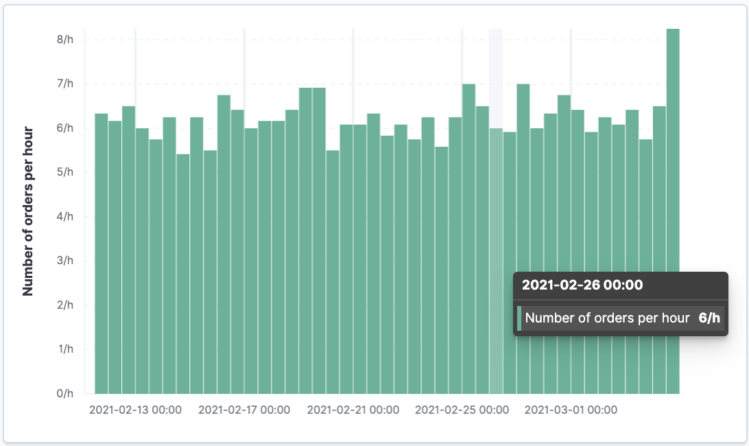
View the number of transactions per hour
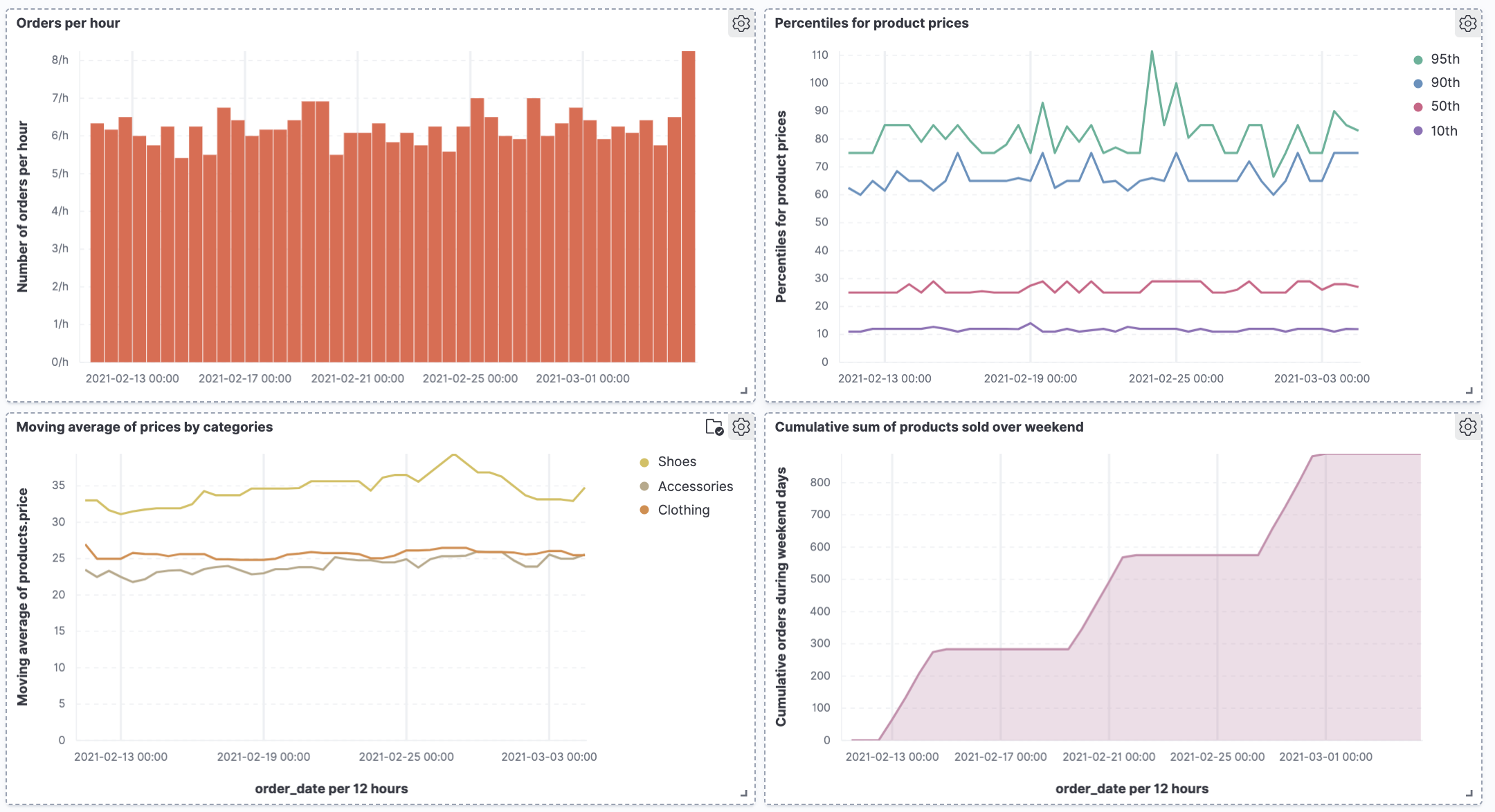
editTo determine the number of orders made every hour, create a bar chart, then add the chart to the dashboard.
- Set the time filter to Last 30 days.
-
From the Available fields list, drag and drop Records to the visualization builder.
-
Change the Vertical axis title and display the number of orders per day.
- In the editor, click Count of Records.
-
In the Display name field, enter
Number of orders. - Click Add advanced options > Normalize by unit.
- From the Normalize by unit dropdown, select per hour, then click Close.
-
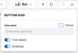
To hide the Horizontal axis label, open the Bottom Axis menu, then deselect Show.
You have a bar chart that shows you how many orders were made at your store every hour.
- Click Save and return.
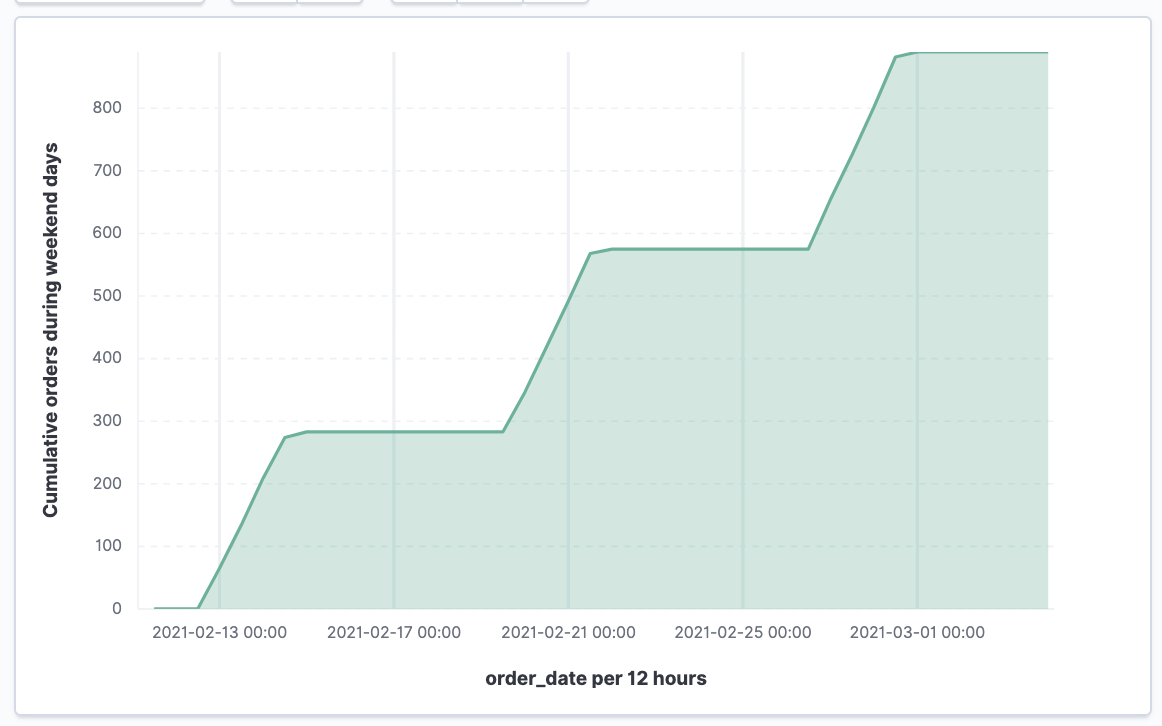
View the cumulative number of products sold on weekends
editTo determine the number of orders made only on Saturday and Sunday, create an area chart, then add it to the dashboard.
- Open Lens.
-
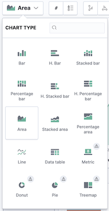
From the Chart Type dropdown, select Area.
-
Configure the cumulative sum of the store orders.
- From the Available fields list, drag and drop Records to the visualization builder.
- From the editor, click Count of Records.
- From Select a function, click Cumulative sum.
-
In the Display name field, enter
Cumulative orders during weekend days, then click Close.
-
Filter the results to display the data for only Saturday and Sunday.
- From the editor, click the Drop a field or click to add field for Break down by.
- From Select a function, click Filters.
- Click All records.
-
In the KQL field, enter
day_of_week : "Saturday" or day_of_week : "Sunday", then press Return.The KQL filter displays all documents where
day_of_weekmatchesSaturdayorSunday.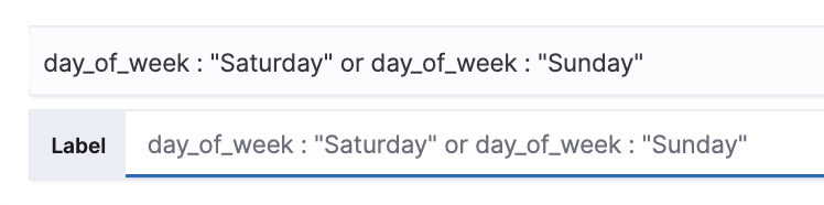
-
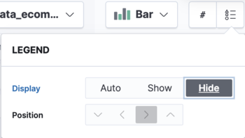
To hide the legend, open the Legend menu, then click Hide.
You have an area chart that shows you how many orders your store received during the weekend.
- Click Save and return.
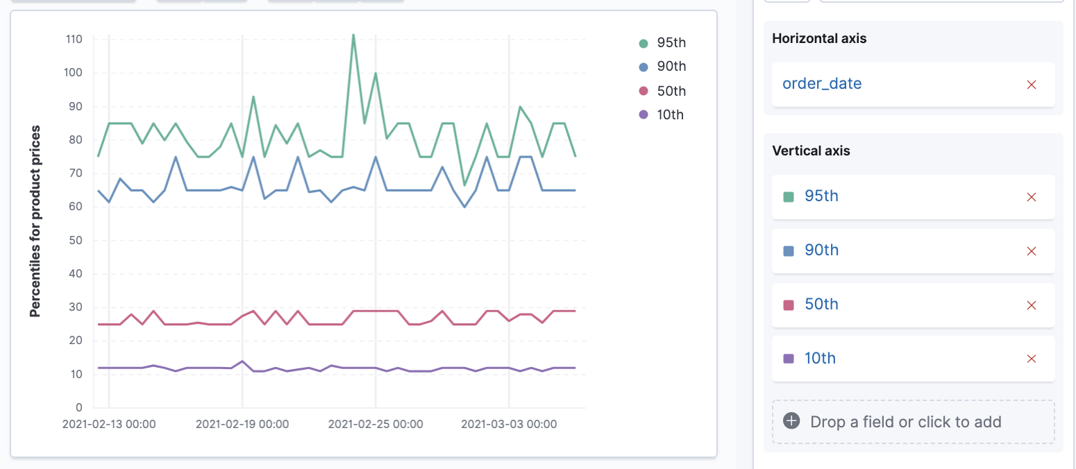
Create multiple key percentiles of product prices
editTo view the price distribution of products sold over time, create a percentile chart, then add it to the dashboard.
- Open Lens.
- From the Chart Type dropdown, select Line.
-
From the Available fields list, drag and drop the data fields to the Drop a field or click to add fields in the editor.
- Drag and drop products.price to the Vertical axis field.
- Drag and drop order_date to the Horizontal axis field.
-
Create the 95th percentile.
- In the editor, click Median of products.price.
- From Select a function, click Percentile.
-
In the Display name field, enter
95th, then click Close.
-
To create the 90th percentile, duplicate the
95thpercentile.- Drag and drop 95th to Drop a field or click to add.
-
Click 95th [1], then enter
90in the Percentile field. -
In the Display name field enter
90th, then click Close.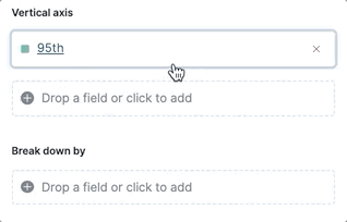
-
Create the 50th percentile.
- Drag and drop 90th to Drop a field or click to add.
-
Click 90th [1], then enter
50in the Percentile field. -
In the Display name field enter
50th, then click Close.
-
Create the 10th percentile.
- Drag and drop 50th to Drop a field or click to add.
-
Click 50th [1], then enter
10in the Percentile field. -
In the Display name field enter
10th, then click Close.
-
To change the left axis label, open the Left Axis menu, then enter
Percentiles for product pricesin the Axis name field.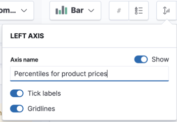
You have a line chart that shows you the price distribution of products sold over time.
- Click Save and return.
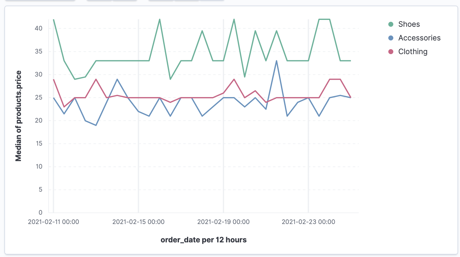
View the moving average of inventory prices
editTo view and analyze the prices of shoes, accessories, and clothing in the store inventory, create a line chart.
- Open Lens.
- From the Chart Type dropdown, select Line.
- From the Available fields list, drag and drop products.price to the visualization builder.
- In the editor, click the Drop a field or click to add field for Break down by.
- From Select a function, click Filters.
-
Add a filter for shoes.
- Click All records.
-
In the KQL field, enter
category.keyword : *Shoes*. -
In the Label field, enter
Shoes, then press Return.
-
Add a filter for accessories.
- Click Add a filter.
-
In the KQL field, enter
category.keyword : *Accessories*. -
In the Label field, enter
Accessories, then press Return.
-
Add a filter for clothing.
- Click Add a filter.
-
In the KQL field, enter
category.keyword : *Clothing*. -
In the Label field, enter
Clothing, then press Return.
-
Click Close
Add the moving average
editTo focus on the general trends rather than on the peaks in the data, add the moving average, then add the visualization to the dashboard.
- In the editor, click the Median of products.price.
- From Select a function, click Moving average.
-
In the Window size field, enter
7, then click Close.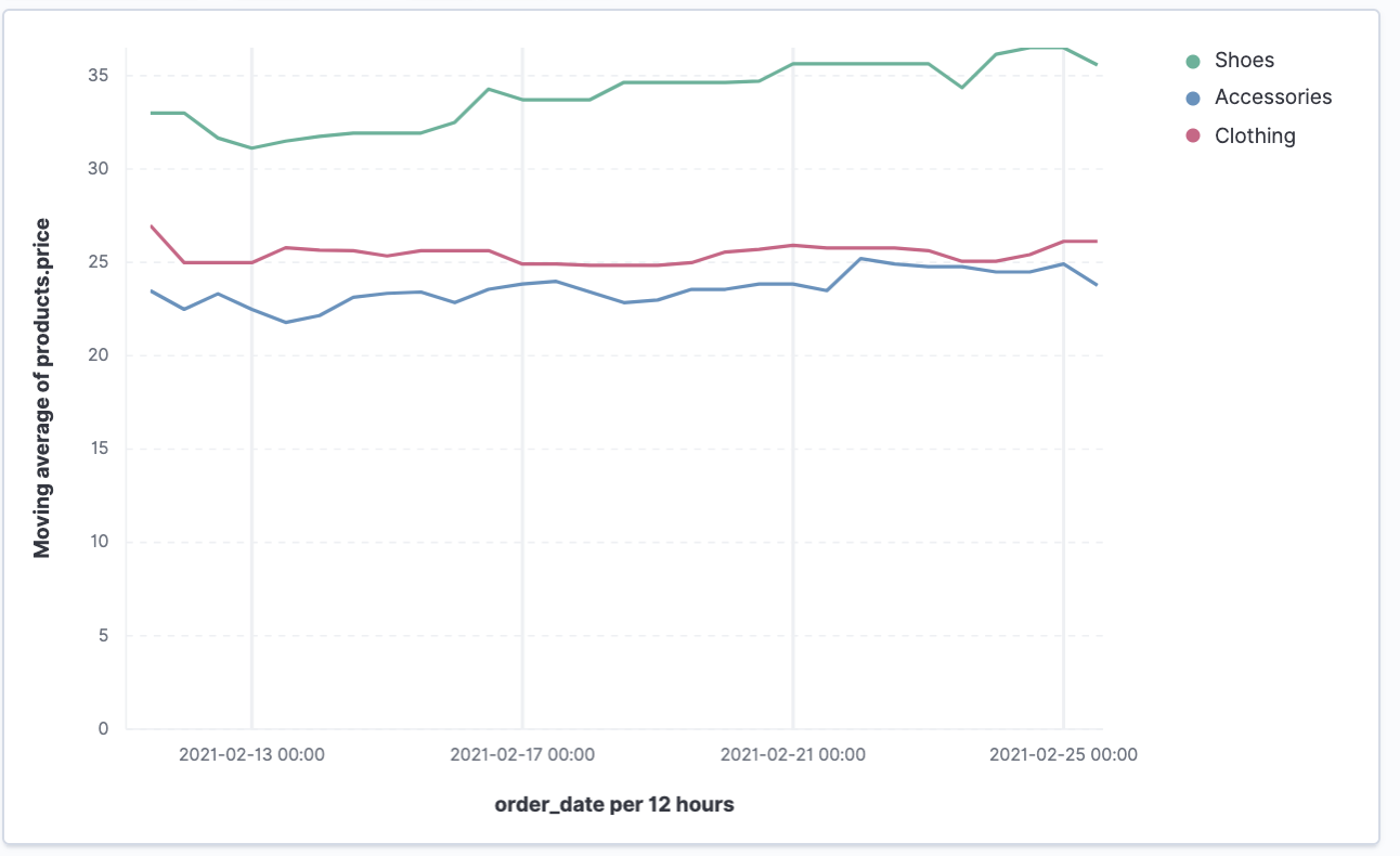
- Click Save and return.
Save the dashboard
editNow that you have a complete overview of your ecommerce sales data, save the dashboard.
- In the toolbar, click Save.
-
On the Save dashboard window, enter
Ecommerce sales data, then click Save.