WARNING: Version 6.2 of Kibana has passed its EOL date.
This documentation is no longer being maintained and may be removed. If you are running this version, we strongly advise you to upgrade. For the latest information, see the current release documentation.
Creating a Visualization
editCreating a Visualization
editTo create a visualization:
- Click on Visualize in the side navigation.
- Click the Create new visualization button or the + button.
-
Choose the visualization type:
-
Basic charts
Compare different series in X/Y charts.
Shade cells within a matrix.
Display each source’s contribution to a total.
-
Data
Display the raw data of a composed aggregation.
Display a single number.
Display a gauge.
-
Maps
Associate the results of an aggregation with geographic locations.
Thematic maps where a shape’s color intensity corresponds to a metric’s value. locations.
-
Time Series
Compute and combine data from multiple time series data sets.
Visualize time series data using pipeline aggregations.
-
Other
Display words as a cloud in which the size of the word correspond to its importance
Display free-form information or instructions.
Support for user-defined graphs, external data sources, images, and user-defined interactivity.
-
-
Specify a search query to retrieve the data for your visualization:
- To enter new search criteria, select the index pattern for the indices that contain the data you want to visualize. This opens the visualization builder with a wildcard query that matches all of the documents in the selected indices.
-
To build a visualization from a saved search, click the name of the saved search you want to use. This opens the visualization builder and loads the selected query.
When you build a visualization from a saved search, any subsequent modifications to the saved search are automatically reflected in the visualization. To disable automatic updates, you can disconnect a visualization from the saved search.
-
In the visualization builder, choose the metric aggregation for the visualization’s Y axis:
- Metric Aggregations:
- count
- average
- sum
- min
- max
- standard deviation
- unique count
- median (50th percentile)
- percentiles
- percentile ranks
- top hit
- geo centroid
- Parent Pipeline Aggregations:
- derivative
- cumulative sum
- moving average
- serial diff
- Sibling Pipeline Aggregations:
- average bucket
- sum bucket
- min bucket
- max bucket
-
For the visualizations X axis, select a bucket aggregation:
For example, if you’re indexing Apache server logs, you could build bar chart
that shows the distribution of incoming requests by geographic location by
specifying a terms aggregation on the geo.src field:
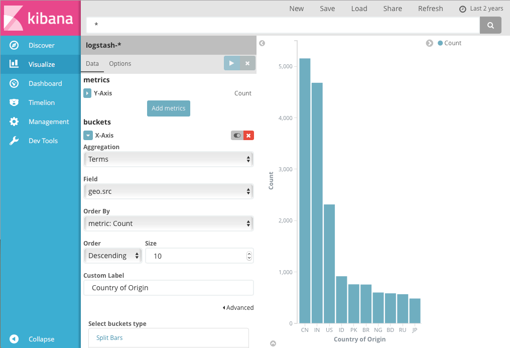
The y-axis shows the number of requests received from each country, and the countries are displayed across the x-axis.
Bar, line, or area chart visualizations use metrics for the y-axis and
buckets for the x-axis. Buckets are analogous to SQL GROUP BY
statements. Pie charts, use the metric for the slice size and the bucket
for the number of slices.
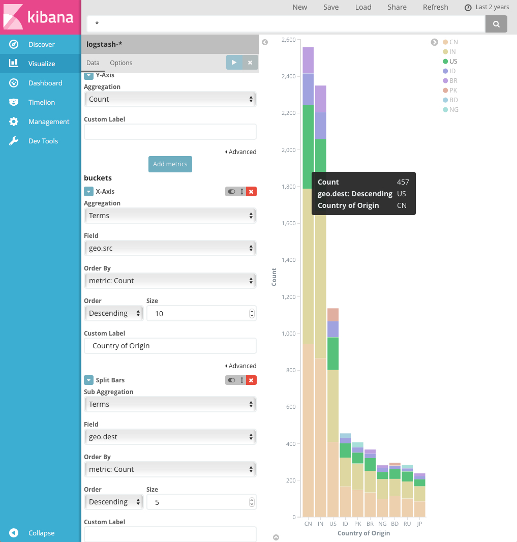
You can futher break down the data by specifying sub aggregations. The first aggregation determines the data set for any subsequent aggregations. Sub aggregations are applied in order—you can drag the aggregations to change the order in which they’re applied.
For example, you could add a terms sub aggregation on the geo.dest field to
the Country of Origin bar chart to see the locations those requests were
targeting.
For more information about working with sub aggregations, see Kibana, Aggregation Execution Order, and You.