WARNING: Version 4.2 of Kibana has passed its EOL date.
This documentation is no longer being maintained and may be removed. If you are running this version, we strongly advise you to upgrade. For the latest information, see the current release documentation.
Visualize
editVisualize
editYou can use the Visualize page to design data visualizations. You can save these visualizations, use them individually, or combine visualizations into a dashboard. A visualization can be based on one of the following data source types:
- A new interactive search
- A saved search
- An existing saved visualization
Visualizations are based on the aggregation feature introduced in Elasticsearch 1.x.
Creating a New Visualization
editTo start the New Visualization wizard, click on the Visualize tab at the top left of the page. If you are already
creating a visualization, you can click the New Visualization button  in the toolbar to the right of the search bar. The wizard guides you through the following steps:
Step 1: Choose the Visualization Type
editChoose a visualization type when you start the New Visualization wizard:
|
Use area charts to visualize the total contribution of several different series. |
|
|
Use data tables to display the raw data of a composed aggregation. You can display the data table for several other visualizations by clicking at the bottom of the visualization. |
|
|
Use line charts to compare different series. |
|
|
Use the Markdown widget to display free-form information or instructions about your dashboard. |
|
|
Use the metric visualization to display a single number on your dashboard. |
|
|
Use pie charts to display each source’s contribution to a total. |
|
|
Use tile maps to associate the results of an aggregation with geographic points. |
|
|
Use vertical bar charts as a general-purpose chart. |
You can also load a saved visualization that you created earlier. The saved visualization selector includes a text field to filter by visualization name and a link to the Object Editor, accessible through Settings > Edit Saved Objects, to manage your saved visualizations.
If your new visualization is a Markdown widget, selecting that type takes you to a text entry field where you enter the text to display in the widget. For all other types of visualization, selecting the type takes you to data source selection.
Step 2: Choose a Data Source
editYou can choose a new or saved search to serve as the data source for your visualization. Searches are associated with an index or a set of indexes. When you select new search on a system with multiple indices configured, select an index pattern from the drop-down to bring up the visualization editor.
When you create a visualization from a saved search and save the visualization, the search is tied to the visualization. When you make changes to the search that is linked to the visualization, the visualization updates automatically.
Step 3: The Visualization Editor
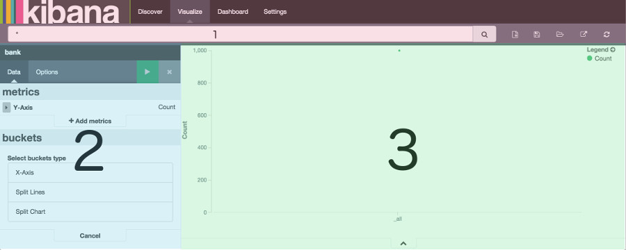
editThe visualization editor enables you to configure and edit visualizations. The visualization editor has the following main elements:
Automatically Refreshing the Page
editYou can configure a refresh interval to automatically refresh the page with the latest index data. This periodically resubmits the search query.
When a refresh interval is set, it is displayed to the left of the Time Filter in the menu bar.
To set the refresh interval:
-
Click the Time Filter
 in the upper right corner of the menu bar.
- Click the Refresh Interval tab.
- Choose a refresh interval from the list.
To automatically refresh the data, click the  Auto-refresh button and select an
autorefresh interval:
Auto-refresh button and select an
autorefresh interval:
image::images/autorefresh-intervals.png
When auto-refresh is enabled, Kibana’s top bar displays a pause button and the auto-refresh interval:
 . Click the Pause button to pause auto-refresh.
Toolbar
editThe toolbar has a search field for interactive data searches, as well as controls to manage saving and loading visualizations. For visualizations based on saved searches, the search bar is grayed out. To edit the search, replacing the saved search with the edited version, double-click the search field.
The toolbar at the right of the search box has buttons for creating new visualizations, saving the current visualization, loading an existing visualization, sharing or embedding the visualization, and refreshing the data for the current visualization.
Aggregation Builder
editUse the aggregation builder on the left of the page to configure the metric and bucket aggregations used in your
visualization. Buckets are analogous to SQL GROUP BY statements. For more information on aggregations, see the main
Elasticsearch aggregations reference.
Bar, line, or area chart visualizations use metrics for the y-axis and buckets are used for the x-axis, segment bar colors, and row/column splits. For pie charts, use the metric for the slice size and the bucket for the number of slices.
Choose the metric aggregation for your visualization’s Y axis, such as count, average, sum, min, max, or cardinality (unique count). Use bucket aggregations for the visualization’s X axis, color slices, and row/column splits. Common bucket aggregations include date histogram, range, terms, filters, and significant terms.
You can set the order in which buckets execute. In Elasticsearch, the first aggregation determines the data set for any subsequent aggregations. The following example involves a date bar chart of Web page hits for the top 5 file extensions.
To use the same extension across all hits, set this order:
- Color: Terms aggregation of extensions
-
X-Axis: Date bar chart of
@timestamp
Elasticsearch collects the records for the top 5 extensions, then creates a date bar chart for each extension.
To chart the top 5 extensions for each hour, use the following order:
-
X-Axis: Date bar chart of
@timestamp(with 1 hour interval) - Color: Terms aggregation of extensions
For these requests, Elasticsearch creates a date bar chart from all the records, then groups the top five extensions inside each bucket, which in this example is a one-hour interval.
Remember, each subsequent bucket slices the data from the previous bucket.
To render the visualization on the preview canvas, click the green Apply Changes button at the top right of the Aggregation Builder.
You can learn more about aggregation and how altering the order of aggregations affects your visualizations here.
Working with Filters
editWhen you create a filter anywhere in Kibana, the filter conditions display in a green oval under the search text entry box:

Hovering on the filter oval displays the following icons:

-
Enable Filter

- Click this icon to disable the filter without removing it. You can enable the filter again later by clicking the icon again. Disabled filters display a striped shaded color, green for inclusion filters and red for exclusion filters.
-
Pin Filter

- Click this icon to pin a filter. Pinned filters persist across Kibana tabs. You can pin filters from the Visualize tab, click on the Discover or Dashboard tabs, and those filters remain in place. NOTE: If you have a pinned filter and you’re not seeing any query results, check that your current tab’s index pattern is one that the filter applies to.
-
Toggle Filter

- Click this icon to toggle a filter. By default, filters are inclusion filters, and display in green. Only elements that match the filter are displayed. To change this to an exclusion filters, displaying only elements that don’t match, toggle the filter. Exclusion filters display in red.
-
Remove Filter

- Click this icon to remove a filter entirely.
To apply any of the filter actions to all the filters currently in place, click the  Global Filter Actions button and select an action.
Preview Canvas
editThe preview canvas displays a preview of the visualization you’ve defined in the aggregation builder. To refresh the
visualization preview, clicking the Refresh button  on the toolbar.