Visualize
editVisualize
editVisualize enables you to create visualizations of the data from your Elasticsearch indices, which you can then add to dashboards for analysis.
Kibana visualizations are based on Elasticsearch queries. By using a series of Elasticsearch aggregations to extract and process your data, you can create charts that show you the trends, spikes, and dips you need to know about.
To begin, open the menu, go to Visualize, then click Create visualization.
Types of visualizations
editKibana supports several types of visualizations.
- Lens
- Quickly build several types of basic visualizations by simply dragging and dropping the data fields you want to display.
- Most frequently used visualizations
-
- Line, area, and bar charts — Compares different series in X/Y charts.
- Pie chart — Displays each source contribution to a total.
- Data table — Flattens aggregations into table format.
- Metric — Displays a single number.
- Goal and gauge — Displays a number with progress indicators.
- Tag cloud — Displays words in a cloud, where the size of the word corresponds to its importance.
- TSVB
- Visualizes time series data using pipeline aggregations.
- Timelion
- Computes and combine data from multiple time series data sets.
- Maps
-
- Maps — Displays geospatial data in Kibana.
- * Heat map
- Display shaded cells within a matrix.
- Dashboard tools
-
- Markdown widget — Displays free-form information or instructions.
- Controls — Adds interactive inputs to a dashboard.
- Vega
- Completes control over query and display.
Choose your data
editSpecify a search query to retrieve the data for your visualization, or used rolled up data.
- To enter new search criteria, select the index pattern for the indices that contain the data you want to visualize. The visualization builder opens with a wildcard query that matches all of the documents in the selected indices.
-
To build a visualization from a saved search, click the name of the saved search you want to use. The visualization builder opens and loads the selected query.
When you build a visualization from a saved search, any subsequent modifications to the saved search are reflected in the visualization. To disable automatic updates, delete the visualization on the Saved Object page.
- To build a visualization using rolled up data, select the index pattern that includes the data. Rolled up data is summarized into time buckets that can be split into sub buckets for numeric field values or terms. To lower granularity, use a time aggregation that uses and combines several time buckets. For an example, refer to Create and visualize rolled up data.
Inspect visualizations
editMany visualizations allow you to inspect the query and data behind the visualization.
- In the Kibana toolbar, click Inspect.
-
To download the data, click Download CSV, then choose one of the following options:
- Formatted CSV - Downloads the data in table format.
- Raw CSV - Downloads the data as provided.
- To view the requests for collecting data, select Requests from the View dropdown.
Save visualizations
editTo use your visualizations in dashboards, you must save them.
- In the Kibana toolbar, click Save.
- Enter the visualization Title and optional Description, then Save the visualization.
To access the saved visualization, go to Management > Kibana > Saved Objects.
Read only access
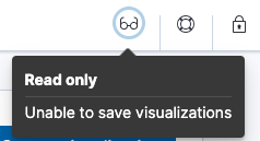
editWhen you have insufficient privileges to save visualizations, the following indicator is displayed and the Save button is not visible.
For more information, refer to Granting access to Kibana.

Share visualizations
editWhen you’ve finished your visualization, you can share it outside of Kibana.
From the Share menu, you can:
- Embed the code in a web page. Users must have Kibana access to view an embedded visualization.
- Share a direct link to a Kibana visualization.
- Generate a PDF report.
- Generate a PNG report.