Observability overview page
editObservability overview page
editWhether you’re an analyst or an admin, Kibana makes your data actionable by providing three key functions. Kibana is:
- An open-source analytics and visualization platform. Use Kibana to explore your Elasticsearch data, and then build beautiful visualizations and dashboards.
- A UI for managing the Elastic Stack. Manage your security settings, assign user roles, take snapshots, roll up your data, and more — all from the convenience of a Kibana UI.
- A centralized hub for Elastic’s solutions. From log analytics to metrics discovery to APM, Kibana is the portal for accessing these and other capabilities.
Within Kibana, the Observability Overview page contains a wide variety of charts displaying analytics relating to the components that help you make your systems observable: logs, metrics, APM, and uptime data.
Additionally, the alerts chart keeps you informed of any issues that you may need to resolve quickly.
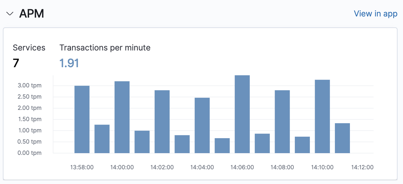
Services and transactions
editThe APM chart displays the total number of services running within your environment and the total number of transactions per minute that were captured by the Elastic APM agent instrumenting those services.
To drill-down and view this APM data in the APM app, click View in app.
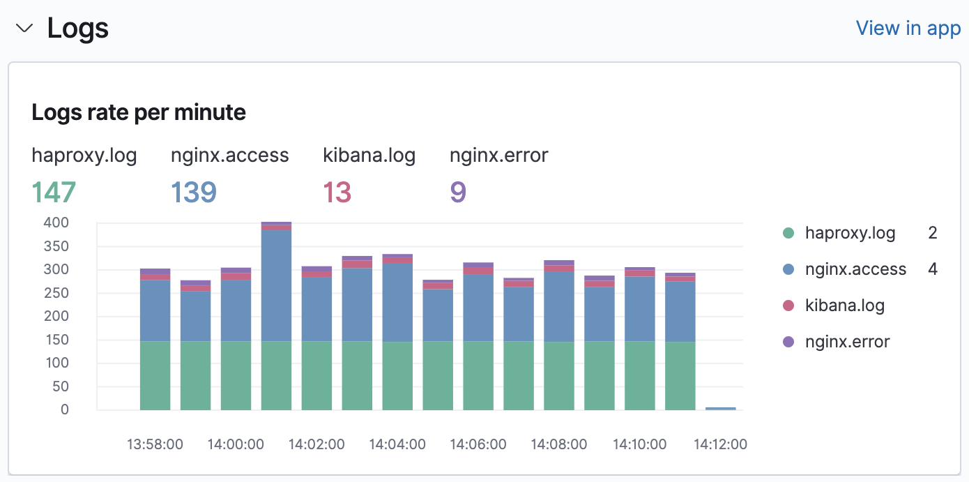
Log rates
editThe Logs chart helps you to detect and inspect possible log anomalies across each of your ingested log sources. The visualization helps you determine if the log rate is outside of your expected bounds, and therefore could be considered anomalous. Any drop in the log rate could suggest a system has stopped responding, or a spike could denote a DDos attack.
To drill-down and view these logs in the Logs app, click View in app. For more information, see Monitor logs.
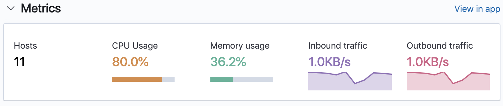
System metrics
editThe Metrics chart provides you with a quick glance of the performance metrics aggregated on all of your running hosts. The metrics help you to evaluate the efficiency of hosts and determine whether there is any impact of resource consumption for your end-users.
CPU usage, memory usage, and disk used metrics enable you to identify possible memory leaks, and whether disk resources need to be added or redistributed. Inbound and outbound traffic metrics provide you with a visualization of any possible spikes to help determine whether any hosts are choking your network.
To drill-down and view these performance metrics in the Metrics app, click View in app. For more information, see Analyze metrics.
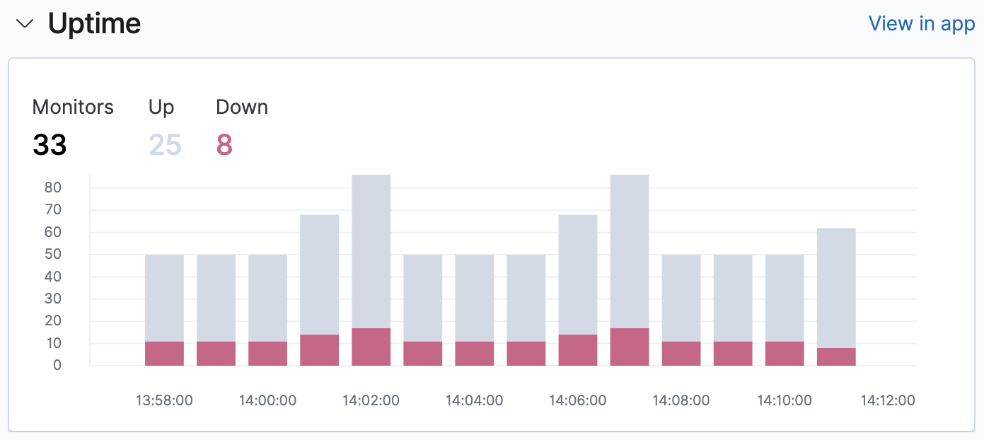
Systems availability
editTo help you react quickly to availability issues before they affect your users, the Uptime
chart provides you with a snapshot of the overall availability of your hosts, network devices, or third-party
services. Based on the last check reported by Heartbeat, you can view the total number of detected monitors,
along with the number of monitors in an up or down state.
To drill-down and view this uptime data in the Uptime app, click View in app. For more information, see Monitor uptime data.
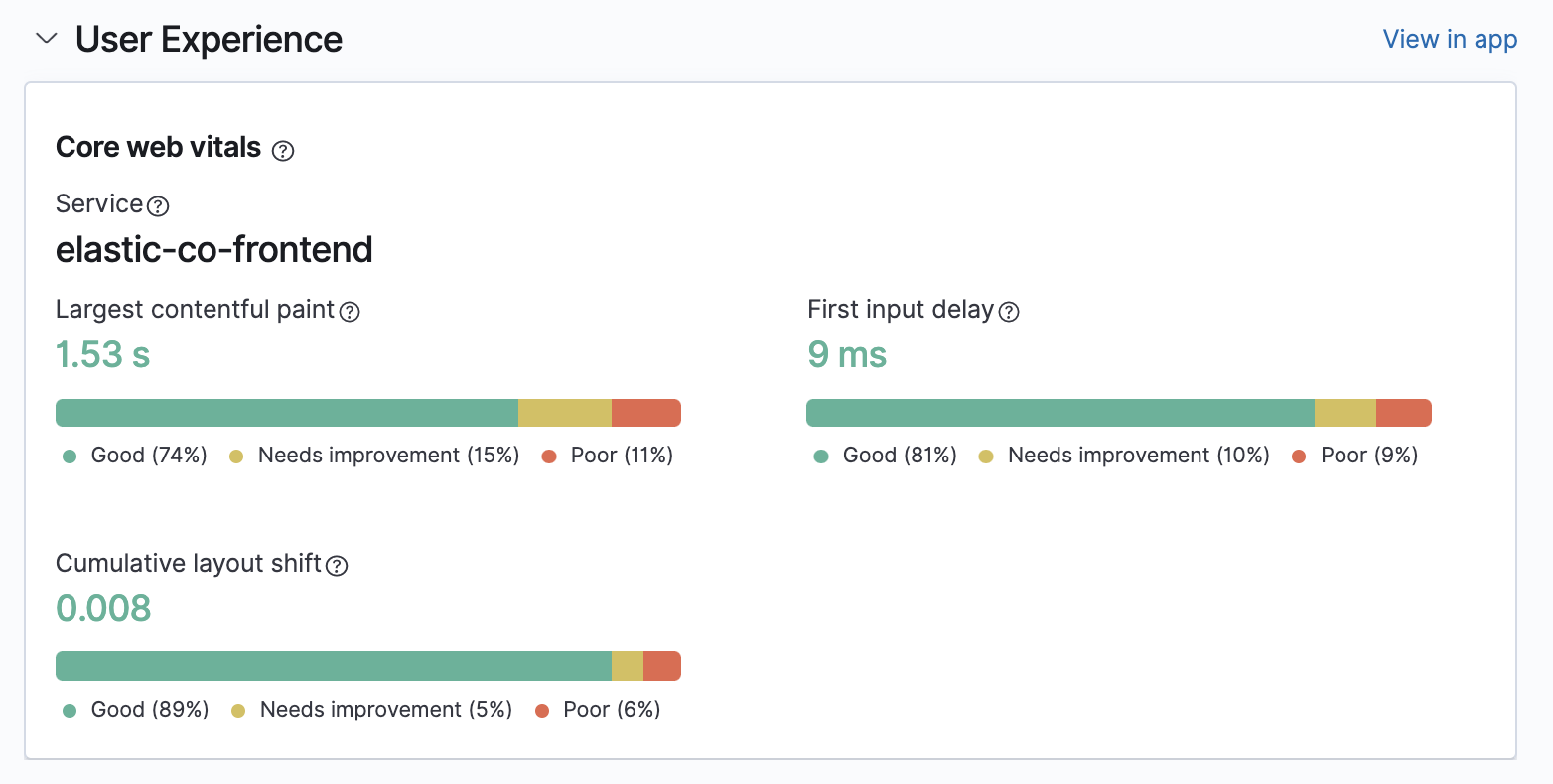
User experience
editUser Experience provides a way to quantify and analyze the perceived performance of your web application. Unlike testing environments, User Experience data reflects real-world user experiences. Drill down further by looking at data by URL, operating system, browser, and location — all of which can impact how your application performs on end-user machines.
To drill-down and view this user experience data, click View in app. For more information, see User experience.
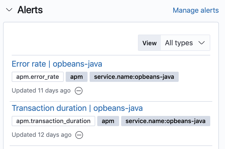
Alerts
editTo help keep you aware of potential issues in your environments, the Alerts feed provides a snapshot of the alerts occurring within the specified time frame. Displayed are the alert types, your specified tags, and the number of instances of each alert within that time frame.
To create or edit alerts, click Manage alerts. For more information about specific alerts that you can create, see Create alerts.