Getting started with anomaly detection
editGetting started with anomaly detection
editReady to take anomaly detection for a test drive? Follow this tutorial to:
- Try out the Data Visualizer
- Create anomaly detection jobs for the Kibana sample data
- Use the results to identify possible anomalies in the data
At the end of this tutorial, you should have a good idea of what machine learning is and will hopefully be inspired to use it to detect anomalies in your own data.
The following video provides a quick overview of some of the tasks we’ll perform in this tutorial:
Need more context? Check out the Elasticsearch introduction to learn the lingo and understand the basics of how Elasticsearch works.
Try it out
edit-
Before you can play with the machine learning features, you must install Elasticsearch and Kibana. Elasticsearch stores the data and the analysis results. Kibana provides a helpful user interface for creating and viewing jobs.
You can run Elasticsearch and Kibana on your own hardware, or use our hosted Elasticsearch Service on Elastic Cloud. The Elasticsearch Service is available on both AWS and GCP. Try out the Elasticsearch Service for free.
- Verify that your environment is set up properly to use the machine learning features. If the Elasticsearch security features are enabled, to complete this tutorial you need a user that has authority to manage anomaly detection jobs. See Setup and security.
-
Add the sample data sets that ship with Kibana.
- From the Kibana home page, click Add data, then select Sample data.
- Pick a data set. In this tutorial, you’ll use the Sample web logs. While you’re here, feel free to click Add data on all of the available sample data sets.
These data sets are now ready be analyzed in machine learning jobs in Kibana.
Explore the data in Kibana
editTo get the best results from machine learning analytics, you must understand your data. You must know its data types and the range and distribution of values. The Data Visualizer enables you to explore the fields in your data:
-
Open Kibana in your web browser. If you are running Kibana locally, go to
http://localhost:5601/.The Kibana machine learning features use pop-ups. You must configure your web browser so that it does not block pop-up windows or create an exception for your Kibana URL.
- Click Machine Learning in the side navigation.
- Select the Data Visualizer tab.
-
Click Select index and choose the
kibana_sample_data_logsdata view. - Use the time filter to select a time period that you’re interested in exploring. Alternatively, click Use full kibana_sample_data_logs data to view the full time range of data.
-
Optional: Change the sample size, which is the number of documents per shard
that are used in the Data Visualizer. There is a relatively small number of
documents in the Kibana sample data, so you can choose a value of
all. For larger data sets, keep in mind that using a large sample size increases query run times and increases the load on the cluster. -
Explore the fields in the Data Visualizer.
You can filter the list by field names or field types. The Data Visualizer indicates how many of the documents in the sample for the selected time period contain each field.
In particular, look at the
clientip,response.keyword, andurl.keywordfields, since we’ll use them in our anomaly detection jobs. For these fields, the Data Visualizer provides the number of distinct values, a list of the top values, and the number and percentage of documents that contain the field. For example: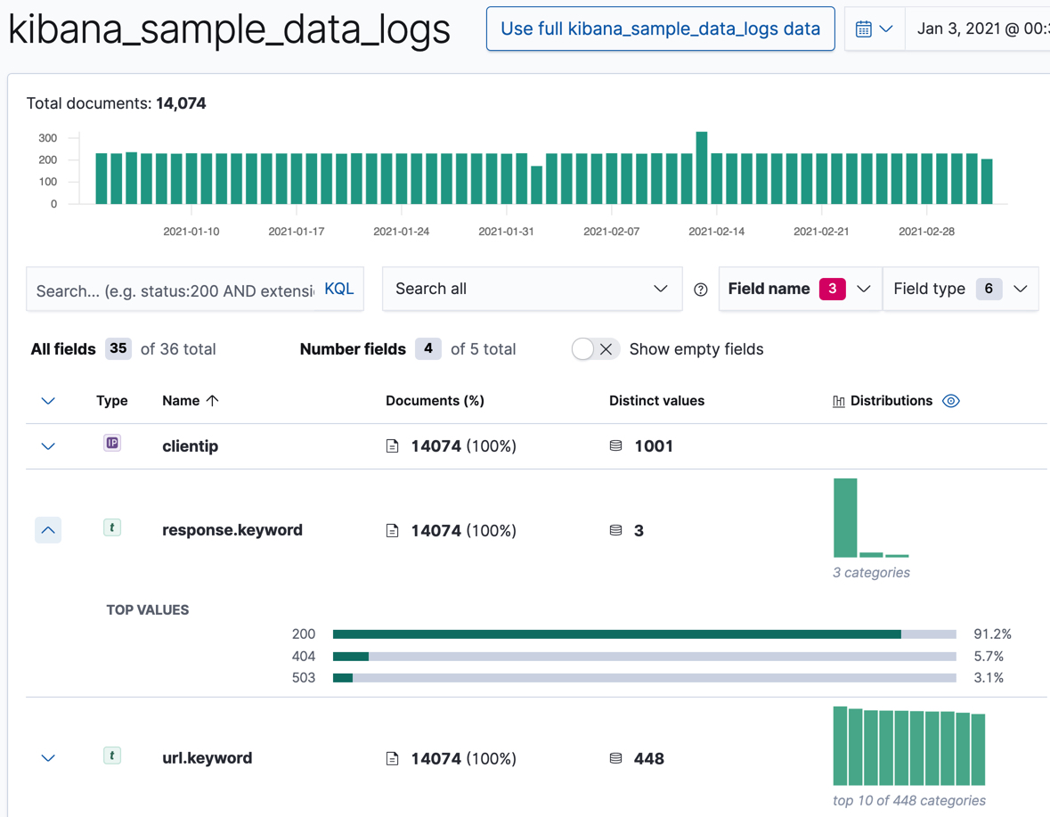
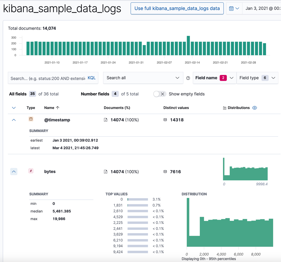
For numeric fields, the Data Visualizer provides information about the minimum, median, maximum, and top values, the number of distinct values, and their distribution. You can use the distribution chart to get a better idea of how the values in the data are clustered. For example:
Make note of the range of dates in the
@timestampfield. They are relative to when you added the sample data and you’ll need that information later in the tutorial.
Now that you’re familiar with the data in the kibana_sample_data_logs index,
you can create some anomaly detection jobs to analyze it.
Create sample anomaly detection jobs in Kibana
editThe Kibana sample data sets include some pre-configured anomaly detection jobs for you to play with. You can use either of the following methods to add the jobs:
- After you load the sample web logs data set on the Kibana home page, click View data > ML jobs.
-
In the Machine Learning app, when you select the
kibana_sample_data_logsdata views in the Data Visualizer or the Anomaly Detection job wizards, it recommends that you create a job using its known configuration. Select the Kibana sample data web logs configuration.
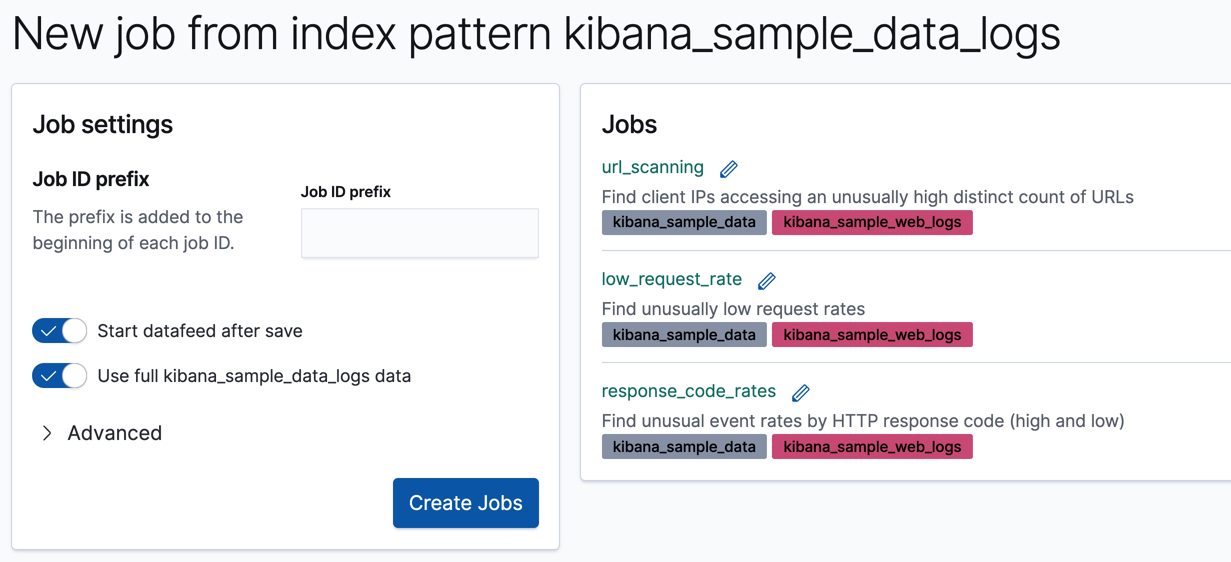
Accept the default values and click Create Jobs.
The wizard creates three jobs and three datafeeds.
If you want to see all of the configuration details for your jobs and datafeeds, you can do so on the Machine Learning > Anomaly Detection > Job Management page. Alternatively, you can see the configuration files in GitHub . For the purposes of this tutorial, however, here’s a quick overview of the goal of each job:
-
low_request_rateuses thelow_countfunction to find unusually low request rates -
response_code_ratesuses thecountfunction and partitions the analysis byresponse.keywordvalues to find unusual event rates by HTTP response code -
url_scanninguses thehigh_distinct_countfunction and performs population analysis on theclientipfield to find client IPs accessing an unusually high distinct count of URLs
The next step is to view the results and see what types of insights these jobs have generated!
View anomaly detection results
editAfter the datafeeds are started and the anomaly detection jobs have processed some data, you can view the results in Kibana.
Depending on the capacity of your machine, you might need to wait a few seconds for the machine learning analysis to generate initial results.
The machine learning features analyze the input stream of data, model its behavior, and perform analysis based on the detectors in each job. When an event occurs outside of the model, that event is identified as an anomaly. You can immediately see that all three jobs have found anomalies, which are indicated by red blocks in the swim lanes for each job.
There are two tools for examining the results from anomaly detection jobs in Kibana: the Anomaly Explorer and the Single Metric Viewer. You can switch between these tools by clicking the icons in the top left corner. You can also edit the job selection to examine a different subset of anomaly detection jobs.
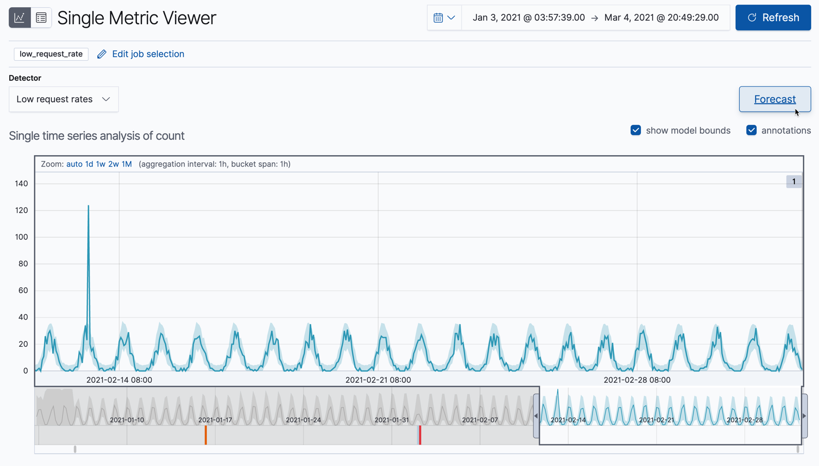
Single metric job results
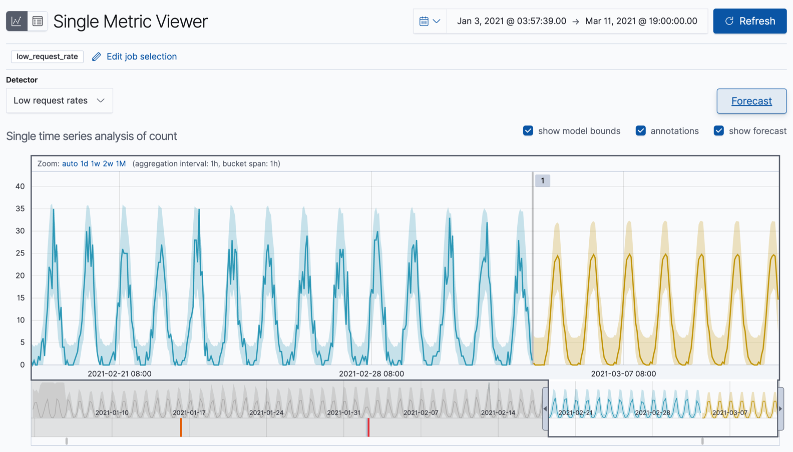
editOne of the sample jobs (low_request_rate), is a single metric anomaly detection job.
It has a single detector that uses the low_count function and limited job
properties. You might use a job like this if you want to determine when the
request rate on your web site drops significantly.
Let’s start by looking at this simple job in the Single Metric Viewer:
- Select the Anomaly Detection tab in Machine Learning to see the list of your anomaly detection jobs.
-
Click the chart icon in the Actions column for your
low_request_ratejob to view its results in the Single Metric Viewer.
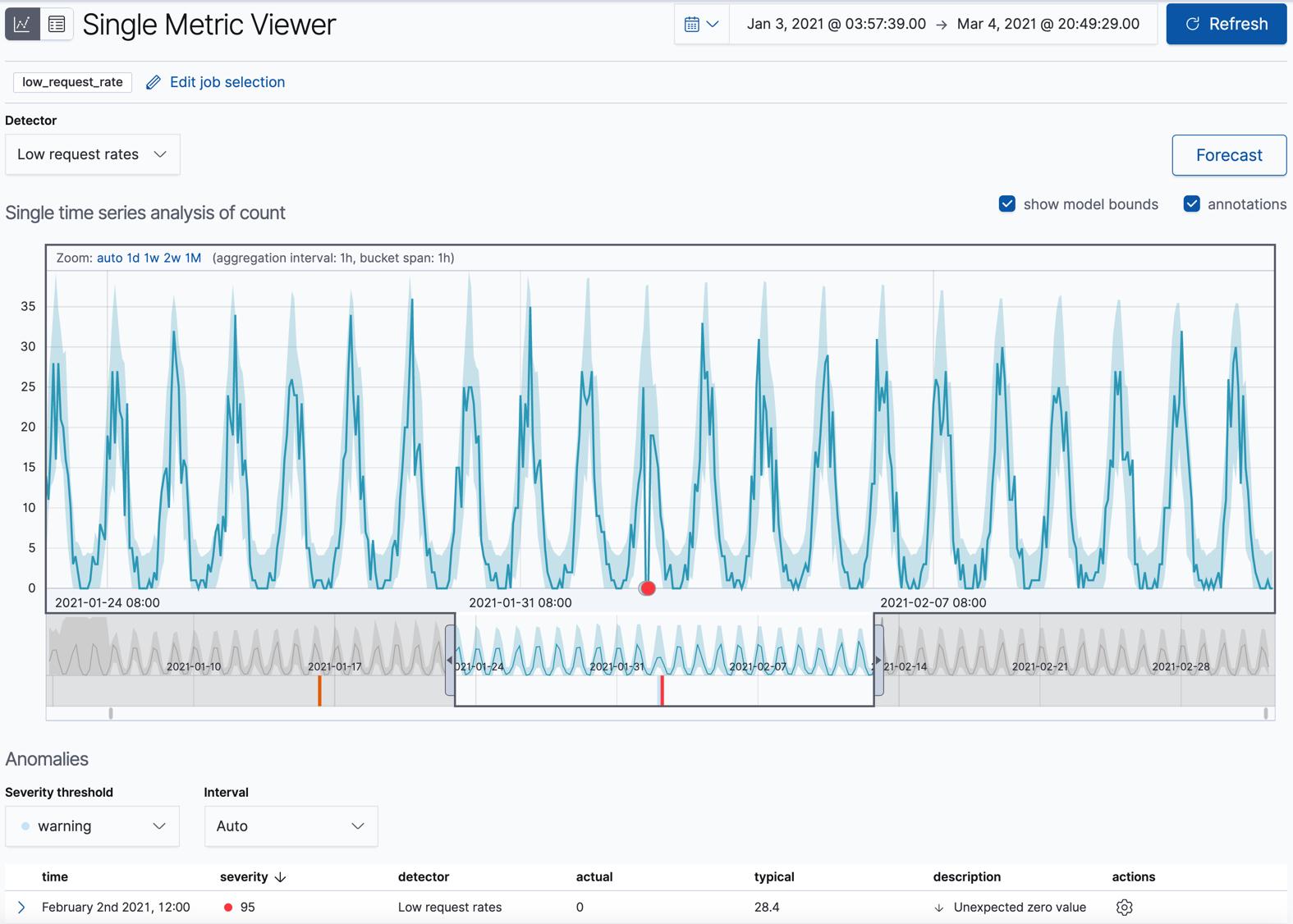
This view contains a chart that represents the actual and expected values over
time. It is available only if the job has model_plot_config enabled. It can
display only a single time series.
The blue line in the chart represents the actual data values. The shaded blue area represents the bounds for the expected values. The area between the upper and lower bounds are the most likely values for the model, using a 95% confidence level. That is to say, there is a 95% chance of the actual value falling within these bounds. If a value is outside of this area then it will usually be identified as anomalous.
If you slide the time selector from the beginning to the end of the data, you can see how the model improves as it processes more data. At the beginning, the expected range of values is pretty broad and the model is not capturing the periodicity in the data. But it quickly learns and begins to reflect the patterns in your data.
Slide the time selector to a section of the time series that contains a red anomaly data point. If you hover over the point, you can see more information.
You might notice a high spike in the time series. It’s not highlighted as an anomaly, however, since this job looks for low counts only.
For each anomaly, you can see key details such as the time, the actual and expected ("typical") values, and their probability in the Anomalies section of the viewer. For example:
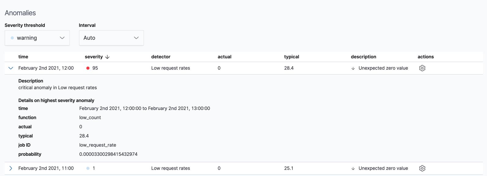
In the Actions column, there are additional options, such as Raw data which generates a query for the relevant documents in Discover. You can optionally add more links in the actions menu with custom URLs.
By default, the table contains all anomalies that have a severity of "warning" or higher in the selected section of the timeline. If you are only interested in critical anomalies, for example, you can change the severity threshold for this table.
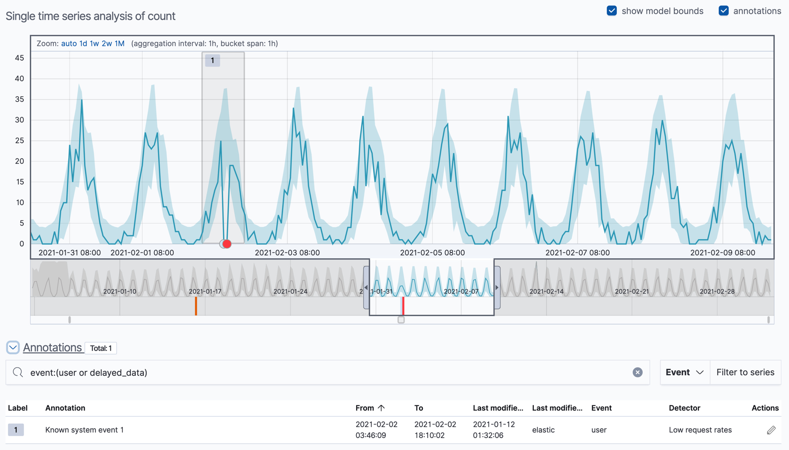
You can optionally annotate your job results by drag-selecting a period of time in the Single Metric Viewer and adding a description. Annotations are notes that refer to events in a specific time period. They can be created by the user or generated automatically by the anomaly detection job to reflect model changes and noteworthy occurrences.
After you have identified anomalies, often the next step is to try to determine the context of those situations. For example, are there other factors that are contributing to the problem? Are the anomalies confined to particular applications or servers? You can begin to troubleshoot these situations by layering additional jobs or creating multi-metric jobs.
Advanced or multi-metric job results
editConceptually, you can think of multi-metric anomaly detection jobs as running multiple independent single metric jobs. By bundling them together in a multi-metric job, however, you can see an overall score and shared influencers for all the metrics and all the entities in the job. Multi-metric jobs therefore scale better than having many independent single metric jobs. They also provide better results when you have influencers that are shared across the detectors.
You can also configure your anomaly detection jobs to split a single time series into
multiple time series based on a categorical field. For example, the
response_code_rates job has a single detector that splits the data based on
the response.keyword and then uses the count function to determine when the
number of events is anomalous. You might use a job like this if you want to
look at both high and low request rates partitioned by response code.
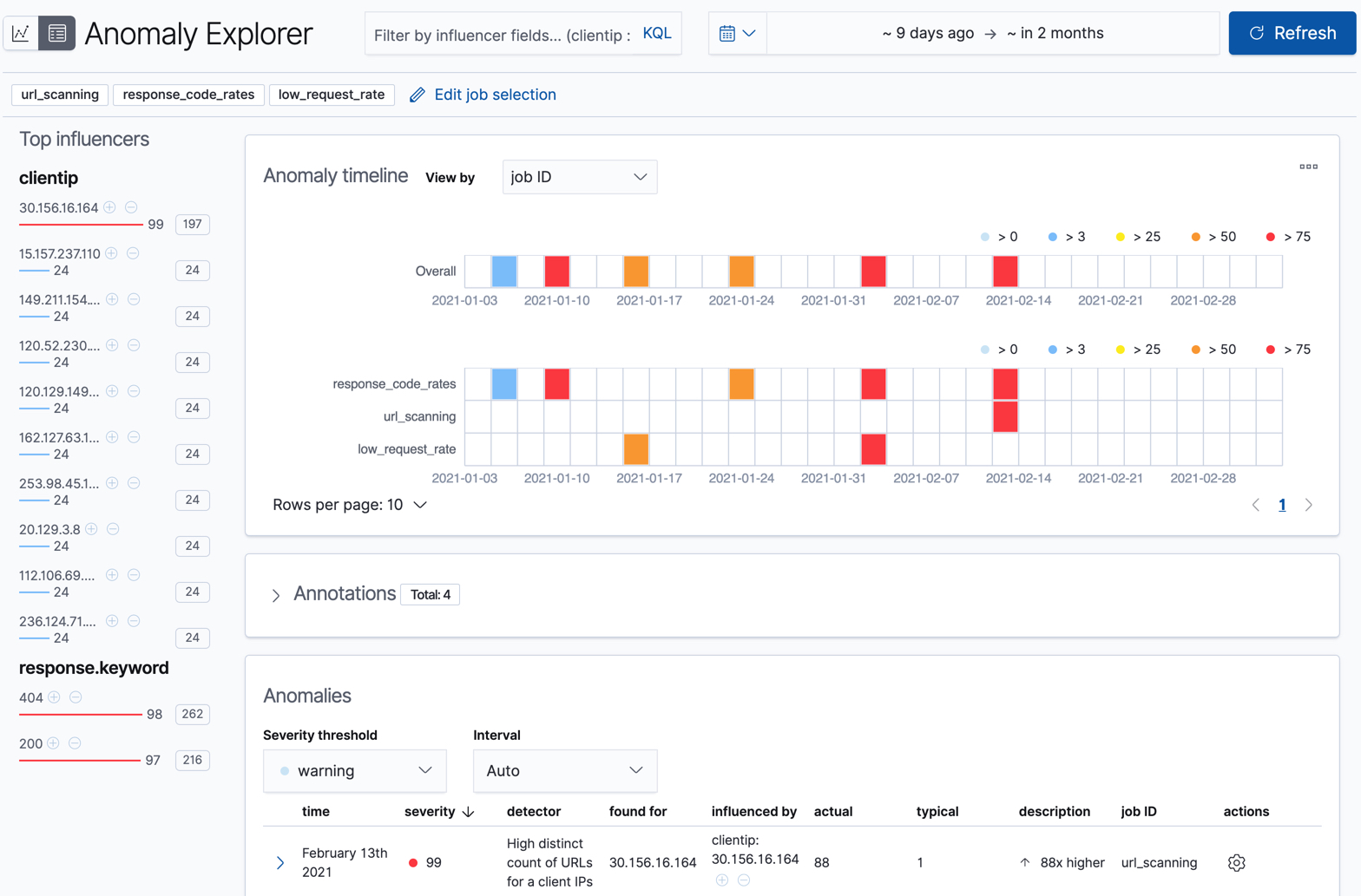
Let’s start by looking at the response_code_rates job in the
Anomaly Explorer:
- Select the Anomaly Detection tab in Machine Learning to see the list of your anomaly detection jobs.
-
Click the grid icon in the Actions column for your
response_code_ratesjob to view its results in the Anomaly Explorer.
For this particular job, you can choose to see separate swim lanes for each client IP or response code. For example:
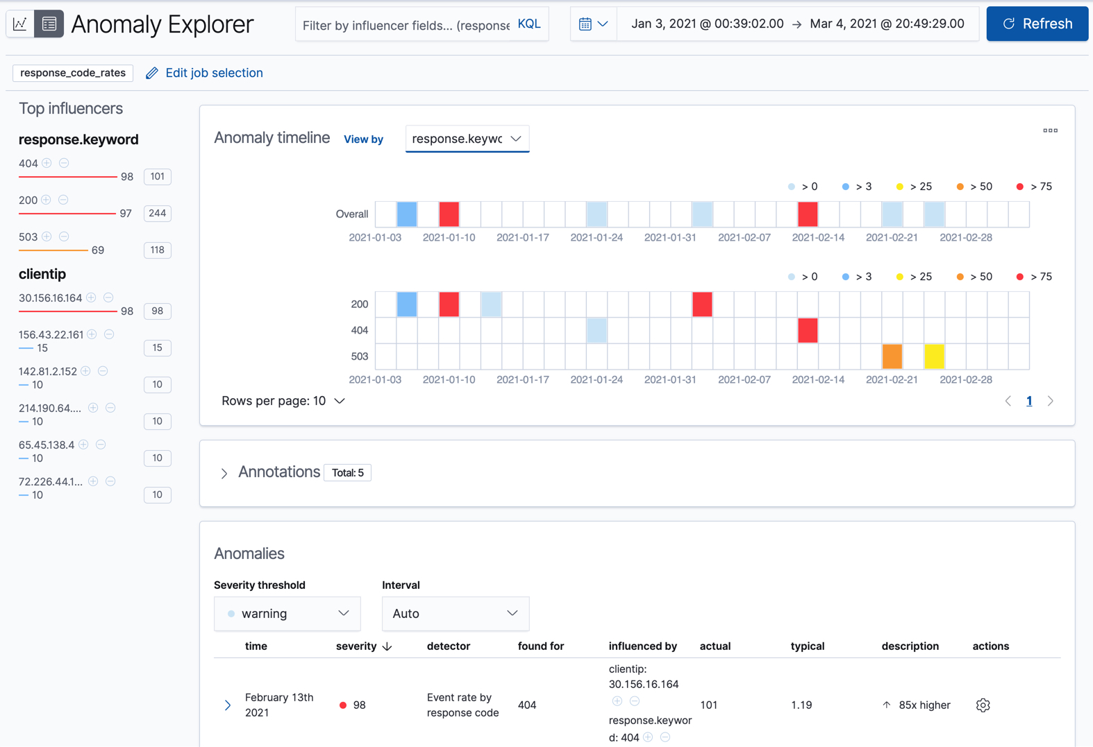
Since the job uses response.keyword as its partition field, the analysis is
segmented such that you have completely different baselines for each distinct
value of that field. By looking at temporal patterns on a per entity basis, you
might spot things that might have otherwise been hidden in the lumped view.
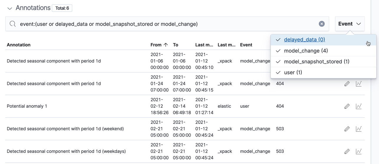
Under the anomaly timeline, there is a section that contains annotations. You can filter the type of events by using the selector on the right side of the Annotations section.
On the left side of the Anomaly Explorer, there is a list of the top influencers for all of the detected anomalies in that same time period. The list includes maximum anomaly scores, which in this case are aggregated for each influencer, for each bucket, across all detectors. There is also a total sum of the anomaly scores for each influencer. You can use this list to help you narrow down the contributing factors and focus on the most anomalous entities.
Click on a section in the swim lanes to obtain more information about the
anomalies in that time period. For example, click on the red section in the
swim lane for the response.keyword value of 404:
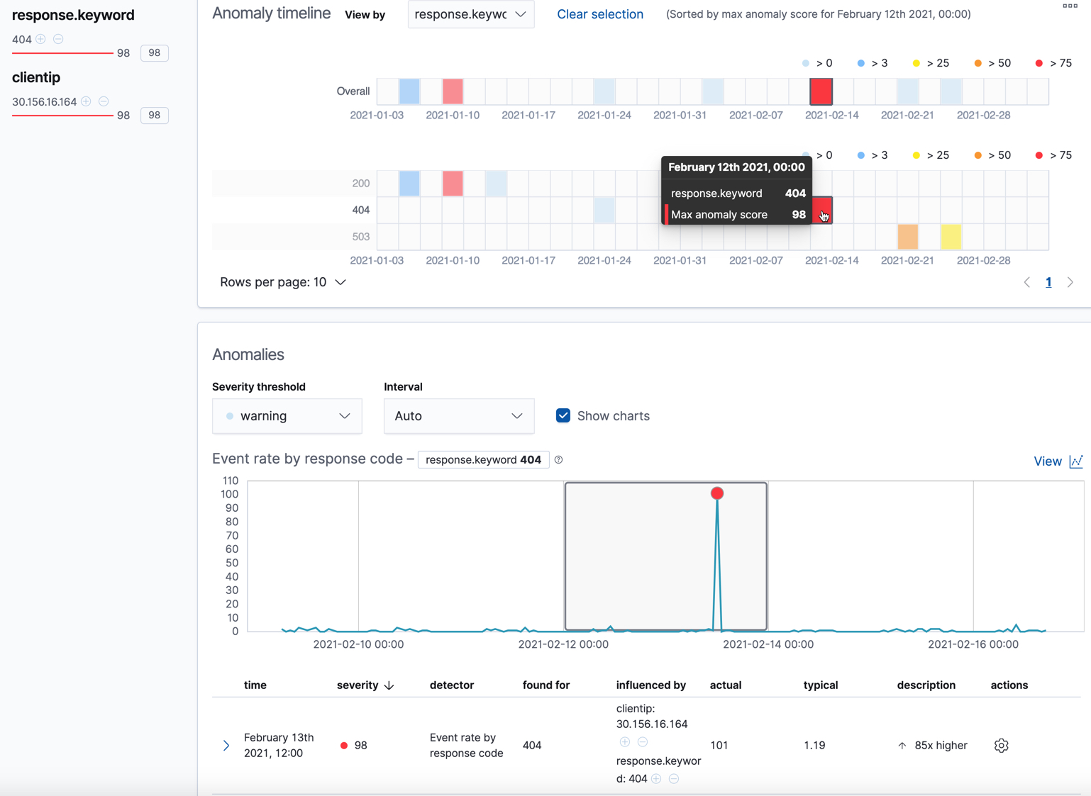
You can see exact times when anomalies occurred. If there are multiple detectors or metrics in the job, you can see which caught the anomaly. You can also switch to viewing this time series in the Single Metric Viewer.
Below the charts, there is a table that provides more information, such as the typical and actual values and the influencers that contributed to the anomaly. For example:
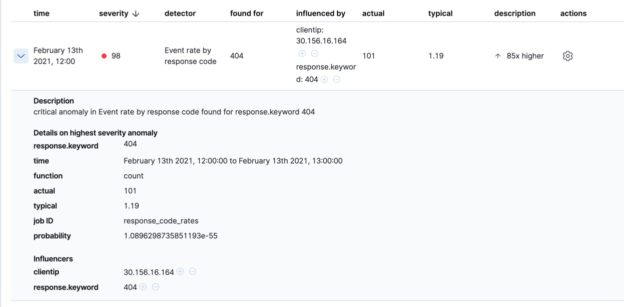
If your job has multiple detectors, the table aggregates the anomalies to show
the highest severity anomaly per detector and entity, which is the field value
that is displayed in the found for column. To view all the anomalies without
any aggregation, set the Interval to Show all.
In this sample data, the spike in the 404 response codes is influenced by a specific client. Situations like this might indicate that the client is accessing unusual pages or scanning your site to see if they can access unusual URLs. This anomalous behavior merits further investigation.
The anomaly scores that you see in each section of the Anomaly Explorer might differ slightly. This disparity occurs because for each job there are bucket results, influencer results, and record results. Anomaly scores are generated for each type of result. The anomaly timeline uses the bucket-level anomaly scores. The list of top influencers uses the influencer-level anomaly scores. The list of anomalies uses the record-level anomaly scores.
Population job results
editThe final sample job (url_scanning) is a population anomaly detection job. As we
saw in the response_code_rates job results, there are some clients that seem
to be accessing unusually high numbers of URLs. The url_scanning sample job
provides another method for investigating that type of problem. It has a
single detector that uses the high_distinct_count function on the url.keyword
to detect unusually high numbers of distinct values in that field. It then
analyzes whether that behavior differs over the population of clients, as
defined by the clientip field.
If you examine the results from the url_scanning anomaly detection job in the
Anomaly Explorer, you’ll notice its charts have a different format. For
example:
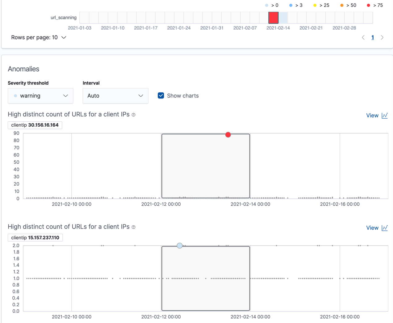
In this case, the metrics for each client IP are analyzed relative to other
client IPs in each bucket and we can once again see that the
30.156.16.164 client IP is behaving abnormally.
If you want to play with another example of a population anomaly detection job, add the
sample eCommerce orders data set. Its high_sum_total_sales job determines
which customers have made unusual amounts of purchases relative to other
customers in each bucket of time. In this example, there are anomalous events
found for two customers:
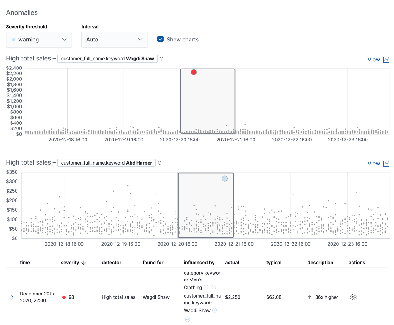
For more information, see Performing population analysis.
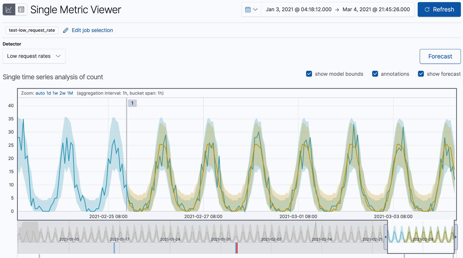
Create forecasts
editIn addition to detecting anomalous behavior in your data, you can use the machine learning features to predict future behavior.
To create a forecast in Kibana:
-
View your job results (for example, for the
low_request_ratejob) in the Single Metric Viewer. To find that view, follow the link in the Actions column on the Anomaly Detection page. -
Click Forecast.
-
Specify a duration for your forecast. This value indicates how far to extrapolate beyond the last record that was processed. You must use time units. In this example, the duration is one week (
1w):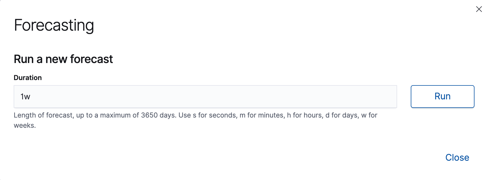
-
View the forecast in the Single Metric Viewer:
The yellow line in the chart represents the predicted data values. The shaded yellow area represents the bounds for the predicted values, which also gives an indication of the confidence of the predictions. Note that the bounds generally increase with time (that is to say, the confidence levels decrease), since you are forecasting further into the future. Eventually if the confidence levels are too low, the forecast stops.
-
Optional: Compare the forecast to actual data.
As the job processes more data, you can click the Forecast button again and choose to see one of your forecasts overlaid on the actual data. The chart then contains the actual data values, the bounds for the expected values, the anomalies, the forecast data values, and the bounds for the forecast. This combination of actual and forecast data gives you an indication of how well the machine learning features can extrapolate the future behavior of the data.
If you want to see this type of comparison for the Kibana sample data, which has a finite number of documents, you can reset the job and analyze only a subset of the data before you create a forecast. For example, reset one of your anomaly detection jobs from the Job Management page in Kibana or use the reset anomaly detection jobs API. When you restart the datafeed for this job, choose a date part way through your sample data as the search end date. By default, the datafeed stops and the anomaly detection job closes when it reaches that date. Create the forecast. You can then restart the datafeed to process the remaining data and generate the type of results shown here.
The Kibana sample data sets have timestamps that are relative to when you added the data sets. However, some of these dates are in the future. Therefore, for the purposes of this tutorial, when you restart your datafeed do not use the No end time (Real-time search) option. Specify the appropriate end dates so that it processes all of the data immediately.
Now that you have seen how easy it is to create forecasts with the sample data, consider what type of events you might want to predict in your own data. For more information and ideas, see Forecast future behavior.
Next steps
editBy completing this tutorial, you’ve learned how you can detect anomalous behavior in a simple set of sample data. You created anomaly detection jobs in Kibana, which opens jobs and creates and starts datafeeds for you under the covers. You examined the results of the machine learning analysis in the Single Metric Viewer and Anomaly Explorer in Kibana. You also extrapolated the future behavior of a job by creating a forecast.
If you’re now thinking about where anomaly detection can be most impactful for your own data, there are three things to consider:
- It must be time series data.
- It should be information that contains key performance indicators for the health, security, or success of your business or system. The better you know the data, the quicker you will be able to create jobs that generate useful insights.
- Ideally, the data is located in Elasticsearch and you can therefore create a datafeed that retrieves data in real time. If your data is outside of Elasticsearch, you cannot use Kibana to create your jobs and you cannot use datafeeds.
In general, it is a good idea to start with single metric anomaly detection jobs for your key performance indicators. After you examine these simple analysis results, you will have a better idea of what the influencers might be. You can create multi-metric jobs and split the data or create more complex analysis functions as necessary. For examples of more complicated configuration options, see Examples.
If you want to find more sample jobs, see Supplied configurations. In particular, there are sample jobs for Apache and Nginx that are quite similar to the examples in this tutorial.
If you encounter problems, we’re here to help. If you are an existing Elastic customer with a support contract, please create a ticket in the Elastic Support portal. Or post in the Elastic forum.