View anomaly detection results
editView anomaly detection results
editAfter the datafeeds are started and the anomaly detection jobs have processed some data, you can view the results in Kibana.
Depending on the capacity of your machine, you might need to wait a few seconds for the machine learning analysis to generate initial results.
The machine learning features analyze the input stream of data, model its behavior, and perform analysis based on the detectors in each job. When an event occurs outside of the model, that event is identified as an anomaly. You can immediately see that all three jobs have found anomalies, which are indicated by red blocks in the swim lanes for each job.
There are two tools for examining the results from anomaly detection jobs in Kibana: the Anomaly Explorer and the Single Metric Viewer. You can switch between these tools by clicking the icons in the top left corner. You can also edit the job selection to examine a different subset of anomaly detection jobs.
Single metric job results
editOne of the sample jobs (low_request_rate), is a single metric anomaly detection job.
It has a single detector that uses the low_count function and limited job
properties. You might use a job like this if you want to determine when the
request rate on your web site drops significantly.
Let’s start by looking at this simple job in the Single Metric Viewer:
- Select the Anomaly Detection tab in Machine Learning to see the list of your anomaly detection jobs.
-
Click the chart icon in the Actions column for your
low_request_ratejob to view its results in the Single Metric Viewer.
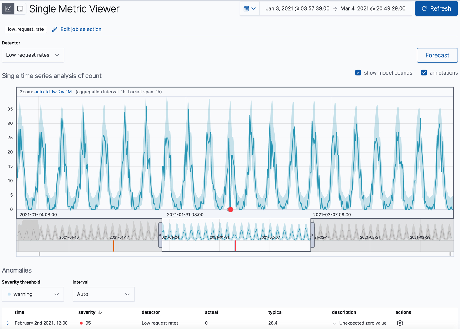
This view contains a chart that represents the actual and expected values over
time. It is available only if the job has model_plot_config enabled. It can
display only a single time series.
The blue line in the chart represents the actual data values. The shaded blue area represents the bounds for the expected values. The area between the upper and lower bounds are the most likely values for the model, using a 95% confidence level. That is to say, there is a 95% chance of the actual value falling within these bounds. If a value is outside of this area then it will usually be identified as anomalous.
If you slide the time selector from the beginning to the end of the data, you can see how the model improves as it processes more data. At the beginning, the expected range of values is pretty broad and the model is not capturing the periodicity in the data. But it quickly learns and begins to reflect the patterns in your data.
Slide the time selector to a section of the time series that contains a red anomaly data point. If you hover over the point, you can see more information.
You might notice a high spike in the time series. It’s not highlighted as an anomaly, however, since this job looks for low counts only.
For each anomaly, you can see key details such as the time, the actual and expected ("typical") values, and their probability in the Anomalies section of the viewer. For example:
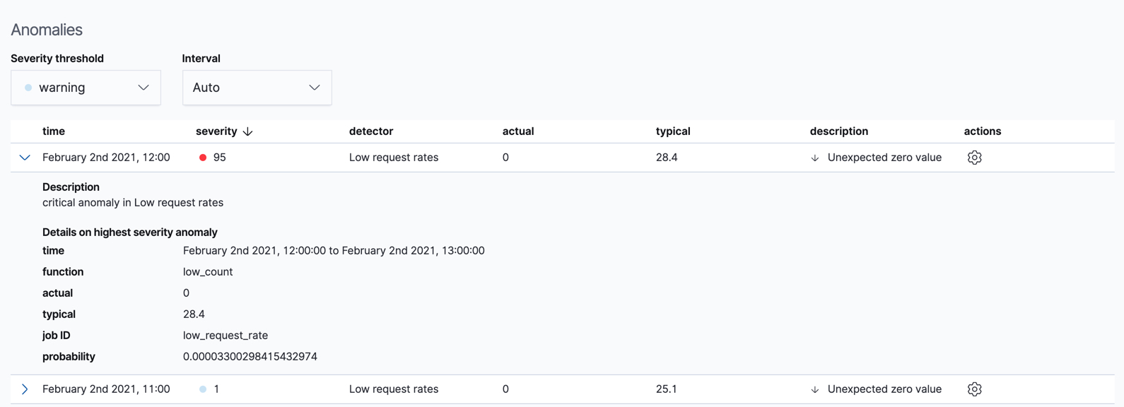
In the Actions column, there are additional options, such as Raw data which generates a query for the relevant documents in Discover. You can optionally add more links in the actions menu with custom URLs.
By default, the table contains all anomalies that have a severity of "warning" or higher in the selected section of the timeline. If you are only interested in critical anomalies, for example, you can change the severity threshold for this table.
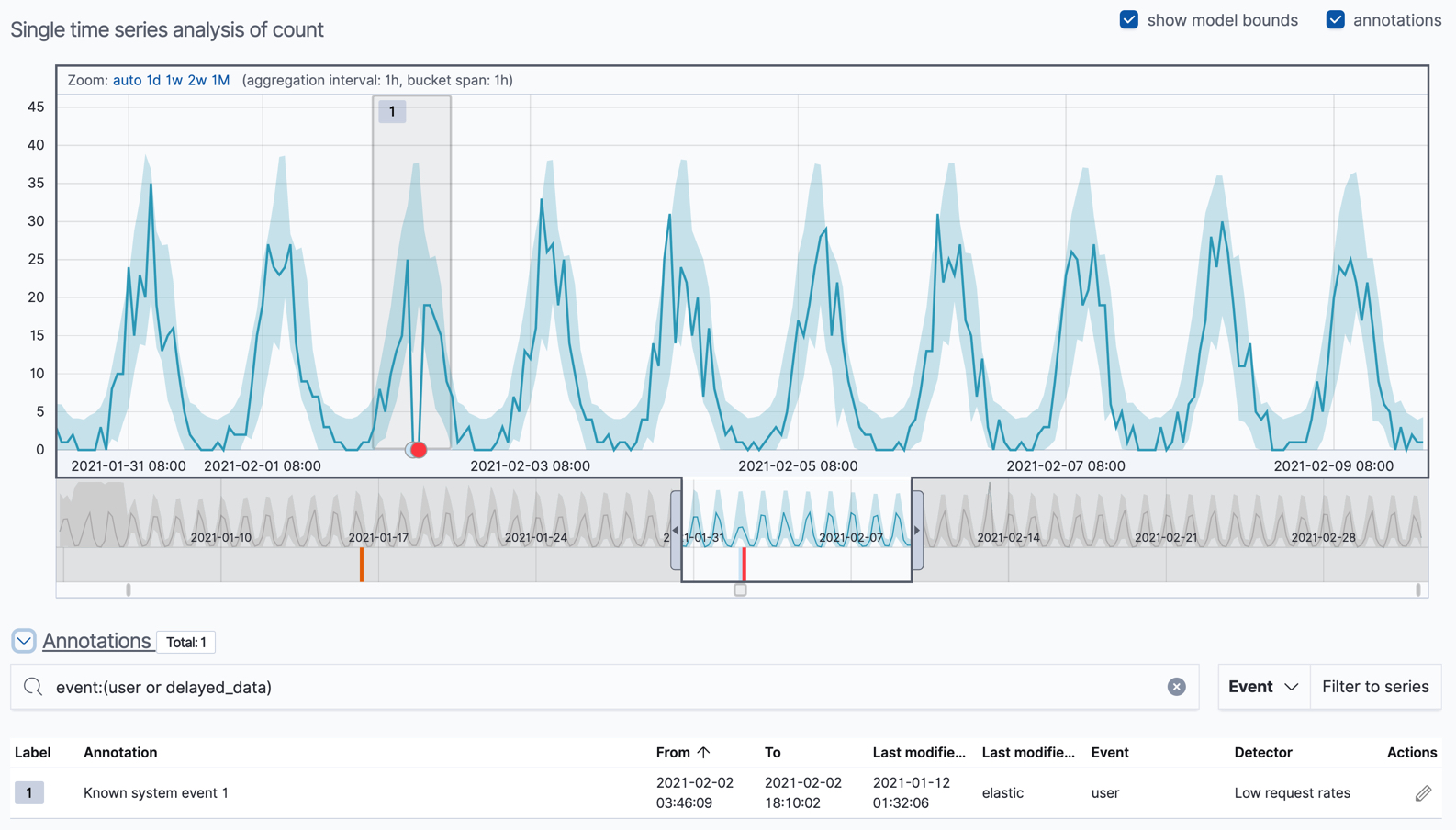
You can optionally annotate your job results by drag-selecting a period of time in the Single Metric Viewer and adding a description. Annotations are notes that refer to events in a specific time period. They can be created by the user or generated automatically by the anomaly detection job to reflect model changes and noteworthy occurrences.
After you have identified anomalies, often the next step is to try to determine the context of those situations. For example, are there other factors that are contributing to the problem? Are the anomalies confined to particular applications or servers? You can begin to troubleshoot these situations by layering additional jobs or creating multi-metric jobs.
Advanced or multi-metric job results
editConceptually, you can think of multi-metric anomaly detection jobs as running multiple independent single metric jobs. By bundling them together in a multi-metric job, however, you can see an overall score and shared influencers for all the metrics and all the entities in the job. Multi-metric jobs therefore scale better than having many independent single metric jobs. They also provide better results when you have influencers that are shared across the detectors.
You can also configure your anomaly detection jobs to split a single time series into
multiple time series based on a categorical field. For example, the
response_code_rates job has a single detector that splits the data based on
the response.keyword and then uses the count function to determine when the
number of events is anomalous. You might use a job like this if you want to
look at both high and low request rates partitioned by response code.
Let’s start by looking at the response_code_rates job in the
Anomaly Explorer:
- Select the Anomaly Detection tab in Machine Learning to see the list of your anomaly detection jobs.
-
Click the grid icon in the Actions column for your
response_code_ratesjob to view its results in the Anomaly Explorer.
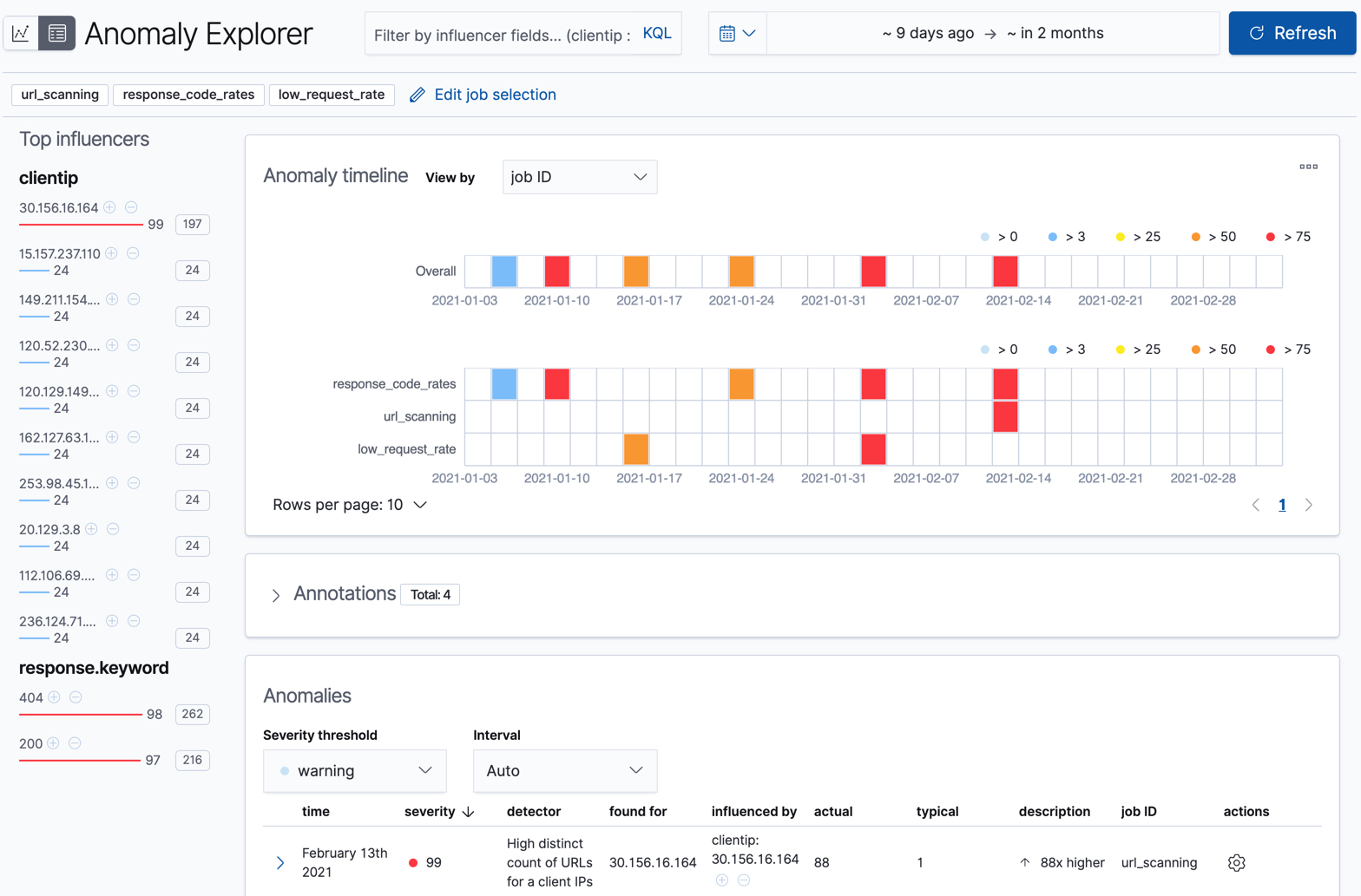
For this particular job, you can choose to see separate swim lanes for each client IP or response code. For example:
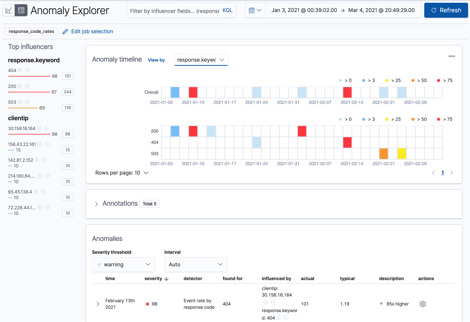
Since the job uses response.keyword as its partition field, the analysis is
segmented such that you have completely different baselines for each distinct
value of that field. By looking at temporal patterns on a per entity basis, you
might spot things that might have otherwise been hidden in the lumped view.
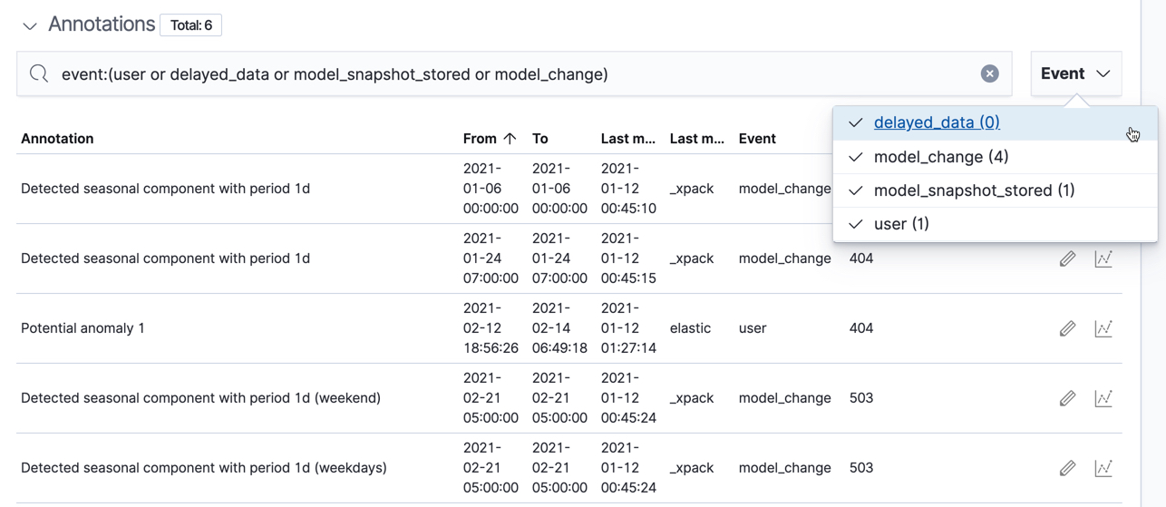
Under the anomaly timeline, there is a section that contains annotations. You can filter the type of events by using the selector on the right side of the Annotations section.
On the left side of the Anomaly Explorer, there is a list of the top influencers for all of the detected anomalies in that same time period. The list includes maximum anomaly scores, which in this case are aggregated for each influencer, for each bucket, across all detectors. There is also a total sum of the anomaly scores for each influencer. You can use this list to help you narrow down the contributing factors and focus on the most anomalous entities.
Click on a section in the swim lanes to obtain more information about the
anomalies in that time period. For example, click on the red section in the
swim lane for the response.keyword value of 404:
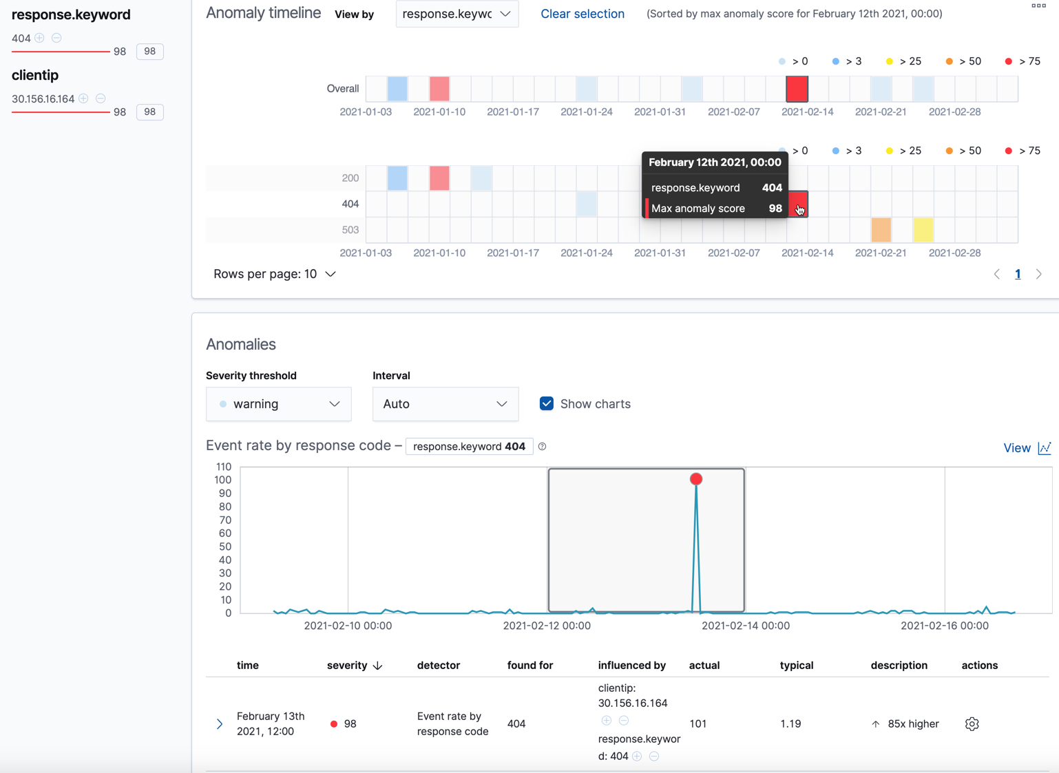
You can see exact times when anomalies occurred. If there are multiple detectors or metrics in the job, you can see which caught the anomaly. You can also switch to viewing this time series in the Single Metric Viewer.
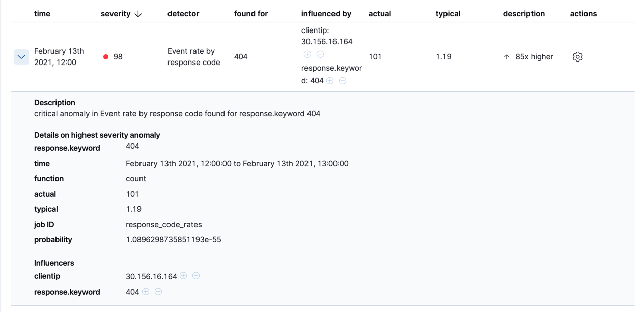
Below the charts, there is a table that provides more information, such as the typical and actual values and the influencers that contributed to the anomaly. For example:
If your job has multiple detectors, the table aggregates the anomalies to show
the highest severity anomaly per detector and entity, which is the field value
that is displayed in the found for column. To view all the anomalies without
any aggregation, set the Interval to Show all.
In this sample data, the spike in the 404 response codes is influenced by a specific client. Situations like this might indicate that the client is accessing unusual pages or scanning your site to see if they can access unusual URLs. This anomalous behavior merits further investigation.
The anomaly scores that you see in each section of the Anomaly Explorer might differ slightly. This disparity occurs because for each job there are bucket results, influencer results, and record results. Anomaly scores are generated for each type of result. The anomaly timeline uses the bucket-level anomaly scores. The list of top influencers uses the influencer-level anomaly scores. The list of anomalies uses the record-level anomaly scores.
Population job results
editThe final sample job (url_scanning) is a population anomaly detection job. As we
saw in the response_code_rates job results, there are some clients that seem
to be accessing unusually high numbers of URLs. The url_scanning sample job
provides another method for investigating that type of problem. It has a
single detector that uses the high_distinct_count function on the url.keyword
to detect unusually high numbers of distinct values in that field. It then
analyzes whether that behavior differs over the population of clients, as
defined by the clientip field.
If you examine the results from the url_scanning anomaly detection job in the
Anomaly Explorer, you’ll notice its charts have a different format. For
example:
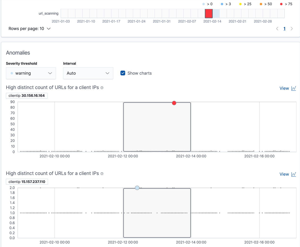
In this case, the metrics for each client IP are analyzed relative to other
client IPs in each bucket and we can once again see that the
30.156.16.164 client IP is behaving abnormally.
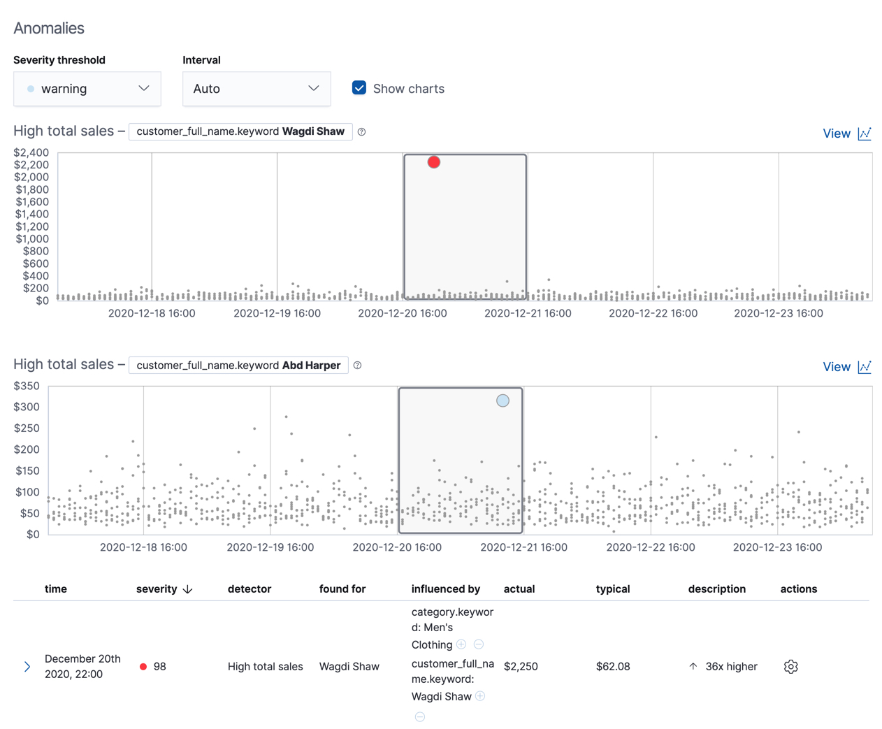
If you want to play with another example of a population anomaly detection job, add the
sample eCommerce orders data set. Its high_sum_total_sales job determines
which customers have made unusual amounts of purchases relative to other
customers in each bucket of time. In this example, there are anomalous events
found for two customers:
For more information, see Performing population analysis.