Predicting delayed flights with classification analysis
editPredicting delayed flights with classification analysis
editThis functionality is in beta and is subject to change. The design and code is less mature than official GA features and is being provided as-is with no warranties. Beta features are not subject to the support SLA of official GA features.
Let’s try to predict whether a flight will be delayed or not by using the
sample flight data. The data set contains
information such as weather conditions, carrier, flight distance, origin,
destination, and whether or not the flight was delayed. When you create a
data frame analytics job for classification analysis, it learns the relationships between the
fields in your data in order to predict the value of the dependent variable,
which in this case is the boolean FlightDelay field. For an overview of these
concepts, see Classification and Introduction to supervised learning.
If you want to view this example in a Jupyter notebook, click here.
Preparing your data
editEach document in the sample flight data set contains details for a single flight, so this data is ready for analysis; it is already in a two-dimensional entity-based data structure. In general, you often need to transform the data into an entity-centric index before you can analyze the data.
In order to be analyzed, a document must contain at least one field with a
supported data type (numeric, boolean, text, keyword or ip) and must
not contain arrays with more than one item. If your source data consists of some
documents that contain the dependent variable and some that do not, the model is
trained on the subset of documents that contain it.
Example source document
{
  "_index": "kibana_sample_data_flights",
  "_type": "_doc",
  "_id": "S-JS1W0BJ7wufFIaPAHe",
  "_version": 1,
  "_seq_no": 3356,
  "_primary_term": 1,
  "found": true,
  "_source": {
    "FlightNum": "N32FE9T",
    "DestCountry": "JP",
    "OriginWeather": "Thunder & Lightning",
    "OriginCityName": "Adelaide",
    "AvgTicketPrice": 499.08518599798685,
    "DistanceMiles": 4802.864932998549,
    "FlightDelay": false,
    "DestWeather": "Sunny",
    "Dest": "Chubu Centrair International Airport",
    "FlightDelayType": "No Delay",
    "OriginCountry": "AU",
    "dayOfWeek": 3,
    "DistanceKilometers": 7729.461862731618,
    "timestamp": "2019-10-17T11:12:29",
    "DestLocation": {
      "lat": "34.85839844",
      "lon": "136.8049927"
    },
    "DestAirportID": "NGO",
    "Carrier": "ES-Air",
    "Cancelled": false,
    "FlightTimeMin": 454.6742272195069,
    "Origin": "Adelaide International Airport",
    "OriginLocation": {
      "lat": "-34.945",
      "lon": "138.531006"
    },
    "DestRegion": "SE-BD",
    "OriginAirportID": "ADL",
    "OriginRegion": "SE-BD",
    "DestCityName": "Tokoname",
    "FlightTimeHour": 7.577903786991782,
    "FlightDelayMin": 0
  }
}
The sample flight data set is used in this example because it is easily accessible. However, the data has been manually created and contains some inconsistencies. For example, a flight can be both delayed and canceled. This is a good reminder that the quality of your input data affects the quality of your results.
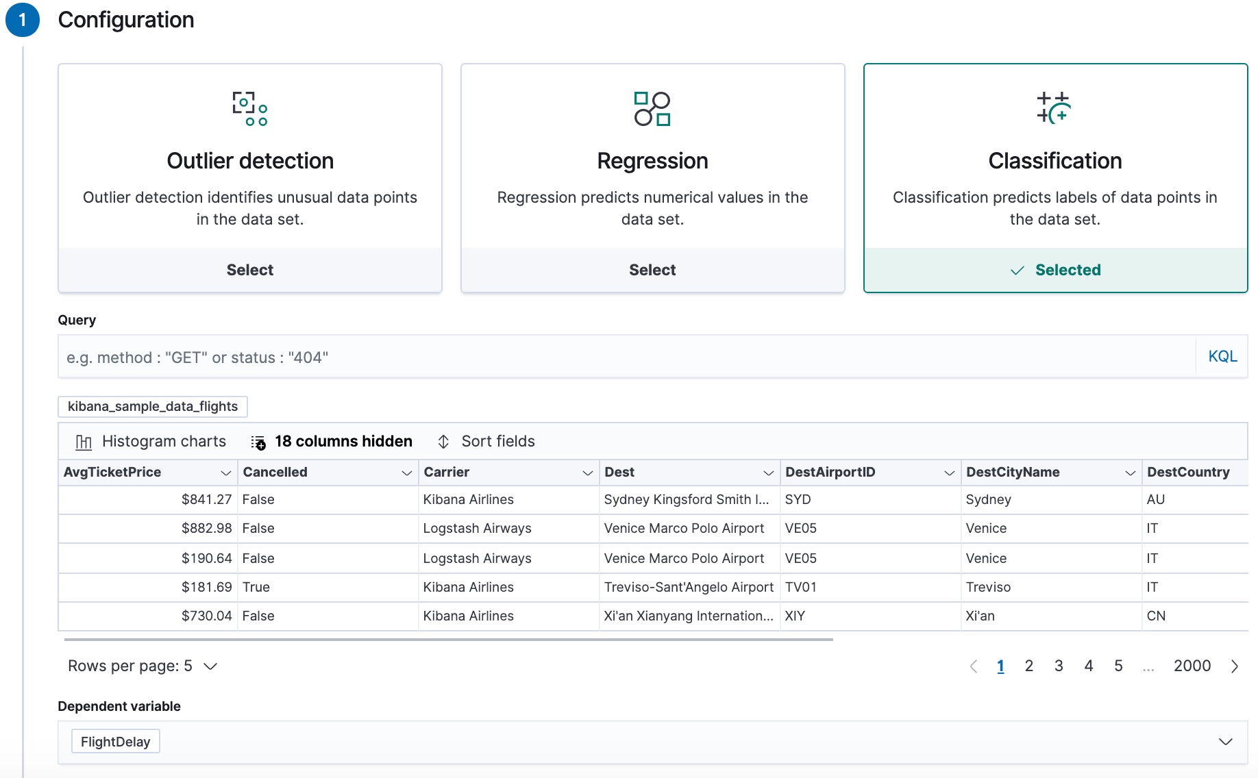
Creating a classification model
editTo predict whether a specific flight is delayed:
-
Create a data frame analytics job.
You can use the wizard on the Machine Learning > Data Frame Analytics tab in Kibana or the create data frame analytics jobs API.
-
Choose
kibana_sample_data_flightsas the source index. -
Choose
classificationas the job type. -
Choose
FlightDelayas the dependent variable, which is the field that we want to predict with the classification analysis. -
Add
Cancelled,FlightDelayMin, andFlightDelayTypeto the list of excluded fields. These fields will be excluded from the analysis. It is recommended to exclude fields that either contain erroneous data or describe thedependent_variable.The wizard includes a scatterplot matrix, which enables you to explore the relationships between the numeric fields. The color of each point is affected by the value of the dependent variable for that document, as shown in the legend. You can use this matrix to help you decide which fields to include or exclude from the analysis.
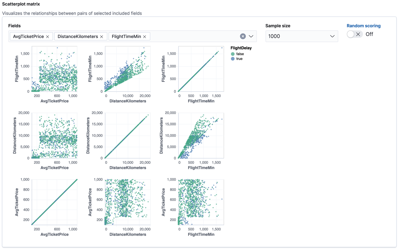
If you want these charts to represent data from a larger sample size or from a randomized selection of documents, you can change the default behavior. However, a larger sample size might slow down the performance of the matrix and a randomized selection might put more load on the cluster due to the more intensive query.
-
Choose a training percent of
10which means it randomly selects 10% of the source data for training. While that value is low for this example, for many large data sets using a small training sample greatly reduces runtime without impacting accuracy. - If you want to experiment with feature importance, specify a value in the advanced configuration options. In this example, we choose to return a maximum of 10 feature importance values per document. This option affects the speed of the analysis, so by default it is disabled.
- Use the default memory limit for the job. If the job requires more than this amount of memory, it fails to start. If the available memory on the node is limited, this setting makes it possible to prevent job execution.
-
Add a job ID (such as
model-flight-delay-classification) and optionally a job description. - Add the name of the destination index that will contain the results of the analysis. In Kibana, the index name matches the job ID by default. It will contain a copy of the source index data where each document is annotated with the results. If the index does not exist, it will be created automatically.
-
Use default values for all other options.
API example
PUT _ml/data_frame/analytics/model-flight-delay-classification
{
  "source": {
    "index": [
      "kibana_sample_data_flights"
    ]
  },
  "dest": {
    "index": "model-flight-delay-classification",
    "results_field": "ml"
  },
  "analysis": {
    "classification": {
      "dependent_variable": "FlightDelay",
      "training_percent": 10,
      "num_top_feature_importance_values": 10
    }
  },
  "analyzed_fields": {
    "includes": [],
    "excludes": [
      "Cancelled",
      "FlightDelayMin",
      "FlightDelayType"
    ]
  }
}
-
Choose
-
Start the job in Kibana or use the start data frame analytics jobs API.
The job takes a few minutes to run. Runtime depends on the local hardware and also on the number of documents and fields that are analyzed. The more fields and documents, the longer the job runs. It stops automatically when the analysis is complete.
API example
POST _ml/data_frame/analytics/model-flight-delay-classification/_start
-
Check the job stats to follow the progress in Kibana or use the get data frame analytics jobs statistics API.
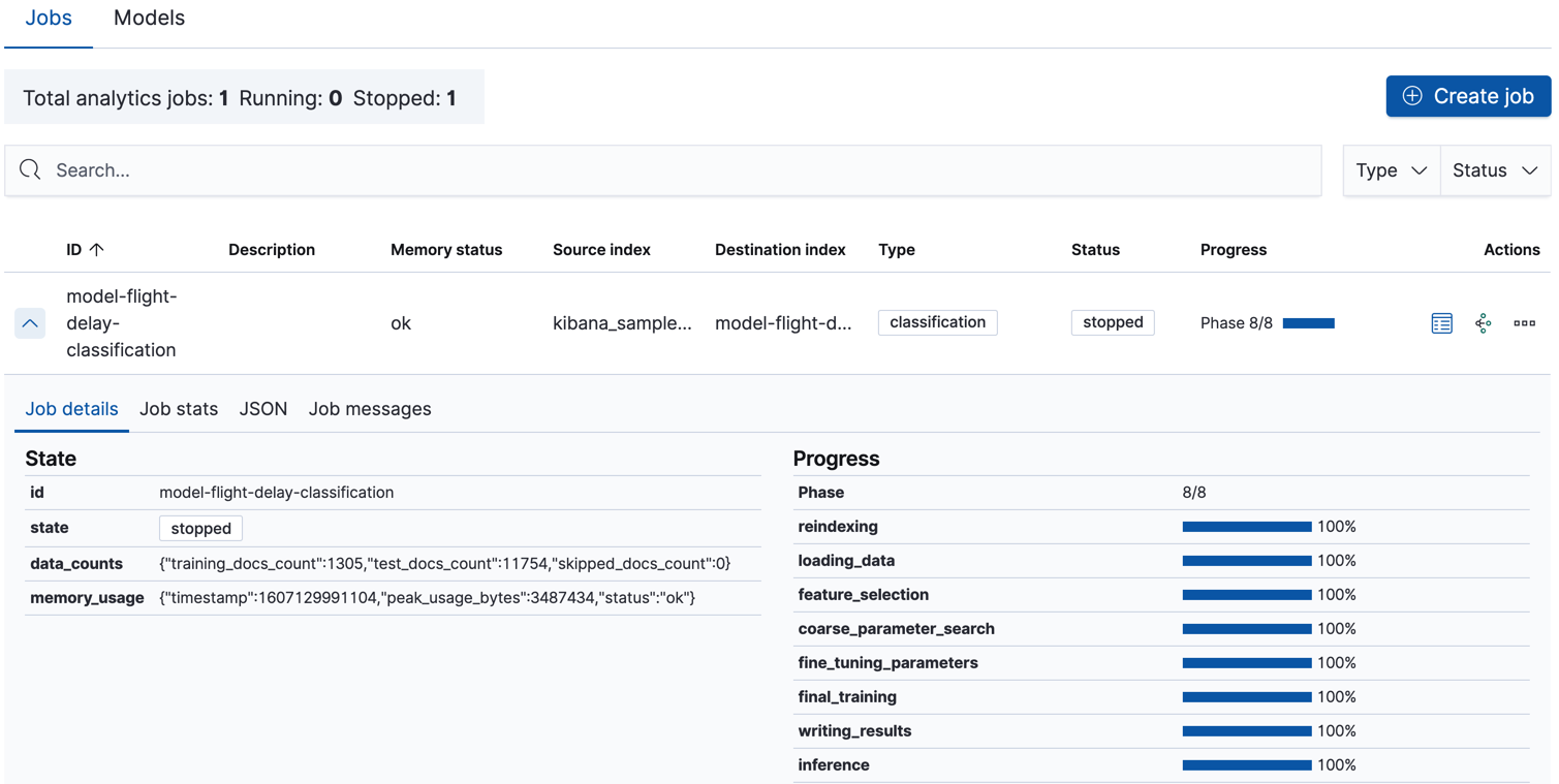
When the job stops, the results are ready to view and evaluate. To learn more about the job phases, see How it works.
API example
GET _ml/data_frame/analytics/model-flight-delay-classification/_stats
The API call returns the following response:
{
  "count" : 1,
  "data_frame_analytics" : [
    {
      "id" : "model-flight-delay-classification",
      "state" : "stopped",
      "progress" : [
        {
          "phase" : "reindexing",
          "progress_percent" : 100
        },
        {
          "phase" : "loading_data",
          "progress_percent" : 100
        },
        {
          "phase" : "feature_selection",
          "progress_percent" : 100
        },
        {
          "phase" : "coarse_parameter_search",
          "progress_percent" : 100
        },
        {
          "phase" : "fine_tuning_parameters",
          "progress_percent" : 100
        },
        {
          "phase" : "final_training",
          "progress_percent" : 100
        },
        {
          "phase" : "writing_results",
          "progress_percent" : 100
        },
        {
          "phase" : "inference",
          "progress_percent" : 100
        }
      ],
      "data_counts" : {
        "training_docs_count" : 1305,
        "test_docs_count" : 11754,
        "skipped_docs_count" : 0
      },
      "memory_usage" : {
        "timestamp" : 1597182490577,
        "peak_usage_bytes" : 316613,
        "status" : "ok"
      },
      "analysis_stats" : {
        "classification_stats" : {
          "timestamp" : 1601405047110,
          "iteration" : 18,
          "hyperparameters" : {
            "class_assignment_objective" : "maximize_minimum_recall",
            "alpha" : 0.7633136599817167,
            "downsample_factor" : 0.9473152348018332,
            "eta" : 0.02331774683318904,
            "eta_growth_rate_per_tree" : 1.0143154178910303,
            "feature_bag_fraction" : 0.5504020748926737,
            "gamma" : 0.26389161802240446,
            "lambda" : 0.6309726978583623,
            "max_attempts_to_add_tree" : 3,
            "max_optimization_rounds_per_hyperparameter" : 2,
            "max_trees" : 894,
            "num_folds" : 5,
            "num_splits_per_feature" : 75,
            "soft_tree_depth_limit" : 4.672705943455812,
            "soft_tree_depth_tolerance" : 0.13448633124842999
            },
            "timing_stats" : {
              "elapsed_time" : 76459,
              "iteration_time" : 1861
            },
            "validation_loss" : {
              "loss_type" : "binomial_logistic"
            }
          }
      }
    }
  ]
}
Viewing classification results
editNow you have a new index that contains a copy of your source data with predictions for your dependent variable.
When you view the classification results in Kibana, it shows the contents of the destination index in a tabular format. It also provides information about the analysis details, total feature importance values, and model evaluation metrics. Let’s start by looking at the results table:
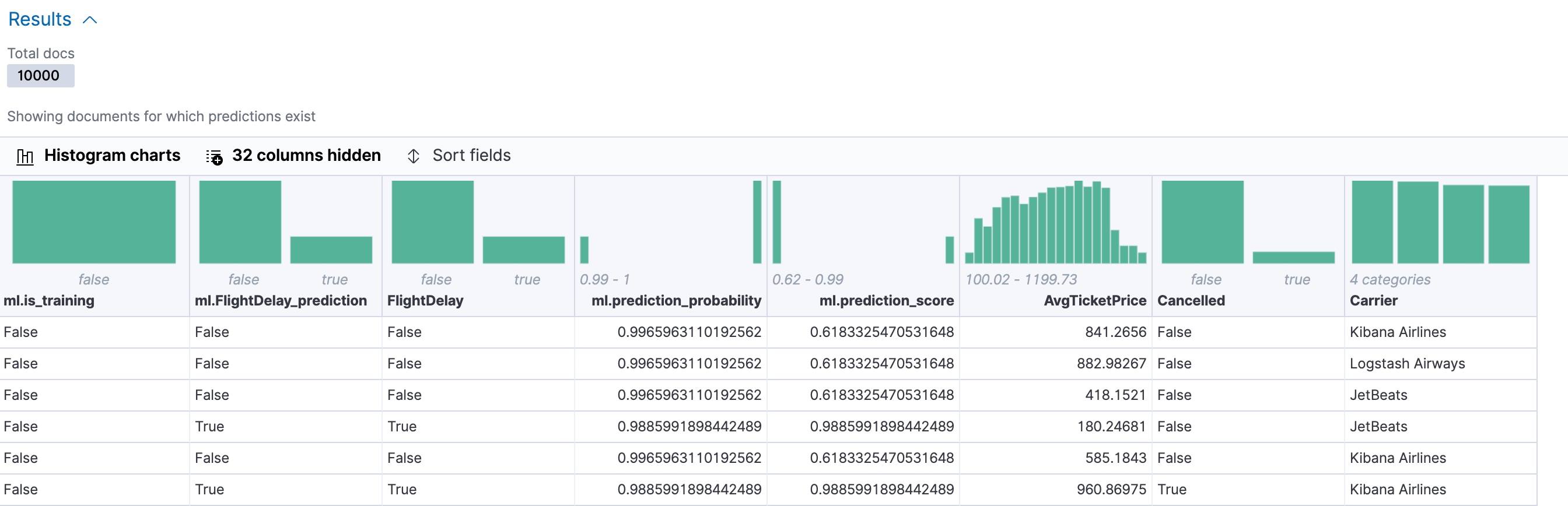
In this example, the table shows a column for the dependent variable
(FlightDelay), which contains the ground truth values that you are trying to
predict. It also shows a column for the predicted values
(ml.FlightDelay_prediction), which were generated by the classification analysis. The
ml.is_training column indicates whether the document was used in the training
or testing data set. You can use the Training and Testing filter options to
refine the contents of the results table. You can also enable histogram charts
to get a better understanding of the distribution of values in your data.
If you want to understand how certain the model is about each prediction, you
can examine its probability and score (ml.prediction_probability and
ml.prediction_score). The higher these values are, the more confident the
model is that the data point belongs to the named class. If you examine the
destination index more closely in the Discover app in Kibana or use the
standard Elasticsearch search command, you can see that the analysis predicts the
probability of all possible classes for the dependent variable. The
top_classes object contains the predicted classes with the highest scores.
If you have a large number of classes, your destination index contains a
large number of predicted probabilities for each document. When you create the
classification job, you can use the num_top_classes option to modify this
behavior.
API example
GET model-flight-delay-classification/_search
The snippet below shows the probability and score details for a document in the destination index:
          ...
          "FlightDelay" : false,
          ...
          "ml" : {
            "FlightDelay_prediction" : false,
            "top_classes" : [
              {
                "class_name" : false,
                "class_probability" : 0.9427605087816684,
                "class_score" : 0.3462468700158476
              },
              {
                "class_name" : true,
                "class_probability" : 0.057239491218331606,
                "class_score" : 0.057239491218331606
              }
            ],
            "prediction_probability" : 0.9427605087816684,
            "prediction_score" : 0.3462468700158476,
            ...
The class with the highest score is the prediction. In this example, false has
a class_score of 0.35 while true has only 0.06, so the prediction will be
false. For more details about these values, see
Interpreting classification results.
If you chose to calculate feature importance, the destination index also contains
ml.feature_importance objects. Every field that is included in the
classification analysis (known as a feature of the data point) is assigned a feature importance
value. This value has both a magnitude and a direction (positive or negative),
which indicates how each field affects a particular prediction. Only the most
significant values (in this case, the top 10) are stored in the index. However,
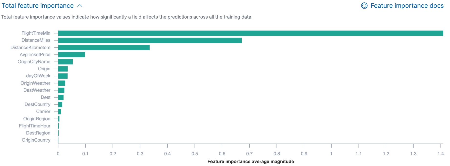
the trained model metadata also contains the average magnitude of the feature importance
values for each field across all the training data. You can view this
summarized information in Kibana:
You can also see the feature importance values for each individual prediction in the form of a decision plot:
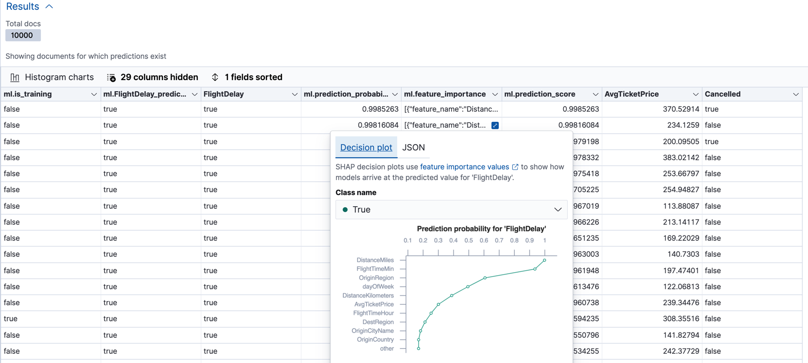
In Kibana, the decision path shows the relative impact of each feature on the probability of the prediction. The features with the most significant positive or negative impact appear at the top of the decision plot. Thus in this example, the features related to flight time and distance had the most significant influence on the probability value for this prediction. This type of information can help you to understand how models arrive at their predictions. It can also indicate which aspects of your data set are most influential or least useful when you are training and tuning your model.
If you do not use Kibana, you can see the summarized feature importance values by using the get trained model API and the individual values by searching the destination index.
API example
GET _ml/trained_models/model-flight-delay-classification*?include=total_feature_importance
The snippet below shows an example of the total feature importance and the corresponding baseline in the trained model metadata:
{
  "count" : 1,
  "trained_model_configs" : [
    {
      "model_id" : "model-flight-delay-classification-1601405047985",
      ...
      "metadata" : {
        ...
        "feature_importance_baseline" : {
          "classes" : [
            {
              "class_name" : true,
              "baseline" : -1.5869016940485443
            },
            {
              "class_name" : false,
              "baseline" : 1.5869016940485443
            }
          ]
        },
        "total_feature_importance" : [
          {
            "feature_name" : "dayOfWeek",
            "classes" : [
              {
                "class_name" : false,
                "importance" : {
                  "mean_magnitude" : 0.037513174351966404,
                  "min" : -0.20132653028125566,
                  "max" : 0.20132653028125566
                }
              },
              {
                "class_name" : true,
                "importance" : {
                  "mean_magnitude" : 0.037513174351966404,
                  "min" : -0.20132653028125566,
                  "max" : 0.20132653028125566
                }
              }
            ]
          },
          {
            "feature_name" : "OriginWeather",
            "classes" : [
              {
                "class_name" : false,
                "importance" : {
                  "mean_magnitude" : 0.05486662317369895,
                  "min" : -0.3337477336556598,
                  "max" : 0.3337477336556598
                }
              },
              {
                "class_name" : true,
                "importance" : {
                  "mean_magnitude" : 0.05486662317369895,
                  "min" : -0.3337477336556598,
                  "max" : 0.3337477336556598
                }
              }
            ]
          },
          ...
|
This object contains the baselines that are used to calculate the feature importance decision paths in Kibana. |
|
|
This value is the average of the absolute feature importance values for the
|
|
|
This value is the minimum feature importance value across all the training data for
this field when the predicted class is |
|
|
This value is the maximum feature importance value across all the training data for
this field when the predicted class is |
To see the top feature importance values for each prediction, search the destination index. For example:
GET model-flight-delay-classification/_search
The snippet below shows an example of the feature importance details for a document in the search results:
          ...
          "FlightDelay" : false,
          ...
          "ml" : {
            "FlightDelay_prediction" : false,
            ...
            "prediction_probability" : 0.9427605087816684,
            "prediction_score" : 0.3462468700158476,
            "feature_importance" : [
              {
                "feature_name" : "DistanceMiles",
                "classes" : [
                  {
                    "class_name" : false,
                    "importance" : -1.4766536146534828
                  },
                  {
                    "class_name" : true,
                    "importance" : 1.4766536146534828
                  }
                ]
              },
              {
                "feature_name" : "FlightTimeMin",
                "classes" : [
                  {
                    "class_name" : false,
                    "importance" : 1.0919201754729184
                  },
                  {
                    "class_name" : true,
                    "importance" : -1.0919201754729184
                  }
                ]
              },
              ...
The sum of the feature importance values for each class in this data point approximates the logarithm of its odds.
Evaluating classification results
editThough you can look at individual results and compare the predicted value
(ml.FlightDelay_prediction) to the actual value (FlightDelay), you
typically need to evaluate the success of your classification model as a
whole.
Kibana provides a normalized confusion matrix that contains the percentage of occurrences where the analysis classified data points correctly with their actual class and the percentage of occurrences where it misclassified them.
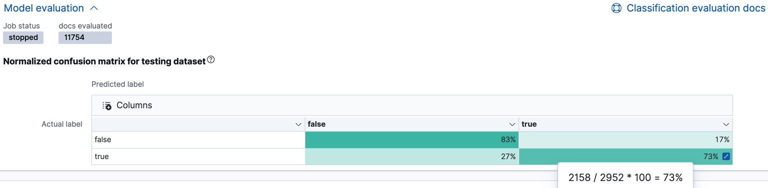
As the sample data may change when it is loaded into Kibana, the results of the classification analysis can vary even if you use the same configuration as the example. Therefore, use this information as a guideline for interpreting your own results.
If you want to see the exact number of occurrences, select a quadrant in the
matrix. You can also use the Training and Testing filter options to refine
the contents of the matrix. Thus you can see how well the model performs on
previously unseen data. In this example, there are 2952 documents in the testing
data that have the true class. 794 of them are
predicted as false; this is called a false negative. 2158 are predicted
correctly as true; this is called a true positive. The confusion matrix
therefore shows us that 27% of the actual true values were correctly
predicted and 73% were incorrectly predicted in the test data set.
Likewise if you select other quadrants in the matrix, it shows the number of
documents that have the false class as their actual value in the testing data
set. In this example, the model labeled 7262 documents out of 8802 correctly as
false; this is called a true negative. 1540 documents are predicted
incorrectly as true; this is called a false positive. Thus 83% of the actual
false values were correctly predicted and 17% were incorrectly predicted in
the test data set. When you perform classification analysis on your own data, it might
take multiple iterations before you are satisfied with the results and ready to
deploy the model.
You can also generate these metrics with the data frame analytics evaluate API. For more information about interpreting the evaluation metrics, see Classification evaluation.
API example
First, we want to know the training error that represents how well the model performed on the training data set.
POST _ml/data_frame/_evaluate
{
 "index": "model-flight-delay-classification",
   "query": {
    "term": {
      "ml.is_training": {
        "value": true
      }
    }
  },
 "evaluation": {
   "classification": {
     "actual_field": "FlightDelay",
     "predicted_field": "ml.FlightDelay_prediction",
     "metrics": {
       "multiclass_confusion_matrix" : {}
     }
   }
 }
}
Next, we calculate the generalization error that represents how well the model performed on previously unseen data:
POST _ml/data_frame/_evaluate
{
 "index": "model-flight-delay-classification",
   "query": {
    "term": {
      "ml.is_training": {
        "value": false
      }
    }
  },
 "evaluation": {
   "classification": {
     "actual_field": "FlightDelay",
     "predicted_field": "ml.FlightDelay_prediction",
     "metrics": {
       "multiclass_confusion_matrix" : {}
     }
   }
 }
}
The returned confusion matrix shows us how many data points were classified
correctly (where the actual_class matches the predicted_class) and how many
were misclassified (actual_class does not match predicted_class):
{
  "classification" : {
    "multiclass_confusion_matrix" : {
      "confusion_matrix" : [
        {
          "actual_class" : "false",
          "actual_class_doc_count" : 8802,
          "predicted_classes" : [
            {
              "predicted_class" : "false",
              "count" : 7262
            },
            {
              "predicted_class" : "true",
              "count" : 1540
            }
          ],
          "other_predicted_class_doc_count" : 0
        },
        {
          "actual_class" : "true",
          "actual_class_doc_count" : 2952,
          "predicted_classes" : [
            {
              "predicted_class" : "false",
              "count" : 794
            },
            {
              "predicted_class" : "true",
              "count" : 2158
            }
          ],
          "other_predicted_class_doc_count" : 0
        }
      ],
      "other_actual_class_count" : 0
    }
  }
}
When you have trained a satisfactory model, you can deploy it to make predictions about new data. Those steps are not covered in this example. See Inference.
If you don’t want to keep the data frame analytics job, you can delete it in Kibana or by using the delete data frame analytics job API. When you delete data frame analytics jobs in Kibana, you have the option to also remove the destination indices and index patterns.