IMPORTANT: No additional bug fixes or documentation updates
will be released for this version. For the latest information, see the
current release documentation.
Heat map
edit
IMPORTANT: This documentation is no longer updated. Refer to Elastic's version policy and the latest documentation.
Heat map
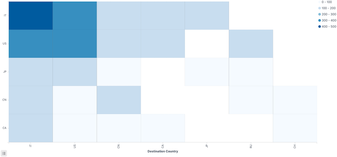
editDisplay graphical representations of data where the individual values are represented by colors. Use heat maps when your data set includes categorical data. For example, use a heat map to see the flights of origin countries compared to destination countries using the sample flight data.
Change the color ranges
editWhen only one color displays on the heat map, you might need to change the color ranges.
To specify the number of color ranges:
- Click Options.
- Enter the Number of colors to display.
To specify custom ranges:
- Click Options.
- Select Use custom ranges.
- Enter the ranges to display.