TSVB
editTSVB
editTSVB is a time series data visualizer that allows you to use the full power of the Elasticsearch aggregation framework. With TSVB, you can combine an infinite number of aggregations to display complex data.
In Elasticsearch version 7.3.0 and later, the time series data visualizer is now referred to as TSVB instead of Time Series Visual Builder.
Types of TSVB visualizations
editTSVB comes with these types of visualizations:
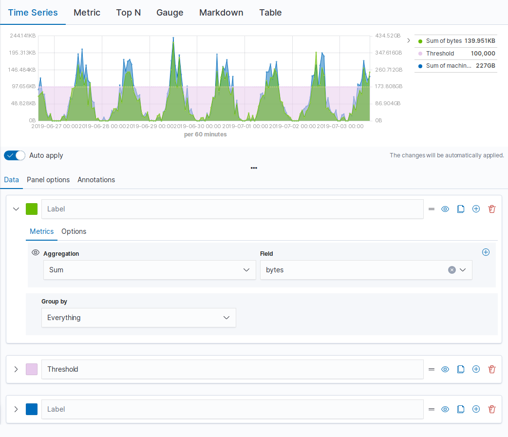
- Time Series
- A histogram visualization that supports area, line, bar, and steps along with multiple y-axis.
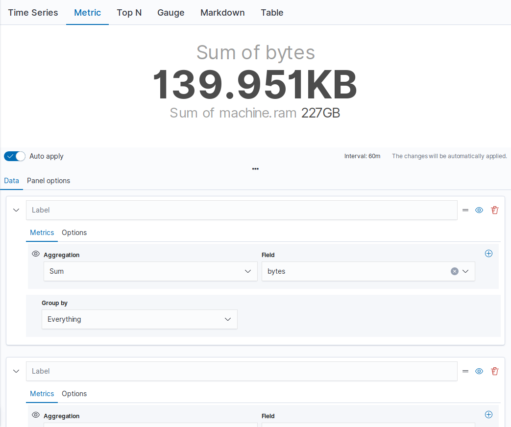
- Metric
- A metric that displays the latest number in a data series.
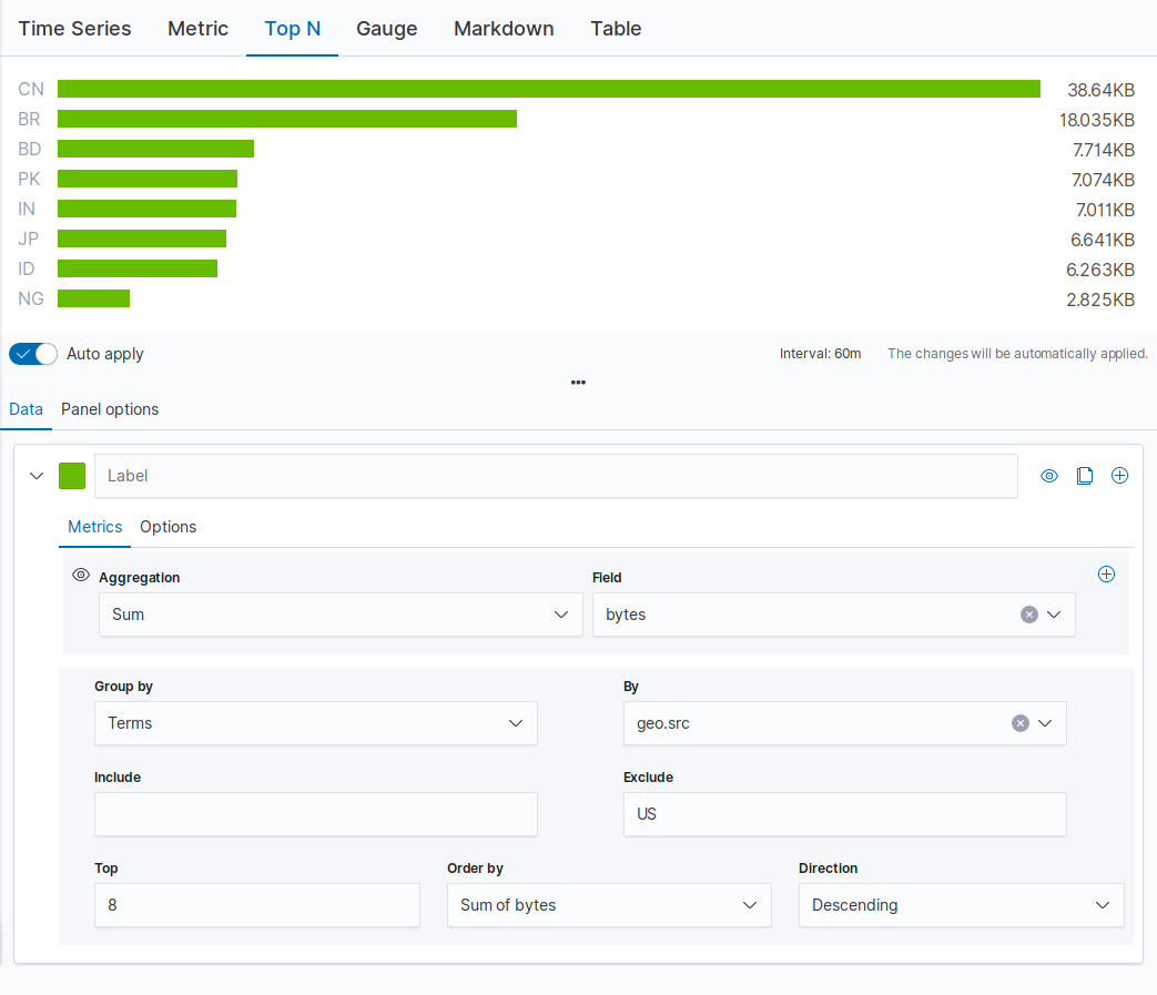
- Top N
- A horizontal bar chart where the y-axis is based on a series of metrics, and the x-axis is the latest value in the series.
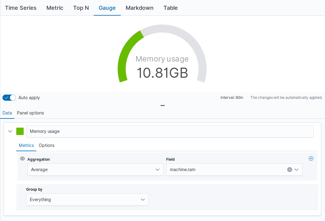
- Gauge
- A single value gauge visualization based on the latest value in a series.
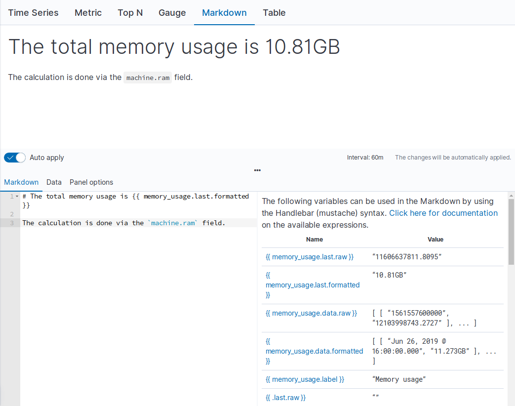
- Markdown
- Edit the data using using Markdown text and Mustache template syntax.
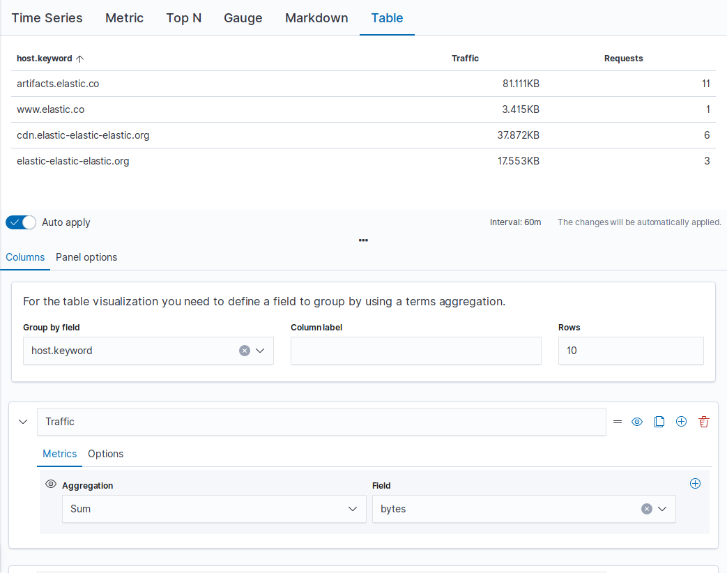
- Table
- Display data from multiple time series by defining the field group to show in the rows, and the columns of data to display.
Supported aggregations
editTSVB supports the following aggregations:
Create TSVB visualizations
editTo create a TSVB visualization, choose the data series you want to display, then choose how you want to display the data. The options available are dependent on the visualization.
Configure the data series
editTo create a single metric, add multiple data series with multiple aggregations.
- Select the visualization type.
-
Specify the data series labels and colors.
-
Select Data.
If you are using the Table visualization, select Columns.
-
In the Label field, enter a name for the data series, which is used on legends and titles.
For series that are grouped by a term, you can specify a mustache variable of
{{key}}to substitute the term. - If supported by the visualization, click the swatch and choose a color for the data series.
- To add another data series, click +, then repeat the steps to specify the labels and colors.
-
-
Specify the data series metrics.
- Select Metrics.
- From the dropdown lists, choose your options.
-
To add another metric, click +.
When you add more than one metric, the last metric value is displayed, which is indicated by the eye icon.
- To specify the format and display options, select Options.
-
To specify how to group or split the data, choose an option from the Group by drop down list.
By default, the data series are grouped by everything.
Configure the panel
editChange the data that you want to display and choose the style options for the panel.
- Select Panel options.
- Under Data, specify how much of the data that you want to display in the visualization.
- Under Style, specify how you want the visualization to look.
Add annotations
editIf you are using the Time Series visualization, add annotation data sources.
- Select Annotations.
- Click Add data source, then specify the options.
Enter Markdown text
editEdit the source for the Markdown visualization.
- Select Markdown.
- In the editor, enter enter your Markdown text, then press Enter.
-
To insert the mustache template variable into the editor, click the variable name.
The mustache syntax uses the Handlebar.js processor, which is an extended version of the Mustache template language.