Timelion
editTimelion
editTo use Timelion, you define a graph by chaining functions together, using the Timelion-specific syntax. The syntax enables some features that classical point series charts don’t offer, such as pulling data from different indices or data sources into one graph.
Timelion is driven by a simple expression language that you use to:
- Retrieve time series data from one or more indices
- Perform math across two or more time series
- Visualize the results
Deprecated in 7.0.0.
Timelion is still supported. The Timelion app is deprecated in 7.0, replaced by dashboard features. In 7.16 and later, the Timelion app is removed from Kibana. To prepare for the removal of Timelion app, you must migrate Timelion app worksheets to a dashboard. For information on how to migrate Timelion app worksheets, refer to Migrate Timelion app worksheets.
Timelion expressions
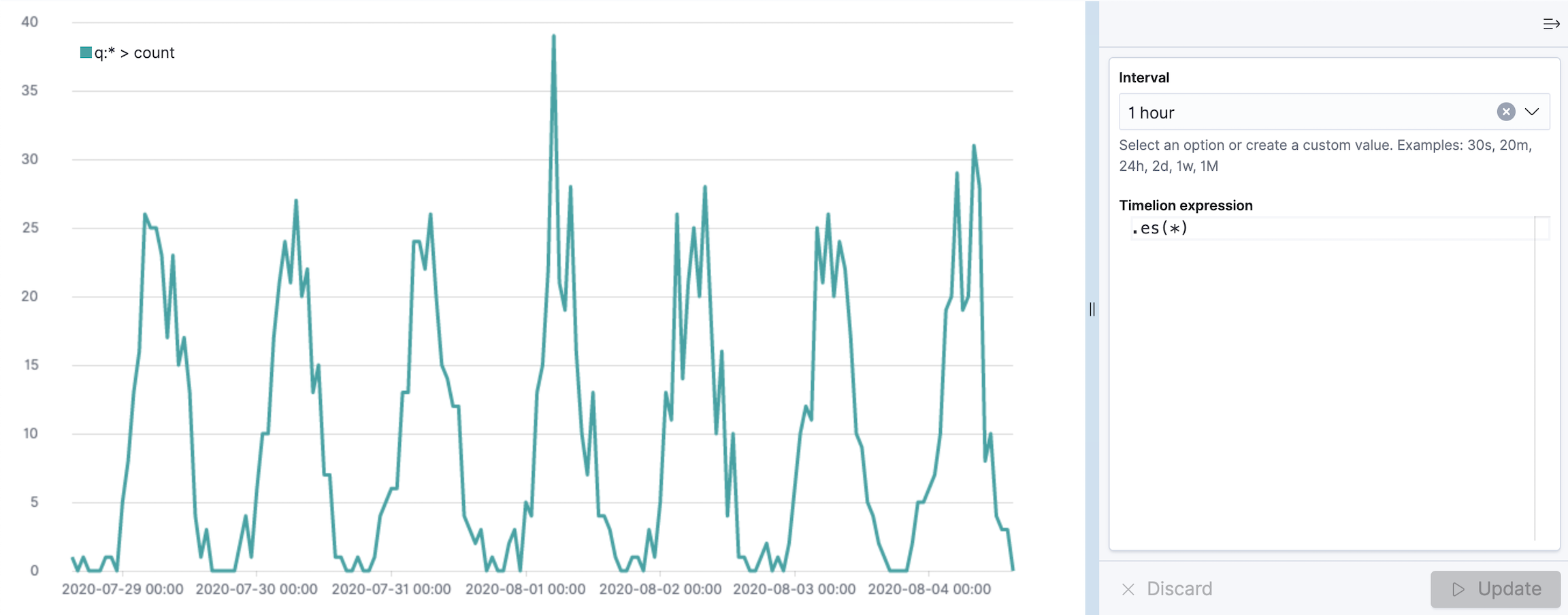
editTimelion functions always start with a dot, followed by the function name, followed by parentheses containing all the parameters to the function.
The .es (or .elasticsearch if you are a fan of typing long words) function gathers data from Elasticsearch and draws it over time. By default the .es function will just count the number of documents, resulting in a graph showing the amount of documents over time.
Function parameters
editFunctions can have multiple parameters, and so does the .es function. Each parameter has a name, that you can use inside the parentheses to set its value. The parameters also have an order, which is shown by the autocompletion or the documentation (using the Docs button in the top menu).
If you don’t specify the parameter name, timelion assigns the values to the parameters in the order, they are listed in the documentation.
The fist parameter of the .es function is the parameter q (for query), which is a Query String used to filter the data for this series. You can also explicitly reference this parameter by its name, and I would always recommend doing so as soon as you are passing more than one parameter to the function. The following two expressions are thus equivalent:
es(q=*)Multiple parameters are separated by comma. The .es function has another parameter called index, that can be used to specify an index pattern for this series, so the query won’t be executed again all indexes (or whatever you changed the above mentioned setting to).
es(q=, index=logstash-)If the value of your parameter contains spaces or commas you have to put the value in single or double quotes. You can omit these quotes otherwise.
.yaxis() function
editKibana supports many y-axis scales and ranges for your data series.
The .yaxis() function supports the following parameters:
-
yaxis — The numbered y-axis to plot the series on. For example, use
.yaxis(2)to display a second y-axis. - min — The minimum value for the y-axis range.
- max — The maximum value for the y-axis range.
-
position — The location of the units. Values include
leftorright. - label — The label for the axis.
- color — The color of the axis label.
-
units — The function to use for formatting the y-axis labels. Values include
bits,bits/s,bytes,bytes/s,currency(:ISO 4217 currency code),percent, andcustom(:prefix:suffix). - tickDecimals — The tick decimal precision.
Example:
.es(index= kibana_sample_data_logs,
    timefield='@timestamp',
    metric='avg:bytes')
  .label('Average Bytes for request')
  .title('Memory consumption over time in bytes').yaxis(1,units=bytes,position=left),
.es(index= kibana_sample_data_logs,
    timefield='@timestamp',
    metric=avg:machine.ram)
  .label('Average Machine RAM amount').yaxis(2,units=bytes,position=right)
|
|
|
|
|
Tutorial: Create visualizations with Timelion
editYou collected data from your operating system using Metricbeat, and you want to visualize and analyze the data on a dashboard. To create panels of the data, use Timelion to create a time series visualization,
Add the data and create the dashboard
editSet up Metricbeat, then create the dashboard.
- To set up Metricbeat, go to Metricbeat quick start: installation and configuration
- From Kibana, open the main menu, then click Dashboard.
- On the Dashboards page, click Create dashboard.
Open and set up Timelion
editOpen Timelion and change the time range.
- On the dashboard, click All types > Aggregation based, then select Timelion.
- Make sure the time filter is Last 7 days.
Create a time series visualization
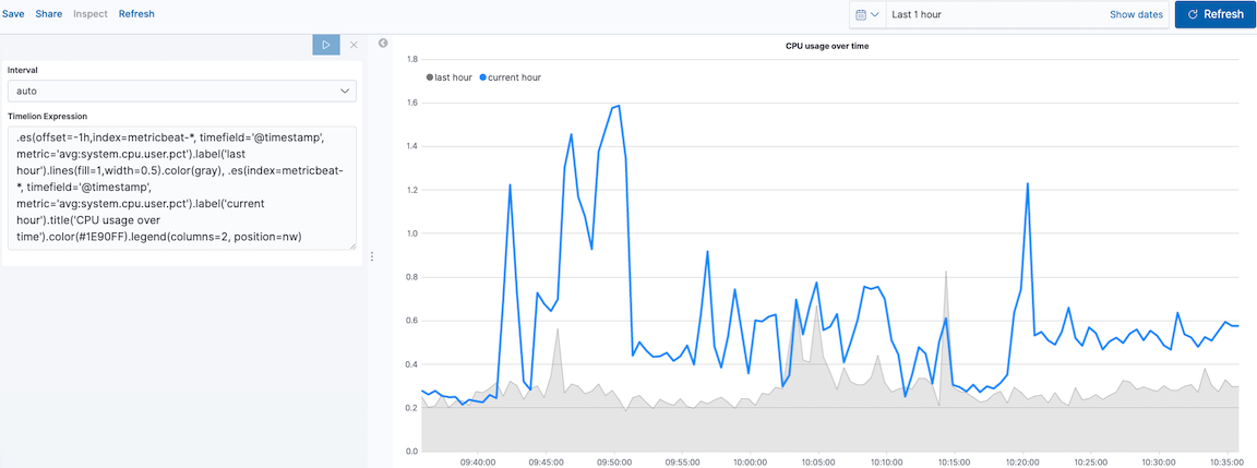
editTo compare the real-time percentage of CPU time spent in user space to the results offset by one hour, create a time series visualization.
Define the functions
editTo track the real-time percentage of CPU, enter the following in the Timelion Expression field, then click Update:
.es(index=metricbeat-*,
    timefield='@timestamp',
    metric='avg:system.cpu.user.pct')
Compare the data
editTo compare two data sets, add another series, and offset the data back by one hour, then click Update:
.es(index=metricbeat-*,
    timefield='@timestamp',
    metric='avg:system.cpu.user.pct'),
.es(offset=-1h,
    index=metricbeat-*,
    timefield='@timestamp',
    metric='avg:system.cpu.user.pct')
Add label names
editTo easily distinguish between the two data sets, add label names, then click Update:
.es(offset=-1h,index=metricbeat-*,
    timefield='@timestamp',
    metric='avg:system.cpu.user.pct').label('last hour'),
.es(index=metricbeat-*,
    timefield='@timestamp',
    metric='avg:system.cpu.user.pct').label('current hour')
Add a title
editTo make is easier for unfamiliar users to understand the purpose of the visualization, add a title, then click Update:
.es(offset=-1h,
    index=metricbeat-*,
    timefield='@timestamp',
    metric='avg:system.cpu.user.pct')
  .label('last hour'),
.es(index=metricbeat-*,
    timefield='@timestamp',
    metric='avg:system.cpu.user.pct')
  .label('current hour')
  .title('CPU usage over time')
Change the appearance of the chart lines
editTo differentiate between the current hour and the last hour, change the appearance of the chart lines, then click Update:
.es(offset=-1h,
    index=metricbeat-*,
    timefield='@timestamp',
    metric='avg:system.cpu.user.pct')
  .label('last hour')
  .lines(fill=1,width=0.5),
.es(index=metricbeat-*,
    timefield='@timestamp',
    metric='avg:system.cpu.user.pct')
  .label('current hour')
  .title('CPU usage over time')
Change the line colors
editTimelion supports standard color names, hexadecimal values, or a color schema for grouped data.
To make the first data series stand out, change the line colors, then click Update:
.es(offset=-1h,
    index=metricbeat-*,
    timefield='@timestamp',
    metric='avg:system.cpu.user.pct')
  .label('last hour')
  .lines(fill=1,width=0.5)
  .color(gray),
.es(index=metricbeat-*,
    timefield='@timestamp',
    metric='avg:system.cpu.user.pct')
  .label('current hour')
  .title('CPU usage over time')
  .color(#1E90FF)
Adjust the legend
editMove the legend to the north west position with two columns, then click Update:
.es(offset=-1h,
    index=metricbeat-*,
    timefield='@timestamp',
    metric='avg:system.cpu.user.pct')
  .label('last hour')
  .lines(fill=1,width=0.5)
  .color(gray),
.es(index=metricbeat-*,
    timefield='@timestamp',
    metric='avg:system.cpu.user.pct')
  .label('current hour')
  .title('CPU usage over time')
  .color(#1E90FF)
  .legend(columns=2, position=nw)
Save and add the panel
editSave the panel to the Visualize Library and add it to the dashboard, or add it to the dashboard without saving.
To save the panel to the Visualize Library:
- Click Save to library.
- Enter the Title and add any applicable Tags.
- Make sure that Add to Dashboard after saving is selected.
- Click Save and return.
To save the panel to the dashboard:
- Click Save and return.
-
Add an optional title to the panel.
- In the panel header, click No Title.
- On the Customize panel window, select Show panel title.
- Enter the Panel title, then click Save.
Visualize the inbound and outbound network traffic
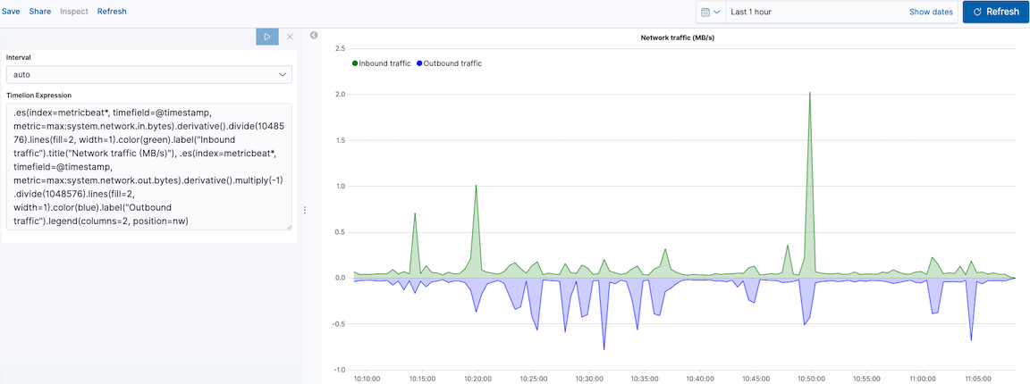
editTo create a visualization for inbound and outbound network traffic, use mathematical functions.
Define the functions
editTo start tracking the inbound and outbound network traffic, enter the following in the Timelion Expression field, then click Update:
.es(index=metricbeat*,
    timefield=@timestamp,
    metric=max:system.network.in.bytes)
Plot the rate of change
editTo easily monitor the inbound traffic, plots the change in values over time, then click Update:
.es(index=metricbeat*,
    timefield=@timestamp,
    metric=max:system.network.in.bytes)
  .derivative()
Add a similar calculation for outbound traffic, then click Update:
.es(index=metricbeat*,
    timefield=@timestamp,
    metric=max:system.network.in.bytes)
  .derivative(),
.es(index=metricbeat*,
    timefield=@timestamp,
    metric=max:system.network.out.bytes)
  .derivative()
  .multiply(-1)
|
|
Change the data metric
editTo make the data easier to analyze, change the data metric from bytes to megabytes, then click Update:
.es(index=metricbeat*,
    timefield=@timestamp,
    metric=max:system.network.in.bytes)
  .derivative()
  .divide(1048576),
.es(index=metricbeat*,
    timefield=@timestamp,
    metric=max:system.network.out.bytes)
  .derivative()
  .multiply(-1)
  .divide(1048576)
|
|
Customize and format the visualization
editCustomize and format the visualization using the following functions, then click Update:
.es(index=metricbeat*,
    timefield=@timestamp,
    metric=max:system.network.in.bytes)
  .derivative()
  .divide(1048576)
  .lines(fill=2, width=1)
  .color(green)
  .label("Inbound traffic")
  .title("Network traffic (MB/s)"),
.es(index=metricbeat*,
    timefield=@timestamp,
    metric=max:system.network.out.bytes)
  .derivative()
  .multiply(-1)
  .divide(1048576)
  .lines(fill=2, width=1)
  .color(blue)
  .label("Outbound traffic")
  .legend(columns=2, position=nw)
Save and add the panel
editSave the panel to the Visualize Library and add it to the dashboard, or add it to the dashboard without saving.
To save the panel to the Visualize Library:
- Click Save to library.
- Enter the Title and add any applicable Tags.
- Make sure that Add to Dashboard after saving is selected.
- Click Save and return.
To save the panel to the dashboard:
- Click Save and return.
-
Add an optional title to the panel.
- In the panel header, click No Title.
- On the Customize panel window, select Show panel title.
- Enter the Panel title, then click Save.
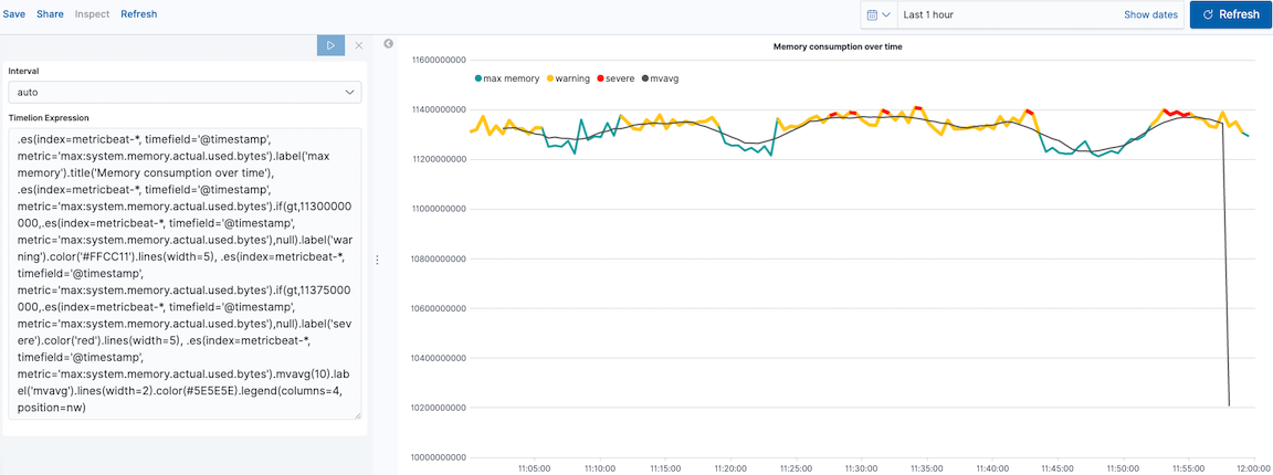
Detect outliers and discover patterns over time
editTo easily detect outliers and discover patterns over time, modify the time series data with conditional logic and create a trend with a moving average.
With Timelion conditional logic, you can use the following operator values to compare your data:
|
|
equal |
|
|
not equal |
|
|
less than |
|
|
less than or equal to |
|
|
greater than |
|
|
greater than or equal to |
Define the functions
editTo chart the maximum value of system.memory.actual.used.bytes, enter the following in the Timelion Expression field, then click Update:
.es(index=metricbeat-*,
    timefield='@timestamp',
    metric='max:system.memory.actual.used.bytes')
Track used memory
editTo track the amount of memory used, create two thresholds, then click Update:
.es(index=metricbeat-*,
    timefield='@timestamp',
    metric='max:system.memory.actual.used.bytes'),
.es(index=metricbeat-*,
    timefield='@timestamp',
    metric='max:system.memory.actual.used.bytes')
  .if(gt,
      11300000000,
      .es(index=metricbeat-*,
          timefield='@timestamp',
          metric='max:system.memory.actual.used.bytes'),
      null)
    .label('warning')
    .color('#FFCC11'),
.es(index=metricbeat-*,
    timefield='@timestamp',
    metric='max:system.memory.actual.used.bytes')
  .if(gt,
      11375000000,
      .es(index=metricbeat-*,
          timefield='@timestamp',
          metric='max:system.memory.actual.used.bytes'),
      null)
  .label('severe')
  .color('red')
|
|
|
|
Timelion conditional logic for the greater than operator. In this example, the warning threshold is 11.3GB ( |
Determine the trend
editTo determine the trend, create a new data series, then click Update:
.es(index=metricbeat-*,
    timefield='@timestamp',
    metric='max:system.memory.actual.used.bytes'),
.es(index=metricbeat-*,
    timefield='@timestamp',
    metric='max:system.memory.actual.used.bytes')
  .if(gt,11300000000,
      .es(index=metricbeat-*,
          timefield='@timestamp',
          metric='max:system.memory.actual.used.bytes'),
      null)
      .label('warning')
      .color('#FFCC11'),
.es(index=metricbeat-*,
    timefield='@timestamp',
    metric='max:system.memory.actual.used.bytes')
  .if(gt,11375000000,
      .es(index=metricbeat-*,
          timefield='@timestamp',
          metric='max:system.memory.actual.used.bytes'),
      null).
      label('severe')
      .color('red'),
.es(index=metricbeat-*,
    timefield='@timestamp',
    metric='max:system.memory.actual.used.bytes')
  .mvavg(10)
|
|
Customize and format the visualization
editCustomize and format the visualization using the following functions, then click Update:
.es(index=metricbeat-*,
    timefield='@timestamp',
    metric='max:system.memory.actual.used.bytes')
  .label('max memory')
  .title('Memory consumption over time'),
.es(index=metricbeat-*,
    timefield='@timestamp',
    metric='max:system.memory.actual.used.bytes')
  .if(gt,
      11300000000,
      .es(index=metricbeat-*,
          timefield='@timestamp',
          metric='max:system.memory.actual.used.bytes'),
      null)
    .label('warning')
    .color('#FFCC11')
    .lines(width=5),
.es(index=metricbeat-*,
    timefield='@timestamp',
    metric='max:system.memory.actual.used.bytes')
  .if(gt,
      11375000000,
      .es(index=metricbeat-*,
          timefield='@timestamp',
          metric='max:system.memory.actual.used.bytes'),
      null)
    .label('severe')
    .color('red')
    .lines(width=5),
.es(index=metricbeat-*,
    timefield='@timestamp',
    metric='max:system.memory.actual.used.bytes')
  .mvavg(10)
  .label('mvavg')
  .lines(width=2)
  .color(#5E5E5E)
  .legend(columns=4, position=nw)
Save and add the panel
editSave the panel to the Visualize Library and add it to the dashboard, or add it to the dashboard without saving.
To save the panel to the Visualize Library:
- Click Save to library.
- Enter the Title and add any applicable Tags.
- Make sure that Add to Dashboard after saving is selected.
- Click Save and return.
To save the panel to the dashboard:
- Click Save and return.
-
Add an optional title to the panel.
- In the panel header, click No Title.
- On the Customize panel window, select Show panel title.
- Enter the Panel title, then click Save.
For more information about Timelion conditions, refer to I have but one .condition().