Bar chart
editBar chart
editYou’ll use a bar chart to look at the Shakespeare data set and compare the number of speaking parts in the plays.
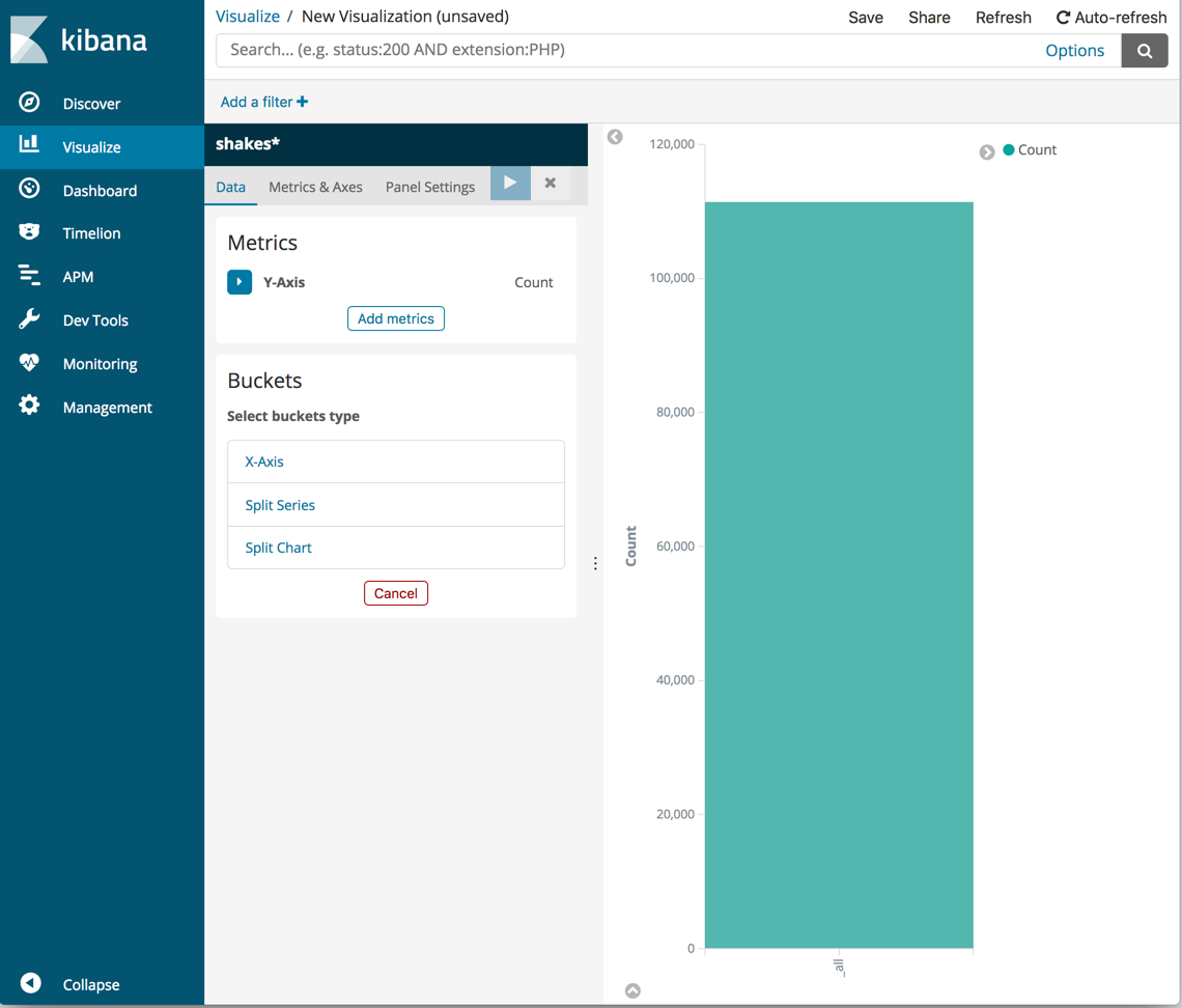
Create a Vertical Bar chart and set the search source to shakes*.
Initially, the chart is a single bar that shows the total count of documents that match the default wildcard query.
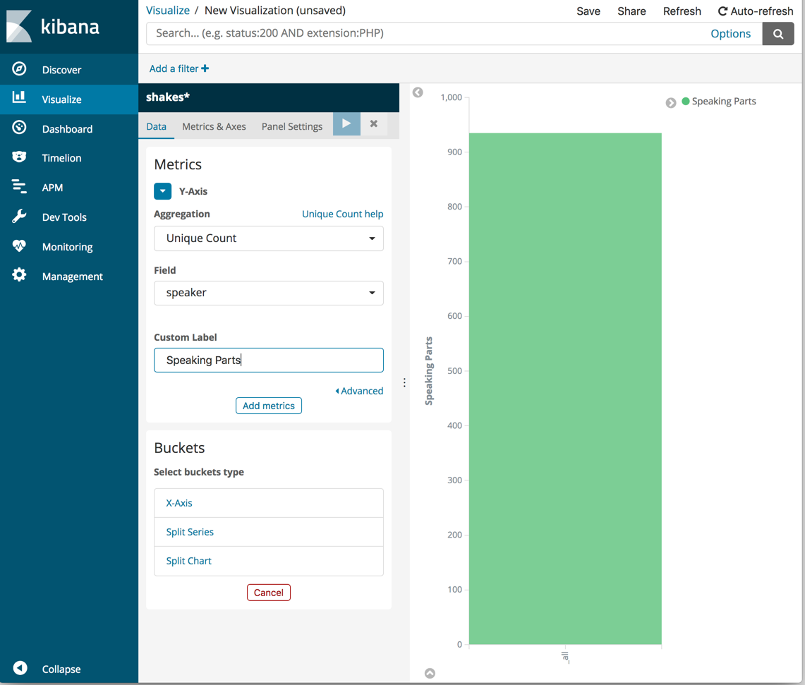
Show the number of speaking parts per play along the Y-axis. This requires you to configure the Y-axis metric aggregation. This aggregation computes metrics based on values from the search results.
- In the Metrics pane, expand Y-Axis.
- Set Aggregation to Unique Count.
- Set Field to speaker.
-
In the Custom Label box, enter
Speaking Parts. -
Click Apply changes
 .
.
Show the plays along the X-axis.
- In the Buckets pane, click X-Axis.
- Set Aggregation to Terms and Field to play_name.
- To list plays alphabetically, in the Order dropdown menu, select Ascending.
-
Give the axis a custom label,
Play Name. -
Click Apply changes .
Hovering over a bar shows a tooltip with the number of speaking parts for that play.
Notice how the individual play names show up as whole phrases, instead of
broken into individual words. This is the result of the mapping
you did at the beginning of the tutorial, when you marked the play_name field
as not analyzed.
Save this chart with the name Bar Example.