Pie Charts
editPie Charts
editThe slice size of a pie chart is determined by the metrics aggregation. The following aggregations are available for this axis:
- Count
- The count aggregation returns a raw count of the elements in the selected index pattern.
- Sum
- The sum aggregation returns the total sum of a numeric field. Select a field from the drop-down.
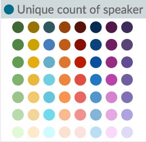
- Unique Count
- The cardinality aggregation returns the number of unique values in a field. Select a field from the drop-down.
Enter a string in the Custom Label field to change the display label.
The buckets aggregations determine what information is being retrieved from your data set.
Before you choose a buckets aggregation, specify if you are splitting slices within a single chart or splitting into multiple charts. A multiple chart split must run before any other aggregations. When you split a chart, you can change if the splits are displayed in a row or a column by clicking the Rows | Columns selector.
You can specify any of the following bucket aggregations for your pie chart:
- Date Histogram
- A date histogram is built from a numeric field and organized by date. You can specify a time frame for the intervals in seconds, minutes, hours, days, weeks, months, or years. You can also specify a custom interval frame by selecting Custom as the interval and specifying a number and a time unit in the text field. Custom interval time units are s for seconds, m for minutes, h for hours, d for days, w for weeks, and y for years. Different units support different levels of precision, down to one second. Intervals are labeled at the start of the interval, using the date-key returned by Elasticsearch. For example, the tooltip for a monthly interval will show the first day of the month.
- Histogram
- A standard histogram is built from a numeric field. Specify an integer interval for this field. Select the Show empty buckets checkbox to include empty intervals in the histogram.
- Range
- With a range aggregation, you can specify ranges of values for a numeric field. Click Add Range to add a set of range endpoints. Click the red (x) symbol to remove a range.
- Date Range
- A date range aggregation reports values that are within a range of dates that you specify. You can specify the ranges for the dates using date math expressions. Click Add Range to add a set of range endpoints. Click the red (/) symbol to remove a range.
- IPv4 Range
- The IPv4 range aggregation enables you to specify ranges of IPv4 addresses. Click Add Range to add a set of range endpoints. Click the red (/) symbol to remove a range.
- Terms
- A terms aggregation enables you to specify the top or bottom n elements of a given field to display, ordered by count or a custom metric.
- Filters
-
You can specify a set of filters for the data.
You can specify a filter as a query string or in JSON format, just as in the Discover search bar. Click Add Filter to
add another filter. Click the
 label button to open the label field, where you can type
in a name to display on the visualization.
label button to open the label field, where you can type
in a name to display on the visualization.
- Significant Terms
- Displays the results of the experimental significant terms aggregation. The value of the Size parameter defines the number of entries this aggregation returns.
After defining an initial bucket aggregation, you can define sub-buckets to refine the visualization. Click + Add sub-buckets to define a sub-aggregation, then choose Split Slices to select a sub-bucket from the list of types.
When multiple aggregations are defined on a chart’s axis, you can use the up or down arrows to the right of the aggregation’s type to change the aggregation’s priority.
You can customize the colors of your visualization by clicking the color dot next to each label to display the color picker.
Enter a string in the Custom Label field to change the display label.
You can click the Advanced link to display more customization options for your metrics or bucket aggregation:
- Exclude Pattern
- Specify a pattern in this field to exclude from the results.
- Include Pattern
- Specify a pattern in this field to include in the results.
- JSON Input
- A text field where you can add specific JSON-formatted properties to merge with the aggregation definition, as in the following example:
{ "script" : "doc['grade'].value * 1.2" }
In Elasticsearch releases 1.4.3 and later, this functionality requires you to enable dynamic Groovy scripting.
The availability of these options varies depending on the aggregation you choose.
Select the Options tab to change the following aspects of the table:
- Donut
- Display the chart as a sliced ring instead of a sliced pie.
- Show Tooltip
- Check this box to enable the display of tooltips.
After changing options, click the Apply changes button to update your visualization, or the grey Discard changes button to keep your visualization in its current state.