IMPORTANT: No additional bug fixes or documentation updates
will be released for this version. For the latest information, see the
current release documentation.
Adding Input Controls
edit
IMPORTANT: This documentation is no longer updated. Refer to Elastic's version policy and the latest documentation.
Adding Input Controls
editTo start a Controls visualization, open the Visualization application and click the + button. Scroll to the Others section and select Controls.
In the visualization builder, choose the type of control to add to your visualization.
Dropdown menu
editA dropdown menu allows users to filter content by selecting one or more options from a list. The dropdown menu is dynamically populated with the results of a terms aggregation.
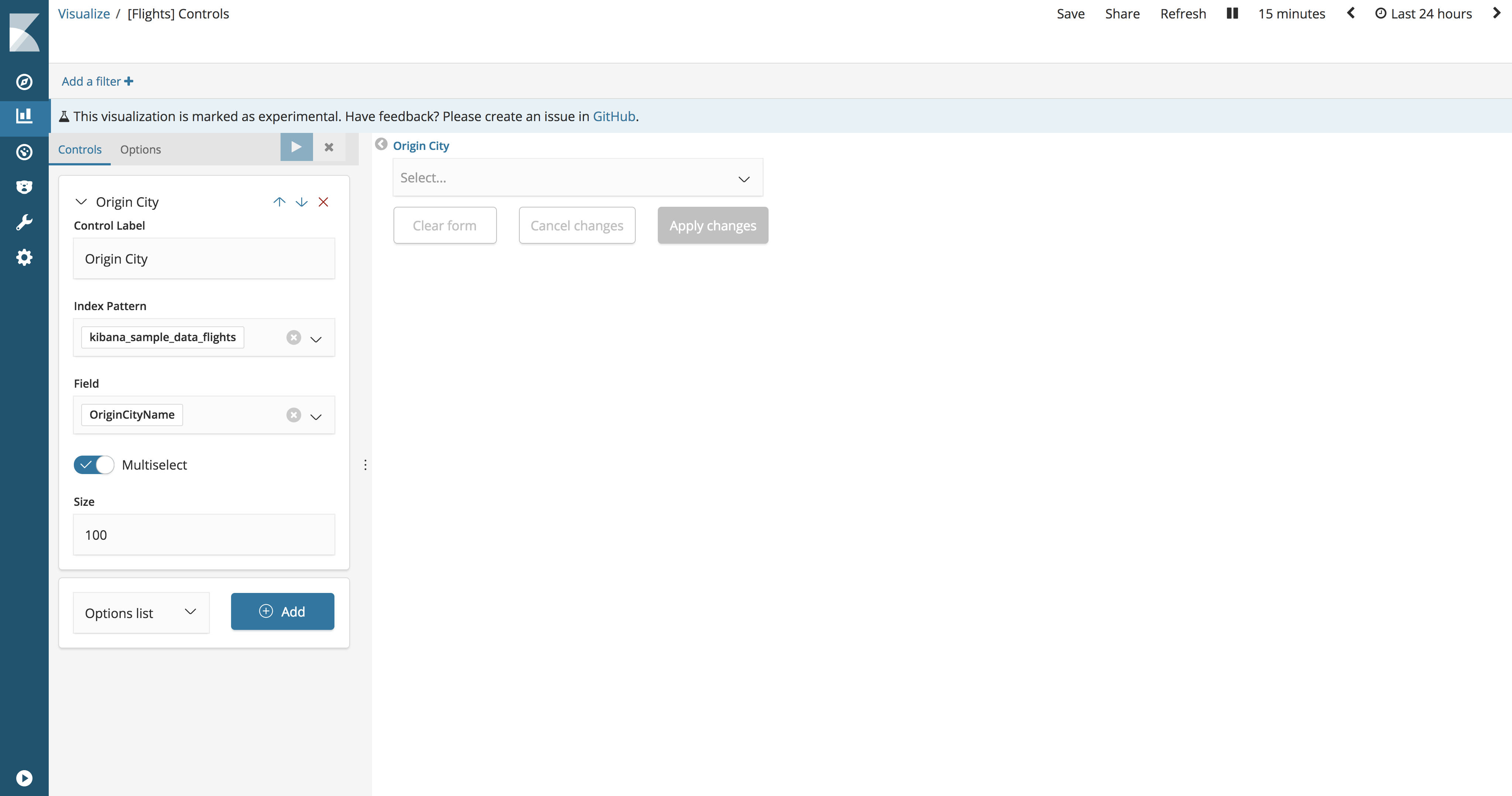
- Control Label
- The label for the dropdown menu. By default, the label is the field name.
- Index Pattern
- The index pattern that contains the data set to visualize.
- Field
- The field used to populate the list of options and filter on when users interact with the input. The list of available fields is derived from the specified index pattern.
- Parent control
- The control for chaining dropdown menus so that the selection in the first menu filters the terms in the second menu. Only available when creating multiple dropdown menus.
- Multiselect
- When enabled, the dropdown menu allows users to select multiple options.
- Size
- The number of options to include in the list.
Range slider
editA range sliders allow users to filter content within a range of numbers. The range slider minimum and maximum values are dynamically populated with the results of a min and max aggregation.
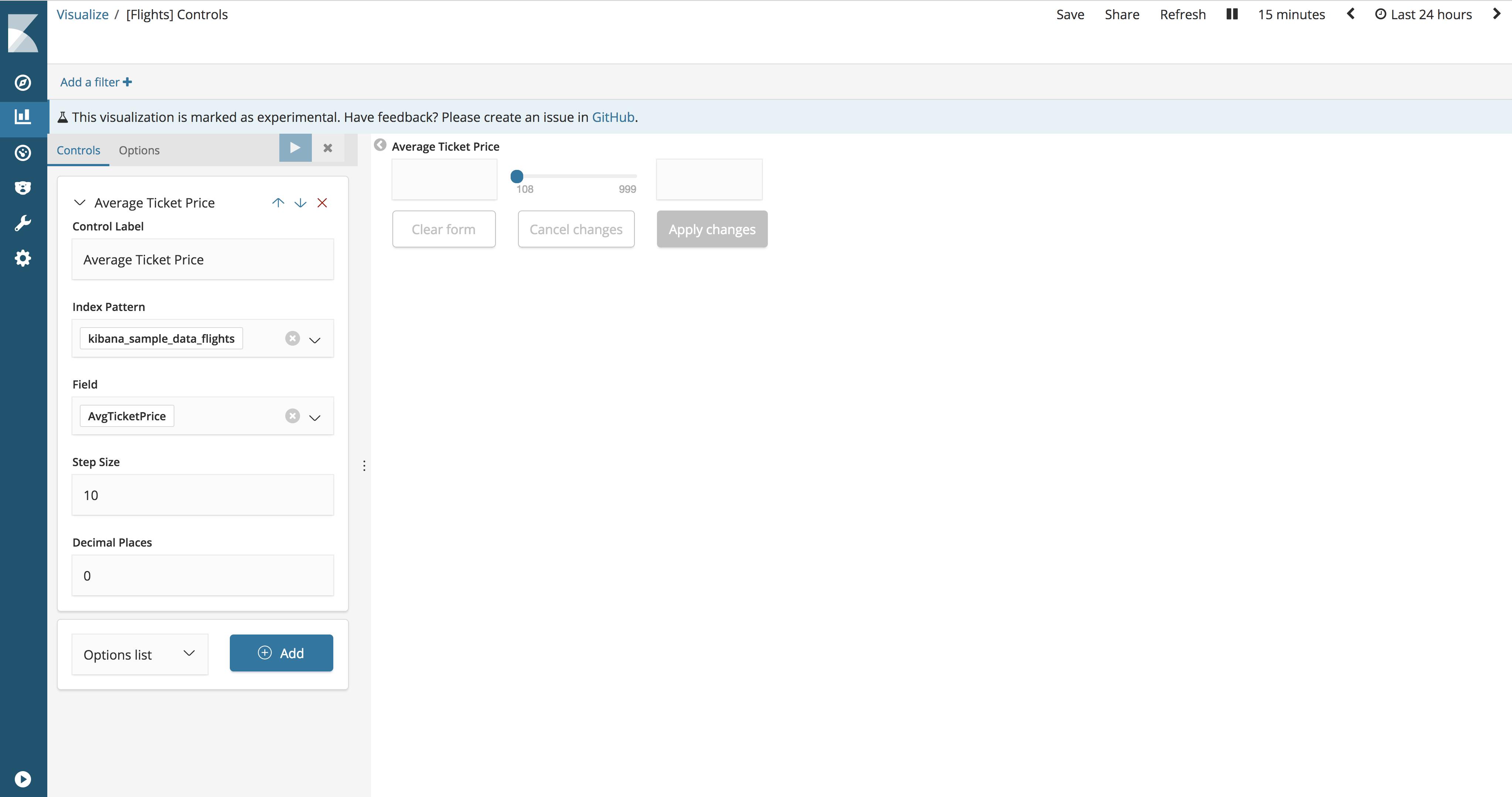
- Control Label
- The label for the range slider. By default, the label is the field name.
- Index Pattern
- The index pattern that contains the data set to visualize.
- Field
- The field used to populate the range slider and filter on when users interact with the input. The list of available fields is derived from the specified index pattern.
- Step Size
- The increment/decrement size of the slider.
- Decimal Places
- The number of decimal places.