WARNING: Version 6.2 of Kibana has passed its EOL date.
This documentation is no longer being maintained and may be removed. If you are running this version, we strongly advise you to upgrade. For the latest information, see the current release documentation.
Customize and format visualizations
editCustomize and format visualizations
editTimelion has plenty of options for customization. You can personalize nearly every aspect of a chart with the functions available. For this tutorial, you will perform the following modifications.
- Add a title
- Change a series type
- Change the color and opacity of a series
- Modify the legend
In the previous section, you created a Timelion chart with two series. Let’s continue to customize this visualization.
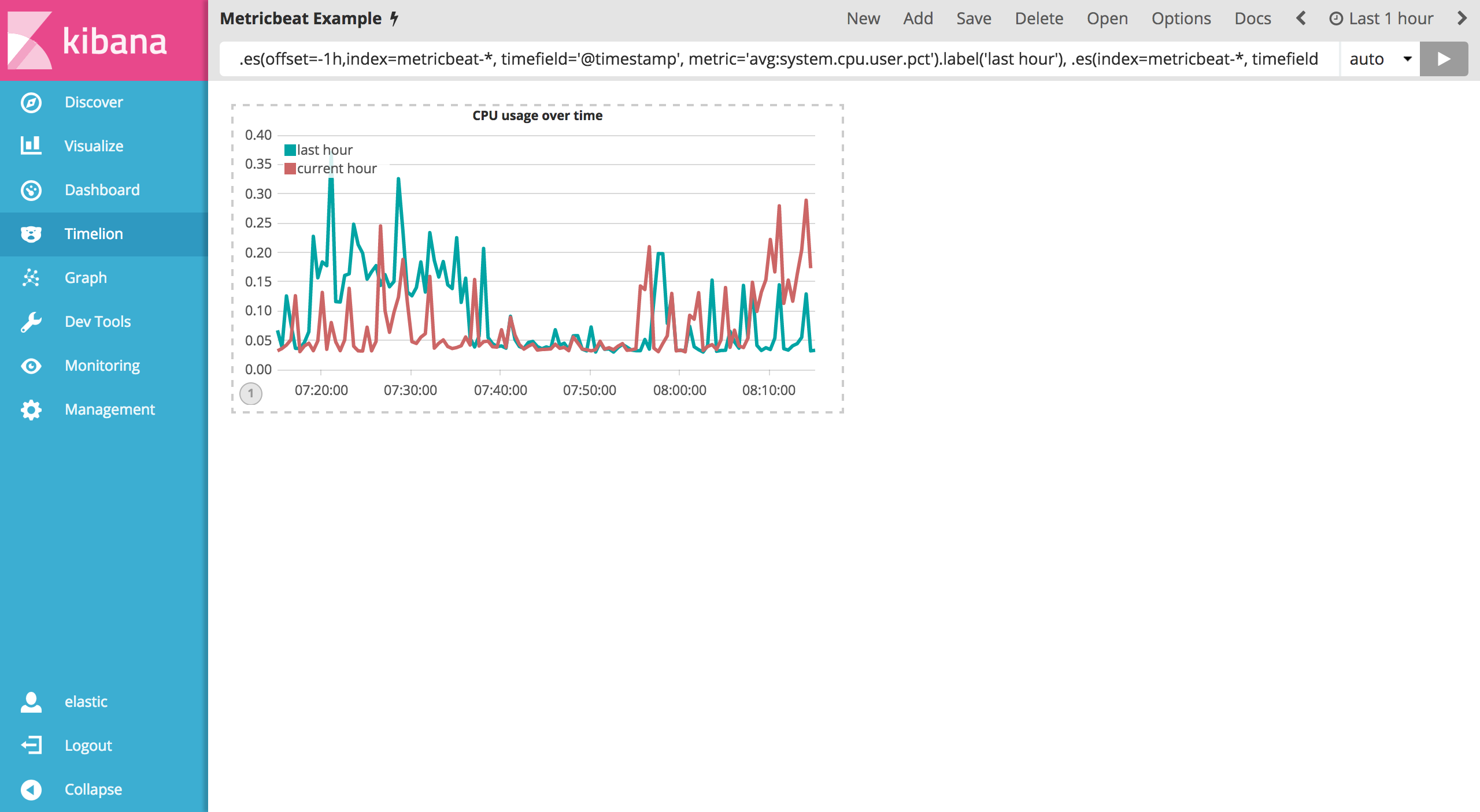
Before making any other modifications, append the title() function to the end of an expression to add a title with a meaningful name. This will make it much easier for unfamiliar users to understand the visualizations purpose. For this example, add title('CPU usage over time') to the original series. Use the following expression in your Timelion querybar:
.es(offset=-1h,index=metricbeat-*, timefield='@timestamp', metric='avg:system.cpu.user.pct').label('last hour'), .es(index=metricbeat-*, timefield='@timestamp', metric='avg:system.cpu.user.pct').label('current hour').title('CPU usage over time')
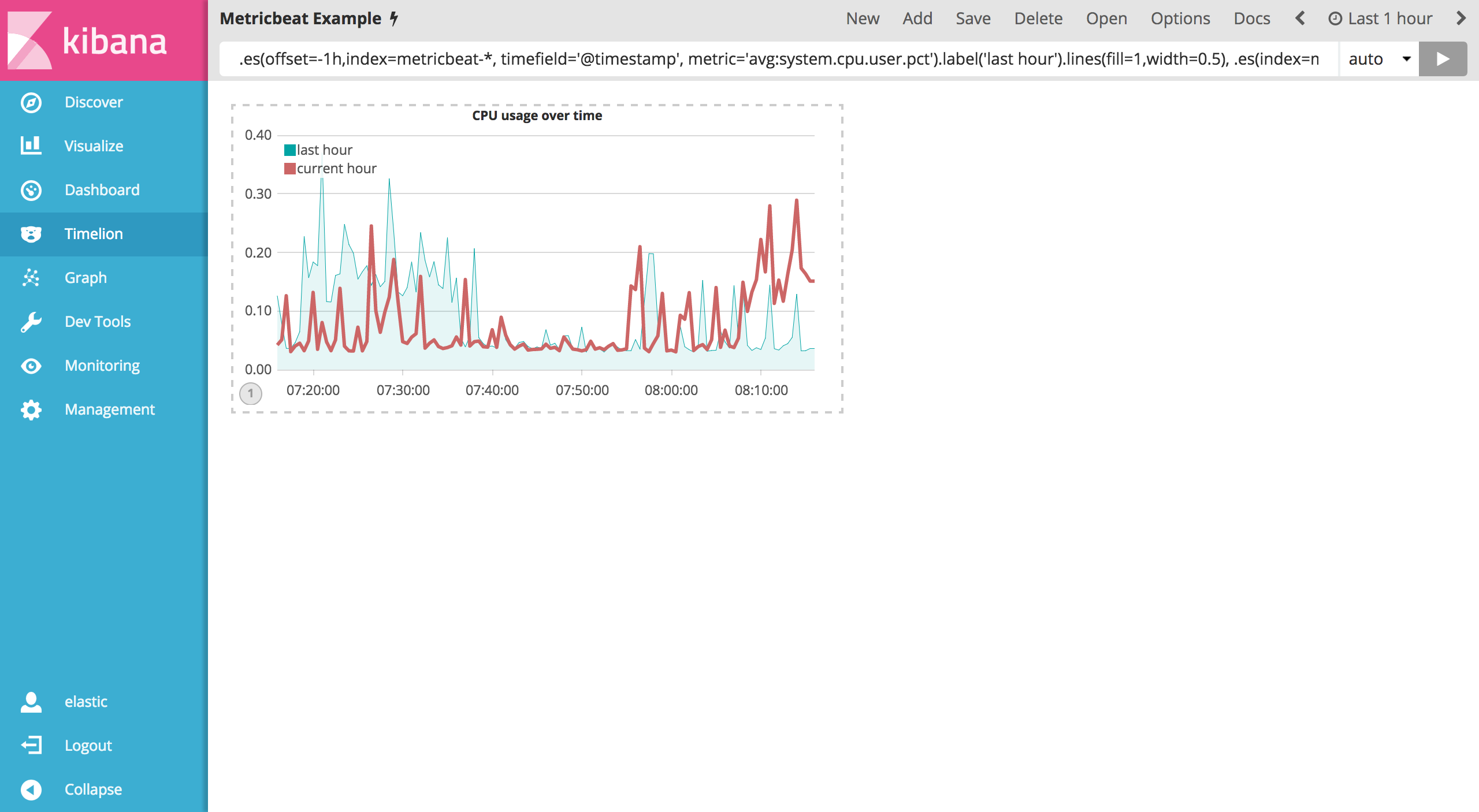
To differentiate the last hour series a bit more, you are going to change the chart type to an area chart. In order do so, you’ll need to use the .lines() function to customize the line chart. You’ll be setting the fill and width arguements to set the fill of the line chart and line width respectively. In this example, you will set the fill level to 1 and the width of the border to 0.5 by appending .lines(fill=1,width=0.5). Use the following expression in the Timelion query bar:
.es(offset=-1h,index=metricbeat-*, timefield='@timestamp', metric='avg:system.cpu.user.pct').label('last hour').lines(fill=1,width=0.5), .es(index=metricbeat-*, timefield='@timestamp', metric='avg:system.cpu.user.pct').label('current hour').title('CPU usage over time')
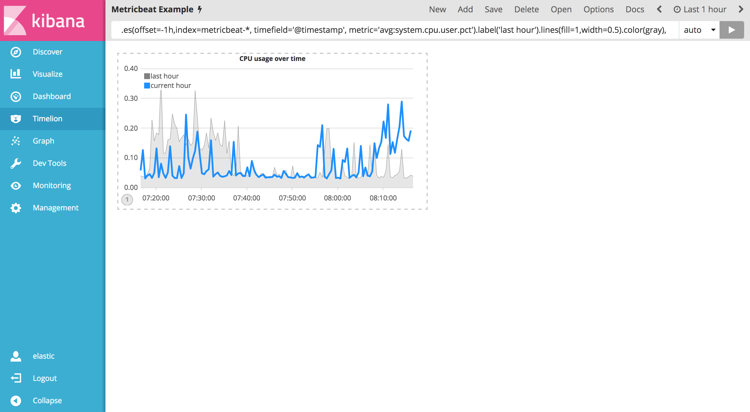
Let’s color these series so that the current hour series pops a bit more than the last hour series. The color() function can be used to change the color of any series and accepts standard color names, hexadecimal values or a color schema for grouped series. For this example you will use .color(gray) for the last hour and .color(#1E90FF) for the current hour. Enter the following expression into the Timelion query bar to make the adjustments:
.es(offset=-1h,index=metricbeat-*, timefield='@timestamp', metric='avg:system.cpu.user.pct').label('last hour').lines(fill=1,width=0.5).color(gray), .es(index=metricbeat-*, timefield='@timestamp', metric='avg:system.cpu.user.pct').label('current hour').title('CPU usage over time').color(#1E90FF)
Last but not least, adjust the legend so that it takes up as little space as possible. You can utilize the .legend() function to set the position and style of the legend. For this example, place the legend in the north west position of the visualization with two columns by appending .legend(columns=2, position=nw) to the original series. Use the following expression to make the adjustments:
.es(offset=-1h,index=metricbeat-*, timefield='@timestamp', metric='avg:system.cpu.user.pct').label('last hour').lines(fill=1,width=0.5).color(gray), .es(index=metricbeat-*, timefield='@timestamp', metric='avg:system.cpu.user.pct').label('current hour').title('CPU usage over time').color(#1E90FF).legend(columns=2, position=nw)

Save your changes and continue on to the next section to learn about mathematical functions.