WARNING: Version 6.2 of Kibana has passed its EOL date.
This documentation is no longer being maintained and may be removed. If you are running this version, we strongly advise you to upgrade. For the latest information, see the current release documentation.
Pie Chart
editPie Chart
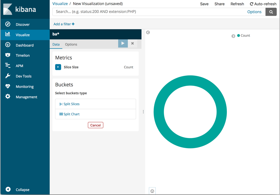
editInitially, the pie contains a single "slice." That’s because the default search matched all documents.
To specify which slices to display in the pie, you use an Elasticsearch bucket aggregation. This aggregation sorts the documents that match your search criteria into different categories, also known as buckets.
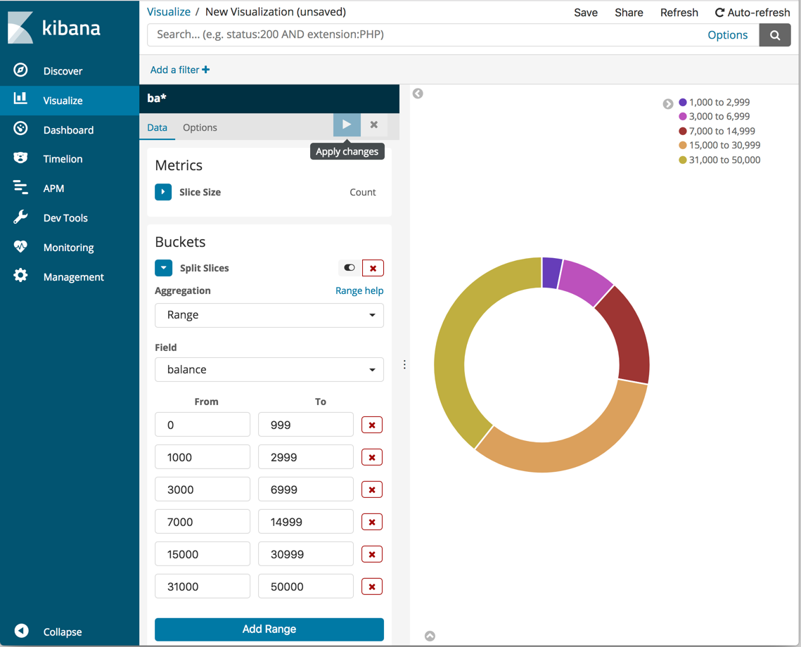
Use a bucket aggregation to establish multiple ranges of account balances and find out how many accounts fall into each range.
- In the Buckets pane, click Split Slices.
- In the Aggregation dropdown menu, select Range.
- In the Field dropdown menu, select balance.
- Click Add Range four times to bring the total number of ranges to six.
-
Define the following ranges:
0             999
1000         2999
3000         6999
7000        14999
15000       30999
31000       50000
-
Click Apply changes
 .
.
Now you can see what proportion of the 1000 accounts fall into each balance range.
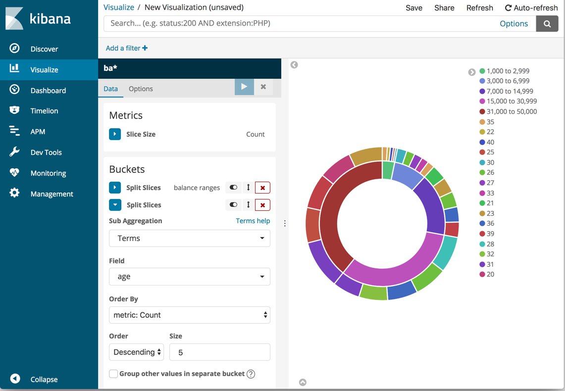
Add another bucket aggregation that looks at the ages of the account holders.
- At the bottom of the Buckets pane, click Add sub-buckets.
- In Select buckets type, click Split Slices.
- In the Sub Aggregation dropdown, select Terms.
- In the Field dropdown, select age.
-
Click Apply changes .
Now you can see the break down of the ages of the account holders, displayed in a ring around the balance ranges.
To save this chart so you can use it later, click Save in the top menu bar
and enter Pie Example.