WARNING: Version 6.0 of Kibana has passed its EOL date.
This documentation is no longer being maintained and may be removed. If you are running this version, we strongly advise you to upgrade. For the latest information, see the current release documentation.
Featured Visualizations
editFeatured Visualizations
editTime Series Visual Build comes with 5 different visualization types. You can switch between each visualization type using the tabbed picker at the top of the interface.
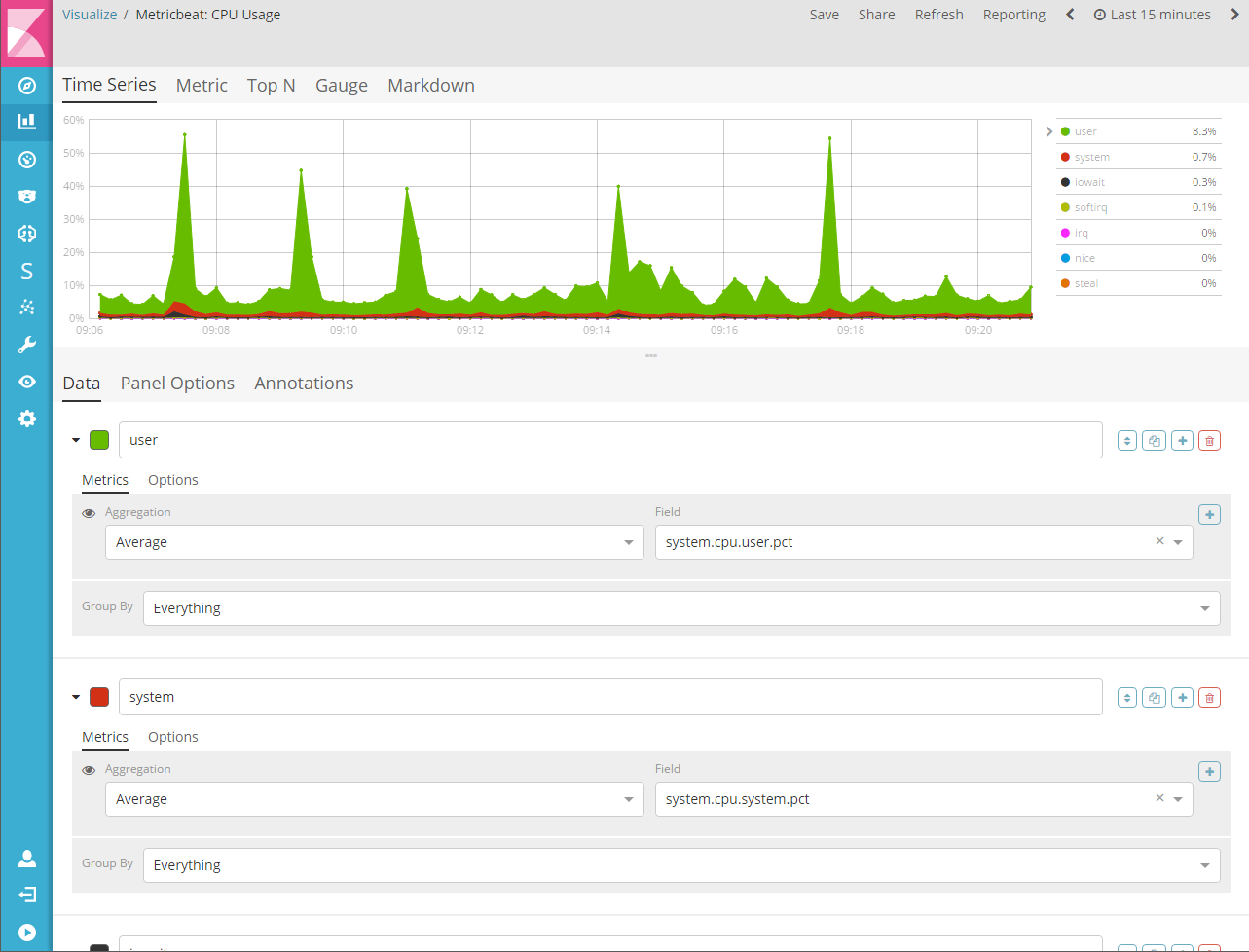
Time Series
editA histogram visualization that supports area, line, bar, and steps along with multiple y-axis. You can fully customize the colors, points, line thickness and fill opacity. This visualization also supports time shifting to compare two time periods. This visualization also supports annotations which can be loaded from a seperate index based on a query.
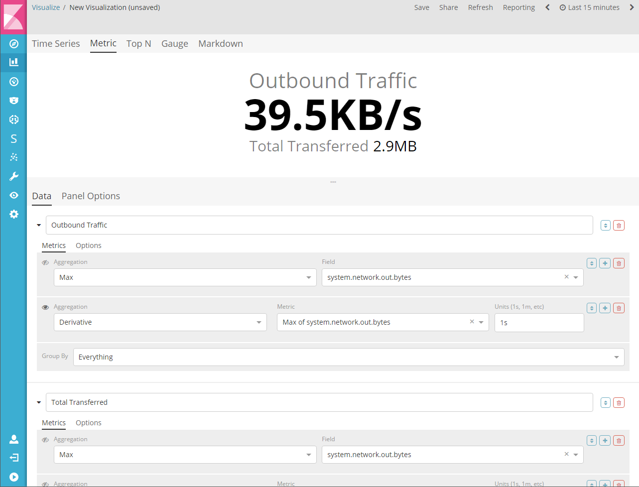
Metric
editA visualization for displaying the latest number in a series. This visualization supports 2 metrics; a primary metric and a secondary metric. The labels and backgrounds can be fully customizable based on a set of rules.
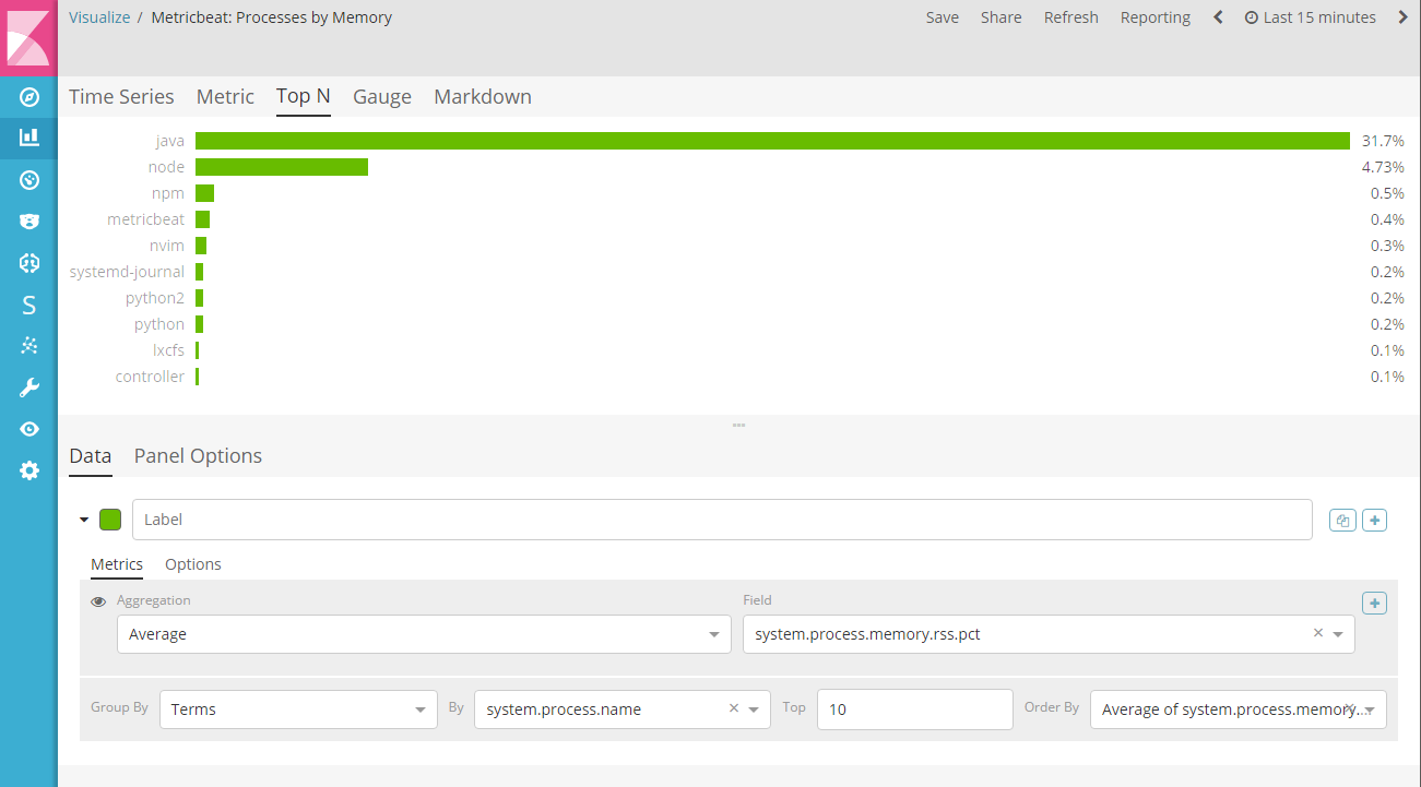
Top N
editThis is a horizontal bar chart where the y-axis is based on a series of metrics and the x-axis is the latest value in those series; sorted in descending order. The color of the bars are fully customizable based on set of rules.
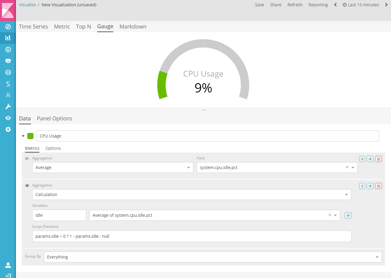
Gauge
editThis is a single value gauge visualization based on the latest value in a series. The face of the gauge can either be a half-circle gauge or full-circle. You can customize the thicknesses of the inner and outer lines to achieve a desired design aesthetic. The color of the gauge and the text are fully customizable based on a set of rules.
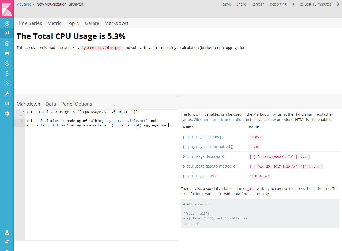
Markdown
editThis visualization allows you to enter Markdown text and embed Mustache template syntax to customize the Markdown with data based on a set of series. This visualization also supports HTML markup along with the ability to define a custom stylesheet.