WARNING: Version 5.0 of Kibana has passed its EOL date.
This documentation is no longer being maintained and may be removed. If you are running this version, we strongly advise you to upgrade. For the latest information, see the current release documentation.
Visualizing Your Data
editVisualizing Your Data
editTo start visualizing your data, click Visualize in the side navigation:
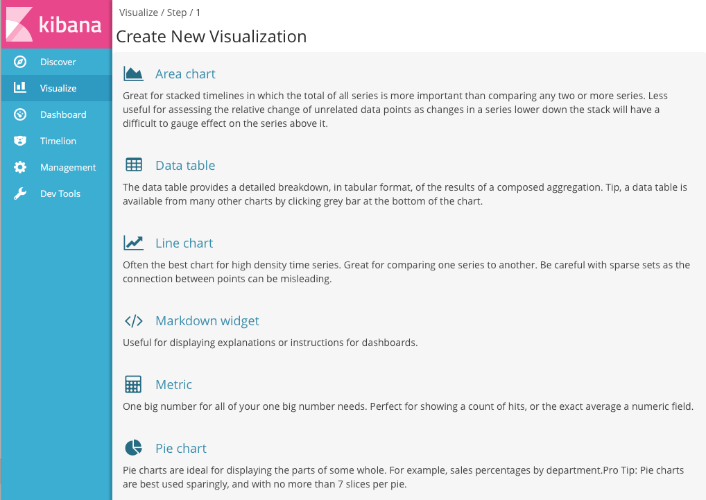
The Visualize tools enable you to view your data in several ways. For example, let’s use that venerable visualization, the pie chart, to get some insight into the account balances in the sample bank account data.
To get started, click Pie chart in the list of visualizations. You can build
visualizations from saved searches, or enter new search criteria. To enter
new search criteria, you first need to select an index pattern to specify
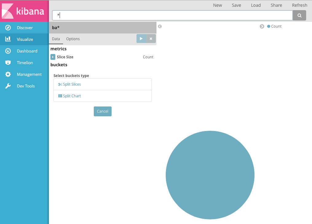
what indices to search. We want to search the account data, so select the ba*
index pattern.
The default search matches all documents. Initially, a single "slice" encompasses the entire pie:
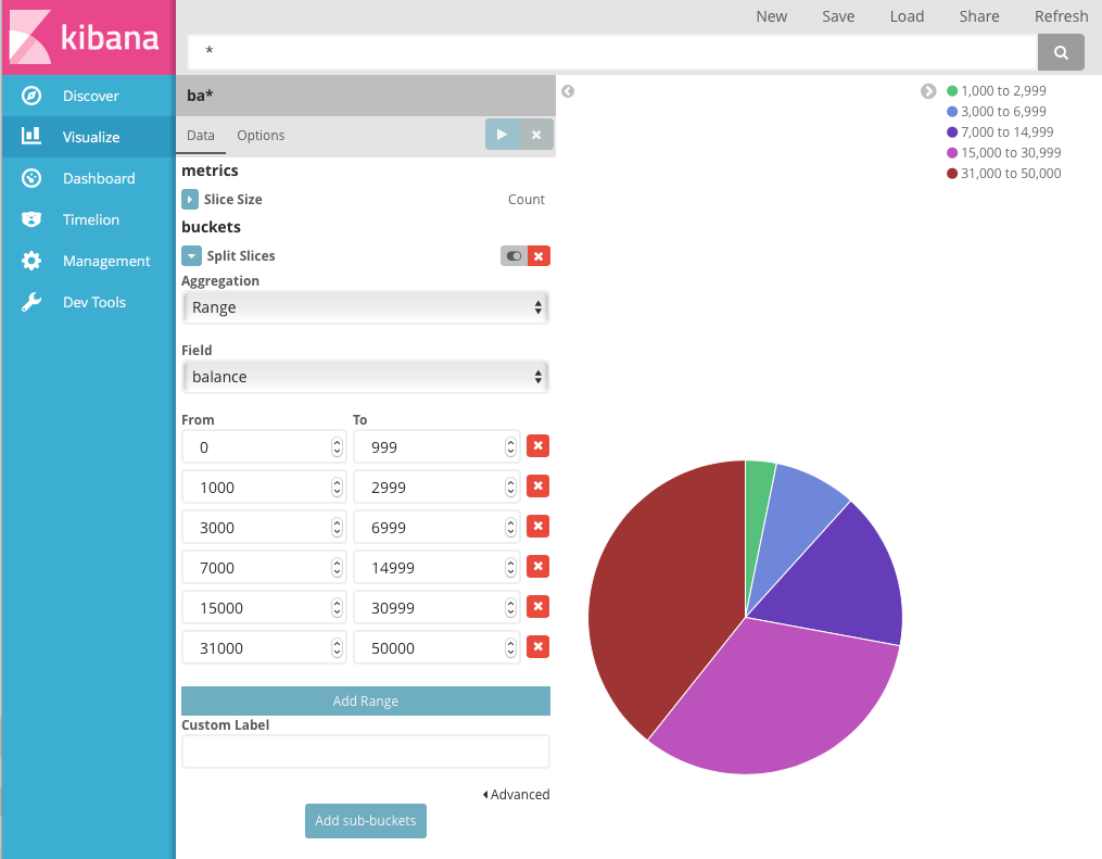
To specify what slices to display in the chart, you use an Elasticsearch bucket aggregation. A bucket aggregation simply sorts the documents that match your search criteria into different categories, aka buckets. For example, the account data includes the balance of each account. Using a bucket aggregation, you can establish multiple ranges of account balances and find out how many accounts fall into each range.
To define a bucket for each range:
- Click the Split Slices buckets type.
- Select Range from the Aggregation list.
- Select the balance field from the Field list.
- Click Add Range four times to bring the total number of ranges to six.
-
Define the following ranges:
0             999
1000         2999
3000         6999
7000        14999
15000       30999
31000       50000
-
Click Apply changes
 to update the chart.
Now you can see what proportion of the 1000 accounts fall into each balance range.
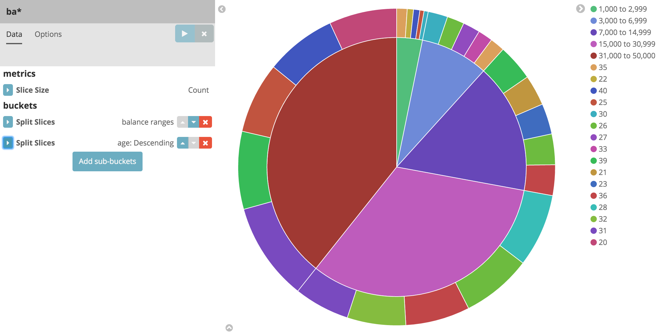
Let’s take a look at another dimension of the data: the account holder’s age. By adding another bucket aggregation, you can see the ages of the account holders in each balance range:
- Click Add sub-buckets below the buckets list.
- Click Split Slices in the buckets type list.
- Select Terms from the aggregation list.
- Select age from the field list.
-
Click Apply changes .
Now you can see the break down of the account holders' ages displayed in a ring around the balance ranges.
To save this chart so we can use it later, click Save and enter the name Pie Example.
Next, we’re going to look at data in the Shakespeare data set. Let’s find out how the plays compare when it comes to the number of speaking parts and display the information in a bar chart:
- Click New and select Vertical bar chart.
-
Select the
shakes*index pattern. Since you haven’t defined any buckets yet, you’ll see a single big bar that shows the total count of documents that match the default wildcard query.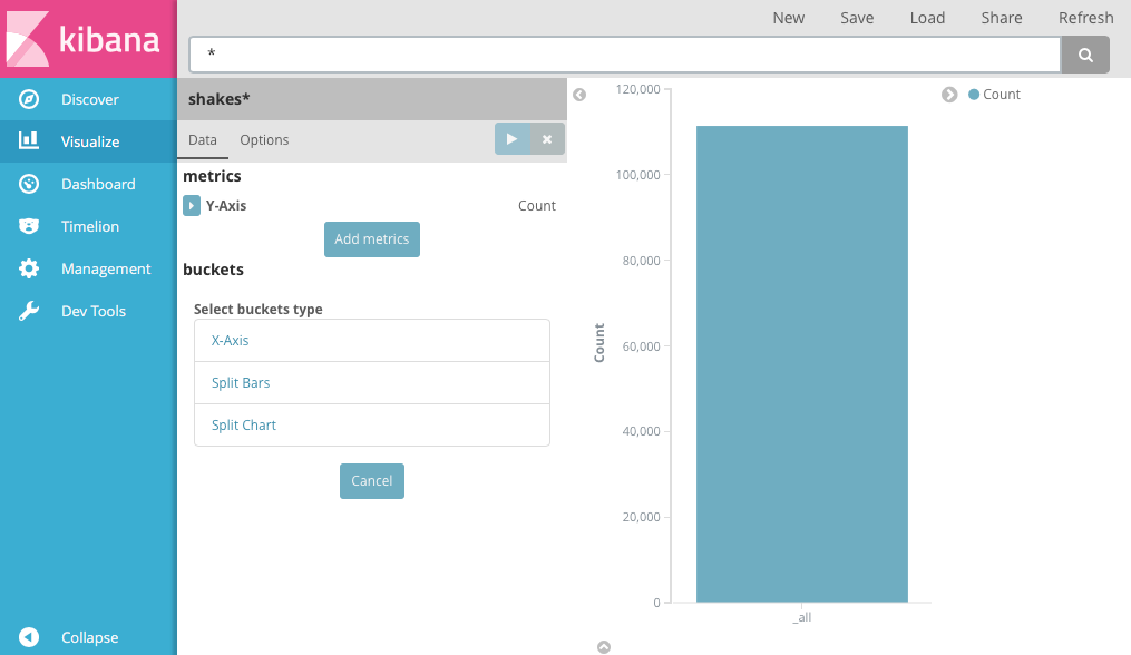
- To show the number of speaking parts per play along the y-axis, you need to configure the Y-axis metric aggregation. A metric aggregation computes metrics based on values extracted from the search results. To get the number of speaking parts per play, select the Unique Count aggregation and choose speaker from the field list. You can also give the axis a custom label, Speaking Parts.
- To show the different plays long the x-axis, select the X-Axis buckets type, select Terms from the aggregation list, and choose play_name from the field list. To list them alphabetically, select Ascending order. You can also give the axis a custom label, Play Name.
-
Click Apply changes to view the
results.
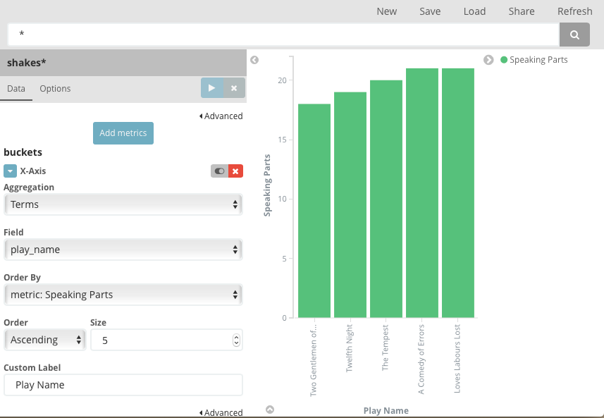
Notice how the individual play names show up as whole phrases, instead of being broken down into individual words. This is the result of the mapping we did at the beginning of the tutorial, when we marked the play_name field as not analyzed.
Hovering over each bar shows you the number of speaking parts for each play as a tooltip. To turn tooltips off and configure other options for your visualizations, select the Visualization builder’s Options tab.
Now that you have a list of the smallest casts for Shakespeare plays, you might also be curious to see which of these plays makes the greatest demands on an individual actor by showing the maximum number of speeches for a given part.
- Click Add metrics to add a Y-axis aggregation.
- Choose the Max aggregation and select the speech_number field.
- Click Options and change the Bar Mode to grouped.
-
Click Apply changes . Your chart should now look like this:
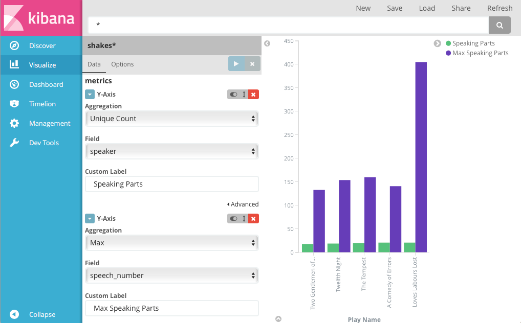
As you can see, Love’s Labours Lost has an unusually high maximum speech number, compared to the other plays, and might therefore make more demands on an actor’s memory.
Note how the Number of speaking parts Y-axis starts at zero, but the bars don’t begin to differentiate until 18. To make the differences stand out, starting the Y-axis at a value closer to the minimum, go to Options and select Scale Y-Axis to data bounds.
Save this chart with the name Bar Example.
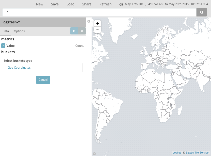
Next, we’re going to use a tile map chart to visualize geographic information in our log file sample data.
- Click New.
- Select Tile map.
-
Select the
logstash-*index pattern. - Set the time window for the events we’re exploring:
- Click the time picker in the Kibana toolbar.
- Click Absolute.
-
Set the start time to May 18, 2015 and the end time to May 20, 2015.
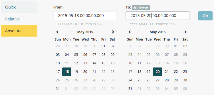
- Once you’ve got the time range set up, click the Go button and close the time picker by clicking the small up arrow in the bottom right corner.
You’ll see a map of the world, since we haven’t defined any buckets yet:
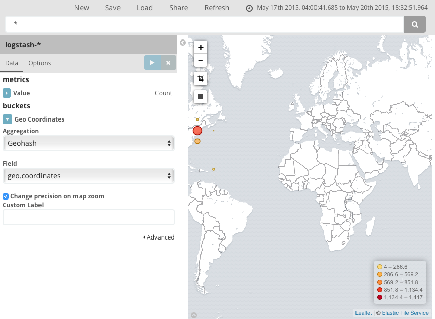
To map the geo coordinates from the log files select Geo Coordinates as
the bucket and click Apply changes .
Your chart should now look like this:
You can navigate the map by clicking and dragging, zoom with the
 buttons, or hit the Fit Data Bounds
 button to zoom to the lowest level that
includes all the points. You can also include or exclude a rectangular area
by clicking the Latitude/Longitude Filter
button to zoom to the lowest level that
includes all the points. You can also include or exclude a rectangular area
by clicking the Latitude/Longitude Filter  button and drawing a bounding box on the map. Applied filters are displayed
below the query bar. Hovering over a filter displays controls to toggle,
pin, invert, or delete the filter.
button and drawing a bounding box on the map. Applied filters are displayed
below the query bar. Hovering over a filter displays controls to toggle,
pin, invert, or delete the filter.
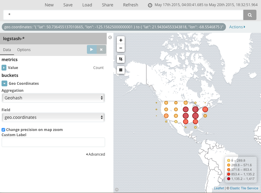
Save this map with the name Map Example.
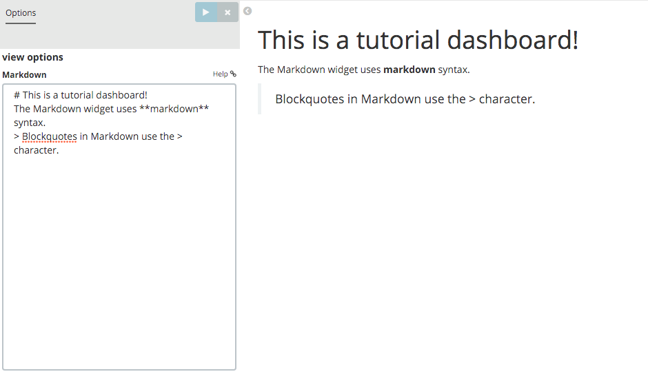
Finally, create a Markdown widget to display extra information:
- Click New.
- Select Markdown widget.
-
Enter the following text in the field:
# This is a tutorial dashboard!
The Markdown widget uses **markdown** syntax.
> Blockquotes in Markdown use the > character.
-
Click Apply changes
render the Markdown in the
preview pane.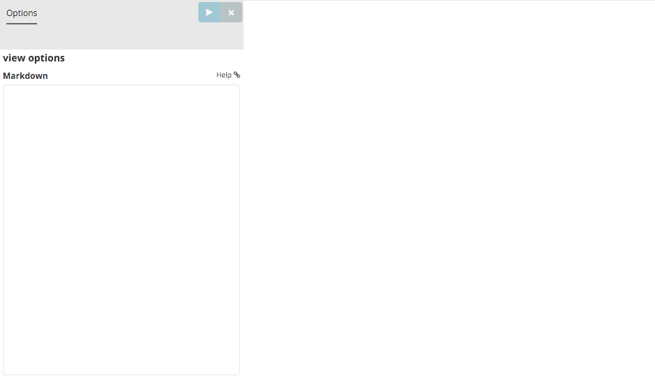
Save this visualization with the name Markdown Example.