WARNING: Version 4.3 of Kibana has passed its EOL date.
This documentation is no longer being maintained and may be removed. If you are running this version, we strongly advise you to upgrade. For the latest information, see the current release documentation.
Data Visualization: Beyond Discovery
editData Visualization: Beyond Discovery
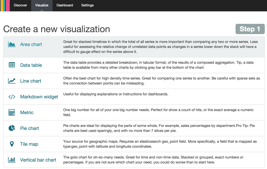
editThe visualization tools available on the Visualize tab enable you to display aspects of your data sets in several different ways.
Click on the Visualize tab to start:
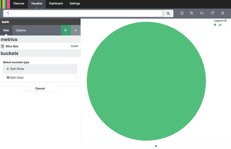
Click on Pie chart, then From a new search. Select the ba* index pattern.
Visualizations depend on Elasticsearch aggregations in two different types: bucket aggregations and metric aggregations. A bucket aggregation sorts your data according to criteria you specify. For example, in our accounts data set, we can establish a range of account balances, then display what proportions of the total fall into which range of balances.
The whole pie displays, since we haven’t specified any buckets yet.
Select Split Slices from the Select buckets type list, then select Range from the Aggregation drop-down selector. Select the balance field from the Field drop-down, then click on Add Range four times to bring the total number of ranges to six. Enter the following ranges:
0             999
1000         2999
3000         6999
7000        14999
15000       30999
31000       50000
Click the green Apply changes button  to display the chart:
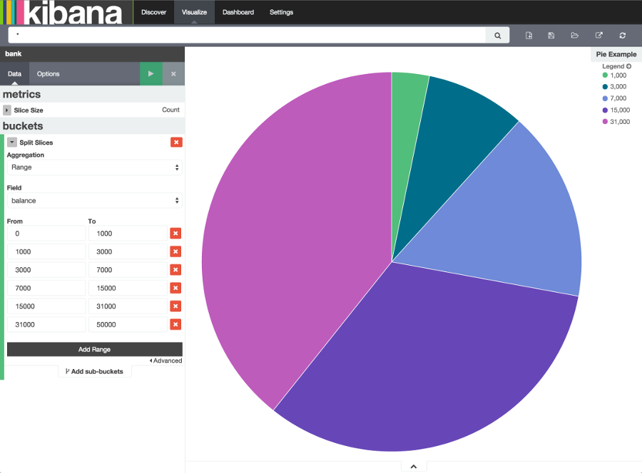
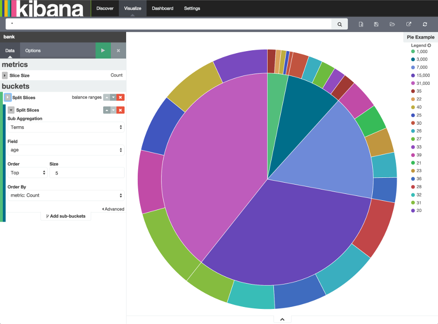
This shows you what proportion of the 1000 accounts fall in these balance ranges. To see another dimension of the data, we’re going to add another bucket aggregation. We can break down each of the balance ranges further by the account holder’s age.
Click Add sub-buckets at the bottom, then select Split Slices. Choose the Terms aggregation and the age field from the drop-downs.
Click the green Apply changes button to add an external ring with the new results.
Save this chart by clicking the Save Visualization button to the right of the search field. Name the visualization Pie Example.
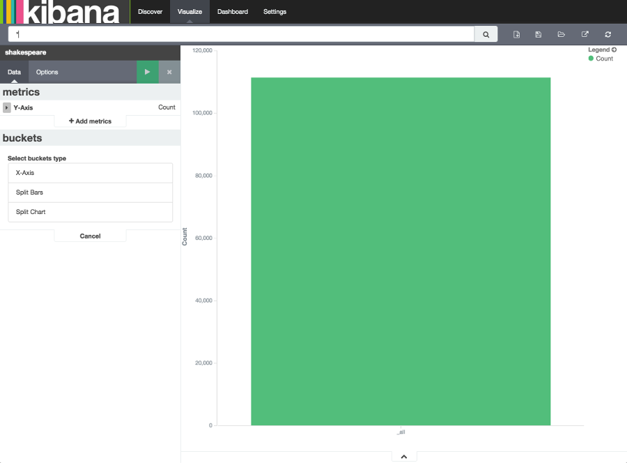
Next, we’re going to make a bar chart. Click on New Visualization, then Vertical bar chart. Select From a new
search and the shakes* index pattern. You’ll see a single big bar, since we haven’t defined any buckets yet:
For the Y-axis metrics aggregation, select Unique Count, with speaker as the field. For Shakespeare plays, it might be useful to know which plays have the lowest number of distinct speaking parts, if your theater company is short on actors. For the X-Axis buckets, select the Terms aggregation with the play_name field. For the Order, select Ascending, leaving the Size at 5.
Leave the other elements at their default values and click the green Apply changes button . Your chart should now look
like this:
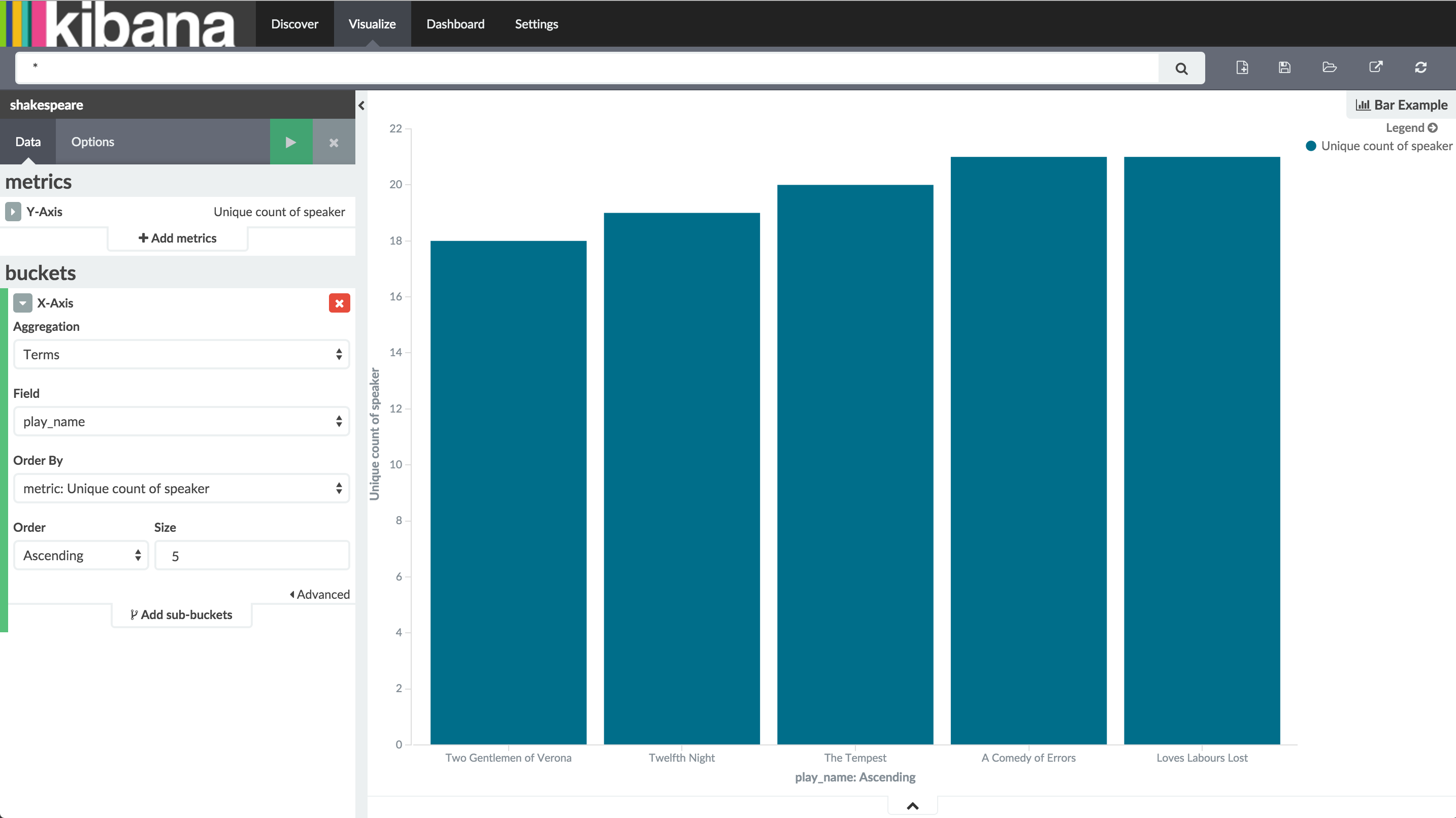
Notice how the individual play names show up as whole phrases, instead of being broken down into individual words. This is the result of the mapping we did at the beginning of the tutorial, when we marked the play_name field as not analyzed.
Hovering on each bar shows you the number of speaking parts for each play as a tooltip. You can turn this behavior off, as well as change many other options for your visualizations, by clicking the Options tab in the top left.
Now that you have a list of the smallest casts for Shakespeare plays, you might also be curious to see which of these
plays makes the greatest demands on an individual actor by showing the maximum number of speeches for a given part. Add
a Y-axis aggregation with the Add metrics button, then choose the Max aggregation for the speech_number field. In
the Options tab, change the Bar Mode drop-down to grouped, then click the green Apply changes button . Your
chart should now look like this:
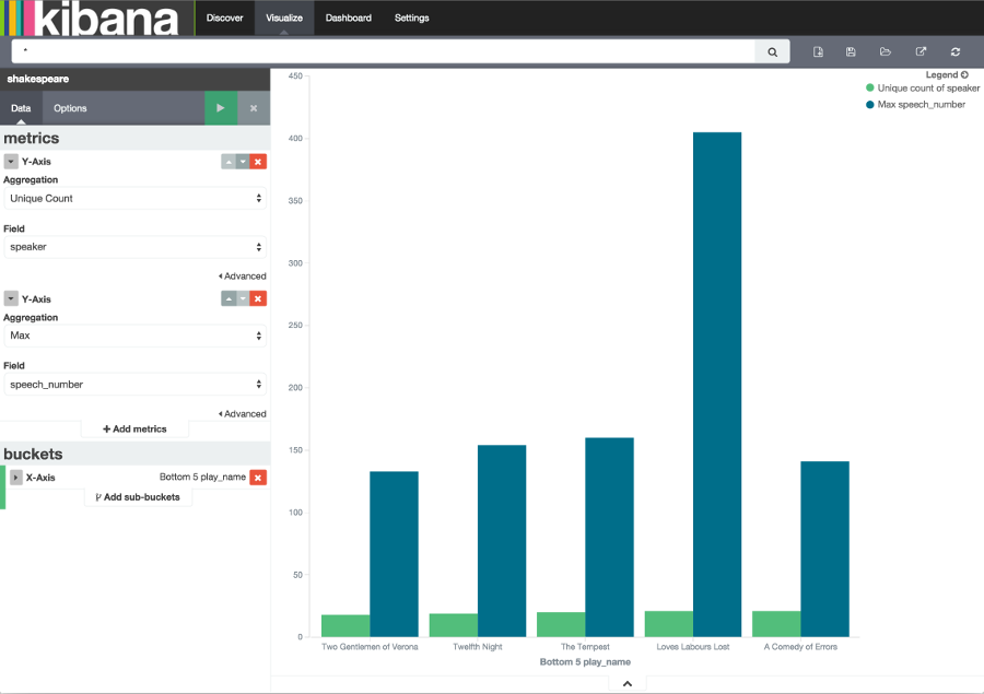
As you can see, Love’s Labours Lost has an unusually high maximum speech number, compared to the other plays, and might therefore make more demands on an actor’s memory.
Save this chart with the name Bar Example.
Next, we’re going to make a tile map chart to visualize some geographic data. Click on New Visualization, then
Tile map. Select From a new search and the logstash-* index pattern. Define the time window for the events
we’re exploring by clicking the time selector at the top right of the Kibana interface. Click on Absolute, then set
the start time to May 18, 2015 and the end time for the range to May 20, 2015:
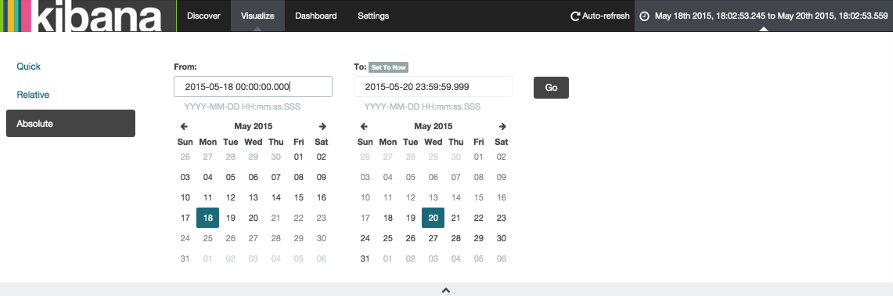
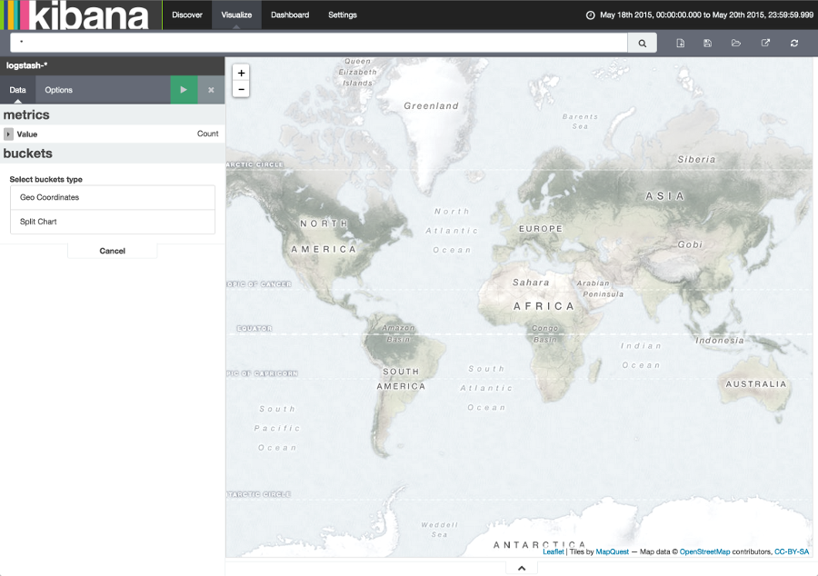
Once you’ve got the time range set up, click the Go button, then close the time picker by clicking the small up arrow at the bottom. You’ll see a map of the world, since we haven’t defined any buckets yet:
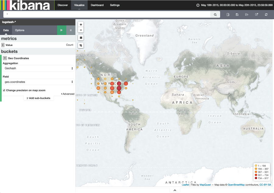
Select Geo Coordinates as the bucket, then click the green Apply changes button . Your chart should now look like
this:
You can navigate the map by clicking and dragging, zoom with the  buttons, or hit the Fit
Data Bounds
buttons, or hit the Fit
Data Bounds  button to zoom to the lowest level that includes all the points. You can
also create a filter to define a rectangle on the map, either to include or exclude, by clicking the
Latitude/Longitude Filter
button to zoom to the lowest level that includes all the points. You can
also create a filter to define a rectangle on the map, either to include or exclude, by clicking the
Latitude/Longitude Filter  button and drawing a bounding box on the map.
A green oval with the filter definition displays right under the query box:
button and drawing a bounding box on the map.
A green oval with the filter definition displays right under the query box:
Hover on the filter to display the controls to toggle, pin, invert, or delete the filter. Save this chart with the name Map Example.
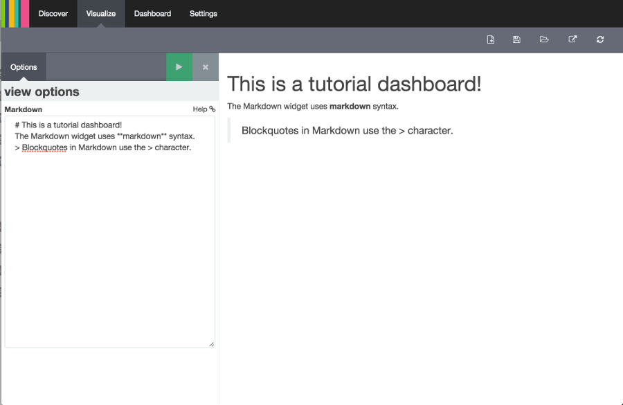
Finally, we’re going to define a sample Markdown widget to display on our dashboard. Click on New Visualization, then Markdown widget, to display a very simple Markdown entry field:
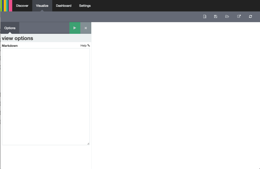
Write the following text in the field:
# This is a tutorial dashboard!
The Markdown widget uses **markdown** syntax.
> Blockquotes in Markdown use the > character.
Click the green Apply changes button to display the rendered Markdown in the preview pane:
Save this visualization with the name Markdown Example.