WARNING: Version 4.3 of Kibana has passed its EOL date.
This documentation is no longer being maintained and may be removed. If you are running this version, we strongly advise you to upgrade. For the latest information, see the current release documentation.
Introduction
editIntroduction
editKibana is an open source analytics and visualization platform designed to work with Elasticsearch. You use Kibana to search, view, and interact with data stored in Elasticsearch indices. You can easily perform advanced data analysis and visualize your data in a variety of charts, tables, and maps.
Kibana makes it easy to understand large volumes of data. Its simple, browser-based interface enables you to quickly create and share dynamic dashboards that display changes to Elasticsearch queries in real time.
Setting up Kibana is a snap. You can install Kibana and start exploring your Elasticsearch indices in minutes — no code, no additional infrastructure required.
This guide describes how to use Kibana 4.3. For information about what’s new in Kibana 4.3, see the release notes.
Data Discovery and Visualization
editLet’s take a look at how you might use Kibana to explore and visualize data. We’ve indexed some data from Transport for London (TFL) that shows one week of transit (Oyster) card usage.
From Kibana’s Discover page, we can submit search queries, filter the results, and examine the data in the returned documents. For example, we can get all trips completed by the Tube during the week by excluding incomplete trips and trips by bus:
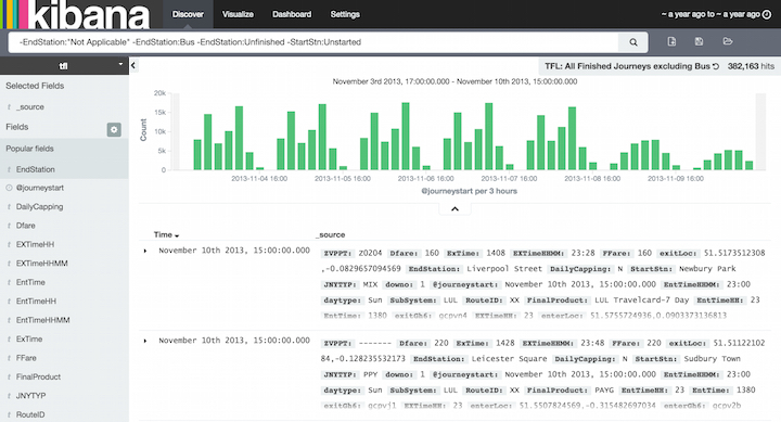
Right away, we can see the peaks for the morning and afternoon commute hours in the histogram. By default, the Discover page also shows the first 500 entries that match the search criteria. You can change the time filter, interact with the histogram to drill down into the data, and view the details of particular documents. For more information about exploring your data from the Discover page, see Discover.
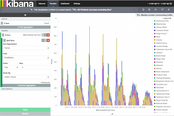
You can construct visualizations of your search results from the Visualization page. Each visualization is associated with a search. For example, we can create a histogram that shows the weekly London commute traffic via the Tube using our previous search. The Y-axis shows the number of trips. The X-axis shows the day and time. By adding a sub-aggregation, we can see the top 3 end stations during each hour:
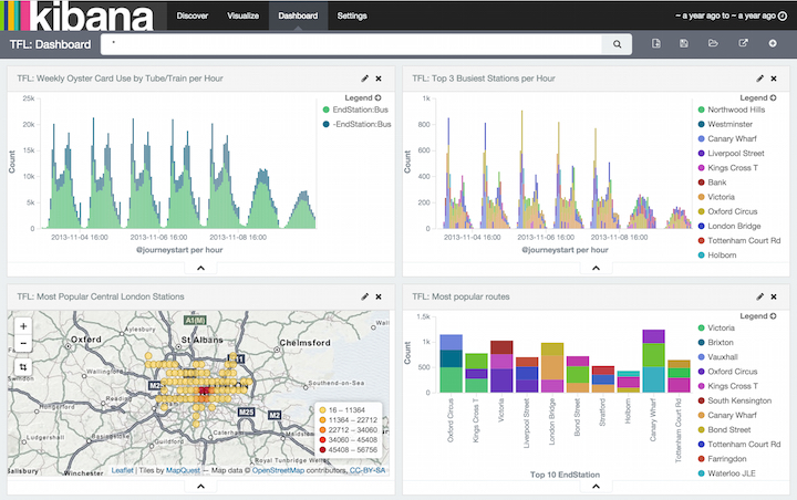
You can save and share visualizations and combine them into dashboards to make it easy to correlate related information. For example, we could create a dashboard that displays several visualizations of the TFL data:
For more information about creating and sharing visualizations and dashboards, see the Visualize and Dashboard topics. A complete tutorial covering several aspects of Kibana’s functionality is also available.