IMPORTANT: No additional bug fixes or documentation updates
will be released for this version. For the latest information, see the
current release documentation.
Filters
edit
IMPORTANT: This documentation is no longer updated. Refer to Elastic's version policy and the latest documentation.
Filters
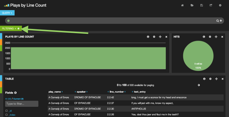
editMany Kibana charts are interactive and can be used to filter the view of
your data. For example, click on the first bar of the chart. You will
end up with something like this. As you can see, the chart has become
one big green bar. This is because a filter was added to match that term
in the play_name field.
"But where" you say?
The answer lies in that little white star that appeared on the filtering tab. Give the tab a click and we can see that a filter has added to the filtering panel. From the filtering panel filters can be added, edited, toggled and removed. Many panels have the ability to add filters, including the table, histogram, map and others.
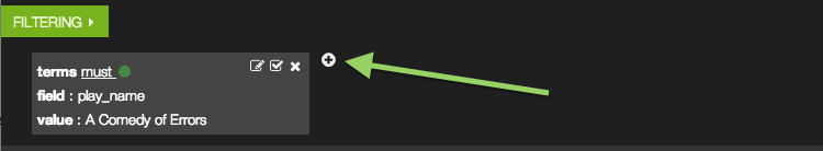
Filters can also be added manually by clicking the +