Kibana highlights
editKibana highlights
editThis list summarizes the most important enhancements in Kibana 8.1.
Discover
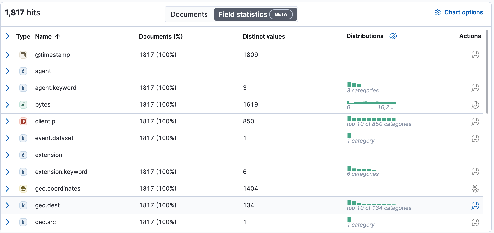
editField statistics on by default
editFind fields to visualize and learn more about the shape of your data with Field statistics. This view is similar to the Index Data Visualizer in Machine Learning. For details, check Explore the fields in your data.
New $ field syntax for Painless scripts
editCreating runtime fields is now easier and more reliable.
Kibana has a shortcut for the field method when a script context supports the scripting fields API.
This shortcut replaces field('fieldname').get(defaultValue) with $('fieldname', defaultValue).
For more information, check Explore your data with runtime fields.
Before
if (!doc.containsKey('myfield') || doc['myfield'].empty) { return "unavailable" } else { return doc['myfield'].value }
After
$('myfield', 'unavailable')
Calling all Document Explorers
editTry the new Document Explorer, which helps you quickly sort, select, and compare data, resize columns, and view documents in fullscreen. The Document Explorer is in beta in 8.1.
Dashboard
editSynchronized ML anomaly visualizations
editMachine Learning visualizations now synchronize your cursor position with the visualization panels you create with Lens, TSVB, Timelion, and Aggregation-based editors. Highlight an anomaly in time and see a visual indication of this time on other panels. The reverse is also true—hovering in another editor highlights the same point-in-time in Machine Learning panels.
Canvas
editAdd heatmap elements to workpads
editCreate heatmaps in workpads using Canvas-only functionality to fetch data, such as Elasticsearch SQL. Configure your heatmap with flexible legend, axis, and visual controls.
New filter capabilities
editUse the new Filter panel on any object to see which objects are filtering it. This helps you author your workpad with the right behavior.
Lens & visualizations
editCombine fields with drag and drop
editCombine multiple fields with drag and drop to view the top combinations in Lens. You’ll find the combinations that contribute most to your metrics' performance.
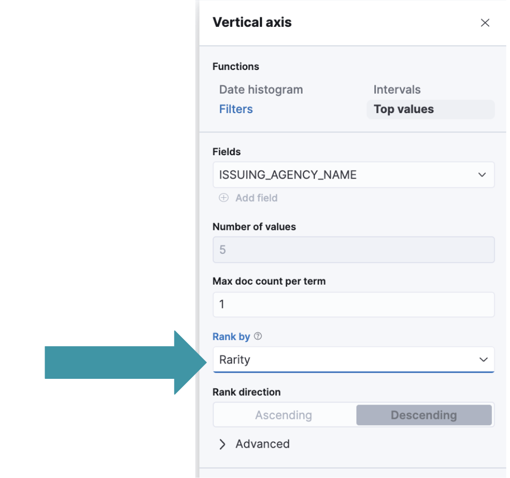
Top values by rarity
editTake advantage of the Elasticsearch rare terms aggregations in Lens and view the top values by rarity. You’ll find answers to "What’s not normal here?"
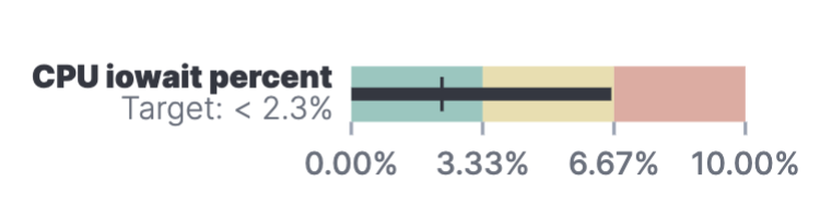
Horizontal and vertical gauges
editUse the gauge visualization to add extra context to your metrics. Show minimum and maximum values dynamically by using a quick function or custom formula, or set a static value for known metric ranges. Include a goal value to see if a metric is above or below the goal. Set color bands to show ranges visually—similar to reference lines in bar, line, and area visualizations. The gauge visualization is in technical preview in 8.1.
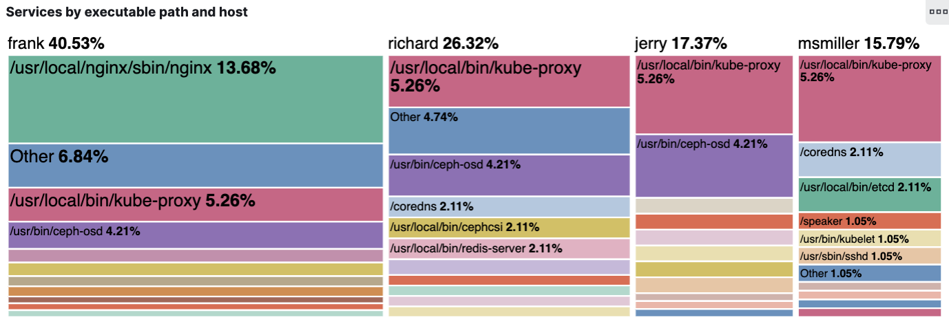
Mosaic visualization
editAdd a mosaic visualization, also known as marimekko or mekko, for side-by-side comparison of two dimensions against a single metric. Treemaps and two-layered pies do this as well, but the mosaic can be more effective for visual comparisons by aligning the colors for the terms side-by-side. For the best mosaic visualizations, create with low cardinality dimensions. The mosaic visualization is in technical preview in 8.1.
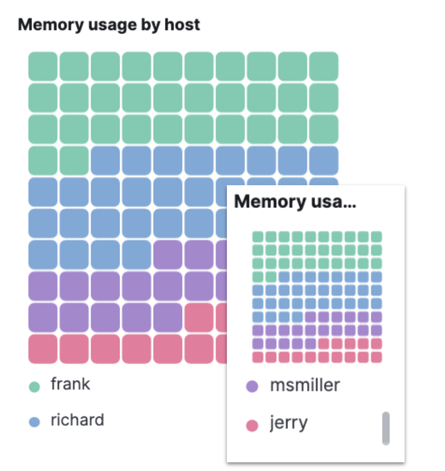
Waffle visualization
editCreate proportional waffle visualizations, which make more efficient use of space than pie charts. Waffles are designed for square spaces, which aligns well with how most dashboards are created. Because waffles display the data in 1% blocks, they are best for low cardinality breakdowns, and are not recommended for small partitions. You might be surprised how small you can make a waffle visualization and maintain readability. The waffle visualization is in technical preview in 8.1.
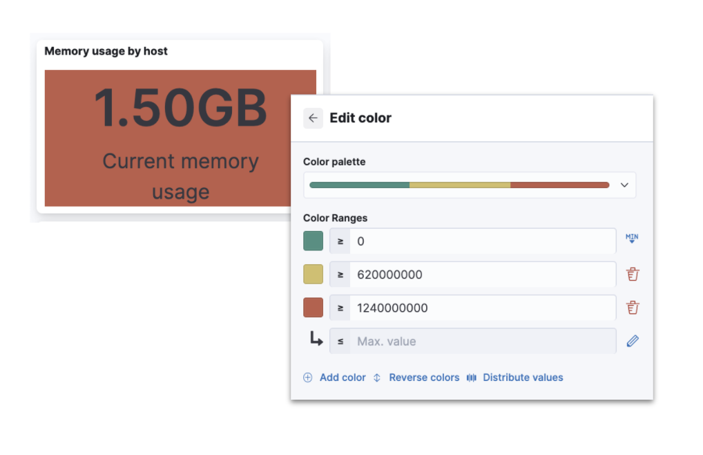
Color by value in metrics
editApply color to the text and background of metric visualizations based on the value of the metric. Set up color stops for multiple colors, similar to what you can do in Lens tables, heatmaps, and gauge.
Sort tables in dashboard view mode
editEnable users with view-only dashboard privileges to sort data tables on the fly, similar to the existing visualization editor behavior.
Filter formulas globally
editFilter each part of your formula with KQL without copying or pasting to all the aggregations in the formula.
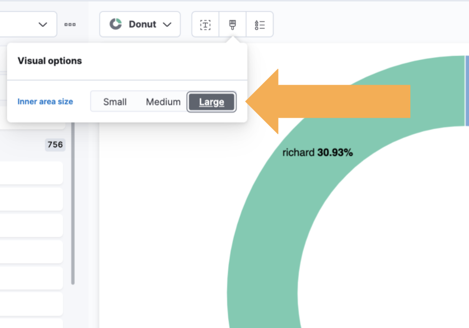
Configurable donut visualizations
editConfigure the inner area size (or donut hole) in the donut visualization. The inner area is a smaller size by default to allow maximize space for labels. You can change this option in Lens.
Collapsable Suggestions panel
editGet back some vertical space in Lens and save on the query cost of suggestions by collapsing the Suggestions panel. Kibana remembers when you collapse your suggestions the next time you use the editor with the same browser.
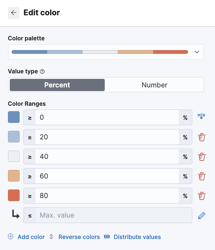
Improved color controls
editThe revised color stop editing experience offers a more streamlined way to specify what happens outside of the defined ranges (above and below the minimum and maximum). These revised controls also add the ability to evenly distribute color stops in one click. Look for the new functionality in Lens tables, heatmaps, metrics, and gauges.
Maps
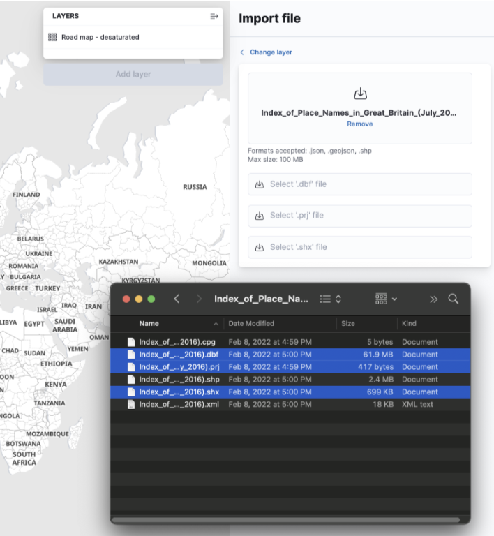
editShapefile upload
editLoad shapefiles into Elastic with this simple but powerful uploader built right into the Maps application. Easily load local open data and boundaries for analysis and comparison.
Vector tiles now the default
editAll new polygon layers now enable Use vector tiles by default. Vector tiles offer the best performance and smooth zooming over the alternative methods. You can change the scaling options in layer settings if you prefer the previous approach.
Machine learning
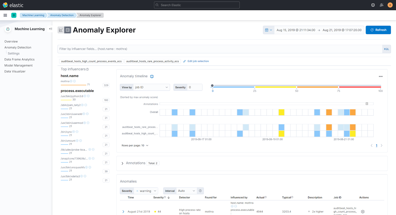
editMachine learning UI enhancements: easier anomaly investigation, new side navigation
edit8.1 contains a couple of enhancements on the machine learning UI.
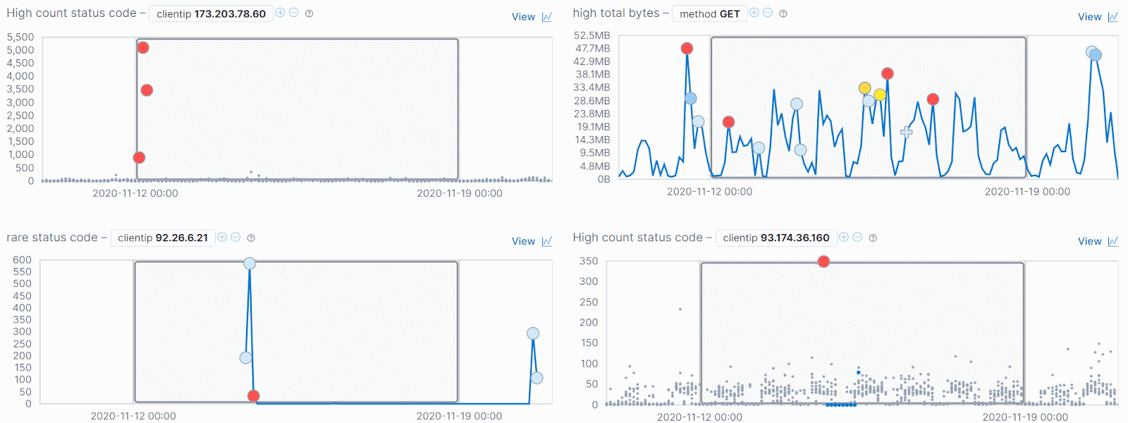
One of the enhancements helps the user interpret the results of their
anomaly detection jobs and explore what else is happening around the time of an anomaly.
In the anomalies table a drilldown link to Discover is automatically available
to investigate the anomaly in the context of the source data.
For the charts in the Anomaly Explorer, synchronized crosshair lines are
provided on hover so that you can see what other anomalous behavior is occurring
at a point in time.
The top navigation bar is now replaced with side navigation. The side navigation is collapsible, so views such as the Anomaly Explorer and Single Metric Viewer can benefit from being viewed at full width if desired.
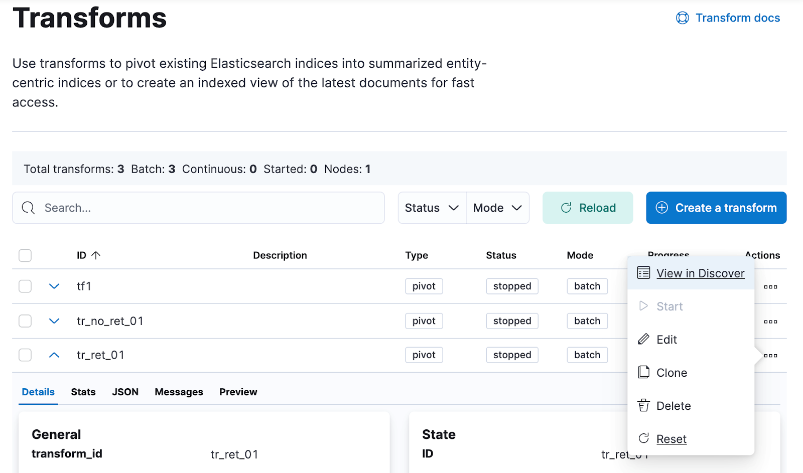
Transform enhancements
editYou can now reset and re-run your transform from the beginning. Transform counters will be reset to zero and if the destination index was created by the transform it will also be deleted.
Other features previously only available to API users are also added to the UI for 8.1: the ability to configure an ingest pipeline to enrich the data persisted to the destination index, and the terms aggregation is available in the list of options when building the aggregations in the pivot transform wizard.
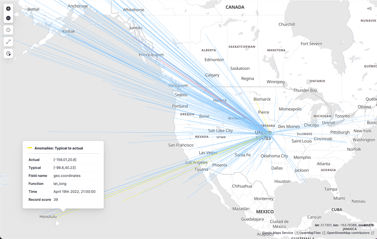
Machine learning anomaly layers in Maps
editMaps introduces a new vector layer–you can add layers to your maps that display points or lines for the anomalies in your geographic data.
ResponseOps
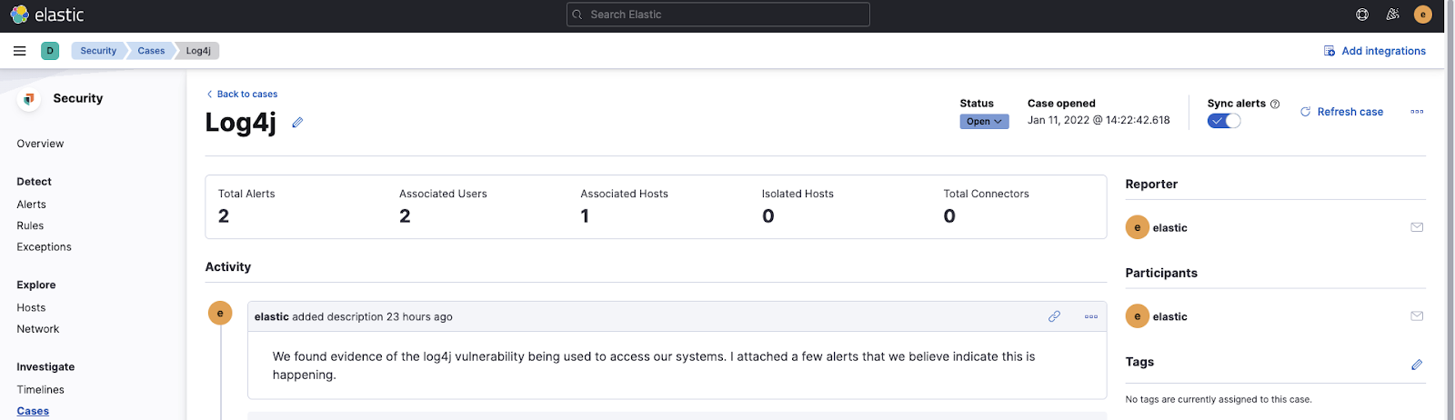
editSummary stats bar in Cases
editThe new section at the top of the Cases view displays summary statistics for the case, such as total numer of alerts, and counts of associated users and hosts. The summarized information in the stats bar help the analyst to determine the priority of a case and indicate effectiveness.