Universal Profiling
Drive optimization and sustainability with continuous profiling
Go green with whole system visibility into complex, cloud-native environments. Frictionless, always-on profiling, based on OpenTelemetry, allows you to optimize performance at all levels of your application, services, and infrastructure with no instrumentation needed.
Performance engineering meets sustainability with the general availability of Elastic Universal Profiling
Learn moreLearn about Elastic's latest contribution — Universal Profiling agent to OpenTelemetry.
Read the blogLearn why Elastic was named a Leader in the 2024 Gartner® Magic Quadrant™ for Observability Platforms.
Get the reportContinuous profiling that just works
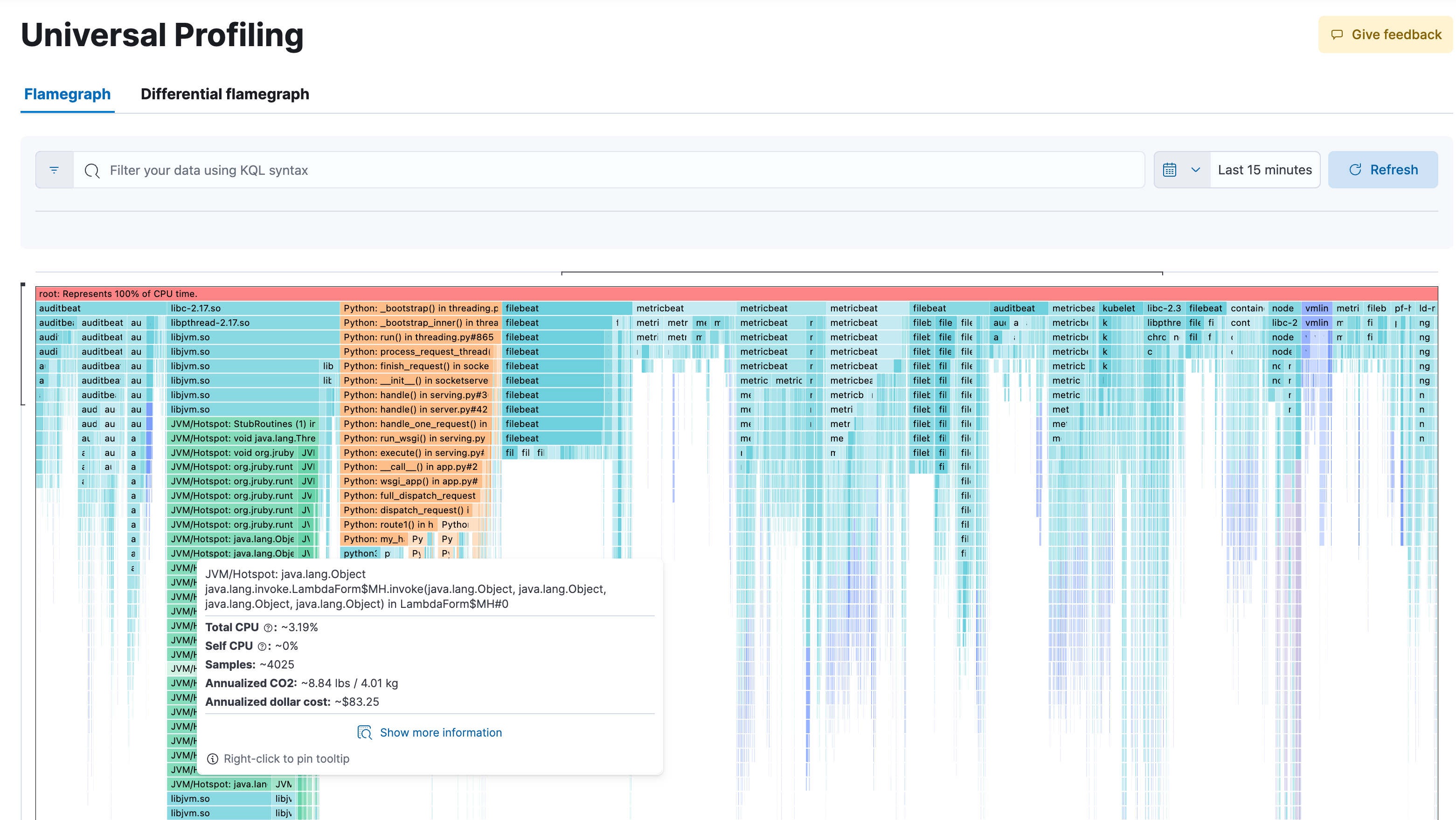
Get unprecedented visibility at all levels with 24x7 whole system profiling. Leveraging eBPF technology, and OpenTelemetry, Universal Profiling profiles every line of code running on the machine –– including not only your application code but the kernel and third-party libraries as well. By capturing only the necessary data in an unobtrusive manner it is able to run continuously on production systems with no noticeable impact (less than 1% CPU overhead)! No intrusive code changes or instrumentation needed.
Performance optimization at your fingertips
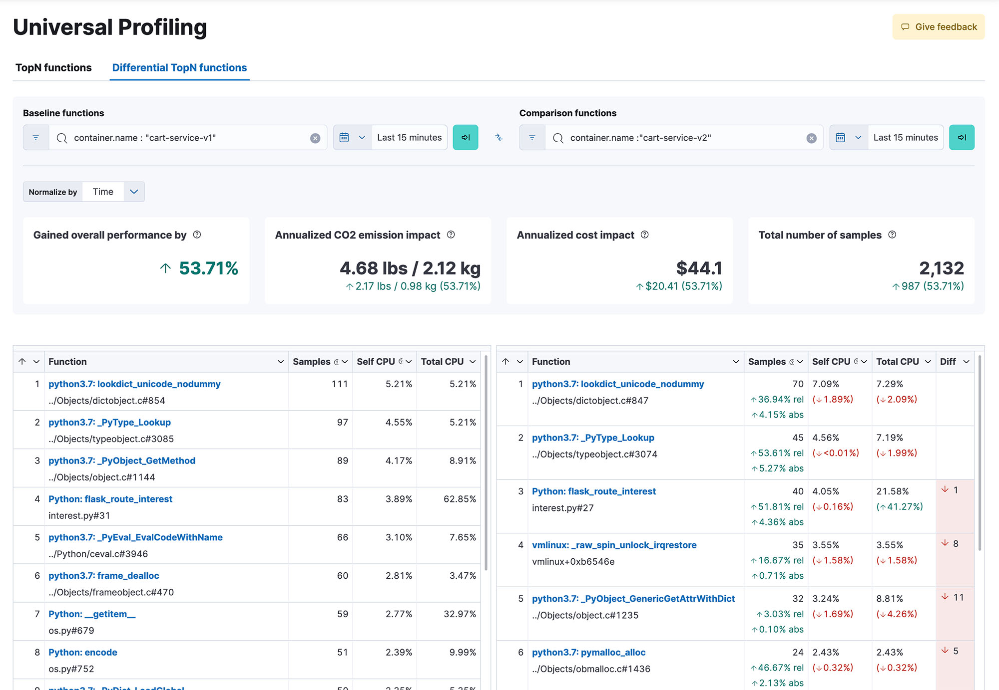
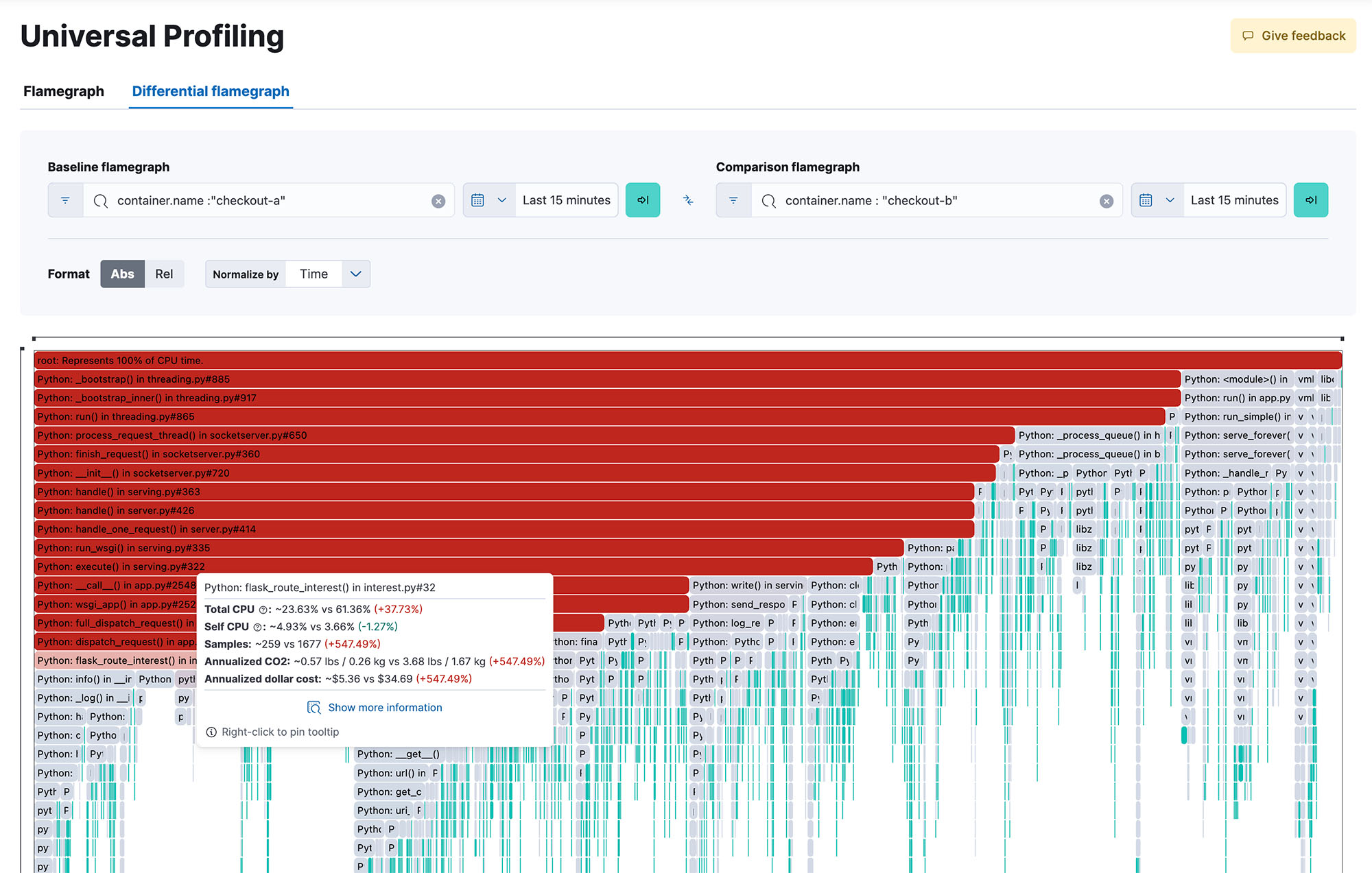
Get whole system visibility into 100% of your code as it executes, across methods, classes, threads, and containers, as well as the ability to compare across builds to identify performance regressions. Responsive and easy to use flame-graphs help you explore the performance of your entire system from a single view. Pinpoint the most resource-intensive code to identify and resolve performance bottlenecks, optimize cloud spend and reduce the carbon footprint of your infrastructure.
Flexible and frictionless deployment
Elastic Universal Profiling does not require any application source code change, instrumentation, or other intrusive operations. Just deploy the agent and receive profiling data a few minutes later. The agent can be deployed using Elastic Agent, manually run as a native binary or as a privileged Docker container, or automatically deployed using your cluster's orchestration framework.
Broad ecosystem support
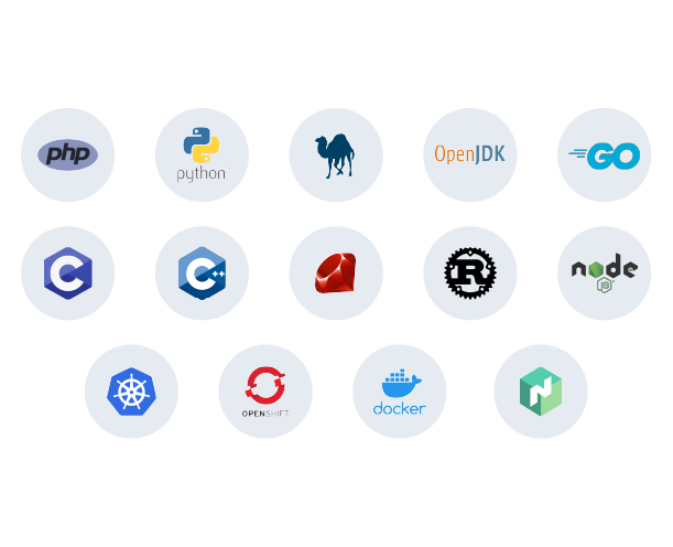
Profiling support includes mixed language traces across almost all popular language runtimes including: PHP, Python, Java (or any JVM language), Go, Rust, C/C++, Node.js/V8, Ruby, Perl and Zig. Plus first-class support for all the major containerization and orchestration frameworks, whether running on premises or on top of a managed Kubernetes platform, such as GKE, AKS, or EKS.
Continuous whole-system profiling is just one way to observe your workloads
Monitor your infrastructure, your logs, and your users all within a single solution.