Fighting Helplessness with Data Visualization: A Reminder to Vote
Raise your hand if you’ve felt stressed this year.
Not just me?
2020 has been rough. At the global scale, we’ve all felt the effects of the COVID-19 pandemic. In the USA (where I live) we’ve also had forest fires, hurricanes, tornadoes, murder-hornets, actual murders, protests, counter-protests, riots, and shut-downs. We also have the Presidential election this year. Even in the best of times, that means constant bombardment with attack ads, and neighbors giving each other side-eye over their choice of yard signs. But this year isn’t the best of times, and I’ve found myself struggling to cope with feelings of isolation and helplessness as our country gears itself up to decide what the next four years will look like.
I believe in the importance of elections, and in the importance of casting votes. I believe in democracy. And in a normal year, I would have pursued traditional means to help get out the vote. I might have attended political gatherings, shaken hands with candidates, or hosted a debate watch-party. I might have even knocked on doors and handed out informational literature. But in the era of COVID-19, I’m reluctant to do these things as my family and I try to stay socially distant from others. I’d been feeling very demoralized, handcuffed to inaction, and subject to the political vitriol that is social-media.
Luckily for me, Elastic has been very cognisant of the extra psychological stressors that this year has placed on its employees. Outside of our normal time off, Elastic began announcing Shut It Down days — two days per month — to be treated as company-wide holidays (with on-call exceptions). On top of those, each employee was given 160 hours of Covid Leave to be used at the employee’s discretion to maintain their mental and emotional health.
I knew that my stress over politics was negatively impacting my mental well-being.
And I knew that all this PTO could be used to help.
But I couldn’t get involved physically like I might have in another year.
So, I got involved digitally.
An organization in my county was looking to start a data team. They had gathered a bunch of public voter records, census data, and VoteBuilder exports and needed help making sense of it all. They wanted to be able to answer questions like:
- “Where are new voters most densely co-located?”
- “What are the demographics of our county districts?”
And ...
- “If we need to leave out flyers to remind folks to get registered to vote, what area gives us the most bang-for-our-buck?”
Since I had the extra PTO and a background in data problems, this seemed like a great way for me to get involved. The only question now was, “how can I solve their problems?”
Elasticsearch, Kibana, and the United States Census Bureau to the rescue!
It’s not hard to turn Excel spreadsheets and CSV files into an Elasticsearch index. I’ll leave that explanation to other blogs. The first major hurdle was helping turn voter addresses into dots on a map. We, as humans, are used to knowing that a phrase like, “1600 Pennsylvania Avenue, Washington, DC” is a physical location. But computers need a little help. For this task, I turned to The United States Census Bureau’s Geocoder tool. This nifty little API is free, and worked better than I’d expected. They have a full documentation guide, a full-service REST API, and a web UI allowing you to get a feel for how the tool works.
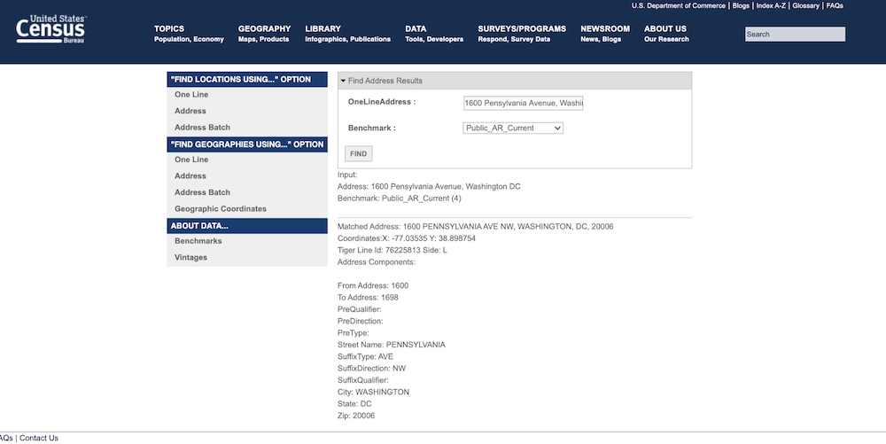
Two things to notice about this API. First, notice how it handles the typo of “Pensylvania.” If you’ve ever worked with human-typed data before, you’ll know how common it is for people to make typos even with their own address. So this is a handy feature. Second, the reason we’re talking about this — the response includes coordinates that represent the latitude and longitude of our address.
I used these coordinates to form geo-point fields in my Elasticsearch index, and then I was just a hop-skip-and-a-jump from being able to plot my dots-on-a-map!
My dataset was limited to a single county in Tennessee.
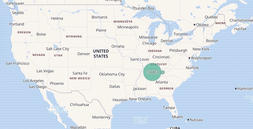
As you zoom in, the dots resolve into individual points-per-document.
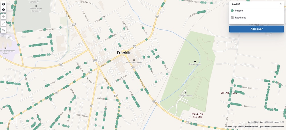
Once I got the geo-point data working, it was a simple matter to build a few heat maps.
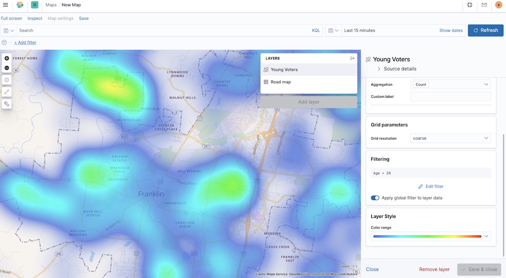
Want to see where young voters are? A simple heat-map with a filter of Age < 20 gives us:
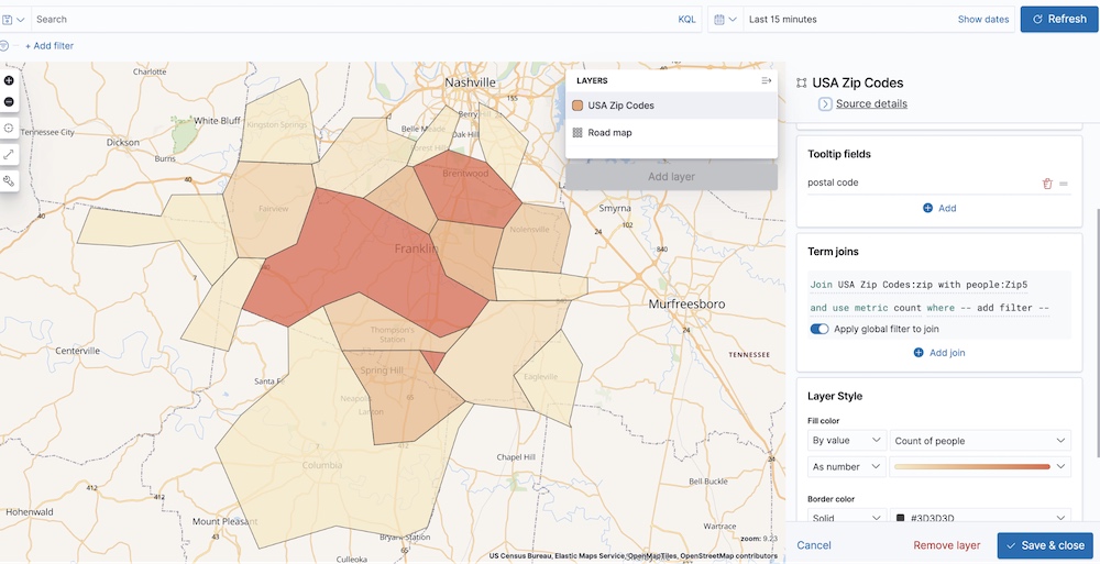
Or maybe we need to know which zip codes hold the most voters? Elastic Maps Service gives us USA Zip Code boundaries out of the box, so it’s only a few clicks to make a Cloropleth Map like this:
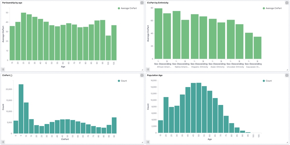
Even without using mapping functionality, it was amazingly easy to visualize value in the data. Want to see how the various State House districts breakdown by ethnicity? All it takes is two easy drag-and-drops in Lens:
My personal favorite was just exploring simple histograms. The data I was working with had a field for Civic Partisanship (CivPart) which provided a scale on which to measure a voter’s lean. On the right/left spectrum, this translates to a 0 being “Far Right” and 100 being “Far Left.” This helped me, and the organization I volunteered with, to get a really good understanding of the political landscape in our county. They’ll use this system in coming years to continue tracking voter demographics.
After just a couple days of poking at the data and building some eye-opening visualizations, I knew I had to write this blog post. And for a couple reasons.
First, there’s a lot of data out there. And while the people who have it know that it’s valuable, it might seem really daunting to find the value. I want to encourage you to try loading your data into Elasticsearch and building some visualizations with Kibana. Because if I can spend a few days of PTO poking at data I’m unfamiliar with and get this far, a subject-matter expert could certainly make a bigger splash.
Second, there’s a lot of hopelessness out there. I know I’m not alone in having felt like, in this particular year, everything is terrible. But as the motivational saying goes:
“Don’t mourn. Organize!”
This is a great moment for organization. This is a great moment to dive deep into your data and feel empowered to make smart, strategic decisions. We don’t have to feel powerless if we can be civically engaged.
Finally, this is a reminder to vote. Please vote. Do it. Go vote. The saddest visualization I’ve made thus-far is this one:
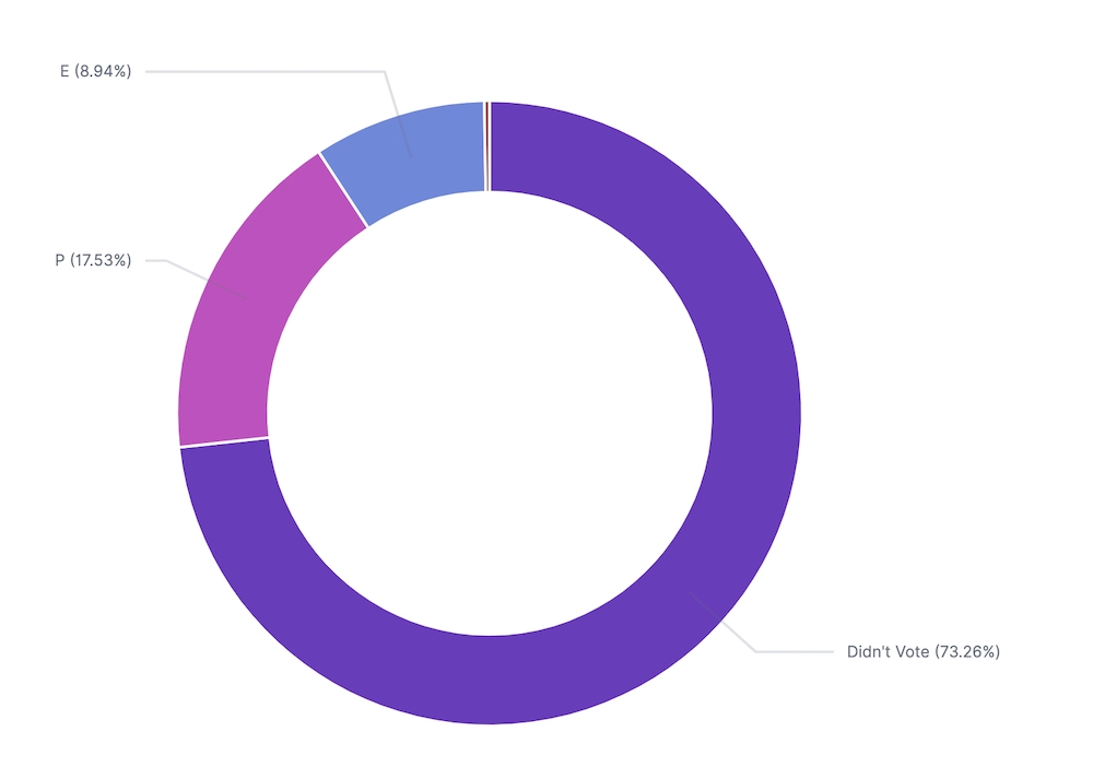
This shows my county’s 2020 primary election data. 8.94% of the county voted early (E). 17.53% of the county voted in-person (P). And 73.26% of my neighbors didn’t vote at all.
But that was the primary. There is still time for us to get people engaged before the general election. There is still time to get organized, so that on November 4th, we’re not left wishing we’d just looked at the data a little harder.
There is still time to get out there and vote.