Visualize synthetic monitoring
editVisualize synthetic monitoring
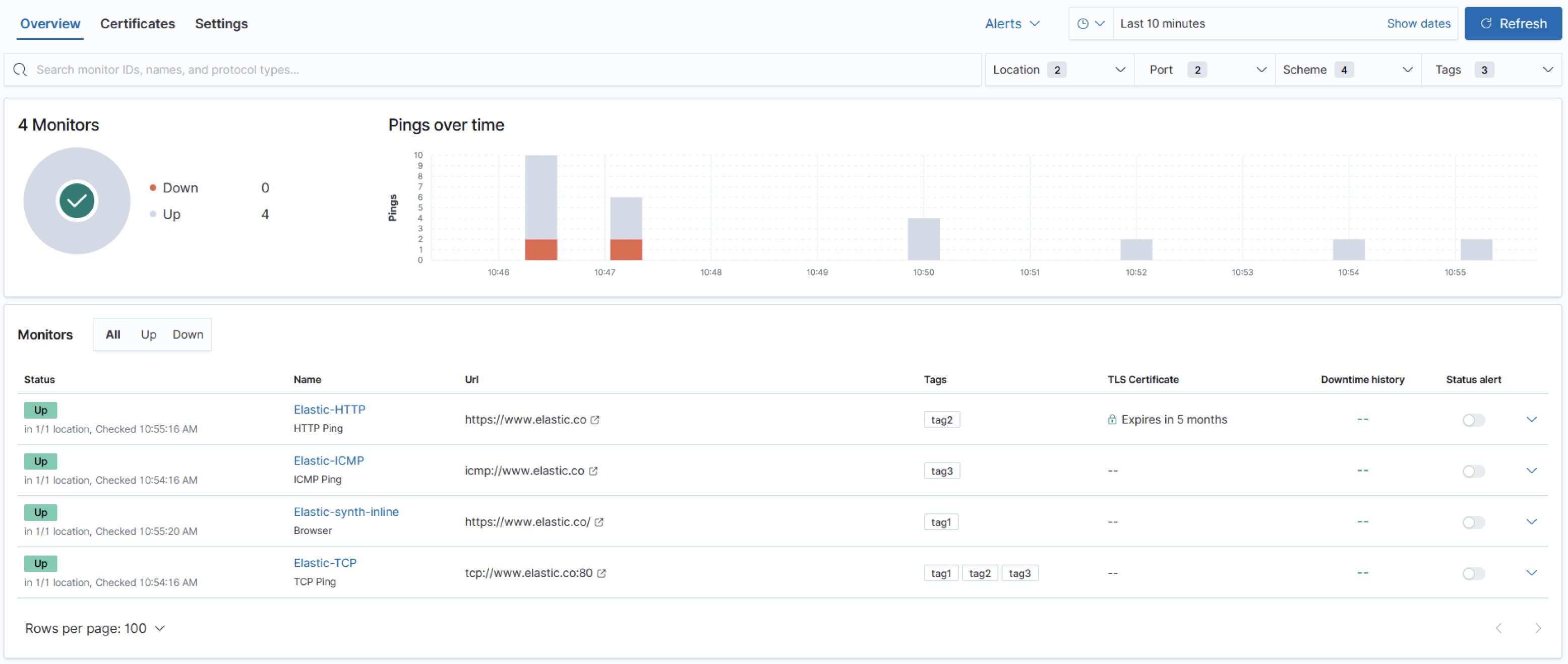
edit[beta] This functionality is in beta and is subject to change. The design and code is less mature than official GA features and is being provided as-is with no warranties. Beta features are not subject to the support SLA of official GA features. Synthetic monitoring journeys can be visualized in the Uptime app side-by-side with your other Uptime monitors.
Analyze synthetic journeys
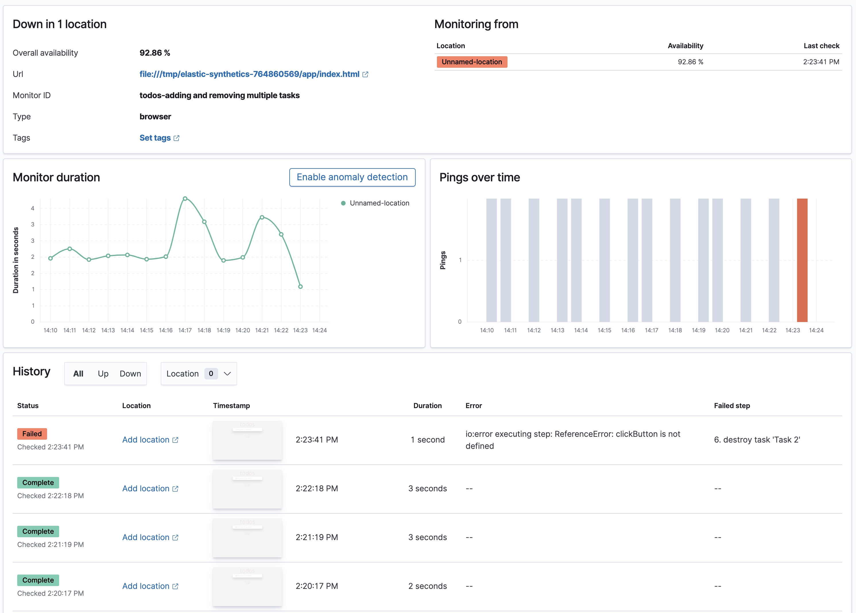
editOn the Monitors table, you can click a listed journey to analyze it further on the monitor Overview page. You can examine journey details, including its availability, monitor ID, service availability per monitoring location, the timing for each synthetic check performed, and check statuses over time.
The History table lists the total count of all of the synthetic checks that completed or failed during the journey. The timestamp for each check is also displayed, along with its duration. For any failed checks, the error and the failed step are displayed.
Review synthetic checks
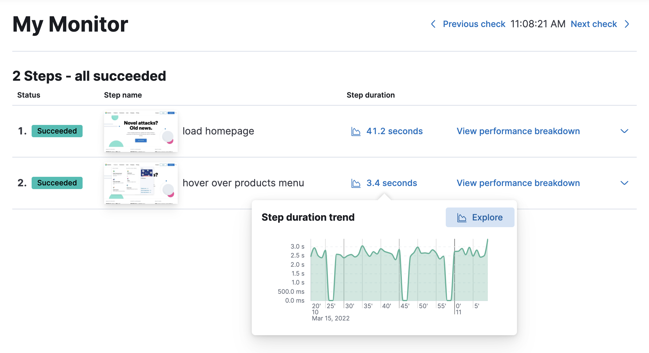
editTo drill down and review the steps performed by a synthetic check, select it in the History table to view the synthetic check details page.
For each synthetic step, the following details are displayed:
-
The status of each step:
succeeded,failed, orskipped. - Step name.
- A screenshot taken of the step. In the case of a failed step, the last good screenshot is displayed, making it easier to compare the step with the previous time it succeeded.
You can expand the table row for each step to view the following additional information:
- An error message in the case of a failed step.
- The script performed for the step.
- The console output listing any errors or warnings from your browser.
- A screenshot taken of the step.
- The stack trace in the case of a failed step to help you quickly debug what caused the error.
Select View performance breakdown to view the waterfall chart for the synthetic check.
Waterfall chart
editElastic Synthetics is regularly updated. To view the waterfall chart, make sure you are running the latest synthetics docker image.
The waterfall chart provides a visualization of every request the page made when a user executed it. Each line in the chart represents an HTTP network request and helps you quickly identify what resources are taking the longest to load and in what order they are loading.
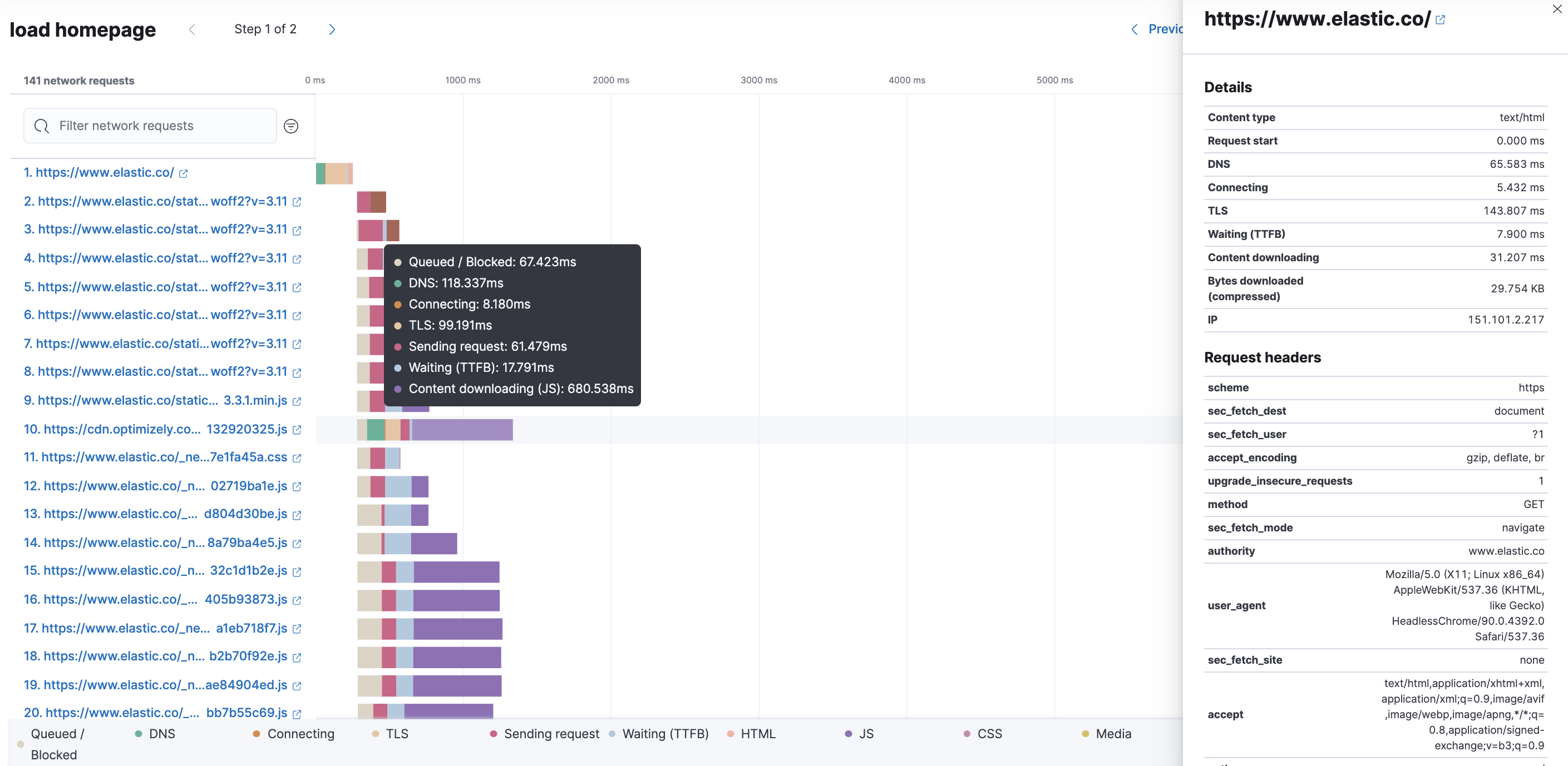
The colored bars within each line indicate the time spent per resource. Each color represents a different part of that resource’s loading process and includes the time spent downloading content for specific Multipurpose Internet Mail Extensions (MIME) types: HTML, JS, CSS, Media, Font, XHR, and Other.
It’s important to understand each phase of a request so you can improve your site’s speed by reducing the time spent in each one.
HTTP request phases
- Queued/Blocked
- The request was initiated but is blocked or queued.
- DNS
- The DNS lookup to convert the hostname to an IP Address.
- Connecting
- The time it took the request to connect to the server. Lengthy connections could indicate network issues, connection errors, or an overloaded server.
- TLS
- If your page is loading resources securely over TLS, this is the time it took to set up that connection.
- Sending request
- The time spent sending the request data to the server.
- Waiting (TTFB)
- The time it took for the response generated by the server to be received by the browser. A lengthy Waiting (TTFB) time could indicate server-side issues.
Without leaving the waterfall chart, you can view data points relating to each resource: resource details, request headers, response headers, and certificate headers. On the waterfall chart, select a resource name, or any part of each row, to display the resource details overlay.
For additional analysis, whether to check the content of a CSS file or to view a specific image,
click ![]() located beside each resource,
to view its content in a new tab.
located beside each resource,
to view its content in a new tab.
You can also navigate between steps and checks at the top of the page to view the corresponding waterfall charts.
Filter network requests
editTo help you quickly identify resources that impact your user experience, you can combine searching for a network request name with the automated filter options to focus on specific MIME types.
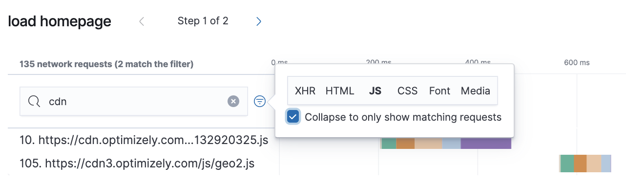
You can filter by XHR, HTML, JS, CSS, Font, and Media, to highlight the waterfall chart’s matching results. To remove even more noise from the chart, you can select only the matching requests to view and group.
Alerts
editUser journeys that are tested with synthetic monitoring need to consistently work for your users. Alerting ensures any degraded performance or broken actions are fixed prior to impacts on your bottom line or customers' experience.
To receive notifications based on errors and degraded performance, see create a monitor status rule.