自定义格式化控件
edit
IMPORTANT: This documentation is no longer updated. Refer to Elastic's version policy and the latest documentation.
自定义格式化控件
editTimelion 有大量的自定义选项。您可以利用这些功能根据自己的喜好定义几乎每个图表的所有细节部分。在本节教程中,您将会进行以下修改:
- 添加一个标题
- 修改一个序列图表的类型
- 修改序列图表的颜色和透明度
- 调整布局
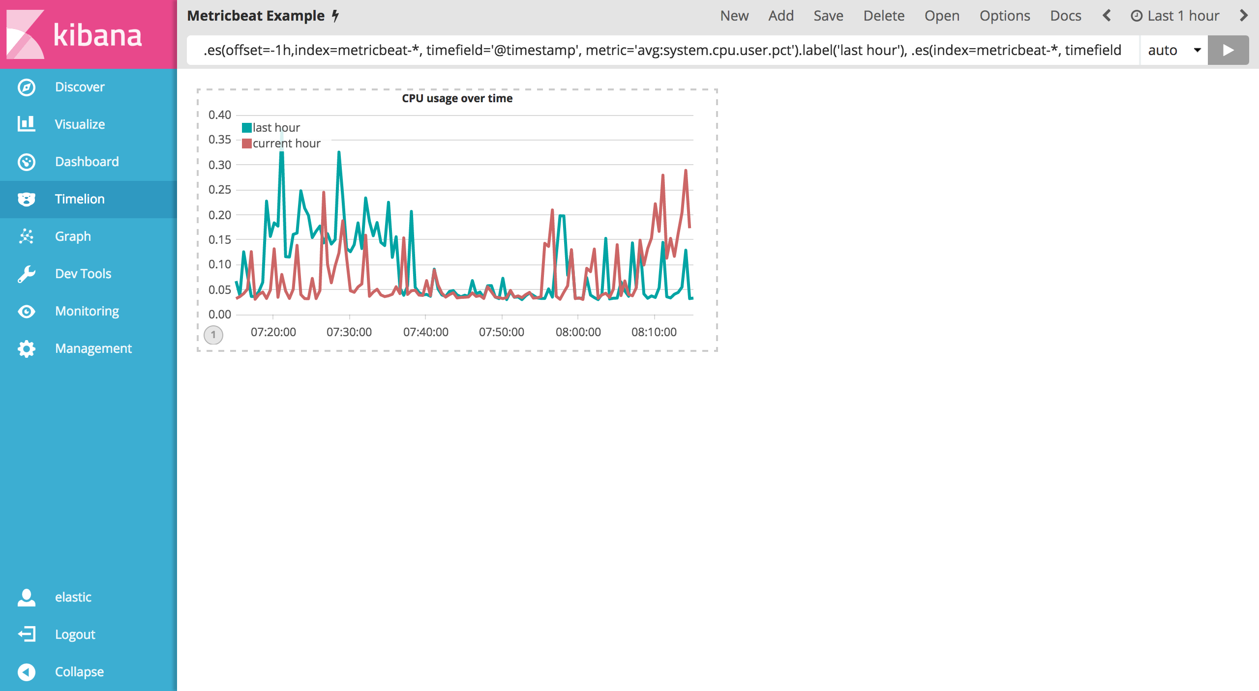
在上一节创建 Timelion 中,您创建了有两个序列图表的 Timelion 控件。让我们继续自定义这些可视化控件。
在进行任何修改之前,我们可以利用 title() 函数在表达式结尾添加一个有意义的标题。这将会使不熟悉的用户更容易理解这个可视化控件的目的。如下示例添加了 title('CPU usage over time') 到原始的序列表达式中。
.es(offset=-1h,index=metricbeat-*, timefield='@timestamp', metric='avg:system.cpu.user.pct').label('last hour'), .es(index=metricbeat-*, timefield='@timestamp', metric='avg:system.cpu.user.pct').label('current hour').title('CPU usage over time')
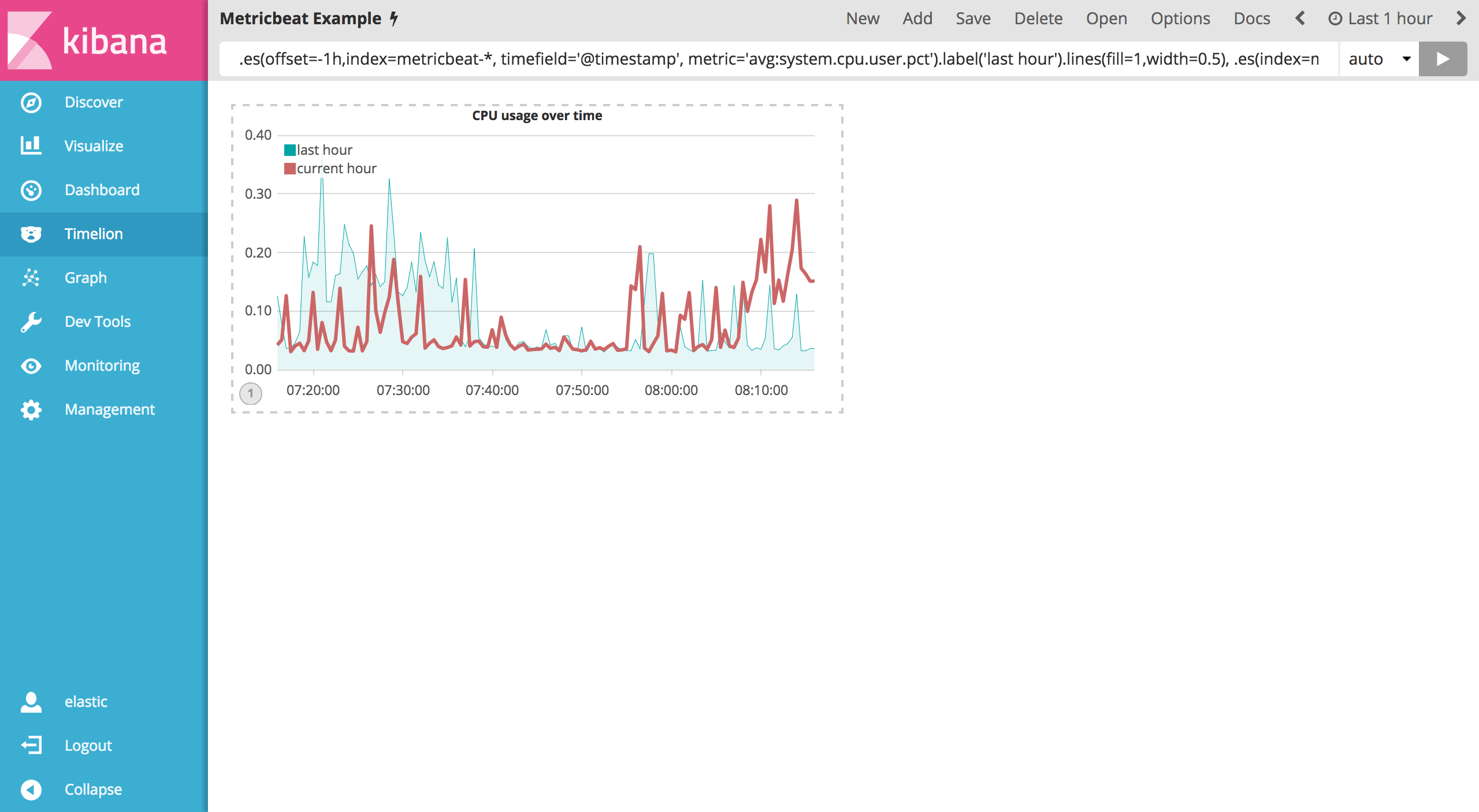
为了区分前一个小时数据的序列图,您可以修改图表的类型为一个填充的区域图表。为了实现这个目的,您需要使用 .lines() 函数来自定义原有的图表。可以设置 fill 和 width 参数来定义填充级别和线宽。如下示例通过 .lines(fill=1,width=0.5) 定义了填充级别为1,线宽为0.5的样式:
.es(offset=-1h,index=metricbeat-*, timefield='@timestamp', metric='avg:system.cpu.user.pct').label('last hour').lines(fill=1,width=0.5), .es(index=metricbeat-*, timefield='@timestamp', metric='avg:system.cpu.user.pct').label('current hour').title('CPU usage over time')
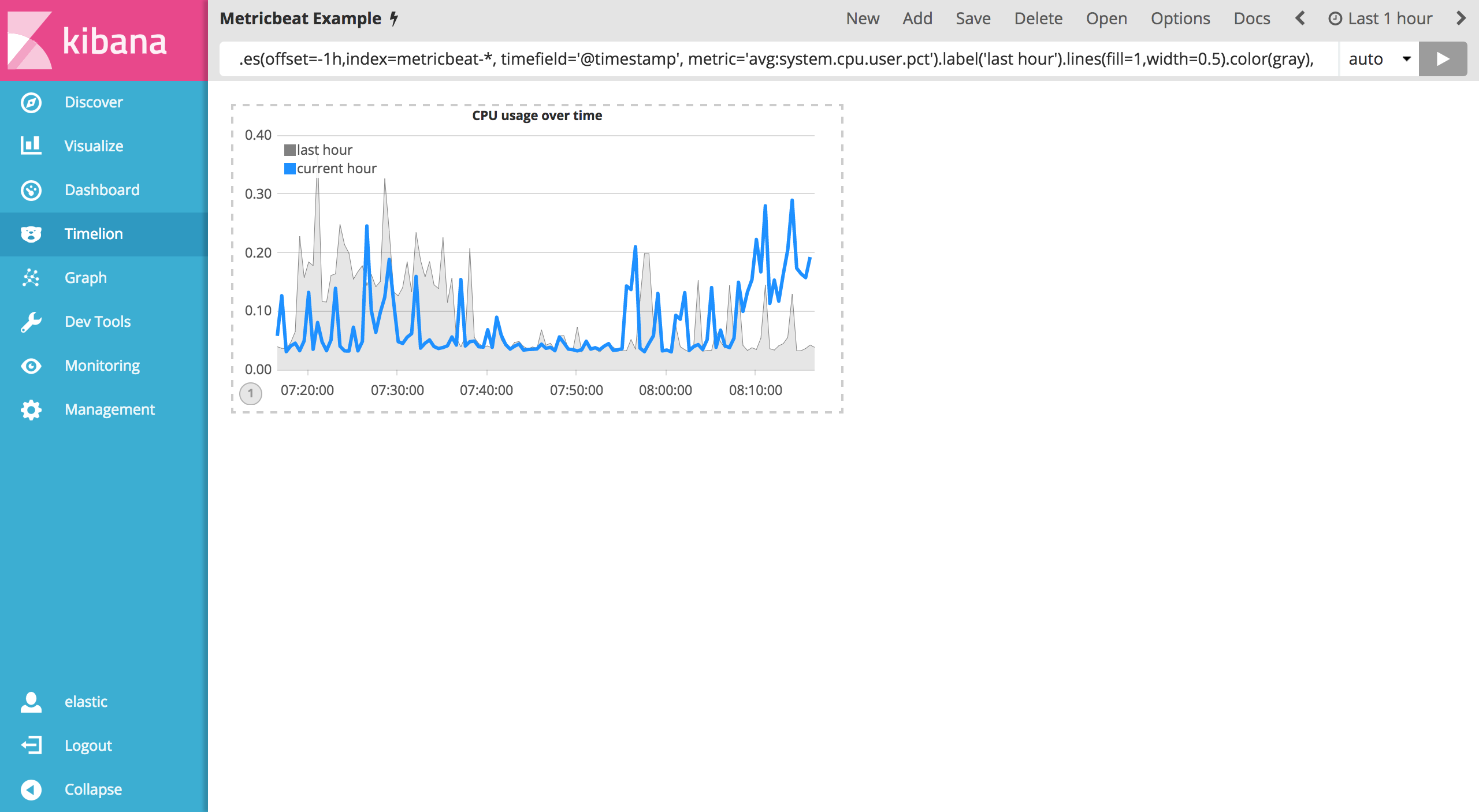
接下来我们用颜色来凸显当前小时的序列图表。color() 函数可以用来改变颜色,它接受标准的颜色命名,十六进制的值或者直接用标准的颜色命名。例如我们可以使用 .color(gray) 来标记上一个小时的数据,用 .color(#1E90FF) 来标记当前小时的数据。完整的输入如下表达式到 Timelion 查询框来调整:
.es(offset=-1h,index=metricbeat-*, timefield='@timestamp', metric='avg:system.cpu.user.pct').label('last hour').lines(fill=1,width=0.5).color(gray), .es(index=metricbeat-*, timefield='@timestamp', metric='avg:system.cpu.user.pct').label('current hour').title('CPU usage over time').color(#1E90FF)
最后,调整控件布局合理利用空间。您可以利用 .legend() 函数设置位置和样式。例如可以通过设置 .legend(columns=2, position=nw) 使控件位于西北方向并占用两列。利用如下的表达式进行调整:
.es(offset=-1h,index=metricbeat-*, timefield='@timestamp', metric='avg:system.cpu.user.pct').label('last hour').lines(fill=1,width=0.5).color(gray), .es(index=metricbeat-*, timefield='@timestamp', metric='avg:system.cpu.user.pct').label('current hour').title('CPU usage over time').color(#1E90FF).legend(columns=2, position=nw)

保存您的修改并继续学习下一节的数学函数。